
The quest for the perfect red, whether for a logo, a product package, or an advertising campaign, is a journey rooted in the fundamental principles of color theory. Red, a color that commands attention and evokes a powerful spectrum of emotions – from passion and energy to danger and urgency – is not a primary color in the subtractive color system most commonly used in physical media like printing and painting. Therefore, understanding how to create it is essential for any brand aiming to harness its potent visual impact. This exploration delves into the world of color mixing, specifically focusing on how to achieve red, and examines the implications for brand identity and visual communication.

The Science of Subtractive Color Mixing for Red
The perception of color is a complex interplay between light, pigment, and our visual system. When we talk about mixing colors to create red, we are typically referring to the subtractive color model. This model is based on pigments, inks, or dyes that absorb certain wavelengths of light and reflect others. The primary colors in this system are Cyan, Magenta, and Yellow (CMY). By mixing these pigments, we subtract wavelengths of light, and the reflected light is what we perceive as color.
Understanding the Primary Pigments
In the subtractive color system, the “purest” forms of the primary colors are crucial.
- Cyan (C): This is a bluish-green pigment. It absorbs red light and reflects blue and green light.
- Magenta (M): This is a purplish-red pigment. It absorbs green light and reflects blue and red light.
- Yellow (Y): This is a bright, pure yellow pigment. It absorbs blue light and reflects red and green light.
These three pigments are foundational because, in theory, when mixed in the correct proportions, they can create a wide gamut of other colors, including black (though a dedicated black pigment, K for Key, is usually added in printing – CMYK – for richer blacks and to save ink).
The Path to Red: Mixing Magenta and Yellow
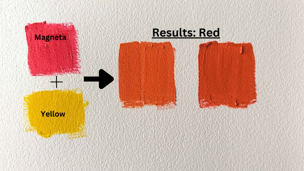
The most direct and fundamental way to create red in the subtractive color system is by mixing Magenta and Yellow.
- Magenta absorbs green light and reflects blue and red light.
- Yellow absorbs blue light and reflects red and green light.
When you mix magenta and yellow pigments, the resulting mixture absorbs green light (from the magenta) and blue light (from the yellow). The wavelengths of light that are neither absorbed by the magenta nor the yellow are predominantly red wavelengths. Therefore, the reflected light is perceived as red. The resulting shade of red will depend on the specific hues and proportions of the magenta and yellow used.
Achieving Different Shades of Red
The beauty of color mixing lies in its nuance. Simply mixing magenta and yellow will produce a basic red, but achieving specific brand-relevant reds requires a more refined approach.
- Brighter, more vibrant reds: To achieve a vibrant, almost “true” red, one would typically use a pure, saturated magenta and a clean yellow. The ratio is important; generally, a higher proportion of magenta relative to yellow will yield a more intense red. Think of the red in many iconic brand logos – it often leans towards a strong, pure red.
- Deeper, richer reds: To create a deeper, more maroon-like red, one might introduce a very small amount of Cyan. Cyan, being a bluish-green, will absorb red light. Adding a tiny bit of cyan to a magenta and yellow mix will absorb some of the red wavelengths, darkening and enriching the red towards a burgundy or crimson. This is a delicate balance; too much cyan will turn the red into a purplish-brown or even muddy it.
- Orangey-reds: Conversely, to create reds that lean towards orange, one would increase the proportion of yellow relative to magenta. Yellow contributes green and red wavelengths. By increasing yellow, you amplify the reflected red while also introducing more green, which, when combined with the red, starts to push the color towards orange.
- The Role of Black: In a practical printing context, achieving a rich, opaque red often involves using a small amount of black ink in addition to magenta and yellow. This doesn’t fundamentally change the color mixing principle but enhances its depth and vibrancy, especially on certain paper stocks.
Red in Brand Identity: Psychology and Application
The choice of red in branding is rarely arbitrary. It’s a strategic decision informed by color psychology and the desired brand perception. Red is one of the most potent colors in the human visual spectrum, known for its ability to grab attention and elicit strong emotional responses.
Evoking Emotion and Meaning
Red is intrinsically linked to a wide array of emotions and concepts, making its application in branding a powerful tool for communication.
- Passion and Energy: Red is the color of love, desire, and enthusiasm. Brands that want to convey excitement, dynamism, and a sense of spirited activity often use red. Think of sports brands, fast-food chains, or companies focused on entertainment.
- Power and Strength: Red can also signify power, courage, and determination. It’s a color associated with leadership and ambition. Brands aiming to project confidence, authority, or a no-nonsense approach might lean on red.
- Urgency and Warning: In a different context, red is universally recognized as a signal for caution, danger, or immediate action. This is why it’s used for stop signs, emergency buttons, and warning labels. Brands in industries where safety is paramount, or those wishing to create a sense of urgency in their marketing, might incorporate red strategically.
- Appetite Stimulation: For the food and beverage industry, red is often chosen for its proven ability to stimulate appetite. This is a key reason why many popular restaurants and food brands utilize red in their logos and packaging.
Strategic Application in Visual Design
The way red is applied within a brand’s visual assets is as critical as the shade itself. It can be used as a primary brand color, an accent color, or a focal point.
- Primary Brand Color: When red is the dominant color in a brand’s palette, it signals a strong commitment to the emotions and meanings associated with it. This can create a bold, unforgettable identity, but it requires careful consideration to avoid overwhelming the audience or appearing too aggressive.
- Accent Color: More commonly, red is used as an accent color to draw attention to key elements. A touch of red can highlight a call-to-action button on a website, a crucial detail on product packaging, or a specific part of a logo. This strategic use leverages red’s attention-grabbing power without making it the sole focus.
- Creating Hierarchy: In design layouts, red can be employed to establish visual hierarchy. By using a vibrant red for important information or calls to action, designers can guide the viewer’s eye through the content effectively.
- Brand Consistency: Ensuring consistent application of the chosen shade of red across all platforms – digital, print, and physical products – is paramount for brand recognition and integrity. This is where the understanding of precise color mixing becomes critical for design teams and printers.
The Role of Color Models: RGB vs. CMYK for Red
While we’ve focused on subtractive color mixing for physical media, it’s important to acknowledge the additive color model (RGB) used in digital displays. The way red is created and perceived differs significantly between these two systems, and understanding this distinction is vital for brands operating in both the physical and digital realms.
Additive Color Mixing (RGB)
The RGB color model is based on light. The primary colors are Red, Green, and Blue. When these lights are combined, they add wavelengths, creating brighter colors.
- Red (R): In RGB, “pure red” is achieved by emitting pure red light at its maximum intensity, with no green or blue light. This is a primary color in itself within this system.
- Mixing for Other Colors: To create other colors in RGB, you mix varying intensities of Red, Green, and Blue light. For instance, mixing red and green light at equal intensities produces yellow. Mixing all three primary lights at their maximum intensity creates white.
The Challenge of Bridging RGB and CMYK Reds
The fundamental difference is that in RGB, red is a primary, additive color. In CMYK, red is a secondary, subtractive color made from mixing magenta and yellow. This leads to a significant challenge: a red that looks vibrant and specific on a screen (RGB) may not be achievable with the same vibrancy or hue when printed using CMYK inks.
- Gamut Differences: The range of colors that can be produced by RGB (the RGB gamut) is generally larger and more vibrant than the gamut achievable with CMYK. Many bright, luminous reds seen on screens are simply outside the CMYK color space.
- Color Conversion and Profiling: When a brand moves from digital design to print, careful color conversion is necessary. This involves using color profiles to translate the RGB red to its closest CMYK equivalent. This process often requires adjustments and might necessitate choosing a slightly different shade of red for print to maintain brand consistency and visual impact.
- Brand Guidelines and Color Accuracy: Robust brand guidelines will specify not only the RGB values for digital applications but also the CMYK values for print. They might also include Pantone (PMS) color codes, which are special inks designed to provide consistent and accurate color reproduction across various media, often bridging the gap between RGB and CMYK limitations. For a specific brand red, designers and printers might select a Pantone color that offers the best possible representation of the intended hue in both digital and print environments.
Conclusion: The Art and Science of Brand Red
The seemingly simple question of “what colours do you mix to make red” opens a door to the sophisticated interplay of color science, artistic application, and strategic branding. In the world of physical media, red is predominantly achieved through the subtractive mixing of magenta and yellow pigments. However, the exact hue and vibrancy depend on the quality of the pigments, their proportions, and the potential addition of other colors like cyan or black to deepen or refine the shade.
For brands, red is more than just a color; it’s a powerful communicator of emotion, energy, and intent. Whether it’s the fiery passion of a sports brand, the inviting warmth of a restaurant, or the urgent signal of a safety campaign, the strategic use of red can profoundly influence consumer perception and brand recognition.
Navigating the digital and physical realms requires a nuanced understanding of color models, particularly the differences between additive (RGB) and subtractive (CMYK) color systems. The translation of a screen-based red to its printed equivalent is a critical step that necessitates precise color management, well-defined brand guidelines, and often the use of spot colors like Pantone to ensure unwavering consistency. Ultimately, mastering the art and science of mixing colors to create the perfect red is an indispensable skill for any brand aiming to make a lasting and impactful visual statement.
aViewFromTheCave is a participant in the Amazon Services LLC Associates Program, an affiliate advertising program designed to provide a means for sites to earn advertising fees by advertising and linking to Amazon.com. Amazon, the Amazon logo, AmazonSupply, and the AmazonSupply logo are trademarks of Amazon.com, Inc. or its affiliates. As an Amazon Associate we earn affiliate commissions from qualifying purchases.