In the world of luxury marketing and consumer packaged goods (CPG), the visual profile of a product often speaks louder than its actual utility. When we ask the question, “What colour is rum?” we are not merely inquiring about a chemical reaction involving charred oak barrels and oxidation. Instead, we are exploring one of the most sophisticated exercises in brand strategy: the use of visual cues to dictate market positioning, perceived value, and consumer trust.
In the spirits industry, color is the primary driver of the brand narrative. It is the first point of touch in the consumer journey, occurring long before the cork is pulled or the first sip is taken. For a brand manager, the “colour” of rum is a strategic choice that defines whether a product is seen as a versatile mixer for a youthful demographic or a sophisticated, contemplative liquid for the high-end connoisseur.
The Psychology of Visual Cues: Why Color Defines the Brand Narrative
The human brain is wired to make split-second associations based on chromatic data. In branding, these associations form the foundation of “sensory marketing.” When a consumer looks at a bottle of rum, the shade of the liquid acts as a silent ambassador for the brand’s heritage and price point.
The Spectrum of Trust: From White to Dark
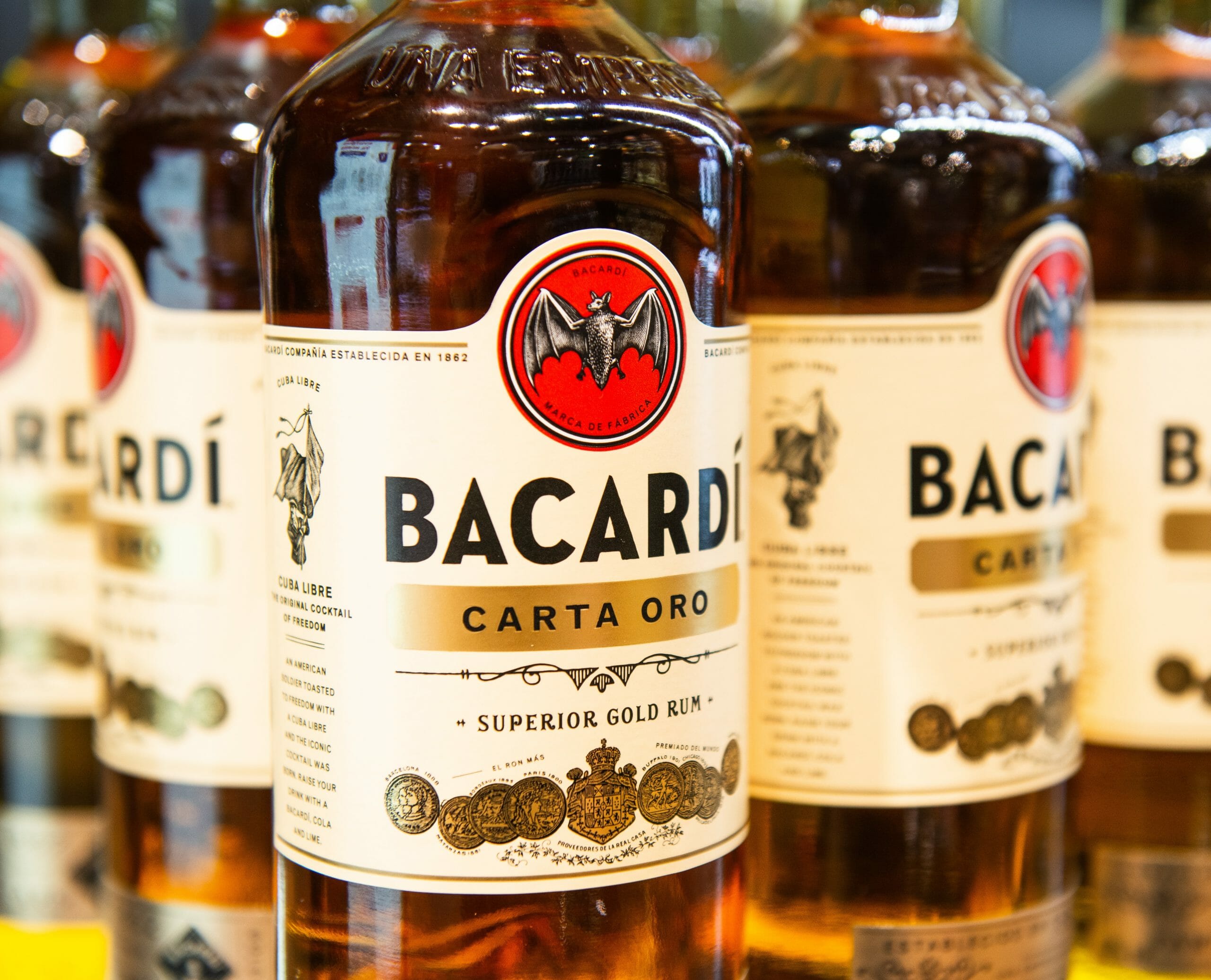
In the branding architecture of spirits, “White” or “Silver” rums are positioned around themes of purity, clarity, and modernism. From a brand strategy perspective, clear rum represents a “blank canvas.” It signals to the consumer that the product is designed for versatility—primarily as a component in cocktails. Brands like Bacardí have mastered this by associating their clear profile with a “clean” lifestyle and high-energy social environments.
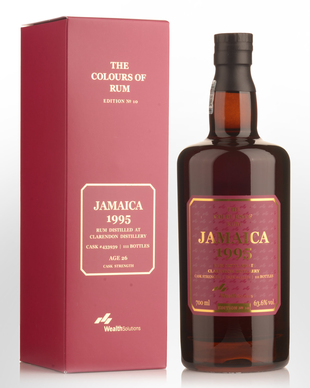
Conversely, as the liquid shifts toward gold, amber, and deep mahogany, the brand narrative shifts toward “time,” “craftsmanship,” and “authority.” Darker hues are psychologically linked to the concept of aging. In the mind of the consumer, color serves as a proxy for the years spent in a cellar. For a brand, this is a powerful tool to justify a premium price point; the darker the liquid, the higher the perceived “investment” in the product’s creation.
Premiumization Through Pigmentation
“Premiumization” is currently the most significant trend in the global spirits market. Brand owners are moving away from volume-based sales and toward value-based sales. The color of the rum is central to this transition. A deep amber hue suggests a “sipping rum,” moving the product out of the crowded well-drink category and onto the top shelf. By carefully managing the visual output of the liquid, brands can pivot their identity from a utilitarian commodity to a luxury lifestyle asset.
Brand Authenticity and the “E150a” Debate: Transparency as a Strategy
One of the most complex challenges in brand management is maintaining consistency without sacrificing authenticity. In the rum industry, the use of Spirit Caramel (E150a) to standardize color is a common practice. However, as consumers become more educated and demand greater transparency, how a brand handles its “color” has become a litmus test for its corporate identity.
The Conflict Between Consistency and Craft
For global corporate brands, consistency is the hallmark of reliability. A bottle of “Gold” rum purchased in London must look identical to one purchased in Tokyo. If the colors vary, the brand’s “promise of quality” is perceived as broken. This leads many large-scale producers to use additives to ensure a uniform brand image.
On the other hand, “Craft” and “Artisan” brands are increasingly using the lack of color consistency as a brand strength. By eschewing additives, these brands lean into a strategy of radical transparency. They argue that “natural” color—even if it is lighter or inconsistent—is a sign of an unadulterated, high-quality product. This strategy appeals to the “Conscious Consumer,” a demographic that values honesty over aesthetic perfection.

Communicating Value Through Labeling and Clarity
Brand strategy is not just about the product; it is about the information surrounding it. Brands that choose not to use artificial coloring often make this a centerpiece of their marketing collateral. By including phrases like “No Added Color” or “Natural Aging” on the label, they create a “Reason to Believe” (RTB) for the consumer. This transforms the physical color of the rum into a brand value, aligning the visual identity with a commitment to traditional methods.
Case Studies in Chromatic Branding: How Leaders Master the Palette
To understand how the “colour of rum” functions as a brand tool, we must look at the market leaders who have successfully utilized their liquid’s appearance to dominate specific niches.
Mount Gay: The Golden Standard of Heritage
Mount Gay, the world’s oldest running rum distillery, uses a specific “Golden” hue to anchor its brand in heritage. Their strategy isn’t about being the darkest or the clearest; it’s about a specific amber glow that suggests the warmth of Barbados. Their branding leverages this color across all touchpoints—from the golden foil on the neck of the bottle to the warm lighting used in their photography. The color is the “Golden Thread” that connects their 300-year history to the modern consumer.
Bacardí: The Logic of the “Clean” Aesthetic
Bacardí is perhaps the greatest example of using “No Colour” as a powerful brand identity. By pioneering the charcoal filtration process to create a clear rum that still possessed character, they revolutionized the market. Their brand strategy focuses on the “Bat” logo against a clean, white, or silver background, reflecting the crystalline nature of the liquid. This visual synergy communicates a message of accessibility and reliability, making it the global standard for the “Rum and Coke” or “Mojito” brand experience.
Digital Branding and the “Instagrammable” Spirit
In the digital age, the “colour” of a product must perform well not just on a physical shelf, but on a five-inch smartphone screen. The visual identity of rum has had to adapt to the requirements of social media marketing and e-commerce.
Color in the Age of Social Media Marketing
For a brand to go viral or maintain engagement on platforms like Instagram and Pinterest, its product must be visually striking. The “richness” of a dark rum’s color is often enhanced in digital marketing through high-contrast photography to evoke a sense of warmth and luxury. Brands are now designing their liquid profiles and bottle glass (using extra-flint glass for higher clarity) specifically to ensure the “rum glow” pops in a digital feed. This is a deliberate move to capture the “scrolling” consumer’s attention.
Liquid Assets: Designing for the Digital Shelf
On the “digital shelf” (e-commerce sites like Amazon or specialized liquor retailers), the thumbnail image of the bottle is the only tool a brand has to convert a viewer into a buyer. Because the consumer cannot touch the bottle or smell the liquid, the color of the rum carries 90% of the weight in communicating the product’s “vibe.” A brand strategy that focuses on high-saturation visuals and clear liquid-to-glass contrast ensures that the brand appears premium even in a low-resolution thumbnail.
The Future of Rum Branding: Beyond the Amber Horizon
As we look toward the future of brand strategy in the spirits sector, the “colour” of rum will continue to evolve alongside consumer values. We are seeing the rise of “Transparent Brands”—not just in the color of the liquid, but in the ethics of the supply chain.
The color of rum is no longer just a byproduct of the barrel; it is a meticulously managed brand asset. It is a psychological trigger, a marker of prestige, and a digital marketing tool. Whether a brand chooses the pristine clarity of a silver rum or the deep, brooding mahogany of an extra-aged reserve, they are making a strategic decision about who they are, who their customer is, and what story they want to tell.
In conclusion, the next time you see a bottle of rum, ask yourself: “What is this color trying to sell me?” You will find that the answer lies not in the distillery, but in the boardroom of a brand strategist. The color of rum is the color of the brand’s soul—carefully aged, perfectly blended, and strategically presented to the world.
aViewFromTheCave is a participant in the Amazon Services LLC Associates Program, an affiliate advertising program designed to provide a means for sites to earn advertising fees by advertising and linking to Amazon.com. Amazon, the Amazon logo, AmazonSupply, and the AmazonSupply logo are trademarks of Amazon.com, Inc. or its affiliates. As an Amazon Associate we earn affiliate commissions from qualifying purchases.