
The question “what colour is mink” appears deceptively simple, yet for brand strategists, designers, and marketers, it unlocks a complex interplay of perception, aspiration, and identity. Mink is not a singular hue but a spectrum, and its perceived colour carries a potent symbolic weight, shaping luxury branding, product aesthetics, and consumer desire across diverse industries. Understanding this nuanced palette and its strategic deployment is crucial for cultivating an image of sophistication, quality, and exclusivity.
Beyond a Single Hue: The Spectrum of Mink and its Brand Implications
To the untrained eye, mink might simply be “brown.” However, the natural animal, and by extension, the material derived from it, boasts an astonishing range of colours and undertones. This inherent diversity is a foundational element that brands leverage to communicate specific values and position their offerings.
Natural Variations and Designer Interpretations
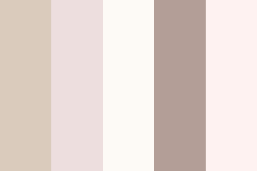
Natural mink colours span from deep, almost black mahogany to warm, golden browns, cool silvery greys, and creamy, almost white beiges. These variations are not just biological accidents but distinct aesthetic categories, each carrying its own set of associations. For instance, “dark mink” or “mahogany mink” often evokes traditional luxury, gravitas, and timeless elegance. These darker shades are frequently utilized by heritage brands seeking to project a sense of enduring class and serious craftsmanship.
Conversely, “silver mink” or “pearl mink” suggests modernity, understated glamour, and a sleek, contemporary edge. Brands targeting a younger, more fashion-forward demographic or those aiming for a minimalist aesthetic might lean into these cooler, lighter tones. “Palomino mink,” with its golden, tawny hues, conveys warmth, approachability, and a softer kind of luxury, often seen in more bohemian-chic interpretations of high-end design.
Designers rarely just replicate natural mink colours; they interpret and refine them. Through dyeing processes and specific material choices, they create “mink-inspired” palettes that extend beyond the animal’s natural range. This allows brands to maintain the core connotations of luxury and softness while tailoring the exact shade to their specific brand identity and seasonal trends. The term “mink” thus becomes an umbrella for a sophisticated, muted, and often earthy colour family.
The Emotional Resonance of ‘Mink’ Tones
The emotional impact of these nuanced mink tones is significant. They are often perceived as sophisticated without being ostentatious, luxurious without being garish. This is largely due to their muted, natural quality. Unlike vibrant primary colours, mink tones tend to be subdued, reflecting an understated confidence and a discerning taste.
Browns, in general, are associated with stability, warmth, and naturalness. When these browns take on the rich, multi-tonal complexity of mink, they also acquire connotations of opulence and high quality. Greys evoke intellect, formality, and modernity, and when imbued with the softness of mink, they soften these associations, suggesting approachable elegance. The overall effect is one of quiet luxury—a brand that doesn’t need to shout its value because its inherent quality is self-evident. This emotional resonance is a powerful tool for brands aiming to cultivate a particular relationship with their clientele, one built on trust, quality, and refined taste.
Color as a Cornerstone of Luxury Brand Identity
In the competitive landscape of luxury, colour is far more than an aesthetic choice; it is a fundamental pillar of brand identity. The specific shades associated with “mink” are instrumental in shaping perceptions of exclusivity, quality, and heritage for countless brands.
Evoking Exclusivity and Sophistication
Luxury brands thrive on differentiation and the perception of rarity. The “colour of mink,” in its diverse manifestations, intrinsically contributes to this. These are not common, everyday colours. They are often complex, requiring a keen eye to distinguish subtle undertones, much like appreciating the craftsmanship of a high-end product. This complexity mirrors the exclusivity that luxury brands aim to project.
When a fashion house presents a collection in shades of “mink grey” or “mink brown,” they are not just selecting colours; they are invoking a legacy of luxury materials, artisanal skill, and timeless style. The association with mink fur, a historical symbol of wealth and status, automatically elevates the perceived value of any product adopting these tones. It signals that the brand understands and caters to a discerning clientele who appreciates understated elegance over flashy statements. This sophisticated palette helps luxury brands carve out a niche that communicates aspiration without needing overt branding.
The Psychology Behind Luxury Color Choices
The psychology of colour plays a critical role in how “mink” colours are utilized in branding. These earthy, muted tones are often associated with comfort, security, and warmth, creating an inviting yet refined atmosphere. They are also considered “adult” colours, appealing to a mature audience that values substance and longevity over fleeting trends.

For luxury brands, these colours convey a sense of gravitas and permanence. Unlike brighter, trend-driven hues that can quickly become dated, the mink palette offers a timeless quality. This aligns perfectly with the luxury ethos of investing in pieces that endure, both in quality and style. Furthermore, these colours tend to recede rather than dominate, allowing the form, texture, and craftsmanship of the product itself to take centre stage. This subtle approach reinforces the idea that true luxury lies in intrinsic quality and thoughtful design, not merely superficial adornment.
Consider the application of mink colours in retail environments. High-end boutiques often employ these tones in their interiors—on walls, furniture, and fixtures. This creates an atmosphere that feels simultaneously opulent and serene, encouraging customers to linger and connect with the brand’s aesthetic vision. The deliberate use of such a sophisticated palette contributes significantly to the overall brand experience, reinforcing the luxury narrative from the moment a customer steps inside.
Leveraging ‘Mink’ in Marketing and Design
The strategic deployment of “mink” colours extends far beyond apparel, becoming a versatile tool in marketing and design across various sectors, from beauty to home décor. Its evocative power makes it ideal for crafting a cohesive visual narrative that resonates with the target audience.
From Fashion Runways to Interior Aesthetics
In fashion, “mink” serves as both a literal material and a colour descriptor. A “mink coat” is the epitome of classic luxury, but “mink-coloured” sweaters, dresses, or accessories communicate the same understated opulence without necessarily using the fur itself. These colours are particularly effective in conveying a sense of warmth, softness, and tactile appeal, qualities highly valued in fashion. Designers frequently incorporate these shades into their collections, often as neutrals that anchor more vibrant seasonal colours, providing a sophisticated backdrop.
Beyond fashion, the “mink” aesthetic has permeated interior design. “Mink grey” sofas, “mink brown” throws, and “mink-coloured” accent walls are popular choices for creating elegant, comfortable, and timeless living spaces. These colours offer versatility, pairing beautifully with both rich jewel tones and crisp whites, allowing for dynamic yet harmonious design schemes. The implication here is that choosing “mink” colours for the home imbues the space with the same sense of quiet luxury and refined taste associated with high fashion. It’s about creating an environment that feels curated and intentionally sophisticated.
The beauty industry has also embraced the “mink” palette. Eyeshadows, lipsticks, and nail polishes often feature “mink brown,” “mink taupe,” or “mink grey” shades, marketed as sophisticated neutrals that enhance natural beauty with an understated glamour. Here, the colour conveys a sense of polished elegance and effortless chic, appealing to consumers who prefer a subtle yet impactful aesthetic.
Crafting a Cohesive Visual Narrative
For brands, consistency in visual identity is paramount. The intelligent use of “mink” colours helps craft a cohesive visual narrative that reinforces brand values across all touchpoints. Whether it’s the packaging of a luxury watch, the website design for a high-end interior designer, or the advertisements for a premium skincare line, integrating a consistent “mink” palette strengthens brand recognition and emotional connection.
A brand choosing to align itself with the “mink” aesthetic typically aims to convey timelessness, quality, and a sophisticated elegance. This choice informs everything from logo design and typography (often leaning towards classic serifs or clean sans-serifs) to photographic styles (often warm, muted, and focusing on texture and natural light). The colour palette becomes a silent storyteller, communicating brand personality without explicit verbal statements. By consistently employing these rich, earthy, and muted tones, brands can build a strong, recognizable identity that resonates with their target audience’s desire for luxury and refinement.
The Evolution of ‘Mink’ as a Brand Descriptor
The term “mink” has transcended its literal meaning as an animal fur to become a powerful, evocative brand descriptor for a particular aesthetic and quality. This evolution highlights its enduring relevance in conveying luxury and sophistication.
Expanding Beyond Fur: Beauty, Home, and Lifestyle
Initially synonymous with actual mink fur garments, the “mink” descriptor has significantly broadened its scope. Today, it’s common to hear about “mink lashes” (referring to soft, luxurious false eyelashes, whether synthetic or animal hair), “mink blankets” (for exceptionally soft and plush throws), and “mink flooring” (for a rich, warm, and luxurious wood or tile finish). In these contexts, “mink” is no longer about the animal itself, but about the qualities it has come to represent: unparalleled softness, rich texture, deep and nuanced colour, and an overall sense of opulent comfort.
This expansion signifies a successful transfer of brand equity. The positive associations built around real mink—luxury, quality, warmth, and a specific aesthetic—have been effectively abstracted and applied to other product categories. Brands leverage this existing perception to instantly elevate their offerings, implying a superior tactile experience or visual appeal simply by attaching the “mink” label or utilizing its associated colour palette.

Maintaining Authenticity in an Expanding Palette
As the use of “mink” as a descriptor expands, brands face the challenge of maintaining authenticity and avoiding dilution of its original powerful connotations. For a brand to successfully leverage the “mink” aesthetic, the product or service must genuinely embody the qualities of luxury, softness, and sophistication that the term implies. Simply labelling something “mink-coloured” without delivering on texture, quality, or design integrity can quickly lead to consumer disappointment and erode brand trust.
Therefore, for brands using “mink” in their strategy, whether through literal colour names or thematic inspiration, it’s essential to ensure that every aspect of their offering aligns with the elevated expectations this term generates. This involves meticulous attention to material quality, craftsmanship, sensory experience, and consistent messaging. The true “colour of mink,” in its brand context, is not just a visual shade; it’s a promise of a certain level of luxury, an aspiration for refined living, and a testament to enduring style. By understanding and honouring this multifaceted identity, brands can continue to harness the potent power of “mink” to captivate and engage discerning audiences worldwide.
aViewFromTheCave is a participant in the Amazon Services LLC Associates Program, an affiliate advertising program designed to provide a means for sites to earn advertising fees by advertising and linking to Amazon.com. Amazon, the Amazon logo, AmazonSupply, and the AmazonSupply logo are trademarks of Amazon.com, Inc. or its affiliates. As an Amazon Associate we earn affiliate commissions from qualifying purchases.