
Lime green, a vibrant hue nestled between yellow and green on the color spectrum, is a powerful choice for brands seeking to convey energy, innovation, and a distinct modern edge. Its inherent brightness demands careful consideration when paired with other colors, as the wrong combination can undermine a brand’s message or create visual discord. Understanding the principles of color theory and brand psychology is paramount to harnessing lime green’s full potential, ensuring it elevates, rather than detracts from, your corporate identity and marketing efforts. This exploration delves into strategic color pairings that optimize lime green for impactful branding, from digital presence to physical merchandise.
The Psychology of Lime Green in Branding
The judicious selection of a primary brand color like lime green is far from arbitrary; it’s a strategic decision rooted in psychological principles and market positioning. Lime green, specifically, communicates a unique set of attributes that resonate with particular audiences and industries.
Energy, Innovation, and Visibility
At its core, lime green is synonymous with vitality and freshness. It combines the optimism and warmth of yellow with the growth and stability of green, resulting in a dynamic shade that grabs attention. For brands, this translates into a perception of being energetic, forward-thinking, and even rebellious in a positive sense. Companies aiming to disrupt established norms, signal innovation, or appeal to a youthful, active demographic often gravitate towards lime green. Its high visibility makes it excellent for call-to-action buttons, highlighting key messages, or creating memorable logos that stand out in a crowded marketplace. It suggests a brand that is alive, responsive, and keen on progress.
Targeting the Right Audience
The emotional response to lime green is not universal, which makes audience targeting crucial. While it might excite a tech-savvy, eco-conscious, or fitness-oriented consumer, it could be perceived as too audacious or informal for brands targeting traditional, luxury, or conservative markets. Brands using lime green often aim for an audience that values modernity, sustainability, health, or adventure. It’s a color frequently seen in sportswear, eco-friendly product packaging, technology interfaces, and lifestyle brands that emphasize vibrancy and a zest for life. A brand’s color palette, with lime green as a key player, therefore acts as a non-verbal cue, signaling its values and personality directly to its intended market segment.
Mastering Color Theory: Complementary and Analogous Pairings
To effectively integrate lime green into a cohesive brand identity, an understanding of fundamental color theory is indispensable. The right pairings not only create aesthetic harmony but also reinforce a brand’s intended message and visual appeal.
Complementary Power: Purple and its Shades
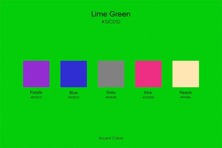
On the color wheel, purple stands directly opposite lime green, making it its complementary color. This pairing creates the highest degree of contrast and visual vibrancy. For branding, a bold lime green alongside a deep, rich purple (think eggplant or plum) can communicate sophistication combined with energy. It’s a daring choice that projects confidence and uniqueness. Lighter lavenders or pastel purples can soften the intensity, offering a more whimsical or creative appeal suitable for brands in the arts, beauty, or children’s products sectors. This combination is particularly effective when a brand wants to make a strong visual statement and ensure high recall, leveraging the inherent tension and excitement of complementary hues.
Analogous Harmony: Blues and Yellows
Analogous colors are those that sit next to each other on the color wheel, creating a sense of harmony and fluidity. For lime green, these include shades of yellow and various blues.
- With Yellows: Introducing a brighter, more pure yellow can amplify lime green’s inherent cheerfulness and optimism. This pairing is excellent for brands in food and beverage, recreation, or any sector aiming for a light, friendly, and energetic appeal. It feels natural and invigorating, often associated with sunlight and growth.
- With Blues: Moving towards the blue side, particularly teal, aqua, or even a sky blue, introduces a sense of calm, trustworthiness, and professionalism without sacrificing modernity. This combination is highly versatile, perfect for tech brands, environmental initiatives, or health and wellness companies that want to balance their innovative edge with reliability. The cool undertones of blue can temper lime green’s intensity, creating a more balanced and approachable palette.
Triadic and Tetradic Combinations for Dynamic Brands
For brands that require a more complex, dynamic, and multifaceted visual identity, triadic and tetradic color schemes offer sophisticated solutions.
- Triadic: A triadic palette uses three colors equally spaced on the color wheel. For lime green, this often involves a shade of orange and a shade of violet/magenta. This creates a vibrant and playful energy, suitable for brands in entertainment, creative industries, or products aimed at a younger demographic that appreciates bold, unexpected combinations. It provides a rich visual experience, offering variety while maintaining an underlying structure.
- Tetradic (Rectangular/Square): This scheme uses four colors, either forming a rectangle or a square on the color wheel. It’s the most complex to balance but offers the richest visual impact. A common approach involves lime green with a complementary purple, and then two additional colors that are complements to each other (e.g., a bright orange and a deep blue). This creates a highly energetic and multi-dimensional brand identity, often employed by fashion-forward brands, large entertainment corporations, or innovative tech companies that need a broad palette for diverse sub-brands or extensive marketing campaigns. Mastering these schemes allows for deep visual storytelling, reflecting complexity and breadth in a brand’s offerings.
Neutral Foundations: Black, White, and Grey with Lime Green
While vibrant pairings create impact, neutrals provide essential balance, sophistication, and readability. Black, white, and various shades of grey are invaluable in grounding lime green and allowing its vivacity to shine without overwhelming the viewer.

Sophistication with Charcoal and Silver
When paired with deeper neutrals like charcoal grey or metallic silver, lime green gains an immediate sense of modern sophistication. Charcoal provides a strong, serious backdrop that makes lime green pop with controlled energy, ideal for corporate branding in tech, luxury automotive, or high-end services. This combination communicates innovation and strength, with lime green acting as a highlight or accent that draws attention to key elements. Silver, especially in metallic finishes, adds a futuristic and refined dimension, perfect for brands emphasizing cutting-edge technology, sleek design, or a premium experience. This pairing prevents lime green from appearing too juvenile or casual, elevating its perceived value.
Clean Contrast with Bright Whites
White is the quintessential neutral, offering purity, simplicity, and expansive negative space. When combined with lime green, white creates a clean, crisp, and extremely modern aesthetic. This combination is excellent for brands that want to convey transparency, freshness, and minimalism. It’s a popular choice for health food brands, sustainable product lines, or digital interfaces where clarity and ease of use are paramount. White allows lime green to deliver its energetic message without competition, ensuring readability and a sense of openness. It can make a brand feel approachable yet contemporary, making it a versatile option across many industries, from personal care to innovative software.
Strategic Application: Branding Across Platforms
The chosen lime green color palette must be consistently applied across all brand touchpoints to build a cohesive and recognizable identity. From digital interfaces to physical products, consistency reinforces brand recall and message.
Digital Design: Websites, Apps, and Social Media
In the digital realm, lime green is a powerful tool for visual hierarchy and user engagement. On websites and apps, it can be strategically used for calls-to-action (buttons, links), headlines, and interactive elements to guide the user’s eye. Paired with dark greys or blues, it creates a modern, high-contrast interface. For social media, consistent use of the lime green palette in graphics, profile pictures, and story highlights ensures instant brand recognition. The brightness of lime green performs exceptionally well on screens, making it a favorite for tech startups, gaming companies, and digital marketing agencies aiming for a fresh, engaging online presence.
Print Media: Packaging, Brochures, and Merch
For physical collateral, the material and finish can significantly impact how lime green is perceived. On packaging, lime green can instantly signal freshness (e.g., in food products) or eco-friendliness (for sustainable goods). When combined with matte finishes and natural textures, it reinforces a brand’s organic or artisanal values. In brochures and business cards, lime green can be used as a spot color to highlight logos, contact information, or key benefits, drawing attention against a neutral background. On merchandise like apparel or promotional items, lime green creates high visibility and a youthful, energetic brand association. The key is to ensure color consistency across print processes (CMYK, Pantone) to maintain brand integrity.
Environmental Branding: Retail and Events
Lime green can be leveraged powerfully in environmental branding to create immersive and memorable experiences. In retail spaces, it can be used for accent walls, furniture, or signage to inject energy and define zones, especially effective for sportswear stores, healthy cafés, or innovative tech showrooms. At events and exhibitions, lime green branding makes a booth instantly recognizable and inviting, setting an energetic tone. When used with lighting, it can transform spaces and create dynamic visual effects that captivate attendees. The strategic use of lime green in these physical environments helps to translate the brand’s digital personality into a tangible experience, reinforcing its vibrant and forward-thinking identity.
Case Studies in Vivid Branding
Observing successful brands that wield lime green effectively offers valuable insights. While specific brand names are beyond the scope of this article, the principles derived from their application are universal.
Sportswear and Fitness Brands
Many high-performance sportswear and fitness brands leverage lime green. They often pair it with strong, dark neutrals like black, charcoal grey, or deep navy. This combination not only enhances visibility (crucial for safety in activewear) but also communicates peak energy, technological advancement, and a bold, competitive spirit. The lime green often serves as an accent in logos, stitching, or shoe details, creating a dynamic contrast that symbolizes speed and agility, appealing directly to an active consumer base.
Tech Startups and Innovation Hubs
The tech industry, constantly striving to appear cutting-edge and future-forward, frequently adopts lime green. Here, it is often seen alongside clean whites, cool blues, and sophisticated silvers or light greys. This palette conveys innovation, digital clarity, and a fresh approach to problem-solving. Lime green might define interactive elements in user interfaces, highlight key features on marketing materials, or form part of a modern, minimalist logo. It helps these brands project an image of being vibrant, intelligent, and accessible, appealing to an audience that values progress and smart solutions.
In conclusion, lime green is a potent color choice for brands that dare to be different, energetic, and forward-thinking. Its versatility, when understood through the lens of color theory and brand psychology, allows for a myriad of effective pairings – from the bold tension of complementary purples to the harmonious flow of analogous blues and yellows, and the grounding sophistication of neutrals. The key to success lies in consistent, strategic application across all brand touchpoints, ensuring that lime green consistently reinforces a brand’s unique message and resonates deeply with its target audience.
aViewFromTheCave is a participant in the Amazon Services LLC Associates Program, an affiliate advertising program designed to provide a means for sites to earn advertising fees by advertising and linking to Amazon.com. Amazon, the Amazon logo, AmazonSupply, and the AmazonSupply logo are trademarks of Amazon.com, Inc. or its affiliates. As an Amazon Associate we earn affiliate commissions from qualifying purchases.