
In the intricate world of brand strategy and corporate identity, color is far more than a mere aesthetic choice; it is a fundamental pillar of perception, emotion, and recognition. The question, “what colors mix to make red?” transcends a simple query about pigment or light. Instead, it opens a gateway to understanding the very essence of one of the most powerful and frequently utilized colors in branding, delving into its composition, psychological impact, and strategic application in design and marketing. For brand architects, grasping the nuances of red—from its primary origins to its myriad shades—is essential for forging a distinctive, memorable, and impactful visual identity.

The Foundational Role of Red in Brand Psychology
Red is a primal color, deeply embedded in human psyche and culture. Its prominence in the natural world, from vibrant sunsets to crucial warning signs, has forged universal associations that brands leverage daily. Understanding what makes red “red” is not just about a formula; it’s about appreciating its inherent power and how it translates into consumer response.
Red as a Primary: Understanding Color Systems
At a basic level, red is often considered a primary color, meaning it cannot be created by mixing other colors within specific color models. In the traditional RYB (Red, Yellow, Blue) color model, familiar to artists and designers, red stands as one of the three foundational hues from which all others theoretically derive. However, in the realm of modern print and digital design, two other models become crucial:
- CMYK (Cyan, Magenta, Yellow, Key/Black): This subtractive model is used for print. Here, a pure red is typically achieved by mixing 100% Magenta and 100% Yellow. This combination illustrates how even “primary” colors like red are, in a technical sense, a result of mixing other primary pigments to achieve their specific vibrant hue.
- RGB (Red, Green, Blue): This additive model is for digital screens and light. Red is one of the three primary colors of light, meaning it’s a foundational element. A pure red on a screen is represented by turning the red light channel to full intensity while green and blue are off (e.g., RGB: 255, 0, 0).
The subtle differences in how red is composed across these systems directly influence its appearance and, consequently, its brand impact. A vivid digital red might appear slightly different in print, necessitating careful color management to maintain brand consistency.
Emotional and Psychological Impact of Red
Red evokes an immediate and potent emotional response. It is the color of passion, energy, and excitement, but also of danger, urgency, and aggression. For brands, this duality is both a powerful asset and a significant responsibility.
- Energy and Action: Red stimulates the senses and can increase heart rate, making it a compelling choice for brands that want to convey dynamism, speed, or a call to action. Think of the distinctive red logos of Coca-Cola, Netflix, or YouTube, all of which thrive on engagement and immediate consumption.
- Love and Desire: Red is inextricably linked to romance and desire, lending itself to brands in fashion, luxury goods, and hospitality that aim to evoke warmth, intimacy, or allure.
- Urgency and Warning: Its association with stop signs, fire trucks, and alarm buttons makes red an effective tool for communicating importance, sale urgency, or critical information. E-commerce sites often use red for “Buy Now” buttons or discount banners to grab attention.
- Power and Leadership: In some contexts, red signifies strength, authority, and confidence. Many sports teams, luxury car brands, and political parties utilize red to project dominance and leadership.
Cultural Nuances of Red
The psychological impact of red is also shaped by cultural context. While some associations are universal, others are specific:
- Western Cultures: Often linked to love, passion, anger, danger, and Christmas.
- Eastern Cultures (e.g., China): Symbolizes good luck, prosperity, happiness, and is traditionally worn by brides.
- India: Associated with purity, fertility, and wealth; brides often wear red saris.
- South Africa: Can be associated with mourning due to its presence in the national flag.
A global brand must be acutely aware of these cultural interpretations when deploying red in its identity and marketing campaigns to ensure the intended message resonates appropriately across diverse markets.
Deconstructing Red for Strategic Brand Design
Understanding how red is formed and its inherent characteristics allows designers to wield it with precision, shaping a brand’s visual language to communicate specific values and attract target audiences. The “mix” isn’t just about primaries; it’s about the variations that emerge.
The RYB Model and its Relevance to Visual Identity
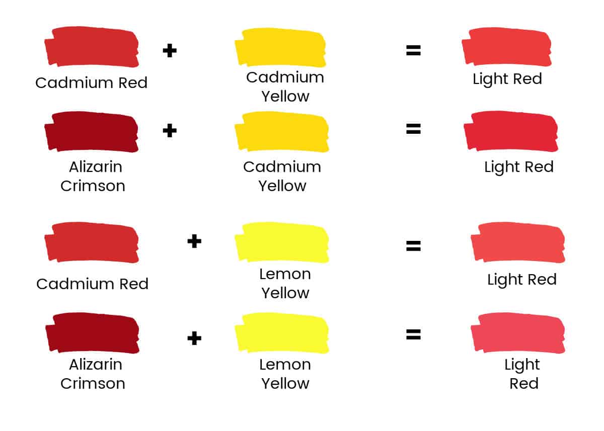
While digital and print technologies rely on CMYK and RGB, the RYB model remains intuitively useful for conceptualizing color mixing and understanding how various shades of red are perceived. For example, adding a touch of yellow to a pure red can make it appear warmer and more vibrant (like an orange-red), evoking energy and approachability. Conversely, adding a hint of blue or black can deepen red into a cooler, richer tone (like a crimson or burgundy), conveying sophistication, tradition, or luxury. These subtle “mixes” are crucial for differentiation. A fast-food brand might opt for a fiery, energetic red, while a premium wine brand would choose a deep, elegant burgundy to reflect its heritage and quality.
Digital Red: RGB and CMYK Considerations
Maintaining brand consistency across various platforms is paramount. A brand’s signature red must look identical whether it appears on a website (RGB), a business card (CMYK), a uniform, or signage. This requires meticulous color management and often involves specifying exact color codes (e.g., hex codes for web, Pantone Matching System for print).
- RGB (Web & Digital Screens): Brands must define their specific red using RGB values or hex codes. This ensures uniformity across digital marketing, social media, apps, and online presence. The vibrancy of red in RGB can be very intense, demanding careful consideration of readability and user experience.
- CMYK (Print): For all printed materials, the CMYK breakdown of the brand’s red is critical. A slight shift in magenta or yellow percentages can drastically alter the final printed hue, potentially undermining brand recognition and perceived quality. Working with printers to achieve accurate CMYK reproduction of a defined brand red is a non-negotiable step in maintaining a strong corporate identity.

Subtlety in Shades: From Crimson to Scarlet
The spectrum of red is vast, and each shade carries distinct connotations. This is where the concept of “mixing” truly manifests in nuanced brand messaging.
- Bright Red (e.g., Scarlet, Vermillion): Highly visible, energetic, often associated with youth, immediacy, and excitement. Ideal for brands targeting a dynamic audience or needing to grab attention quickly.
- Deep Red (e.g., Crimson, Burgundy, Maroon): Conveys sophistication, luxury, power, and heritage. Preferred by high-end brands, financial institutions, or those seeking to establish a sense of gravitas and tradition.
- Orange-Red (e.g., Terra Cotta): Warmer, more approachable than pure red, often associated with creativity, earthiness, or warmth.
- Pink-Red (e.g., Rose, Raspberry): Leans towards gentleness, femininity, and playfulness, used by beauty brands or those appealing to a softer aesthetic.
The deliberate selection of a specific red shade, understood as a “mix” or variation of the primary hue, is a powerful differentiator in the competitive landscape.
Applying Red: Case Studies and Brand Strategy
Numerous successful brands have leveraged the power of red to carve out distinct identities and achieve market dominance. Their strategic use illustrates the multifaceted impact of this compelling color.
Highlighting Urgency and Energy
Brands in fast-moving consumer goods (FMCG), technology, and e-commerce frequently deploy bright reds to signal energy, excitement, and prompt action.
- Coca-Cola: Its iconic red is synonymous with refreshment, joy, and energy. It’s instantly recognizable globally, cutting through clutter with its vibrant appeal.
- Netflix: The bold red of its logo and user interface elements communicates excitement, entertainment, and a dynamic viewing experience. It urges users to “watch now.”
- Red Bull: The name itself is a testament to the color’s association with energy. Its branding uses a vibrant red to visually amplify the product’s promise of stimulating vitality.
Connotations of Luxury and Power
Conversely, deeper, richer reds are often chosen by brands aiming to project exclusivity, sophistication, and a sense of enduring quality.
- Ferrari: The classic Rosso Corsa is more than just a color; it’s a statement of speed, passion, and unparalleled luxury, deeply ingrained in the brand’s heritage.
- Chanel: While primarily associated with black and white, Chanel often uses subtle touches of deep red in its packaging and marketing to convey an undercurrent of timeless elegance and allure.
- Louis Vuitton: A common pairing with its signature brown, deep red accents in linings or product details elevate the perception of luxury and meticulous craftsmanship.
Building Brand Recognition and Recall
Beyond emotional appeals, red’s high visibility and intensity make it an excellent choice for achieving strong brand recognition and easy recall. In a crowded marketplace, a unique and consistent red can act as a powerful visual anchor. Think of CNN’s red banner, Target’s bulls-eye, or YouTube’s play button—these brands use red as a central element of their visual identity, making them instantly identifiable. This strategic use of a primary color, understood in its purest form and applied consistently, drastically reduces the cognitive load required for consumers to identify and remember a brand.
Mastering Red: Practical Design Principles for Brand Success
Successfully integrating red into a brand identity requires more than simply picking a shade. It demands a thoughtful approach to design principles and a commitment to consistency.
Color Harmony and Contrast with Red
Red is a dominant color, and its effectiveness often lies in how it interacts with other hues.
- Complementary Colors: Pairing red with its complement, green, can create high contrast and vibrancy, often used for holiday themes or specific brand statements (e.g., certain sports teams).
- Analogous Colors: Combining red with orange and purple can create a harmonious, energetic palette that feels cohesive and warm.
- Neutral Pairing: Red often shines when paired with neutrals like white, black, or grey. These combinations allow red to pop, emphasizing its power without overwhelming the viewer. This is a common strategy for brands wanting red to be their primary focal point.
- Triadic Schemes: Using red with blue and yellow (the primary colors) can create a balanced, vibrant, and clear brand identity, often seen in educational or children’s brands.
The “mix” of red with surrounding colors defines its context and the overall brand message.
Consistency Across Touchpoints
A brand’s red must be meticulously consistent across every single touchpoint—from digital ads and websites to product packaging, physical stores, uniforms, and print materials. Inconsistent color application can dilute brand recognition, confuse consumers, and convey an unprofessional image. Establishing clear brand guidelines that specify exact color codes (RGB, CMYK, Hex, Pantone) for the chosen red is non-negotiable for maintaining visual integrity. This involves not just the core red, but also its approved variations or complementary colors.
Testing and Iteration for Brand Impact
Even with a deep understanding of color theory and psychology, the ultimate impact of a brand’s red must be tested. A/B testing different shades of red for call-to-action buttons, observing consumer responses to red-dominated advertising campaigns, and gathering feedback on the overall brand perception are crucial steps. Iteration, based on real-world data, ensures that the chosen red not only aligns with strategic goals but also effectively resonates with the target audience. The goal is to ensure the brand’s red is not just aesthetically pleasing but also a powerful driver of brand recognition, emotional connection, and ultimately, business success.
The question “what colors mix to make red” is a springboard into a deeper understanding of brand identity. By appreciating red’s composition, its profound psychological effects, and its strategic application, brands can harness its power to create memorable, impactful, and enduring visual stories that resonate deeply with consumers.
aViewFromTheCave is a participant in the Amazon Services LLC Associates Program, an affiliate advertising program designed to provide a means for sites to earn advertising fees by advertising and linking to Amazon.com. Amazon, the Amazon logo, AmazonSupply, and the AmazonSupply logo are trademarks of Amazon.com, Inc. or its affiliates. As an Amazon Associate we earn affiliate commissions from qualifying purchases.