In the world of professional design and corporate identity, color is rarely just an aesthetic choice; it is a psychological tool. While vibrant primaries like red or blue often dominate the conversation, brown—a color frequently misunderstood as “dull”—holds a unique position of power. To understand how to leverage it, one must first understand its composition. In branding, the question “what colors make up brown?” is the starting point for creating a visual identity that speaks to reliability, luxury, and organic authenticity.
The Science of Composition: Understanding Brown from a Design Perspective
Technically speaking, brown is a composite color. It does not exist on the standard visible spectrum as a single wavelength of light. Instead, it is created through the mixture of multiple pigments or light sources. For a brand strategist, understanding these mixtures is essential for maintaining visual consistency across various mediums, from digital storefronts to physical packaging.
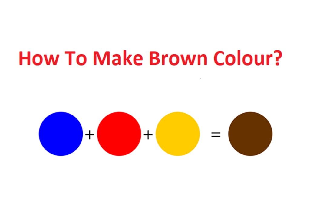
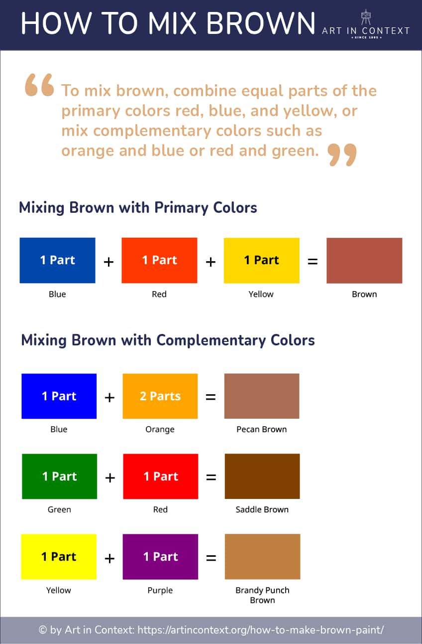
The Primary Mixture: Red, Yellow, and Blue
At its most basic level, brown is created by mixing the three primary colors of the subtractive color model (RYB). When red, yellow, and blue are combined in varying proportions, they neutralize one another, resulting in a dark, earthy tone. In branding, this “all-in” approach signifies a sense of wholeness and complexity. A brand that uses a brown derived from a balanced primary mix often feels “grounded,” suggesting that the company has a multifaceted foundation.
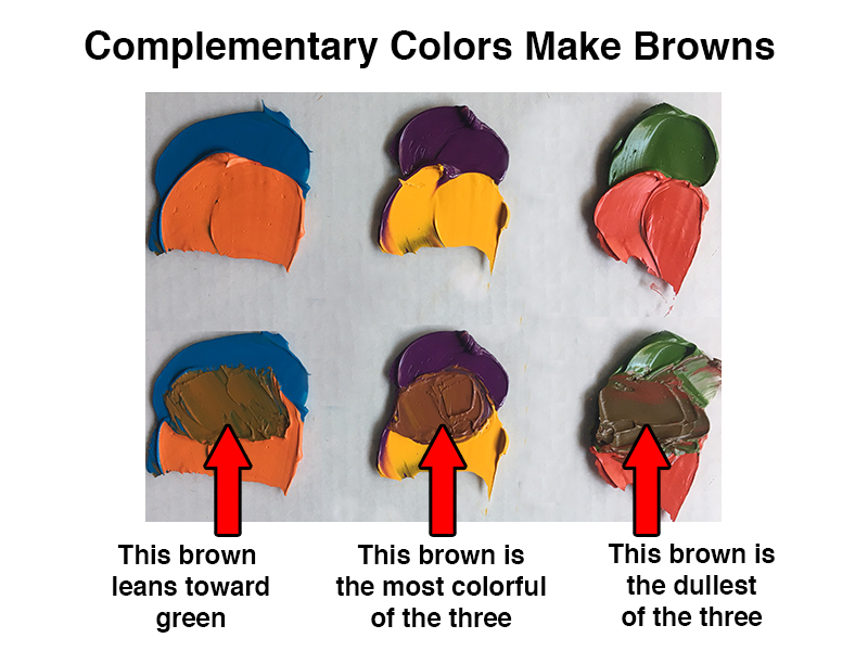
Complementary Colors: The Shortcut to Richer Browns
A more sophisticated way to create brown in professional design is by mixing complementary colors—pairs that sit opposite each other on the color wheel.
- Blue and Orange: This mixture creates a modern, sophisticated brown that is often used in tech-adjacent lifestyle brands.
- Red and Green: This results in a deep, forest-like brown, perfect for outdoor or heritage brands.
- Yellow and Purple: This combination yields a warm, golden brown that evokes luxury and tradition.
By manipulating these pairings, designers can create “undertones” that subtly influence how a customer perceives a brand’s personality without them even realizing it.
Digital vs. Print: RGB and CMYK Configurations
For a brand to remain consistent, the composition of its “brown” must be translated accurately between digital and physical spaces. In the RGB (Red, Green, Blue) model used for screens, brown is typically achieved by high levels of red, moderate green, and low blue. In the CMYK (Cyan, Magenta, Yellow, Black) model used for print, brown is a complex mix that requires careful calibration to avoid looking “muddy.” Brand guidelines must specify these exact percentages to ensure that a logo looks the same on an iPhone screen as it does on a recycled cardboard shipping box.
The Psychology of Brown: Why Brands Choose the Color of the Earth
Once a brand understands how to construct brown, the next question is why they should use it. In the context of brand strategy, brown communicates a specific set of values that flashier colors cannot replicate. It is the color of the earth, wood, and stone—elements that have existed for millennia.
Reliability and Stability
Brown is the ultimate “safety” color. It suggests a brand that is sturdy, dependable, and unshakeable. This is why it is a popular choice for logistics companies and long-standing financial institutions. When a consumer sees brown, they subconsciously associate it with the ground beneath their feet. In an era of volatile markets and fleeting digital trends, a brown-centric identity can provide a much-needed sense of permanence.
Ruggedness and Masculinity
For decades, brown has been the go-to hue for brands targeting rugged, outdoor, or traditionally masculine markets. It evokes leather, dirt, and timber. Think of brands in the construction, automotive, or outdoor apparel industries. The composition of brown in these sectors often leans toward “burnt sienna” or “umber,” utilizing higher red and yellow concentrations to create a feeling of warmth and physical strength.
Sustainable and Organic Visual Cues
In the modern marketplace, brown has become the universal shorthand for “organic” and “eco-friendly.” Because it is the color of natural, unbleached materials (like kraft paper), it signals to the consumer that a brand is environmentally conscious. Brands that prioritize sustainability often move away from bright, artificial dyes in favor of “raw” brown tones, suggesting that their products are closer to nature and free from harmful chemicals.
Case Studies in Excellence: Iconic Brown Brand Identities
To see the strategic application of brown in action, we need only look at some of the world’s most successful corporate identities. These brands have mastered the art of using specific “recipes” of brown to dominate their respective niches.
UPS: “What Can Brown Do For You?”
Perhaps no company owns a color as effectively as United Parcel Service (UPS). Their specific shade, known as “Pullman Brown,” was originally chosen because it hid dirt well on delivery vehicles. However, it evolved into a powerful brand asset. UPS trademarked the color, and their famous slogan, “What can Brown do for you?”, turned a functional choice into a global identity. In this context, brown represents punctuality, hard work, and the physical reality of global commerce.
Hershey’s: Indulgence and Tradition
For Hershey’s, brown is synonymous with the product itself: chocolate. The deep, rich brown of a Hershey’s bar wrapper is designed to trigger a sensory response. By using a warm, high-magenta brown, the brand evokes feelings of comfort, nostalgia, and indulgence. It is a prime example of using color composition to create an immediate “craveability” factor.
Louis Vuitton: Luxury through Muted Tones
In the luxury sector, brown is often used to denote heritage and “old money.” Louis Vuitton’s monogrammed brown canvas is one of the most recognized patterns in the world. Here, the brown is paired with gold-toned accents. This specific combination—a neutral, earthy base with a metallic highlight—is a classic branding move to signal that a product is both grounded in history and exceptionally valuable.
Implementing Brown into Your Personal or Corporate Brand
If you are considering integrating brown into your brand palette, it is not as simple as picking a random shade. The “mix” matters, as do the colors you choose to surround it with.
Choosing the Right Undertone
Because brown is made of multiple colors, it always has an undertone.
- Cool Browns: Contain more blue or green. These are excellent for modern, professional, or tech-leaning brands that want to feel “earthy” but still “sleek.”
- Warm Browns: Contain more red or orange. These are ideal for hospitality, food and beverage, or brands that want to feel “cozy” and “inviting.”
Selecting the wrong undertone can result in a brand looking dated rather than timeless.
Pairing Brown with Secondary Palettes
Brown is a “team player” in design. It rarely works well in total isolation.
- Brown and Turquoise: A classic “earth and sky” combination that feels vibrant and balanced.
- Brown and Cream: The height of sophistication and minimalism, often used in high-end interior design and skincare branding.
- Brown and Gold: Signals premium quality and “legacy” status.
When building a brand kit, use brown as the “anchor” color—the stable foundation upon which more expressive secondary colors can play.
Maintaining Color Consistency Across Media
As mentioned in the composition section, brown is notoriously difficult to replicate across different materials. A leather business card, a cotton tote bag, and a high-resolution website will all “take” the color differently. Professional brand managers must create a “Style Guide” that accounts for these variations, providing specific HEX codes for the web, Pantone (PMS) colors for offset printing, and thread colors for embroidery.
The Future of Earth Tones in a Digital-First World
As we move further into a digital-centric era, the use of brown is seeing a significant resurgence. This is largely a reaction to the “neon-and-glass” aesthetic that dominated the early 2010s.
Minimalism and the Return to Nature
The “Millennial Aesthetic” of bright whites and pinks is giving way to “Gen Z Beige” and deep, chocolatey browns. This shift reflects a broader societal desire for “quiet luxury” and a return to tactile, real-world experiences. In branding, this means more matte finishes, more textured paper stocks, and a palette that feels like it was pulled from a forest rather than a laboratory.
Accessibility and Readability in UX Design
From a technical “Tech” perspective that bleeds into Branding, brown is being utilized for better User Experience (UX). High-contrast black and white can be straining on the eyes during prolonged screen use. Deep browns provide a softer contrast for text and backgrounds, making digital interfaces feel more “analog” and less fatiguing. This “dark mode” evolution often utilizes “ebony” or “coffee” tones to provide depth without the harshness of true black.
In conclusion, knowing what colors make up brown is only the first step. For the brand strategist, the real work lies in understanding how those component colors—red, yellow, blue, or their complements—interact to create a psychological profile. Whether you are aiming for the rugged reliability of a shipping giant or the refined elegance of a luxury fashion house, the strategic application of brown offers a depth and stability that few other colors can match. It is the color of the foundation, and in branding, the foundation is everything.
aViewFromTheCave is a participant in the Amazon Services LLC Associates Program, an affiliate advertising program designed to provide a means for sites to earn advertising fees by advertising and linking to Amazon.com. Amazon, the Amazon logo, AmazonSupply, and the AmazonSupply logo are trademarks of Amazon.com, Inc. or its affiliates. As an Amazon Associate we earn affiliate commissions from qualifying purchases.