
The human experience of food extends far beyond taste and aroma; it is a multi-sensory engagement where visual cues play a profoundly influential role. Among these, color stands as a silent yet potent communicator, capable of stimulating appetite, influencing perceptions of freshness, and even dictating the speed at which we consume our meals. For brands in the food and beverage industry, understanding and strategically deploying color is not merely an aesthetic choice, but a fundamental pillar of marketing, product design, and corporate identity. The psychology of color is a critical discipline for any brand aiming to carve out a compelling presence in the consumer’s mind and stomach.
The Psychology of Color in Food Branding
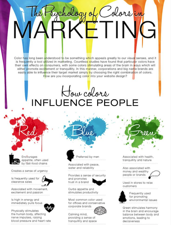
Color psychology is the study of hues as a determinant of human behavior. In the realm of food, certain colors have been scientifically shown to elicit specific physiological and psychological responses related to hunger, cravings, and perception of food quality. Brands leverage these intrinsic associations to craft logos, packaging, and restaurant environments that unconsciously steer consumer choices.
Red: The Powerhouse of Appetite Stimulation
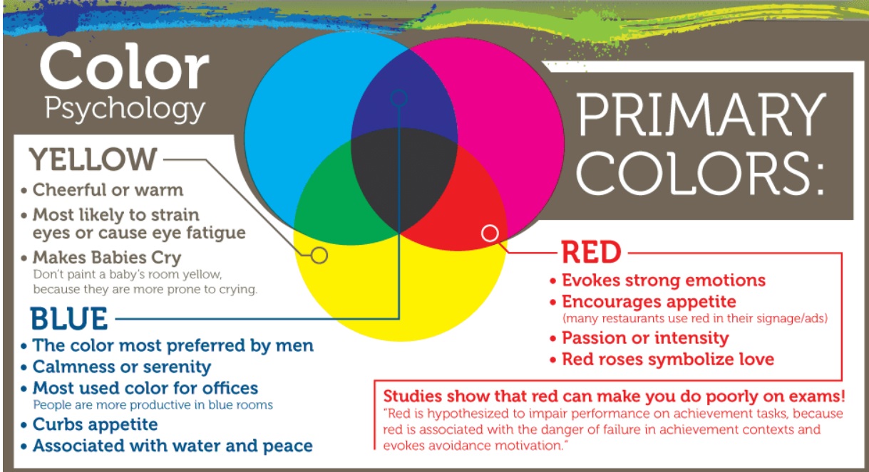
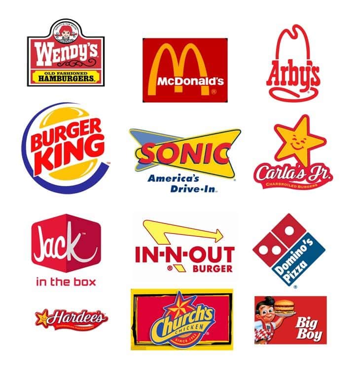
Red is arguably the most recognized color for stimulating appetite and commanding attention. Its physiological effects are well-documented: red can increase heart rate, raise blood pressure, and boost metabolism, all of which contribute to a heightened sense of urgency and hunger. Psychologically, red is associated with passion, energy, and excitement, making food appear more stimulating and appealing. This is why red is a staple in the branding of many fast-food chains and comfort food products, where the goal is often to encourage quick decisions and immediate gratification. Brands like Coca-Cola, McDonald’s, KFC, and Pizza Hut strategically employ red in their logos and advertising, not just for visibility, but to tap directly into the primal impulse of hunger. It signals vitality and the promise of a satisfying, often indulgent, experience.
Yellow: Evoking Happiness and Energy
Yellow, the color of sunshine and optimism, is another powerful player in the realm of food branding. It is associated with happiness, cheerfulness, and warmth, often making consumers feel joyful and uplifted. Yellow is highly visible and attention-grabbing, making it an excellent choice for logos and packaging designed to stand out on crowded shelves. When paired with red, yellow creates a dynamic duo that is virtually synonymous with the fast-food industry. The golden arches of McDonald’s, for instance, perfectly combine the appetite-stimulating power of red with the cheerful, inviting glow of yellow. Yellow also suggests energy and a light-hearted experience, subtly influencing consumers to perceive food items as enjoyable and approachable.
Orange: A Blend of Warmth and Accessibility
Orange, a vibrant blend of red’s energy and yellow’s cheerfulness, offers a unique appeal in food branding. It retains the warmth and stimulating qualities of red without its sometimes aggressive urgency, while adding the friendliness and enthusiasm of yellow. Orange is often associated with affordability, approachability, and good value. It’s also strongly linked to natural foods like citrus fruits, carrots, and pumpkins, conveying a sense of health and natural goodness, albeit with an energetic twist. Brands such as Fanta, Dunkin’, and various snack foods frequently utilize orange to signal vibrancy, approachability, and a sense of fun. It’s a versatile color that can be used to promote both indulgent treats and healthier, natural products, bridging the gap between excitement and wholesomeness.
Green: The Association with Freshness and Health
As humans, our deep-seated connection to nature makes green an obvious choice for brands wishing to emphasize freshness, health, and organic origins. Green evokes feelings of tranquility, growth, and environmental consciousness. For food brands, it immediately communicates natural ingredients, farm-to-table freshness, and a commitment to well-being. This color is omnipresent in the branding of organic produce, health food stores, vegetarian and vegan products, and even certain coffee chains that position themselves around natural ingredients or ethical sourcing. Whole Foods Market, Starbucks (which also uses green to imply naturalness and calm), and various salad bar chains are prime examples of brands that successfully leverage green to appeal to health-conscious consumers. It suggests a wholesome choice that is good for the body and, often, for the planet.
Beyond the Plate: Color in Restaurant Design and Packaging
The influence of color in food extends beyond just a brand’s logo. It permeates the entire consumer experience, from the moment they spot a product on a shelf to the ambiance of a dining establishment.
Creating an Inviting Ambiance
In restaurant design, color is a critical tool for setting the mood and influencing customer behavior. Warm colors like reds, oranges, and yellows tend to stimulate appetite and encourage faster dining, which is ideal for high-turnover establishments like fast-casual restaurants. These colors create an energetic atmosphere, making diners feel more active and less inclined to linger. Conversely, cool colors such as blues and purples, while generally less appetite-stimulating for food directly, can be used sparingly or in combination with warmer tones in fine dining establishments to create a sophisticated, calming, and luxurious ambiance. These colors encourage a more leisurely, reflective dining experience, suggesting elegance and exclusivity. Earthy tones like browns and deep greens can evoke a sense of authenticity and rustic charm, often used by farm-to-table restaurants to emphasize naturalness and wholesome ingredients.
Packaging That Pops and Persuades
Product packaging is the first point of physical contact a consumer has with a food brand. Here, color is paramount for attracting attention, conveying product attributes, and distinguishing a brand from competitors. A vibrant red bag of chips screams bold flavor and excitement, while a pastel blue box of cereal might imply a lighter, healthier option. Brands meticulously choose packaging colors to communicate specific messages: black and gold often signify premium or gourmet products, while bright, primary colors are commonly used for children’s snacks. The use of transparency in packaging, often complemented by specific color schemes, can also play a role, allowing the natural color of the food item itself to contribute to the overall visual appeal and perceived freshness. Effective packaging color ensures that a product not only catches the eye but also communicates its brand promise instantly.
Strategic Color Application: Case Studies and Best Practices
The strategic deployment of color is not accidental; it is the result of extensive market research and a deep understanding of consumer psychology. Examining successful brands provides invaluable insights.
Fast Food Giants: Mastering Red and Yellow
The ubiquity of red and yellow in the fast-food industry is no coincidence. McDonald’s, Burger King, KFC, and In-N-Out Burger all heavily feature these two colors. The combination creates a sense of urgency, excitement, and happiness—perfect for quick, satisfying meals. Red grabs attention and increases heart rate, while yellow evokes cheerfulness and signals accessibility. This color pairing effectively triggers appetite and encourages rapid decision-making, leading to higher turnover rates, which is crucial for the fast-food business model. Their consistency across global markets demonstrates the powerful, near-universal impact of these colors in stimulating hunger and sales.
Health-Oriented Brands: The Green Revolution
On the opposite end of the spectrum, brands focusing on health, wellness, and organic produce have embraced green. Whole Foods Market’s logo is a prime example, instantly conveying naturalness and health. Similarly, numerous vegan, vegetarian, and plant-based food products heavily rely on green packaging and branding. This strategy taps into the consumer’s desire for fresh, wholesome, and ethically produced food. Green aligns the brand with nature, sustainability, and a perception of purity, appealing to a growing segment of health-conscious consumers. Even brands not exclusively focused on health, like Starbucks, cleverly integrate green to suggest freshness and natural ingredients in their offerings, expanding their appeal beyond just coffee.
Fine Dining and Earthy Tones
Fine dining establishments often deviate from the vibrant reds and yellows, opting for more subdued, sophisticated palettes. Deep blues, rich purples, dark greens, and earthy browns are frequently used to create an atmosphere of luxury, intimacy, and tranquility. These colors are not designed to aggressively stimulate hunger but rather to foster a sense of refined indulgence and a leisurely dining experience. They suggest quality, exclusivity, and a focus on the culinary art rather than speed. This strategic choice influences patrons to appreciate the ambiance, linger longer, and perceive higher value in their dining experience, aligning perfectly with the premium price points and sophisticated offerings of such establishments.
Cultural Nuances and Target Audience Considerations
While some color associations for hunger are broadly universal, the specifics of color perception can be influenced by cultural background and demographic factors. Brands operating globally must navigate these nuances carefully.
Universal Principles vs. Local Interpretations
The basic principles of warm colors stimulating appetite and cool colors having a more calming effect tend to hold across most cultures. However, the emotional associations and symbolic meanings of specific colors can vary significantly. For example, while white signifies purity in many Western cultures, it can be associated with mourning in some Eastern cultures. While these differences might not directly impact hunger stimulation, they certainly influence overall brand perception and can be critical for localized marketing efforts. Savvy global brands often conduct local market research to fine-tune their color palettes, ensuring their messaging resonates authentically with target consumers in diverse regions.
Age, Demographics, and Psychological Resonance
Different age groups and demographics also respond to colors in varying ways. Children are often drawn to bright, primary colors, which is why many children’s food products and fast-food restaurant play areas are saturated with them. These vibrant hues capture their attention and convey fun and excitement. Adults, on the other hand, might respond more favorably to nuanced, sophisticated, or earthy tones, particularly in segments like gourmet foods or fine dining. Understanding the psychological resonance of colors within specific target demographics allows brands to craft highly effective and targeted visual strategies, optimizing their appeal and influence across diverse consumer segments.
The Future of Food Color Branding
As consumer preferences evolve and market competition intensifies, the role of color in food branding will only grow more sophisticated. The future promises a blend of data-driven insights, personalized branding, and dynamic visual strategies. Brands will increasingly leverage analytics to understand precise consumer responses to color, leading to hyper-targeted campaigns. The rise of digital platforms and augmented reality also opens avenues for dynamic color schemes that adapt to individual user preferences or contextual factors. Ultimately, a deep, evolving understanding of how colors influence our perception of food will remain a cornerstone for any brand aiming to truly connect with consumers and, quite literally, whet their appetite.
aViewFromTheCave is a participant in the Amazon Services LLC Associates Program, an affiliate advertising program designed to provide a means for sites to earn advertising fees by advertising and linking to Amazon.com. Amazon, the Amazon logo, AmazonSupply, and the AmazonSupply logo are trademarks of Amazon.com, Inc. or its affiliates. As an Amazon Associate we earn affiliate commissions from qualifying purchases.