Magenta is a vibrant and captivating color that evokes a sense of creativity, passion, and sophistication. Its unique position in the color spectrum, often perceived as a purplish-red or reddish-purple, makes it a fascinating subject for designers, artists, and anyone interested in the visual arts. Understanding how magenta is created, particularly in the context of digital design and print, is crucial for achieving desired aesthetic outcomes. This article delves into the technical underpinnings of magenta’s creation, exploring its representation in different color models and the interplay of light and pigment that defines its visual presence.
The Subtractive Color Model: CMYK and the Birth of Magenta
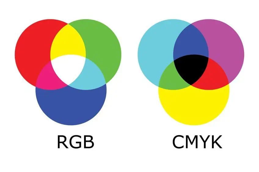
The most common context in which designers encounter the creation of magenta is within the subtractive color model, primarily used in printing. This model, known as CMYK, stands for Cyan, Magenta, Yellow, and Key (Black). Unlike additive color models that combine light, subtractive models work by absorbing certain wavelengths of light and reflecting others. When we perceive a color, we are seeing the light that the pigments don’t absorb.
Cyan: The Foundation of Magenta’s Hue
In the CMYK system, magenta is not a primary color in the same way that red, green, and blue are in the additive RGB model. Instead, it is a fundamental component that, when mixed with other primaries, produces a spectrum of colors. To understand how magenta is “made,” we first need to consider its closest counterpart in the subtractive primaries: cyan.
Cyan, often described as a greenish-blue, is one of the three subtractive primary colors. When a printer lays down ink, it’s essentially filtering out specific colors from white light. Cyan ink absorbs red light and reflects blue and green light. This is why when you look at pure cyan ink on a white surface, you see a blue-green hue. The density of the cyan ink determines how much red light is absorbed.
Magenta: A Primary Ink in its Own Right
The ink labeled “Magenta” in the CMYK system is itself a primary color, meaning it cannot be created by mixing other CMYK inks. This magenta ink absorbs green light and reflects red and blue light. The combination of reflected red and blue light is what we perceive as magenta. It’s a rich, vibrant hue that sits between red and violet on the color wheel.
The Role of Yellow: Completing the Spectrum
While cyan and magenta are crucial for creating a wide range of colors, yellow ink plays a vital role in refining and expanding the color palette. Yellow ink absorbs blue light and reflects red and green light. When combined with other inks, it contributes to the creation of secondary colors and nuances.
The Magic of Mixing: How CMYK Creates Magenta and Beyond
The “magic” of the CMYK model lies in the precise overlay of these inks. When you want to create a specific shade of magenta, you are not mixing red and blue pigments. Instead, you are using the magenta ink itself, possibly in combination with other CMYK inks to achieve variations. For instance, pure magenta is achieved by printing magenta ink at 100% density and no other inks. However, to create shades that lean more towards red or purple, you would adjust the proportions of magenta, cyan, and yellow.
- Pure Magenta: Achieved with 100% Magenta ink, 0% Cyan, 0% Yellow, and 0% Black.
- Reddish Tones: Increasing the proportion of yellow can subtly shift magenta towards red, creating shades like a deep coral or a warmer crimson.
- Purplish Tones: Adding a small amount of cyan to magenta will pull it towards violet, creating shades of fuchsia or a deep plum. The interplay between cyan and magenta is particularly important for achieving a broad spectrum of purples and blues.
The concept of “what colors make magenta” in the CMYK context is therefore slightly nuanced. Magenta ink itself is a primary ink. However, the perception of a pure magenta hue is achieved when other colors are absent or minimized. When we talk about “making” magenta in a broader sense, it’s about understanding how the combination of CMYK inks can create variations of this color, or how other colors can be achieved using magenta as a component.
The Additive Color Model: RGB and the Perception of Magenta
The way we perceive magenta on digital screens is governed by the additive color model, known as RGB. This model, comprising Red, Green, and Blue, is fundamental to how displays like monitors, smartphones, and projectors generate color. In RGB, colors are created by adding light. The absence of light results in black, and the combination of all three primary colors at their maximum intensity results in white.
Red and Blue Light: The Building Blocks of Digital Magenta
In the RGB model, magenta is not a primary color. Instead, it is a secondary color, created by the combination of two primary colors: red and blue light. When red light and blue light are mixed together in equal proportions, our eyes perceive this as magenta.

The Intensity Game: Varying Shades of Digital Magenta
The intensity of the red and blue light components directly influences the shade of magenta produced. This is represented by numerical values, typically ranging from 0 to 255 for each channel (Red, Green, Blue).
- Pure Magenta: In RGB, pure magenta is achieved by combining maximum red light (255) and maximum blue light (255), with no green light (0). This results in the RGB value (255, 0, 255). This is often referred to as “Fuchsia” or a very vibrant, pure magenta.
- Lighter Magentas (Pinks): To create lighter shades, like pinks, you reduce the intensity of both red and blue light equally, while still maintaining a balance between them. For example, (255, 150, 150) would result in a lighter pink. Alternatively, introducing a small amount of green light can also desaturate the magenta, making it appear lighter and more pastel-like.
- Deeper/Redder Magentas: To lean magenta towards red, you would increase the red component relative to the blue component. For instance, (200, 0, 100) would produce a deeper, more reddish magenta.
- Deeper/Bluer Magentas (Violets/Purples): Conversely, to move magenta towards blue, you would increase the blue component relative to the red. An example would be (100, 0, 200), which would yield a bluer shade, leaning towards violet or a deep purple.
The Absence of Green: A Defining Characteristic
A key takeaway from the RGB model is that the absence of green light is critical for the perception of magenta. When red and blue light combine, they stimulate the red and blue cones in our eyes. If green light were also present in equal measure, it would stimulate the green cones, and the brain would interpret this mixed signal as white or a desaturated color, not magenta.
Hexadecimal Representation: A Designer’s Tool
In digital design, RGB values are often expressed using hexadecimal codes. This system uses a base-16 numeral system and represents each color channel as a two-digit hexadecimal number ranging from 00 to FF (equivalent to 0 to 255 in decimal). Therefore, pure magenta in RGB (255, 0, 255) is represented by the hexadecimal code #FF00FF. This notation is widely used in web design, graphic design software, and other digital applications.
Beyond the Basics: Pigment Interactions and Perceptual Nuances
While the CMYK and RGB models provide a foundational understanding of how magenta is created, the actual perception and creation of magenta can involve more subtle interactions and subjective interpretations.
Pigment Purity and Interaction
In the physical world of art and design, the “colors that make magenta” can be more complex due to the properties of pigments. While artists might mix red and blue pigments to achieve a shade of magenta, the exact hue depends heavily on the specific red and blue pigments used. For instance, a cadmium red mixed with ultramarine blue will produce a different magenta than a crimson lake mixed with cobalt blue. The purity and transparency of the pigments play a significant role in the resulting color.
Furthermore, in traditional painting, magenta is often considered a primary color, or at least a color that is difficult to achieve accurately by mixing. Artists often use pre-mixed magenta pigments like Alizarin Crimson or Quinacridone Magenta to ensure the desired vibrancy and hue. This highlights a difference between theoretical color mixing and practical pigment application.
The Physics of Light and Perception
Our perception of color is a complex interplay between the physical properties of light and the biological and psychological processing of our brains. Magenta itself occupies a unique space in the visible spectrum. Unlike spectral colors (like red, green, blue) that correspond to specific wavelengths of light, magenta is an “extra-spectral” color. It’s a color that our brain constructs when it receives a combination of red and blue light, but no green light. This is why you won’t find a single wavelength on a prism that directly corresponds to pure magenta.
This perceptual uniqueness contributes to magenta’s striking and sometimes elusive quality. It’s a color that is both familiar and slightly unconventional, making it a powerful tool for designers seeking to create impactful and memorable visuals.
Practical Applications: Branding and Design Choices
Understanding the technical makeup of magenta is not just an academic exercise; it has profound implications for practical design. When a brand chooses magenta as its primary color, they are making a deliberate statement.
- Digital Consistency: Designers need to ensure that the magenta used in digital assets (websites, social media, app interfaces) translates consistently across different devices and screens, adhering to RGB specifications.
- Print Accuracy: For printed materials, designers must work with CMYK values to ensure the magenta ink appears as intended. Variations in ink formulation and printing processes can lead to deviations from the desired hue.
- Psychological Impact: Magenta is often associated with creativity, luxury, innovation, and playfulness. Brands like T-Mobile, Adobe, and sometimes luxury goods utilize magenta to convey these associations. The specific shade chosen can further refine these messages – a bright, electric magenta might suggest modernity and energy, while a deeper, richer magenta might evoke elegance and sophistication.
By grasping the fundamental principles of how magenta is created within both additive (RGB) and subtractive (CMYK) color models, professionals can confidently navigate the complexities of color reproduction, ensuring their designs are not only visually appealing but also technically sound and aligned with their intended message.
aViewFromTheCave is a participant in the Amazon Services LLC Associates Program, an affiliate advertising program designed to provide a means for sites to earn advertising fees by advertising and linking to Amazon.com. Amazon, the Amazon logo, AmazonSupply, and the AmazonSupply logo are trademarks of Amazon.com, Inc. or its affiliates. As an Amazon Associate we earn affiliate commissions from qualifying purchases.