
In the sophisticated world of brand identity, color is more than a visual preference; it is a psychological tool that communicates values, builds trust, and dictates consumer behavior. Among the most versatile and increasingly popular palettes in modern design is light brown. Often referred to in the industry as “almond,” “taupe,” “sand,” or “terracotta,” light brown has moved away from its historical reputation as a dull, utilitarian shade to become a cornerstone of high-end, organic, and minimalist branding. Understanding how to create this color—and how to deploy it effectively—is essential for any brand strategist or designer looking to evoke a sense of stability, warmth, and timelessness.
The Psychology of Light Brown in Brand Identity
Before diving into the technicalities of color mixing, it is vital to understand why a brand would choose light brown as a primary or secondary anchor. Color psychology suggests that brown is deeply rooted in the earth, providing a sense of grounding and reliability. Unlike bold primary colors that demand immediate attention, light brown offers a subtle invitation.
Stability, Warmth, and Approachability
Light brown conveys a sense of “approachable luxury.” While dark browns can sometimes feel heavy or dated, lightening the tone introduces an element of airiness and modernity. It suggests a brand that is dependable but not rigid, sophisticated but not exclusionary. For professional services—such as boutique law firms, architectural agencies, or financial consultants—light brown communicates a grounded expertise that puts clients at ease.
The “Organic” Appeal: Why Light Brown is Trending
The global shift toward sustainability and wellness has propelled light brown to the forefront of brand design. It mirrors the colors of natural materials: unbleached paper, raw linen, dried clay, and oak. When consumers see these tones, they subconsciously associate the brand with transparency, health, and eco-consciousness. This makes it the go-to choice for skincare lines, ethical fashion brands, and organic food technology companies that want to distance themselves from the “artificial” feel of neon or high-contrast corporate palettes.
The Color Science: Mixing Light Brown for Visual Assets
In a branding context, creating “light brown” is an exercise in balancing temperature and value. Whether working with physical pigments for retail interiors or digital hex codes for a mobile app, the foundation remains the same. To create a light brown, one must first understand the construction of a neutral base and then apply the correct “tint” to reach the desired lightness.
The Primary Mix: Red, Yellow, and Blue
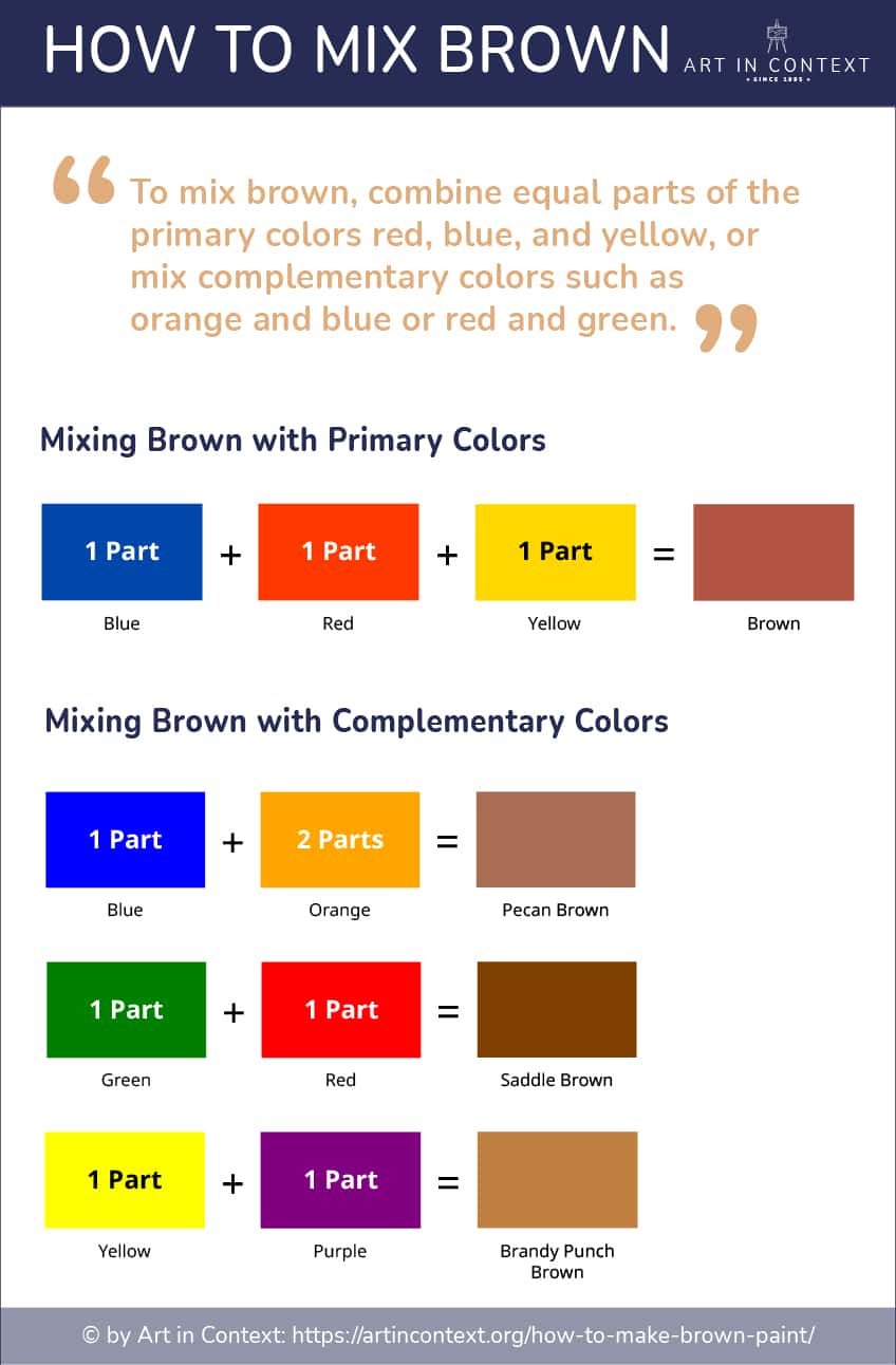
At its most fundamental level, brown is a secondary or tertiary color created by mixing the three primary colors: red, yellow, and blue. Equal parts of these three will result in a dark, muddy neutral. To push this toward a light brown, the ratio must be adjusted toward the warmer end of the spectrum (more yellow and red) before being diluted. In brand design, we often start with an orange base (red + yellow) and then add a very small amount of its complement, blue, to “kill” the vibrancy and turn it into a sophisticated brown.
Using Complementary Colors: Blue and Orange
One of the most effective ways to achieve a professional light brown is by mixing complementary colors. Orange and blue are the standard pair for this. By starting with a muted orange and adding a touch of blue, you create a brown that feels “alive” rather than flat. If the brown feels too green, you add a hint of red; if it feels too purple, you add a hint of yellow. This balancing act is what gives a brand’s color palette its unique character.
Achieving the “Light” Aspect: The Role of White and Tinting
The “light” in light brown comes from the addition of white, a process known in design as “tinting.” In digital design, this is managed by increasing the “value” or “brightness” in the HSB (Hue, Saturation, Brightness) color model. A light brown is essentially a low-saturation orange or red with a high brightness value. However, a common mistake in branding is adding too much white, which can result in a “flesh tone” or a washed-out beige that lacks the authority needed for a corporate identity. The key is to maintain enough saturation to ensure the color retains its earthy “weight.”
Digital vs. Print: Color Profiles for Brand Consistency

A brand’s visual identity must remain consistent across all touchpoints, from a high-resolution website to a recycled cardboard shipping box. Light brown is notoriously difficult to maintain across different mediums because it is a “neutral” color, meaning it is highly sensitive to the lighting conditions and the material it is printed on.
RGB Values for Web Design
In the digital space, light brown is defined by RGB (Red, Green, Blue) values. Because screens emit light, light browns can often appear more “golden” or “yellow” than intended. A classic light brown for a modern website might sit around a Hex code like #C2B280 (Eco-Sand) or #D2B48C (Tan). Designers must ensure that these shades pass accessibility standards; light brown text on a white background often fails contrast tests, potentially alienating users with visual impairments.
CMYK and Pantone for Packaging and Print
When moving to physical branding, such as business cards or product packaging, the CMYK (Cyan, Magenta, Yellow, Key/Black) process is used. Light brown in print can easily “shift” toward green if the Cyan levels are too high or toward pink if the Magenta dominates. To avoid this, many high-end brands utilize the Pantone Matching System (PMS). Using a specific Pantone spot color, such as PMS 465 or 7528, ensures that the light brown on a retail shopping bag perfectly matches the light brown on a luxury watch box, regardless of the printing facility’s location.
Integrating Light Brown into Your Brand Palette
Rarely does a brand stand on a single color. The mastery of light brown lies in how it is paired with other hues to create a cohesive brand language. It acts as a “new neutral,” often replacing the starkness of white or the coldness of gray.
Complementary Color Schemes
Light brown pairs exceptionally well with deep “forest” greens or “navy” blues. This combination is a staple in the “Modern Heritage” aesthetic—think of brands that want to feel established and traditional but with a contemporary edge. The light brown provides warmth, while the darker cool tone provides the necessary contrast for readability and professional authority.
Minimalist and High-End Aesthetics
In the beauty and fashion industries, “monochromatic layering” is a dominant trend. This involves using three or four different shades of light brown and beige together. This strategy creates a brand identity that feels soft, expensive, and cohesive. By removing the distraction of high-contrast colors, the brand forces the consumer to focus on the texture of the product and the quality of the craftsmanship. This is a common tactic used by “quiet luxury” brands to signal status without shouting.
Case Studies: Successful Brands Using Light Brown Tones
To understand the power of light brown, we can look at industry leaders who have successfully claimed these shades as part of their brand equity.
Beauty and Wellness Sectors
Brands like Glossier and Skims have revolutionized the use of light browns and nudes. By utilizing a spectrum of light browns that mimic skin tones, these brands communicate inclusivity and “realness.” Their branding doesn’t feel like a mask; it feels like an extension of the body. This strategic use of light brown has allowed them to disrupt a market previously dominated by clinical whites and artificial pinks.

Sustainable and Eco-Conscious Labels
Consider the branding of Allbirds or Patagonia’s specific product lines. They frequently utilize light, sandy browns in their digital marketing and physical packaging. This choice reinforces their commitment to natural materials. For these companies, light brown is not just a color—it is a shorthand for “this product came from the earth and can return to it.” It builds a bridge of trust between the consumer’s environmental values and the company’s manufacturing processes.
In conclusion, mastering the creation and application of light brown is a sophisticated skill in the modern branding toolkit. It requires a balance of artistic intuition and technical precision. By understanding how to mix primary and complementary colors to achieve the perfect tint, and by recognizing the psychological impact of these earthy tones, brand strategists can create visual identities that are not only beautiful but also deeply resonant and enduring. Light brown is no longer just a background color; it is a powerful statement of stability, sustainability, and refined taste.
aViewFromTheCave is a participant in the Amazon Services LLC Associates Program, an affiliate advertising program designed to provide a means for sites to earn advertising fees by advertising and linking to Amazon.com. Amazon, the Amazon logo, AmazonSupply, and the AmazonSupply logo are trademarks of Amazon.com, Inc. or its affiliates. As an Amazon Associate we earn affiliate commissions from qualifying purchases.