Brown is a foundational color in design, embodying warmth, stability, and approachability. Yet, its versatility often leaves designers and consumers pondering: what colors truly complement this earthy hue? Understanding color theory and the psychological impact of color combinations is crucial for creating impactful and aesthetically pleasing designs, whether you’re developing a brand identity, crafting marketing materials, or designing user interfaces. This exploration delves into the most effective color palettes that harmonize with brown, offering insights for strategic application across various visual mediums.
The Psychology and Versatility of Brown
Brown, in its myriad shades, evokes a range of emotions and associations. From the rich depth of dark chocolate to the light, airy feel of sand, brown can communicate grounding, reliability, organic qualities, and a sense of comfort. Its inherent connection to nature—wood, soil, stone—makes it a consistently appealing choice for brands seeking to convey authenticity and trustworthiness.

The effectiveness of brown in branding is undeniable. Think of iconic brands that leverage its power: UPS with its signature brown, conveying a sense of dependable delivery; or the natural, artisanal feel of many coffee brands. Brown’s ability to act as a neutral base, similar to grey or beige, allows it to be paired with a wide spectrum of other colors, elevating them or allowing them to shine. However, the success of these pairings hinges on a nuanced understanding of color theory and the specific impression one aims to create.
Harmonizing Brown with Nature’s Palette
The most intuitive and often successful color pairings with brown draw inspiration directly from the natural world. These combinations inherently feel balanced and pleasing because they mimic established visual harmonies we encounter daily.
Earth Tones: A Foundation of Natural Synergy
When considering colors that naturally complement brown, other earth tones are the most obvious and effective starting point. These hues share a similar grounding quality, creating a sense of organic unity.
Greens: The Breath of Life
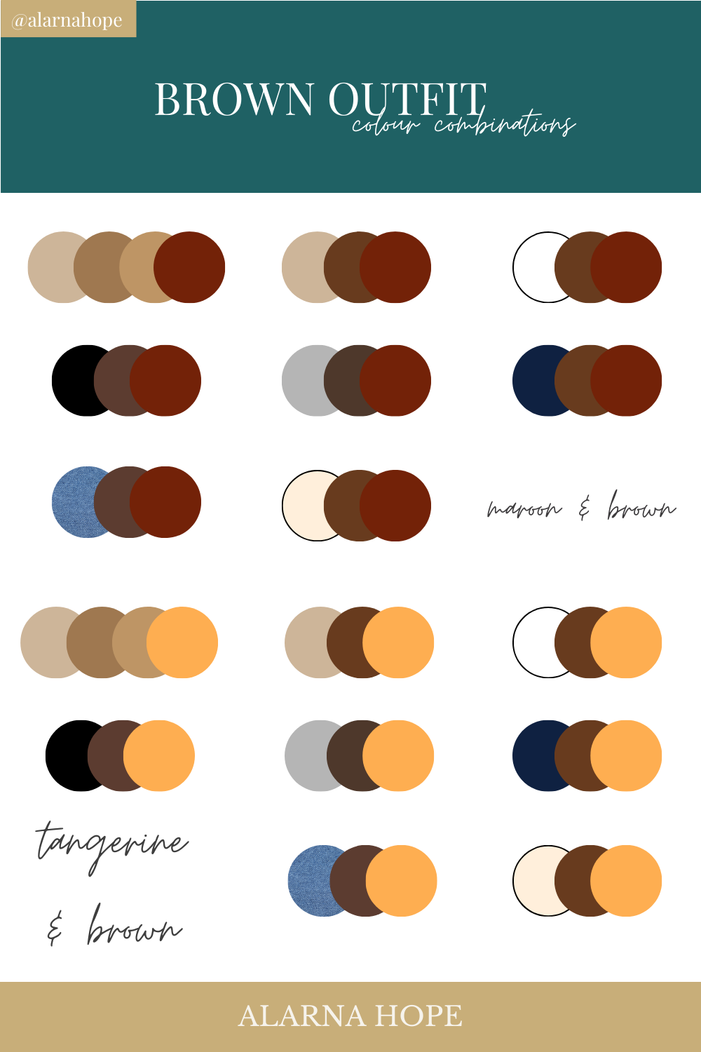
The quintessential pairing for brown is green. This combination immediately brings to mind forests, landscapes, and the fundamental connection between trees and the earth. The specific shade of green can dramatically alter the mood.
- Forest Green and Deep Greens: Paired with darker, richer browns like mahogany or walnut, deep greens evoke a sense of established nature, sophistication, and endurance. This is ideal for brands wanting to project heritage, reliability, and a connection to sustainable practices. Think of high-end outdoor gear brands or premium organic food products.
- Olive Green and Muted Greens: Lighter, more muted browns, such as tan or beige, find a sophisticated partner in olive or sage greens. This combination feels calm, organic, and approachable. It’s excellent for lifestyle brands, wellness products, or anything aiming for a relaxed, natural aesthetic.
- Emerald Green and Brighter Greens: For a more vibrant and energetic feel, consider pairing richer browns with brighter, more saturated greens. This combination can feel lush and invigorating, suggesting growth and vitality. It can work for brands wanting to communicate innovation within a natural context, like sustainable tech or eco-friendly agriculture.
Blues: The Sky and Water Complement
The juxtaposition of brown with blues creates a refreshing contrast, drawing from the sky and water elements of nature. This pairing can be incredibly calming and trustworthy.
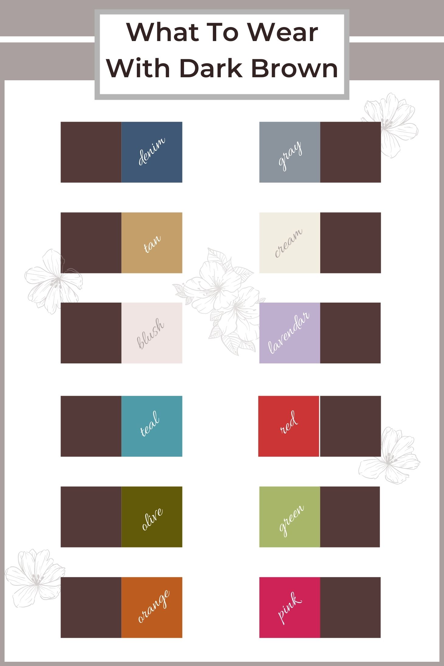
- Navy Blue and Deep Browns: A classic combination, navy blue with dark chocolate or espresso brown conveys professionalism, stability, and a touch of gravitas. This is a go-to for corporate branding, financial institutions, or anything requiring a strong sense of authority and trustworthiness. The depth of both colors prevents the palette from feeling somber, instead lending it a sophisticated elegance.
- Sky Blue and Lighter Browns: Lighter browns, such as sand or light oak, paired with soft sky blues or dusty blues create a serene and airy atmosphere. This evokes feelings of open spaces, clarity, and calm. It’s a beautiful choice for travel brands, coastal-themed businesses, or any brand aiming for a peaceful and inviting presence.
- Teal and Muted Browns: The blend of blue and green in teal can offer a modern and intriguing contrast with brown. Teal, when paired with mid-tone or slightly desaturated browns, can feel sophisticated, creative, and slightly enigmatic. This works well for brands in the arts, design, or those seeking a unique and contemporary edge.
Reds and Oranges: The Warmth of Earth and Fire
Reds and oranges, when used thoughtfully with brown, can inject warmth, energy, and a sense of richness. These colors often bring to mind autumnal landscapes or the warm glow of a hearth.
- Terracotta and Rust with Browns: This is perhaps one of the most natural and harmonious pairings. Terracotta and rust tones, when combined with various shades of brown, create a palette that is deeply earthy, warm, and artisanal. It speaks to tradition, craftsmanship, and a connection to the soil. Ideal for pottery, handcrafted goods, or brands emphasizing heritage and authenticity.
- Burgundy and Deep Reds with Dark Browns: A deep, rich burgundy or a muted, earthy red can add a touch of luxury and passion to dark browns. This combination feels opulent, confident, and inviting, often seen in premium leather goods, fine dining establishments, or brands aiming for a sophisticated and passionate appeal.
- Burnt Orange and Mid-tone Browns: Burnt orange offers a vibrant yet grounded energy when paired with medium-toned browns. This combination is warm, energetic, and inviting. It can be used to create a sense of excitement and creativity, making it suitable for lifestyle brands, content creation platforms, or businesses that want to convey enthusiasm.
Strategic Color Pairings Beyond Nature
While nature provides a robust foundation, brown can also be strategically paired with colors that create more unexpected, yet highly effective, design outcomes. These pairings often rely on contrasts in saturation, lightness, or hue to create visual interest and convey specific brand messages.
Metallics: Adding a Touch of Sophistication and Modernity
The inclusion of metallic accents can elevate brown from its earthy origins to a more refined and luxurious status. Metallics add a touch of shimmer and perceived value, making them excellent for premium branding.
Gold and Brass with Rich Browns
Gold and brass tones, with their inherent warmth, pair exceptionally well with deep, rich browns like espresso or dark chocolate. This combination screams luxury, opulence, and timeless elegance. It’s a powerful choice for high-end jewelry brands, premium spirits, or any brand aiming to convey an air of exclusivity and established wealth. The interplay of light on the metallic surface can highlight the depth and texture of the brown.
Silver and Platinum with Lighter or Neutral Browns
Silver and platinum offer a cooler, more contemporary metallic accent. When paired with lighter browns, taupes, or even greige, they create a sophisticated and modern aesthetic. This combination can feel sleek, professional, and understatedly luxurious. It’s a great fit for minimalist luxury brands, tech companies aiming for a refined look, or brands that want to project innovation with a touch of elegance.
Copper and Rose Gold with Warmer Browns
Copper and rose gold bring a contemporary warmth and a touch of trendy sophistication. They complement warmer, medium-toned browns beautifully, creating a palette that feels inviting, stylish, and approachable. This pairing is excellent for lifestyle brands, artisanal food producers, or businesses that want to convey a sense of modern craft and personal warmth.
Neutrals: Creating Subtle Sophistication and Versatility
While brown itself is a neutral, pairing it with other neutrals can create incredibly sophisticated and versatile color schemes. These combinations are often about subtle nuances in tone and texture.
Cream and Beige with All Shades of Brown
Cream and beige act as excellent “lighter” neutrals that allow brown to remain the star of the show while softening the overall impression. With dark browns, cream offers a high-contrast, elegant pairing, while beige provides a more seamless, tonal harmony. This is a highly versatile combination, suitable for a vast range of applications from interior design to fashion branding, conveying comfort, warmth, and understated elegance.
Grey and Charcoal with Browns
The interplay between brown and grey is nuanced and can produce strikingly modern and sophisticated results.
- Cool Greys with Warmer Browns: Pairing cooler, blue-toned greys with warmer, reddish-browns creates an interesting chromatic tension that feels contemporary and grounded. This combination can be very effective for brands seeking to balance tradition with innovation.
- Charcoal and Dark Browns: A deep charcoal grey paired with a dark brown can create a powerful, masculine, and sophisticated palette. It conveys strength, reliability, and a sense of timeless appeal. This is often seen in menswear brands, automotive design, or brands emphasizing durability and performance.
- Light Greys and Taupes with Lighter Browns: Lighter greys and taupes with lighter browns create a very subtle, harmonious, and airy feel. This palette is serene, minimalist, and sophisticated, perfect for brands that value quiet elegance and subtle impact.
Leveraging Brown in Digital Branding and Marketing
The strategic application of color is paramount in digital marketing and branding. The right color combinations can significantly influence user engagement, brand perception, and conversion rates. Brown, with its versatile nature, offers unique opportunities in this domain.
Enhancing User Experience with Brown Palettes
When designing websites, apps, or digital marketing materials, the choice of color directly impacts how users feel and interact with the interface. Brown, when paired correctly, can foster a sense of trust, warmth, and approachability, crucial for building user loyalty.
- Call-to-Action Buttons: While not typically the primary color for CTAs, a well-placed accent of a contrasting yet complementary color against a brown background can draw attention effectively. For instance, a vibrant green or a rich orange CTA on a brown interface can stand out.
- Backgrounds and Textures: Using brown as a background color, especially lighter shades, can create a calming and stable environment for content. Pairing it with darker text in black, deep grey, or even a dark navy enhances readability.
- Illustrations and Imagery: In digital illustrations or image selection, incorporating brown alongside greens, blues, or even muted reds can create visually appealing and on-brand narratives. This is particularly effective for brands focused on nature, sustainability, or artisanal products.
Crafting Brand Identity with Brown
The choice of color is a cornerstone of brand identity. Brown, in its various forms, can communicate specific attributes and values that resonate with a target audience.
- Conveying Trust and Reliability: Brands that use brown, especially in conjunction with stable blues or deep greens, often aim to project an image of trustworthiness, dependability, and longevity. This is why it’s prevalent in industries like logistics, finance, and organic goods.
- Evoking Natural and Organic Qualities: For businesses focused on natural products, sustainability, or an artisanal approach, brown is an indispensable tool. It immediately signals a connection to the earth and a commitment to wholesome, authentic offerings.
- Creating a Sense of Warmth and Comfort: In hospitality, food, or lifestyle brands, brown can be used to create an inviting and comfortable atmosphere, making consumers feel at ease and welcome.
The Power of Contrast and Accent Colors
The effectiveness of brown in digital design often lies in the thoughtful use of accent colors. These are colors used sparingly to draw attention to key elements or to add visual pop.
- High-Contrast Accents: Bright, saturated colors like teal, coral, or even a bold yellow can provide a striking contrast against brown, creating a dynamic and energetic feel. This is useful for brands wanting to stand out and convey innovation or excitement.
- Analogous Accents: Using colors that are close to brown on the color wheel, such as muted oranges or deep reds, can create a harmonious and sophisticated look, reinforcing the natural or warm aspects of the brand.
- Monochromatic Variations: Within the brown family itself, using different shades and tints can create depth and visual interest without relying on strong contrasting hues. This approach is inherently subtle, elegant, and builds a strong sense of brand cohesion.
In conclusion, brown is a remarkably adaptable color that, when paired with intentionality, can form the basis of powerful and effective visual strategies. By understanding the psychological impact of various color combinations and drawing inspiration from both nature and strategic design principles, brands can harness the full potential of brown to communicate their message, connect with their audience, and create lasting impressions.
aViewFromTheCave is a participant in the Amazon Services LLC Associates Program, an affiliate advertising program designed to provide a means for sites to earn advertising fees by advertising and linking to Amazon.com. Amazon, the Amazon logo, AmazonSupply, and the AmazonSupply logo are trademarks of Amazon.com, Inc. or its affiliates. As an Amazon Associate we earn affiliate commissions from qualifying purchases.