
In the realm of personal branding, every visual element contributes to the narrative you project. Far from being a mere aesthetic preference, the colors you choose to wear, particularly if you have a pale complexion, play a pivotal role in shaping perceptions, conveying authority, approachability, creativity, or professionalism. Understanding which colors strategically enhance your natural features is not just about looking “good”; it’s about optimizing your visual identity to align seamlessly with your personal brand message. This strategic approach to color selection transforms appearance into a powerful non-verbal communication tool, reinforcing your brand’s core values and positioning you effectively in your desired professional or social spheres.
The Strategic Foundation: Understanding Your Personal Color Palette
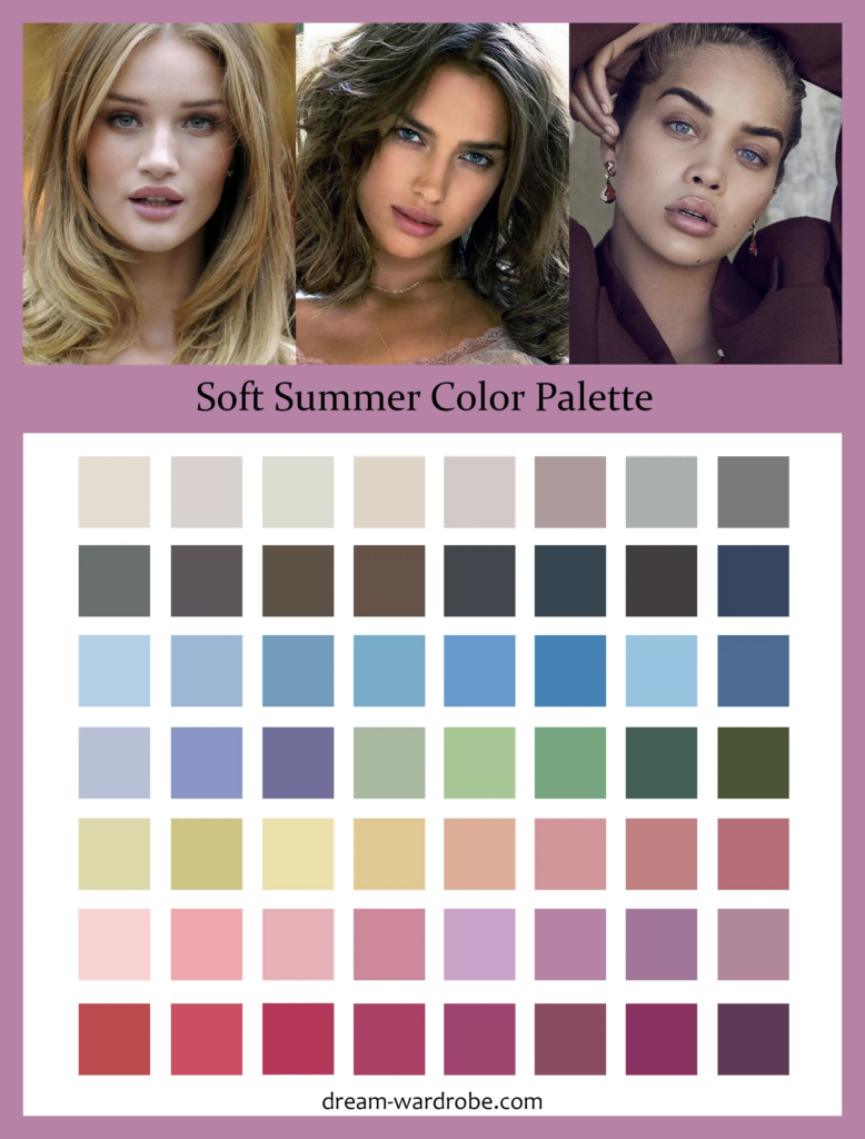
The cornerstone of an impactful personal brand’s visual identity lies in understanding your inherent personal coloring. For those with pale skin, this goes beyond simple complexion tone; it delves into the nuances of your undertone, which acts as the ultimate guide to selecting colors that resonate, rather than clash, with your natural radiance. Aligning your personal brand’s visual elements with your unique undertone ensures a cohesive, authentic, and memorable presentation.
Identifying Your Undertone for Brand Alignment
Your skin’s undertone is the subtle hue beneath the surface, distinct from its surface color, which can change with sun exposure. For pale individuals, correctly identifying your undertone—whether cool, warm, or neutral—is critical.
- Cool Undertones: Often characterized by pink, red, or blueish hues. Veins on your wrist might appear blue or purple. Silver jewelry tends to be more flattering. Individuals with cool undertones might burn easily in the sun.
- Warm Undertones: Typically feature golden, peachy, or yellow hues. Veins might appear green. Gold jewelry often complements warm undertones best. Skin might tan more easily.
- Neutral Undertones: A balanced mix of both warm and cool, with veins appearing a mix of blue and green. Both silver and gold jewelry can look equally good.
For a personal brand, this identification is not vanity; it’s a foundational design principle. Imagine a professional headshot where the subject’s clothing color clashes with their undertone, making them appear washed out or overly harsh. This subtle visual disharmony can unconsciously undermine credibility or approachability. Conversely, a perfectly aligned color choice enhances natural vitality, making the individual appear more vibrant, confident, and, crucially, more aligned with their authentic brand persona. This alignment signals attention to detail and self-awareness, valuable attributes for any personal brand.
The Psychology of Color for Pale Complexions
Color psychology is a potent, often subconscious, force in branding. For pale complexions, specific color families can leverage this psychology to amplify desired brand messages.
- Cool-Toned Colors (e.g., true blues, emerald greens, deep purples, fuchsia): When chosen to complement a cool undertone, these colors project professionalism, trustworthiness, authority, and sophistication. They can evoke a sense of calm and stability. For a consultant, legal professional, or executive, leveraging these hues in their attire and personal branding collateral can reinforce their expertise and reliability.
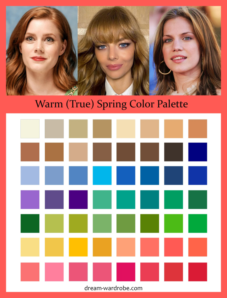
- Warm-Toned Colors (e.g., coral, peach, terracotta, olive green, golden yellow): For those with warm undertones, these colors exude warmth, creativity, approachability, and energy. They can be excellent for personal brands in creative fields, coaching, or roles requiring a friendly, engaging demeanor. They evoke enthusiasm and innovation.
- Neutral Colors (e.g., charcoal gray, taupe, off-white, soft beige): These versatile colors are fundamental to any personal brand palette, especially for pale individuals. When selected in the correct temperature (cool grays for cool undertones, warm beiges for warm undertones), they provide a sophisticated backdrop that allows your personality and expertise to take center stage. They convey elegance, stability, and understated confidence, offering flexibility to accessorize with accent colors that inject personality or a specific brand message.
The strategic application of these psychological principles, informed by your undertone, ensures that your visual presence consistently communicates the intended brand message, avoiding unintentional misinterpretations.
Building a Cohesive Personal Brand Color Scheme
Moving beyond individual color choices, a robust personal brand requires a cohesive color scheme. For pale complexions, this means curating a palette that consistently enhances your natural features while reinforcing your brand’s core attributes across all touchpoints.
Cool-Toned Palettes for Professional Presence
For pale individuals with cool undertones, a palette rooted in cool colors can powerfully convey professionalism, authority, and meticulousness. Think of the timeless elegance of a deep navy suit, a crisp white shirt, or the intellectual appeal of a charcoal gray.
- Core Colors: True navy, royal blue, charcoal gray, pure white, cool black.
- Accent Colors: Emerald green, ruby red, fuchsia, lavender. These can be used for ties, scarves, jewelry, or subtle branding elements to add personality without diluting professionalism.
- Brand Impact: This palette is ideal for leaders, finance professionals, legal experts, or anyone whose personal brand emphasizes trust, stability, and serious expertise. The cool undertones of these colors prevent them from overpowering a pale complexion, instead providing a sophisticated frame that enhances perceived competence.
Warm-Toned Palettes for Approachable Authenticity
Pale individuals with warm undertones can build a vibrant, inviting palette using warm and earthy tones that project approachability, creativity, and genuine warmth.
- Core Colors: Cream, camel, olive green, warm brown, terracotta.
- Accent Colors: Coral, peach, golden yellow, rust, burnt orange. These can inject energy and individuality into your brand’s visual story.
- Brand Impact: This scheme is highly effective for coaches, creatives, educators, or entrepreneurs who want to foster connection, inspire creativity, and appear highly personable. These colors prevent a pale complexion from looking stark, instead imparting a healthy glow that underscores authenticity and enthusiasm.
Neutral Palettes for Versatility and Sophistication
Neutral undertones offer incredible flexibility, allowing for the strategic incorporation of both warm and cool elements. For pale individuals with neutral undertones, a sophisticated neutral palette, paired with carefully chosen accent colors, delivers versatility and refined elegance.
- Core Neutrals: Taupe, soft gray, mushroom, off-white, slate.
- Versatile Accents: Jewel tones (sapphire, amethyst), muted pastels (mint, dusty rose), or even deep, rich browns. The key is to select accents that lean slightly warm or cool, depending on the specific message you want to emphasize.
- Brand Impact: A neutral palette speaks to adaptability, sophisticated simplicity, and understated confidence. It’s excellent for personal brands that need to pivot across various contexts or cater to a broad audience, allowing the individual’s expertise and personality to shine through without a dominant color message. This approach allows for subtle shifts in messaging through the choice of accessories or secondary brand elements.

Beyond Clothing: Integrating Color into Your Digital Personal Brand
The principles of strategic color selection for pale complexions extend far beyond your wardrobe. In today’s digital-first world, your personal brand’s visual identity encompasses every online touchpoint, from your professional headshot to your social media presence and any branded collateral you may employ as a solopreneur. Consistency in color application across these platforms reinforces your brand message and enhances recognition.
Headshots and Professional Photography
A professional headshot is often the first visual impression you make in an online context. For pale individuals, careful color selection in attire and background can significantly impact this impression.
- Attire Color: Choose clothing colors that align with your identified personal brand palette and undertone. A cool-toned individual should opt for blues, grays, or jewel tones to appear vibrant and authoritative, while a warm-toned individual might select earthy greens, creams, or corals to project warmth and approachability. Avoid colors that wash you out or create an unflattering contrast, as this can detract from perceived competence.
- Background Selection: The background color should complement, not compete with, your skin tone and clothing. A soft, neutral background (a muted gray or a warm off-white, depending on your palette) ensures that you remain the focal point, reinforcing a clean, professional brand image. Strategic use of a brand-aligned accent color in the background can subtly reinforce your personal brand’s visual identity.
Social Media and Online Presence
Your social media profiles and professional networking sites are extensions of your personal brand. Visual consistency through color is paramount.
- Profile Pictures & Banners: Ensure your profile picture adheres to your chosen color palette. This includes not just your clothing, but also considering the overall color balance. For banners or cover photos, incorporate your brand’s accent colors or a complementary neutral scheme to maintain a cohesive visual identity across platforms.
- Content Aesthetics: If you create content, even simple text posts can be enhanced by using your brand’s designated font colors or graphic elements that echo your personal palette. This subconscious visual thread ties all your online interactions back to a singular, recognizable brand.
- Platform Alignment: While some platforms have their own dominant colors, strive to integrate your personal brand colors through custom images, filters, or specific post templates. For example, a coach with a warm-toned brand might use inviting, warm-filtered images on Instagram, while a tech professional with a cool-toned brand might favor sleek, blue-tinged graphics on LinkedIn.
Branded Collateral for Solopreneurs
For solopreneurs, consultants, or freelancers, your personal appearance is intrinsically linked to your business brand. Extending your personal color palette to your business collateral creates a powerful, unified brand experience.
- Business Cards: Design your business cards using your core personal brand colors. This ensures that the physical representation of your brand is an extension of your visual identity, creating instant recognition and recall.
- Website Design Elements: If your personal brand extends to a website or portfolio, integrate your chosen colors into the site’s layout, buttons, headers, and even image overlays. This creates a harmonious user experience that reinforces your professional persona.
- Presentations and Proposals: When delivering presentations or submitting proposals, ensure that the slide templates, font colors, and graphic accents align with your personal brand palette. This level of consistency speaks volumes about your professionalism and attention to detail, bolstering confidence in your services or ideas.
By consciously applying color principles across these digital touchpoints, pale individuals can build a robust, recognizable, and consistently branded online presence that powerfully communicates their professional identity.
Common Missteps and Strategic Refinements
Even with a strong understanding of color theory and personal branding, certain pitfalls can dilute the impact of your visual identity. Recognizing and proactively addressing these can significantly refine your personal brand’s presentation.
Avoiding Washed-Out or Overpowered Looks
One of the most common challenges for pale complexions is selecting colors that either make them appear “washed out” or, conversely, overpower their delicate features, making the individual seem secondary to their attire.
- Washed Out: This often occurs when pale individuals wear colors that are too close to their skin tone or lack sufficient saturation. For example, a very light pastel yellow on a warm-toned pale person might blend in rather than enhance. Similarly, an overly muted, dull gray on a cool-toned pale person can strip away vitality.
- Refinement: The solution lies in choosing colors within your palette that offer a subtle, healthy contrast. For warm undertones, opt for richer earth tones or vibrant corals. For cool undertones, select jewel tones or crisp blues that provide a clear distinction from the skin without being jarring.
- Overpowered: Bright, highly saturated, or very dark colors can sometimes overwhelm a pale complexion, making the face recede. A stark, pure black can be particularly challenging for some pale individuals, especially those with cool undertones, if not balanced with an appropriate neckline or accent color.
- Refinement: If gravitating towards strong colors, ensure they are balanced. For example, a deep emerald green (for cool undertones) or a rich terracotta (for warm undertones) can be stunning when paired with a softer neutral near the face, or used in textures that diffuse their intensity. Employing these powerful colors as accent pieces rather than primary garments can also be an effective strategy.
The Power of Contrast and Complementary Colors
Strategic use of contrast and complementary colors is an advanced technique for refining your personal brand’s visual appeal. Contrast isn’t about stark opposition; it’s about thoughtful differentiation that highlights your features and brand message.
- Subtle Contrast: For pale skin, effective contrast often comes from varying the value (lightness/darkness) and chroma (intensity) of colors within your established palette. Pairing a medium-intensity color with a softer neutral, for example, creates visual interest without overwhelming.
- Complementary Colors (within your undertone): Using colors that are opposite each other on a color wheel, chosen carefully to suit your undertone, can create dynamic and memorable pairings. For a cool-toned pale person, a deep true blue with an accent of muted coral (a cool-leaning version) can be striking. For a warm-toned pale person, an olive green paired with a subtle terracotta can feel sophisticated and harmonious. These pairings, applied in accessories or secondary brand elements, demonstrate a sophisticated understanding of visual design.
Evolving Your Personal Brand’s Visuals
Your personal brand, like any successful entity, is not static. It evolves as you grow, develop new expertise, or shift career directions. Your visual identity, including your color palette, should be adaptable.
- Periodic Review: Regularly assess whether your current color scheme still accurately reflects your brand message and professional goals. A young professional aiming for dynamic growth might initially choose more vibrant accents, whereas an established expert seeking to convey gravitas might transition to a more muted, sophisticated palette.
- Gradual Shifts: Rather than a radical overhaul, consider gradual shifts. Introduce new accent colors that align with your evolving brand, or adjust the intensity of your core colors. For example, if your brand is shifting from “innovator” to “thought leader,” you might transition from bright accent colors to deeper, richer jewel tones that convey more authority.
- Consistency vs. Evolution: While consistency is key, intelligent evolution prevents your brand from becoming stagnant or outdated. Maintain core elements (like your primary neutrals) while allowing secondary colors to adapt, ensuring your visual brand remains fresh, relevant, and authentically reflective of your professional journey.
By being mindful of these strategic refinements, pale individuals can leverage color not just to look good, but to consistently build and project a compelling, authentic, and memorable personal brand.
aViewFromTheCave is a participant in the Amazon Services LLC Associates Program, an affiliate advertising program designed to provide a means for sites to earn advertising fees by advertising and linking to Amazon.com. Amazon, the Amazon logo, AmazonSupply, and the AmazonSupply logo are trademarks of Amazon.com, Inc. or its affiliates. As an Amazon Associate we earn affiliate commissions from qualifying purchases.