Navy blue, a shade that evokes sophistication, trust, and timeless elegance, is a foundational color in many design disciplines. Its depth and versatility make it a strategic choice for brands seeking to establish a strong, reliable, and aspirational identity. While its inherent gravitas is undeniable, understanding the nuanced interplay of colors that complement navy blue is crucial for maximizing its impact in branding and marketing. This exploration delves into the strategic color pairings that elevate navy blue, transforming it from a mere hue into a powerful brand asset.
The Strategic Foundation: Understanding Navy Blue in Branding
Navy blue is more than just a color; it’s a strategic decision. Its widespread adoption across industries, from finance and technology to education and law, speaks to its inherent ability to convey reliability and professionalism. In branding, navy blue can signify stability, authority, and depth of knowledge. However, its effectiveness is amplified when paired thoughtfully with other colors. The success of a navy blue-centric brand often lies not just in its presence, but in the careful selection of its supporting palette.

Navy Blue’s Psychological Resonance in Brand Identity
The psychological impact of navy blue is a cornerstone of its appeal. It’s often associated with intelligence, competence, and loyalty. This makes it an ideal choice for brands that want to position themselves as trustworthy and knowledgeable. Think of major financial institutions or technology giants that utilize navy blue – they are communicating a message of stability and innovation, respectively. Its perceived seriousness can also lend an air of luxury and exclusivity, appealing to premium markets.
The Complementary Palette: Expanding Navy Blue’s Expressive Potential
While navy blue is a strong anchor, it’s the complementary colors that bring a brand’s personality to life. These pairings can shift the perception of navy blue, making it appear more modern, playful, energetic, or serene. The selection process requires a deep understanding of the target audience and the desired emotional response. A well-chosen accent color can unlock new dimensions of meaning and create a more memorable and impactful brand experience.
Unlocking Sophistication: Classic Pairings for Timeless Brands
For brands that aim for enduring appeal and a sense of established authority, classic color pairings with navy blue are paramount. These combinations exude a timeless sophistication that resonates across generations and industries, reinforcing messages of reliability and high quality.
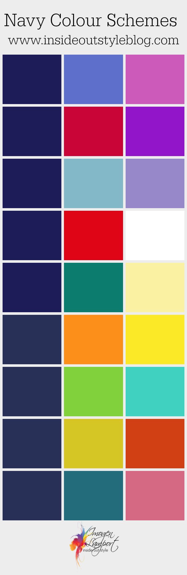
The Power of White and Cream: Crispness and Clarity
The most ubiquitous and arguably most effective pairing with navy blue is white or its softer counterpart, cream. This combination offers a stark, clean contrast that enhances the depth of navy blue and imbues the brand with a sense of clarity, purity, and straightforwardness.
- White: In branding, white alongside navy blue signifies a no-nonsense approach, precision, and a modern aesthetic. It’s often seen in technology, finance, and luxury goods where a clean, uncluttered image is paramount. This pairing communicates efficiency and a focus on core strengths. Consider how many tech companies use navy and white for their logos and interfaces – it immediately signals competence and advanced capabilities.
- Cream/Off-White: Moving to cream or off-white introduces a touch of warmth and approachability to the navy blue palette. While still maintaining a sense of elegance, it softens the overall feel, making the brand appear more inviting and accessible. This is particularly effective for brands in sectors like interior design, fashion, or hospitality, where a welcoming yet sophisticated ambiance is desired. It adds a layer of comfort without sacrificing prestige.
Metallic Accents: Luxury, Innovation, and Premium Positioning
Introducing metallic colors to a navy blue palette immediately elevates the brand perception, signaling luxury, innovation, and a premium offering. These accents add a touch of glamour and sophistication that can set a brand apart in a crowded marketplace.
- Gold: Gold with navy blue is a classic representation of opulence, prestige, and established quality. This pairing evokes a sense of wealth, tradition, and exclusivity. Brands in the luxury goods sector, high-end financial services, or even certain premium hospitality ventures might opt for this combination to convey a sense of enduring value and superior craftsmanship. It speaks of heritage and a commitment to excellence.
- Silver/Platinum: Silver or platinum offers a more modern and sleek metallic contrast to navy blue. This combination often conveys innovation, advanced technology, and a forward-thinking approach. It’s a popular choice for tech companies, automotive brands, or brands focused on modern design and engineering, suggesting a cutting-edge, sophisticated, and high-performance image. The cool undertones of silver complement the deep coolness of navy blue, creating a harmonious yet striking effect.
- Rose Gold: For a softer, more contemporary metallic touch, rose gold can be a compelling choice. It blends the warmth of pink with the sophistication of gold, offering a unique and inviting premium feel. This pairing can be particularly effective for brands targeting a younger, design-conscious demographic or those in the beauty, fashion, or lifestyle sectors, adding a touch of modern romance and personal style.
Injecting Energy and Approachability: Modern and Vibrant Pairings
Beyond the classic, navy blue can be remarkably dynamic when paired with colors that inject energy, creativity, and a more approachable personality. These pairings are crucial for brands aiming to connect with younger audiences, foster innovation, or express a more spirited and engaging identity.
The Boldness of Red and Orange: Impact and Enthusiasm
Red and orange, when used strategically with navy blue, can create a powerful and dynamic visual impact. These colors are known for their energy and warmth, and their juxtaposition with the stability of navy blue can be highly effective.
- Red: Red is a color of passion, energy, and urgency. When paired with navy blue, it creates a strong, confident, and attention-grabbing combination. This pairing is excellent for brands that want to convey leadership, boldness, or a sense of excitement and dynamism. Think of sports brands, certain food services, or even political campaigns where a strong, commanding presence is desired. The contrast is visually striking and memorable.
- Orange: Orange, with its blend of red’s energy and yellow’s cheerfulness, offers a more playful and approachable warmth. Combined with navy blue, it can signify creativity, enthusiasm, and optimism. This pairing works well for brands in the creative industries, education, or consumer goods that aim to appear friendly, innovative, and engaging. It’s a less aggressive but equally impactful way to inject vibrancy.
The Freshness of Greens and Yellows: Growth and Optimism
The natural world provides a rich source of inspiration, and pairing navy blue with various shades of green and yellow can create palettes that convey growth, vitality, and a positive outlook.
- Emerald Green/Teal: Deeper greens like emerald or the blue-toned teal can create a sophisticated and harmonious blend with navy blue. These colors evoke nature, harmony, and a sense of calm, but with a hint of sophistication. They are excellent for brands in environmental sectors, wellness, or design, suggesting a grounded yet refined approach. Teal, in particular, bridges the gap between blue and green, creating a particularly cohesive and visually pleasing effect.
- Mint Green/Lime Green: Lighter, brighter greens like mint or lime introduce a refreshing and contemporary feel. Paired with navy blue, they create a vibrant yet balanced aesthetic, suggesting innovation, growth, and a fresh perspective. This is ideal for tech startups, lifestyle brands, or companies focused on sustainability and modern living, where a sense of optimism and forward-thinking is key.
- Mustard Yellow/Gold Yellow: Yellow, especially warmer shades like mustard, can add a touch of optimistic vibrancy and warmth to navy blue. This pairing is energetic and inviting, often signifying happiness, creativity, and approachability. It’s a great choice for brands in the creative arts, food and beverage, or children’s products that want to convey a sense of joy and engaging personality. It adds a spark of interest without being overwhelming.
Strategic Applications: Integrating Navy Blue Palettes into Brand Design
The successful integration of navy blue color palettes into brand design requires a strategic approach that considers the specific goals of the brand and the intended audience. From digital interfaces to physical marketing materials, color choices are critical in shaping perception and driving engagement.
Digital Presence: Websites, Apps, and User Interfaces
In the digital realm, color plays a pivotal role in user experience and brand recognition. Navy blue provides a stable and trustworthy base, while accent colors guide the user and convey essential information.
- Navigation and Calls to Action: Navy blue can be used for primary navigation elements, establishing a clear and authoritative structure. Brighter, more energetic accent colors (like red, orange, or a vibrant yellow) are highly effective for calls to action (CTAs) like “Buy Now” or “Sign Up,” drawing the user’s eye and encouraging interaction. The contrast ensures that crucial CTAs are not missed.
- Information Hierarchy and Readability: Using lighter colors (white, cream, light grey) for text on a navy blue background ensures excellent readability and prevents eye strain. Conversely, using navy blue for important headings or key data points on a lighter background can emphasize their significance. The strategic use of these contrasts helps users quickly scan and absorb information.
- Brand Consistency: Maintaining a consistent color palette across all digital touchpoints—website, mobile app, social media graphics—is paramount. This reinforces brand identity, builds trust, and creates a cohesive user experience, making the brand instantly recognizable and reliable.
Marketing Collateral and Physical Branding
Beyond the digital, the physical manifestation of a brand’s color palette is equally important, influencing everything from packaging to print advertisements and retail environments.
- Packaging Design: For products, the choice of colors on packaging can be a powerful differentiator. A navy blue base can convey quality and sophistication, while strategic use of metallic accents, vibrant colors, or natural greens can highlight specific product benefits or target market appeal. For example, a navy blue box with gold lettering might signify a luxury product, while navy with bright orange might suggest a more energetic or youthful offering.
- Print Advertising and Stationery: In print materials, color combinations must be carefully considered for their impact and aesthetic appeal. A navy blue and white business card speaks of professionalism and clarity, while a navy blue brochure with a vibrant accent color can draw attention to key messages or special offers. The tactile experience of printed materials can be enhanced by well-chosen color pairings.
- Retail Environments and Brand Spaces: The physical space a brand occupies is a direct extension of its identity. Navy blue can be used for larger architectural elements or furniture to establish a sense of calm and authority, while accent colors can highlight specific product displays, create feature walls, or guide customers through the space. The overall ambiance created by the color palette significantly influences customer perception and experience.
By understanding the psychological impact of navy blue and strategically pairing it with complementary colors, brands can craft powerful, memorable, and effective identities that resonate with their target audiences and achieve their business objectives.
aViewFromTheCave is a participant in the Amazon Services LLC Associates Program, an affiliate advertising program designed to provide a means for sites to earn advertising fees by advertising and linking to Amazon.com. Amazon, the Amazon logo, AmazonSupply, and the AmazonSupply logo are trademarks of Amazon.com, Inc. or its affiliates. As an Amazon Associate we earn affiliate commissions from qualifying purchases.