
Magenta is a captivating color, a vibrant fusion of red’s passion and blue’s calm, often imbued with the mystique of purple. In the realm of branding and design, understanding how to pair magenta effectively is not just an aesthetic choice but a strategic one. Its use can evoke everything from playful creativity to sophisticated luxury, making it a powerful tool for brands aiming to make a distinct visual statement. Leveraging magenta successfully requires a nuanced understanding of color theory, brand psychology, and strategic application to ensure it communicates the desired message and resonates with the target audience.

Understanding Magenta’s Brand Impact and Psychology
Before diving into specific color combinations, it’s crucial to grasp the inherent psychological and emotional impact of magenta itself. As a highly saturated and stimulating hue, magenta commands attention. Psychologically, it is often associated with creativity, innovation, passion, and sophistication. It carries an air of uniqueness and non-conformity, making it an excellent choice for brands looking to stand out from the crowd and challenge conventions.
Magenta straddles the line between warm and cool colors, inheriting the energy of red and the thoughtfulness of blue/violet. This duality makes it incredibly versatile. It can be seen as energetic and playful, particularly in brighter, purer forms, or as elegant and regal when used in deeper, richer tones. For personal and corporate branding, magenta can signify a forward-thinking entity, a vibrant personality, or a luxurious offering. It often appeals to creative industries, fashion and beauty brands, technology innovators, and businesses targeting a youthful or trend-conscious demographic. Its bold presence can communicate confidence and individuality, distinguishing a brand in a crowded marketplace.
Harmonious Pairings: Analogous and Monochromatic Schemes
When aiming for a sense of coherence, elegance, or subtle complexity in a brand’s visual identity, harmonious color schemes offer a refined approach. These pairings leverage colors that are either variations of magenta or sit close to it on the color wheel, creating a visually pleasing and easy-on-the-eye effect.
Monochromatic Magic with Magenta
A monochromatic scheme involves using different shades, tints, and tones of magenta itself. This approach strips away the need to find complementary colors, instead focusing on the depth and variation within a single hue. By adjusting the lightness (tints, adding white), darkness (shades, adding black), and saturation (tones, adding grey) of magenta, a brand can create a sophisticated and cohesive palette.
Imagine a luxury fashion brand using a rich, deep magenta as its primary color, accented by a soft, pastel fuchsia for secondary elements and a vibrant, pure magenta for calls to action. This creates an elegant flow, communicating refinement and a strong, singular brand identity without overwhelming the viewer. The monochromatic approach highlights the versatility of magenta, proving that a single color can offer substantial visual interest and depth when explored thoroughly. It’s particularly effective for brands that want to convey a sense of understated confidence and focused identity.
Analogous Harmony
Analogous color schemes pair magenta with colors that are adjacent to it on the color wheel. These typically include various shades of purples, violets, and reds. This creates a natural, flowing transition between colors, resulting in a visually pleasing and harmonious aesthetic that evokes creativity, warmth, or depth without stark contrasts.
For instance, pairing magenta with a deep plum purple and a soft lavender creates a sophisticated, almost mystical palette, ideal for a high-end spa, a luxury interior design firm, or a sophisticated personal brand. Adding a red-violet alongside magenta and a true red can amplify the passionate and energetic aspects of the brand, suitable for a dynamic lifestyle brand or an innovative tech startup. The key to successful analogous pairing is to ensure sufficient contrast in value (lightness/darkness) to prevent the colors from blending into each other, maintaining distinctiveness while upholding harmony. This method helps a brand tell a richer story, allowing different facets of its personality to shine through while maintaining visual unity.
Contrasting Combinations: Complementary and Triadic Schemes
For brands seeking to make a bold statement, inject energy, or cultivate a dynamic and memorable presence, contrasting color schemes are incredibly effective. These pairings deliberately choose colors that sit opposite or are evenly spaced on the color wheel, creating vibrant tension and immediate visual impact.
Complementary Power Play
The complementary color to magenta is green. Pairing magenta with various shades of green creates the highest possible contrast, leading to a vibrant, energetic, and visually arresting palette. This combination demands attention and is often associated with creativity, innovation, and a strong sense of individuality.
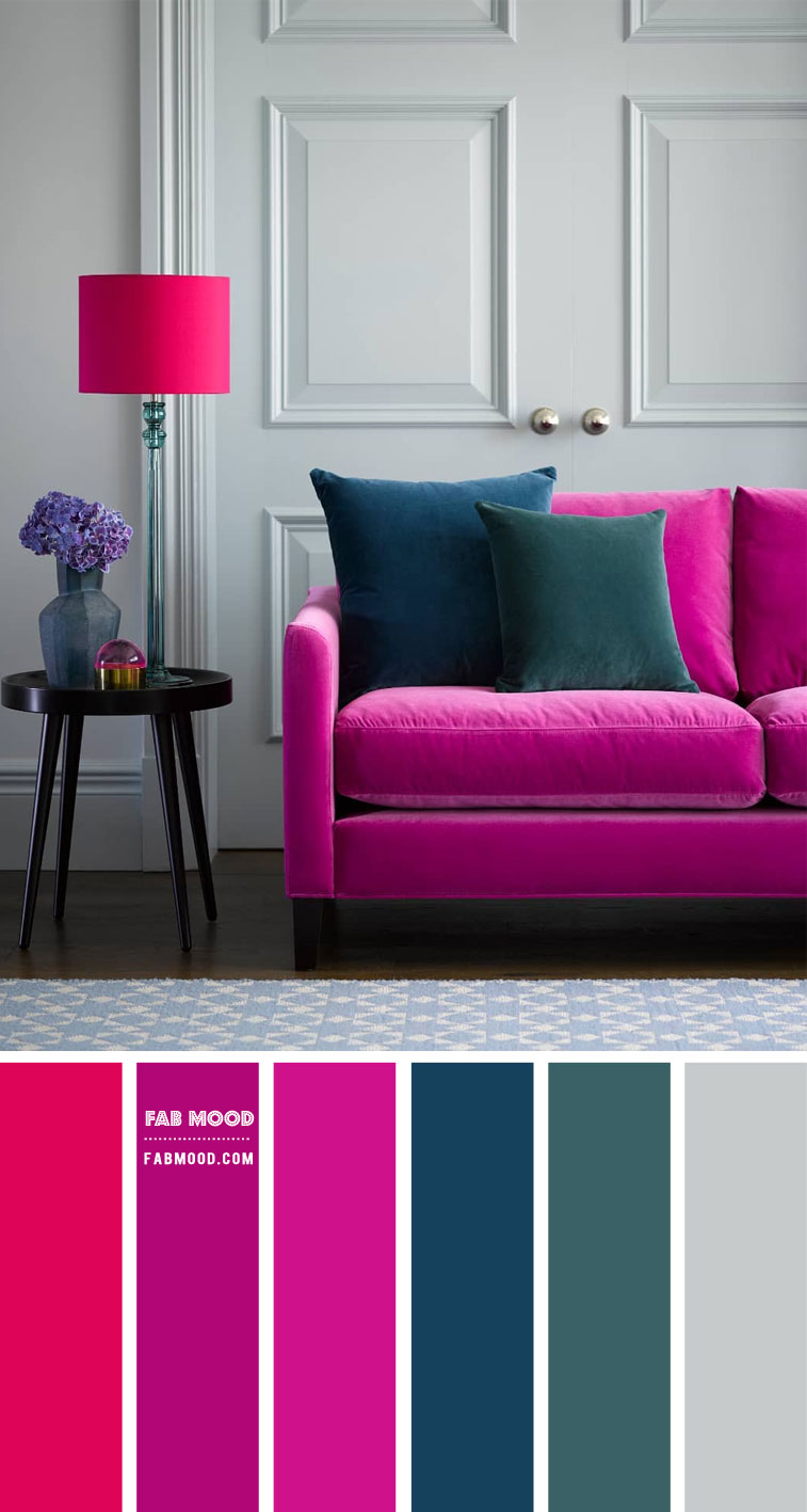
However, using complementary colors requires careful balance. A pure magenta alongside a pure green can be visually overwhelming if not managed correctly. Brands can achieve a more sophisticated look by manipulating the saturation and lightness of the green. For example, a deep, jewel-toned emerald green paired with a rich magenta can convey luxury and vibrancy, perfect for a high-end event planning service or a distinctive beauty brand. A softer, more muted olive green alongside magenta can evoke a connection to nature with a modern twist, suitable for an eco-conscious brand that wants a pop of personality. Conversely, a bright, almost neon lime green with magenta can scream youthful energy and cutting-edge innovation, ideal for a gaming brand or a disruptive tech company. The complementary scheme is best for brands that want to be seen as bold, memorable, and unafraid to stand out.
Triadic Vibrancy
A triadic color scheme involves three colors equally spaced on the color wheel. For magenta, this typically includes yellow and a cyan/blue-green hue. This combination is inherently bold, playful, and energetic, often seen in creative industries, entertainment, or brands aiming for a high-impact, fun, and dynamic identity.

This scheme offers a broad spectrum of visual possibilities. Imagine a brand identity that uses magenta as its dominant color, with pops of a bright, sunny yellow for accents and a touch of deep teal (a blue-green) for secondary elements. This creates a lively, youthful, and adventurous feel, perfect for a travel brand, a creative marketing agency, or a children’s educational platform. The challenge with triadic schemes lies in achieving balance; typically, one color should dominate, with the other two serving as accents to avoid visual chaos. When expertly executed, the triadic scheme communicates a brand that is multifaceted, dynamic, and full of life, projecting an image of excitement and innovation.
Strategic Application of Magenta in Branding
The choice to incorporate magenta into a brand’s palette, and which colors to pair it with, should always be driven by strategic objectives. A brand’s visual identity must align with its core values, target audience, and industry context.
Industry-Specific Resonance
Different industries can leverage magenta to communicate distinct messages:
- Fashion and Beauty: Magenta, especially when paired with metallic golds, silvers, crisp whites, or deep blacks, conveys luxury, trend-setting, and sophisticated playfulness. It speaks to innovation and desirability.
- Technology and Innovation: Here, magenta can signal a forward-thinking, creative, and bold approach. Paired with stark whites, various shades of grey, electric blues, or even lime greens, it denotes a brand that is modern, disruptive, and vibrant.
- Creative Agencies and Arts: Magenta naturally fits brands in the creative sector, expressing uniqueness, energy, and artistic freedom. Combinations with complementary greens, bright yellows, or deep purples enhance this expressive quality.
- Food and Beverage (Niche Markets): For certain segments, like exotic juices, confectionery, or vibrant cafes, magenta can evoke fun, vibrancy, and a unique flavor profile.
Target Audience Considerations
Magenta’s appeal can vary across demographics. Its vibrancy often resonates strongly with younger, digitally native audiences, signaling modernity and relevance. When used in deeper, more muted tones or paired with sophisticated neutrals, it can also appeal to a luxury segment, indicating exclusivity and refined taste. Brands seeking to disrupt traditional markets or position themselves as fresh alternatives will find magenta a valuable ally.
Dominance vs. Accent
Deciding whether magenta should be a dominant brand color or an accent hue is another critical strategic choice.
- As a Primary Color: A brand choosing magenta as its dominant color is making a powerful statement. This communicates confidence, uniqueness, and a desire to be distinctly memorable. It’s best for brands that fully embody the color’s inherent qualities of creativity, passion, or sophistication.
- As an Accent Color: When paired with a more neutral primary palette (e.g., greys, whites, blacks, navy), magenta can serve as a potent accent. It can highlight calls to action, draw attention to key elements, or infuse a pop of personality and energy without overwhelming the brand’s primary message. This approach offers versatility and allows a brand to introduce vibrancy strategically.
Practical Tips for Integrating Magenta into Your Brand Palette
Successfully integrating magenta into a brand’s visual identity goes beyond just selecting appealing color combinations. Practical considerations ensure consistency, effectiveness, and accessibility across all brand touchpoints.
Balance is Key
Regardless of the scheme chosen, balance is paramount. A good guideline is the 60-30-10 rule: 60% dominant color (often a neutral or primary brand color), 30% secondary color, and 10% accent color. If magenta is the accent, it provides impact without being overused. If it’s a dominant color, ensure sufficient use of complementary neutrals (whites, greys, blacks) to provide visual breathing room and prevent saturation overload. Experiment with different tints, shades, and tones within your chosen palette to add depth and sophistication without introducing additional hues.
Context Matters
Consider how magenta will manifest across various mediums. A color that looks brilliant on a screen (RGB) might print differently (CMYK or Pantone). Ensure brand guidelines specify exact color codes for both digital and print applications to maintain consistency. Think about different materials—packaging, merchandise, signage—as textures and finishes can significantly alter how a color is perceived. Always test colors on actual applications to foresee and mitigate any discrepancies.
Test and Iterate
Visual identity design is an iterative process. Create mockups of your logo, website, marketing materials, and social media graphics. Gather feedback from diverse groups, including your target audience, to gauge their reactions and ensure the palette evokes the intended emotions and associations. Be open to refining shades, adjusting proportions, or even swapping out a secondary color if early testing reveals an unintended message or lack of clarity.
Leverage Color Tools
Utilize online color palette generators like Adobe Color or Coolors to explore various combinations and visualize schemes based on magenta. Professional design software offers advanced color management features, allowing for precise control over hues, saturation, and lightness. Familiarity with different color models (RGB for digital, CMYK for print, Pantone for universal consistency) is essential for maintaining brand integrity across all platforms.
By thoughtfully considering magenta’s psychological impact, exploring harmonious and contrasting color pairings, and applying these strategies with practical considerations in mind, brands can harness its unique power to create a memorable, effective, and visually compelling identity that resonates deeply with their audience.
aViewFromTheCave is a participant in the Amazon Services LLC Associates Program, an affiliate advertising program designed to provide a means for sites to earn advertising fees by advertising and linking to Amazon.com. Amazon, the Amazon logo, AmazonSupply, and the AmazonSupply logo are trademarks of Amazon.com, Inc. or its affiliates. As an Amazon Associate we earn affiliate commissions from qualifying purchases.