
In the intricate world of brand strategy and design, color is far more than mere aesthetics; it is a potent psychological tool, a silent communicator of values, personality, and purpose. The strategic selection of a brand’s primary and secondary color palette can profoundly influence perception, evoke specific emotions, and forge a lasting connection with its target audience. When considering a hue as vibrant and multifaceted as coral, understanding its inherent characteristics and its potential complementary colors becomes a critical exercise in crafting a compelling visual identity.
Coral, a captivating blend of pink and orange, occupies a unique space on the color spectrum, embodying warmth, energy, and a distinctive modernity. Its versatility allows it to pivot from playful and youthful to sophisticated and elegant, depending on its exact shade and the colors it is paired with. For brands, this presents both an exciting opportunity and a nuanced challenge. The key lies in leveraging color theory and design principles to build a palette that not only complements coral’s inherent charm but also reinforces the brand’s core message and resonates deeply with its market.

Understanding Coral as a Strategic Brand Hue
The decision to incorporate coral into a brand’s visual identity is often a deliberate move to project specific attributes and stand out in a crowded marketplace. Its psychological impact and versatile nature make it a powerful choice for modern branding.
The Psychology of Coral
Coral inherently carries a sense of optimism, vitality, and approachability. Psychologically, it merges the energy of orange with the softness of pink, resulting in a hue that is both invigorating and comforting. Brands utilizing coral often aim to convey innovation, friendliness, and creativity. It can evoke feelings of warmth, excitement, and a touch of the exotic, reminiscent of tropical escapes and natural beauty. For a brand, this translates into a perception of being dynamic, forward-thinking, and genuinely engaging. It’s less aggressive than pure red, more assertive than pure pink, and more nuanced than pure orange, positioning it as a sophisticated yet inviting choice.
Coral’s Versatility and Vibrancy
Coral is not a monolithic color; it encompasses a wide range of shades, from soft, peachy tones to vibrant, almost neon, reddish-oranges. This spectrum allows for immense versatility in application. A softer coral might lend itself to a more feminine or gentle brand identity, while a bolder, more saturated coral can command attention and signify a brand that is confident and energetic. Its inherent vibrancy naturally draws the eye, making it an excellent choice for calls to action, prominent logos, or focal points within a design. Moreover, its warmth can inject life and personality into an otherwise sterile or minimalist aesthetic, humanizing a brand’s digital presence or product design.
Strategic Application in Branding
Brands that gravitate towards coral often belong to sectors where innovation, style, and connection are paramount. This includes fashion, beauty, lifestyle, hospitality, and certain segments of the tech industry that wish to differentiate from traditional corporate blues and greys. By adopting coral, a brand signals a departure from the conventional, embracing a fresh, contemporary, and often more human-centric approach. It suggests a brand that is approachable yet distinct, offering a blend of warmth and modern sensibility. Strategically, coral can be used as a primary brand color to define the core identity, or as an accent color to inject personality and highlight key elements, depending on the desired impact and the overall brand narrative.
Crafting Visual Harmony: Complementary Color Palettes
The true power of coral in branding is unlocked when it is paired with complementary colors that enhance its qualities and contribute to a balanced, cohesive, and impactful visual narrative. These pairings can range from understated elegance to bold, dynamic statements.
Classic Pairings for Sophistication
For brands aiming for a refined, timeless, and sophisticated aesthetic, classic pairings with neutral tones or deep, anchoring hues work exceptionally well.
- Neutrals (Creams, Beiges, Greys, Taupe): These foundational colors provide a sophisticated backdrop that allows coral to truly shine without overwhelming the senses. A soft coral paired with cream or light grey evokes a sense of understated luxury and calm, ideal for wellness brands, high-end homeware, or elegant fashion labels. Taupe and sand tones add an organic, earthy feel, grounding coral’s vibrancy.
- White & Black: White offers crispness, modernity, and space, making coral feel fresh and vibrant. A coral and white palette is clean, minimalist, and often associated with contemporary design and digital platforms. Black, on the other hand, adds drama, depth, and a touch of edgy sophistication. Coral contrasted with black creates a powerful, high-impact look suitable for luxury goods, avant-garde fashion, or bold editorial design.
- Navy Blue: A perennial favorite, navy blue provides a deep, trustworthy, and professional anchor against coral’s playful energy. This combination exudes confidence, balance, and a modern twist on classic elegance. It’s a versatile pairing often seen in corporate branding that desires a contemporary edge, maritime-themed luxury brands, or fashion lines that blend tradition with innovation.
Bold Contrasts for Dynamic Impact
To create a visually striking and memorable impression, contrasting colors offer a powerful solution, injecting energy and vibrancy into the brand’s identity.
- Teal & Turquoise: These cool, oceanic blues and greens are near complements to coral on the color wheel, creating a dynamic, high-contrast pairing that is inherently eye-catching. This combination evokes feelings of adventure, vibrancy, and tropical allure, making it perfect for travel brands, youthful apparel, or companies in the leisure and entertainment sectors. The juxtaposition of warm coral with cool teal creates a stimulating visual tension that grabs attention.
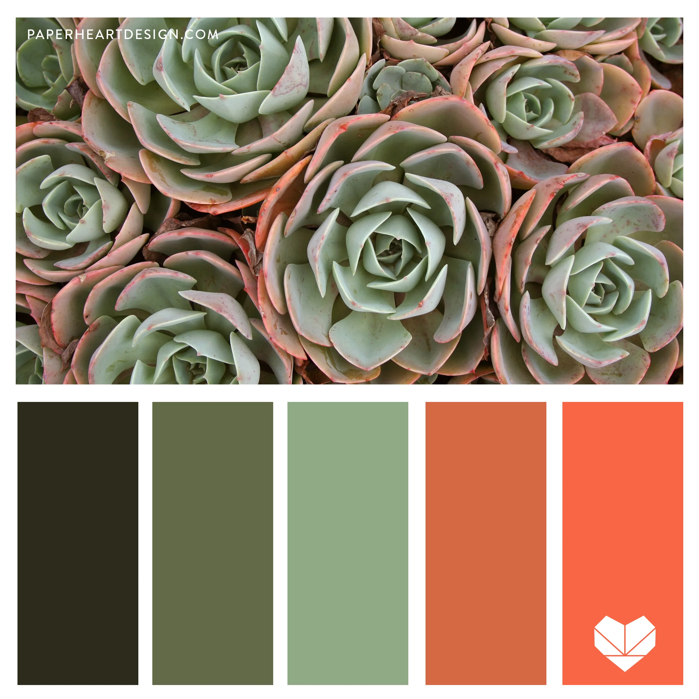
- Deep Greens (e.g., Forest Green, Emerald): While teal offers energy, deeper greens provide a richer, more grounded contrast. Pairing coral with forest green or emerald creates a sophisticated, nature-inspired palette that suggests luxury, sustainability, and organic elegance. This is particularly effective for eco-conscious brands, high-end artisan products, or lifestyle brands seeking a harmonious blend of natural and vibrant elements.
- Gold & Bronze: To elevate coral and inject a sense of opulence and glamour, metallic accents like gold or bronze are invaluable. Coral and gold evoke a sense of warmth, luxury, and celebration, ideal for beauty brands, jewelry, celebratory events, or any brand aiming to convey premium quality and exquisite taste.
Analogous Schemes for Serenity and Warmth
Analogous color schemes, which use colors adjacent to coral on the color wheel, create a harmonious, flowing, and often comforting visual experience.
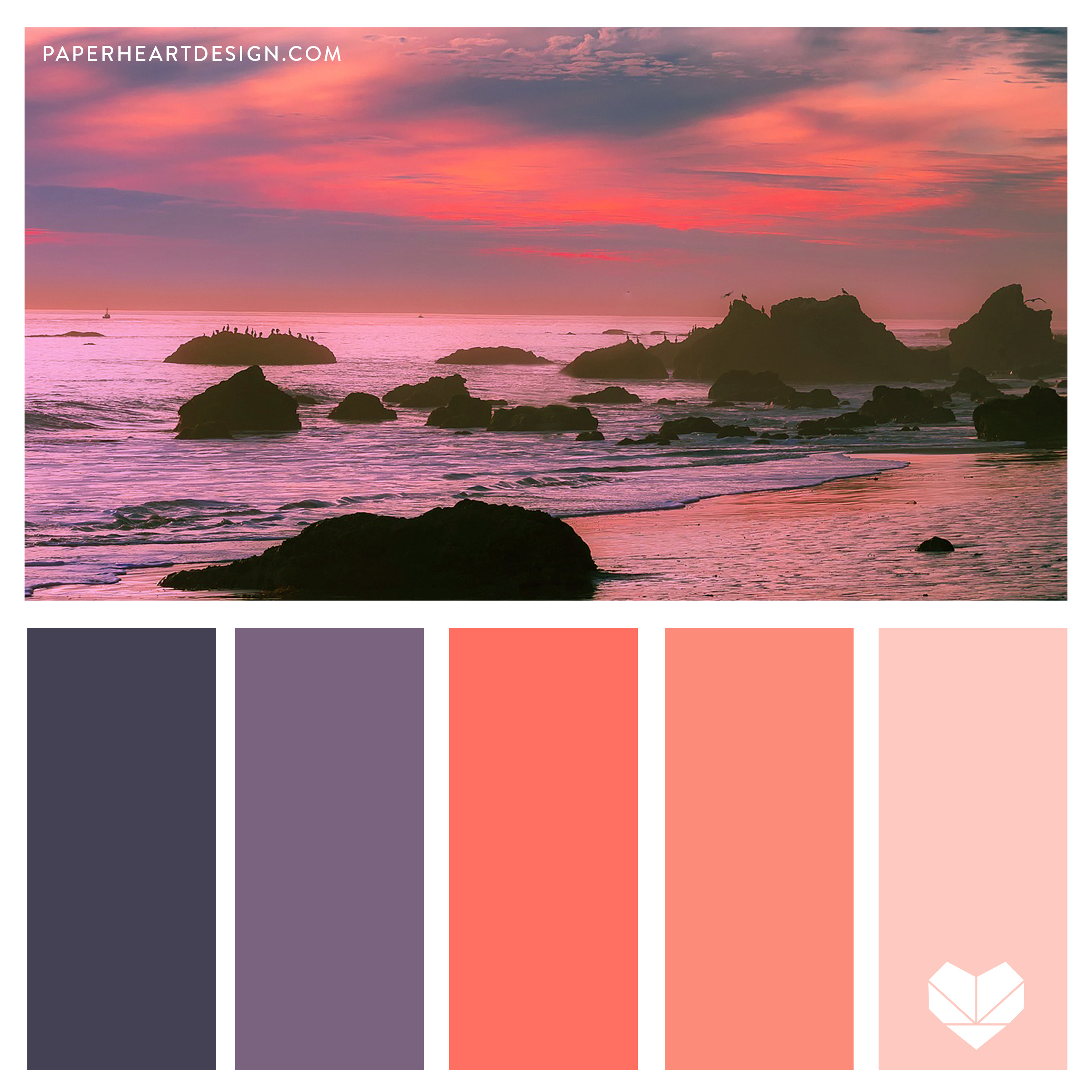
- Pinks (e.g., Dusty Rose, Salmon): Pairing coral with softer, adjacent pinks like dusty rose or salmon creates a gentle, harmonious, and often feminine palette. This scheme is ideal for brands in the beauty, wellness, or gentle lifestyle sectors, conveying softness, care, and approachability.
- Oranges (e.g., Peach, Terracotta): Introducing lighter oranges such as peach or deeper, earthy oranges like terracotta alongside coral enhances its inherent warmth and vibrancy. This creates an inviting, approachable, and often playful palette, well-suited for creative agencies, food brands, or brands emphasizing community and connection.
Practical Application in Brand Design and Marketing
Translating these color theories into tangible brand assets is where the real impact is made. The consistent and strategic application of coral and its complementary colors across all touchpoints is crucial for a cohesive brand identity.
Logo and Visual Identity
The brand’s logo is the cornerstone of its visual identity. If coral is the primary brand color, its complements can be used for secondary elements, typography, or to create visual depth. For example, a coral logomark might be paired with navy text for a professional feel, or with white text on a teal background for a more dynamic and modern aesthetic. The choice of palette directly influences the logo’s distinctiveness, memorability, and the immediate emotional response it elicits.
Website and Digital Presence
In digital environments, color palettes influence user experience (UX) and overall brand perception. Coral can be strategically used for calls-to-action (CTAs), prominent headings, or hero sections to draw attention and guide the user’s eye. Complementary colors can then be applied to background elements, secondary information, and interactive components. Crucially, digital design demands adherence to accessibility standards, ensuring sufficient contrast ratios between text and background colors (especially for coral, which can be bright) to accommodate all users and maintain legibility.
Product Packaging and Merchandise
For physical products, packaging color plays a vital role in shelf appeal and brand recognition. Coral packaging might signify freshness, creativity, or luxury, depending on the accompanying colors, textures, and finishes. A coral product box accented with gold foil speaks to opulence, while a coral bag with a crisp white logo suggests a clean, modern aesthetic. Similarly, merchandise like apparel, stationery, or promotional items should consistently reflect the brand’s chosen coral palette to reinforce identity and create a unified brand experience.
Marketing Campaigns and Advertising
In marketing and advertising, color is used to set the mood, convey messages, and capture attention. A brand might use a vibrant coral and teal combination for a summer campaign to evoke excitement and fun, or a more subdued coral and cream palette for a sophisticated product launch. Consistency across all advertising channels—print, digital, social media—ensures that the brand’s visual language is strong, memorable, and immediately recognizable, amplifying the impact of its messaging.
Considerations for Target Audience and Industry
The effectiveness of any color palette, especially one involving a distinctive hue like coral, is deeply intertwined with the brand’s target audience and the industry landscape.
Demographics and Psychographics
Understanding who the brand is trying to reach is paramount. Different age groups, cultural backgrounds, and psychographic profiles respond to colors in varying ways. A vibrant coral might resonate strongly with younger, trend-conscious demographics seeking authentic and engaging brands. Conversely, a softer, more muted coral might appeal to an older demographic that values understated elegance and comfort. Brand strategists must conduct thorough research to ensure their chosen coral palette authentically connects with their desired consumer base.
Industry Conventions and Differentiation
While some industries have established color norms (e.g., green for environmental brands, blue for finance), a brand might strategically employ coral to either align with or differentiate from these conventions. In a saturated market, using coral can be a powerful way to break through the noise and signal innovation, freshness, or a unique approach. For instance, a tech company using coral instead of ubiquitous blues might signify a more human-centered or creative approach to technology. Conversely, if an industry is already trending towards similar vibrant hues, a brand might need to use coral in a more unique way or find another differentiating factor.
Seasonal and Trend Adaptability
Coral’s vibrant nature makes it particularly strong for spring and summer campaigns, aligning with themes of warmth, growth, and celebration. However, a well-chosen coral can be adapted for year-round relevance by pairing it with deeper, richer tones for fall and winter. While some brands embrace coral as a core, timeless color, others might use it as a strategic accent to capitalize on current trends. The challenge for brand strategists is to distinguish between fleeting trends and enduring appeal when integrating coral into a long-term brand identity.
The Role of Color Theory in Brand Cohesion
Ultimately, the goal of selecting complementary colors for coral, or any brand hue, is to create a cohesive, impactful, and enduring brand identity. This goes beyond mere aesthetics, touching upon consistency, emotional resonance, and inclusivity.
Ensuring Brand Consistency
A carefully defined color palette ensures that every brand touchpoint—from logos and websites to packaging and social media posts—speaks with a unified visual voice. Consistent application of coral and its chosen complements reinforces brand recognition, builds trust, and solidifies the brand’s position in the consumer’s mind. Inconsistency, on the other hand, can dilute brand perception and erode credibility.
Evoking Desired Emotions and Associations
Beyond just looking good, a brand’s color palette must consistently evoke the core emotions and associations it wishes to convey. If a brand aims to be perceived as energetic and innovative, its coral palette might lean towards bold contrasts like teal. If the goal is warmth and approachability, analogous pinks and oranges might be prioritized. The strategic deployment of color helps to articulate the brand’s personality and values without uttering a single word.
Accessibility and Inclusivity in Color Choices
In modern branding, inclusivity is paramount. Ensuring that chosen coral color combinations, especially text overlaid on backgrounds, meet accessibility standards (such as WCAG guidelines for contrast ratios) is not just good practice—it’s essential. Accessible design ensures that content is legible for individuals with visual impairments or color blindness, broadening the brand’s reach and demonstrating a commitment to an inclusive audience. A beautiful palette loses its impact if it cannot be universally perceived and understood.
By meticulously considering coral’s psychological impact, exploring diverse complementary palettes, and applying these insights consistently across all brand touchpoints, businesses can harness the full power of this captivating hue. The result is a brand identity that is not only visually appealing but also strategically aligned, emotionally resonant, and designed for lasting impact.
aViewFromTheCave is a participant in the Amazon Services LLC Associates Program, an affiliate advertising program designed to provide a means for sites to earn advertising fees by advertising and linking to Amazon.com. Amazon, the Amazon logo, AmazonSupply, and the AmazonSupply logo are trademarks of Amazon.com, Inc. or its affiliates. As an Amazon Associate we earn affiliate commissions from qualifying purchases.