
In the landscape of brand strategy and visual identity, color is more than a mere aesthetic choice; it is a silent language that communicates values, emotions, and positioning before a single word of copy is read. When we ask “what colors does blue and green make,” we are not simply inquiring about a secondary school art project. We are exploring the genesis of some of the most influential hues in the corporate world: teal, cyan, and turquoise.
The fusion of blue and green represents a sophisticated intersection of two psychological powerhouses. Blue, the color of the sky and sea, is globally recognized as the herald of trust, stability, and intelligence. Green, the color of nature and currency, signals growth, harmony, and renewal. When these two are blended, the resulting spectrum offers a unique strategic advantage for brands looking to occupy a space that is both innovative and grounded.

The Technical Synthesis: From Pigment to Pixel
Understanding what blue and green produce requires a dual perspective: the subtractive model of physical design and the additive model of digital displays. For a brand strategist, this distinction is critical for ensuring visual consistency across all touchpoints, from a high-resolution mobile app to a matte-finished business card.
The Subtractive Model: Teal and Turquoise
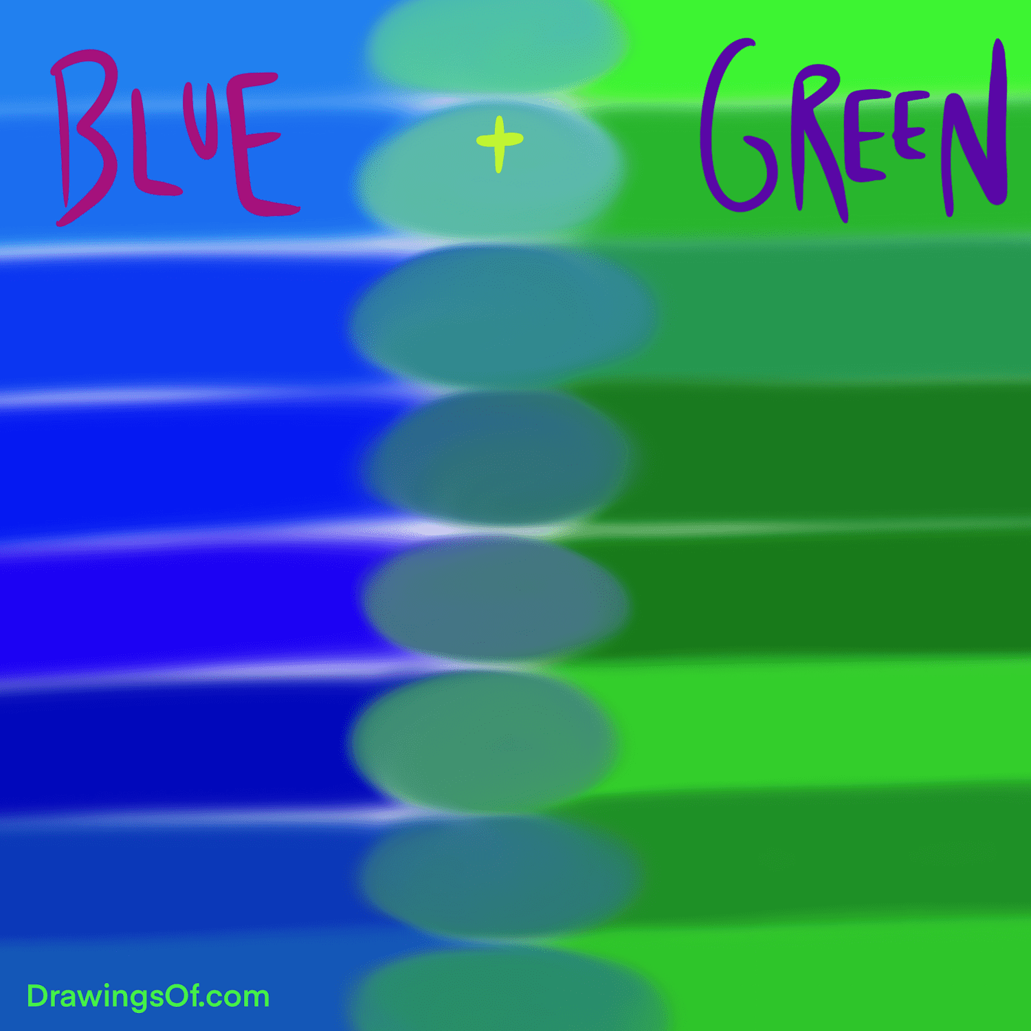
In the world of physical branding—think packaging, stationery, and interior office design—we deal with pigments. When blue and green pigments are mixed, the result is typically teal or turquoise, depending on the ratio and the underlying values of the base colors.
Teal is a deeper, more saturated version of this mixture. It carries a heavy weight of sophistication. In corporate identity, teal is often used to signal a “bridge” between the traditional (blue) and the eco-conscious or growth-oriented (green). Turquoise, which features a higher concentration of green and often a touch of white or yellow, offers a more vibrant, energetic feel. It is frequently seen in brands that want to appear approachable, creative, and “fresh.”
The Additive Model: The Brilliance of Cyan
In the digital realm (RGB), mixing blue and green light produces cyan. Cyan is one of the three primary colors of the subtractive CMYK model used in printing, but as a digital light output, it is exceptionally bright and modern. For tech-forward brands and software companies, cyan represents the “glow” of the future. It is high-energy and high-visibility, making it an ideal choice for call-to-action buttons, app icons, and digital interfaces where user engagement is the primary goal.
The Psychological Impact of Blue-Green Hues in Branding
Every color evokes a subconscious reaction. By understanding the psychological profile of the blue-green family, brand managers can more effectively steer consumer perception.
Trust Meets Growth
The most significant benefit of the blue-green spectrum is its ability to balance two seemingly opposing traits. Blue is often seen as conservative and safe—the color of banking and legal institutions. Green is seen as organic and evolving. By blending them, a brand can convey that it is a “safe bet” for the future.
This is why we see these colors so frequently in the “MedTech” and “FinTech” sectors. A health-tech company needs to appear reliable (Blue) but also innovative and focused on life (Green). A blue-green palette tells the consumer: “We are professionals who are moving the needle forward.”
The Emotional Resonance of Serenity and Clarity
Blue-green shades are often associated with the ocean and tropical environments. This connection triggers a sense of calm and mental clarity. In a crowded marketplace where consumers are bombarded with high-friction “urgent” red and “warning” yellow, a brand that utilizes teal or aqua can provide a “visual oasis.” This strategy is particularly effective for lifestyle brands, wellness services, and high-end hospitality groups that want to sell an experience of peace and luxury.
Strategic Application: Choosing Your Specific Shade
Not all blue-green mixes are created equal. The specific ratio you choose for your brand identity will dictate your market positioning.
The Sophistication of Deep Teal
Deep teal is a favorite among brands that want to disrupt traditional industries without appearing reckless. It is a “power color” that feels more modern than navy blue but more professional than forest green. When a brand uses deep teal, it is communicating authority and depth. This is often paired with metallic accents like copper or gold to create a premium, “exclusive” feel.
The Innovation of Aqua and Mint
On the lighter end of the blue-green spectrum lie aqua and mint. These colors are synonymous with cleanliness, transparency, and digital-first thinking. Startups often gravitate toward these shades because they feel “light” and “unburdened” by the weight of legacy corporate structures. It suggests a brand that is agile, responsive, and easy to interact with.
The Heritage of Turquoise
Turquoise has a historical and cultural depth that other blue-green mixes lack. It is often associated with artisan crafts, indigenous history, and jewelry. For brands that want to emphasize their heritage or the “handcrafted” nature of their products, a turquoise-heavy palette can bridge the gap between ancient wisdom and modern commerce.
Case Studies and Market Positioning
To understand the power of what blue and green make, we must look at how industry leaders have utilized these combinations to dominate their respective niches.
The “Tiffany Blue” Phenomenon
Perhaps the most famous brand color in history is a specific shade of blue-green: Tiffany Blue. Technically a light medium robin egg blue, it sits firmly in the territory where blue and green meet. This color is so potent that it is trademarked. It conveys a specific type of luxury—one that is elegant, timeless, and feminine. The success of this color demonstrates that the right mix of blue and green can become more than just a brand element; it can become a global icon of status.
The Rise of Teal in Digital Services
Look at the evolution of collaborative software and communication tools. Many have moved away from “IBM Blue” toward “Teal” and “Cyan.” This shift reflects a change in the workplace from rigid hierarchy to collaborative growth. These brands use blue-green to signify that they are tools for productivity (Blue) that foster creative expansion (Green).
Implementation: Building a Palette Around Blue-Green
Once you have decided to leverage the blue-green spectrum, the next step in brand strategy is building a supporting palette that reinforces your core message.
Complementary Contrasts
The direct complement of blue-green on the color wheel is a range of oranges and corals. Using a coral accent against a teal primary brand color creates a dynamic, high-energy contrast. This is an excellent strategy for brands that want to appear “vibrant” and “active.” The orange provides the warmth and energy, while the teal provides the stability.
Monochromatic Harmony
For a more sophisticated and understated brand identity, a monochromatic palette is highly effective. This involves using various shades of the blue-green mix—from a deep, near-black teal to a pale, misty aqua. This approach creates a sense of cohesion and “completeness.” It is often used in luxury real estate and high-end consulting firms where the goal is to appear “seamless.”
The Role of Neutrals
Blue-green mixes pair exceptionally well with “cool” neutrals like slate grey and crisp white. However, a growing trend in brand design is pairing teal with “warm” neutrals like almond, beige, or sand. This combination feels more organic and “human,” moving away from the coldness of traditional tech branding toward something more approachable and lifestyle-oriented.
Navigating the Technical Hurdles of Blue-Green
One of the greatest challenges in choosing a blue-green brand color is its volatility across different mediums. This is a critical consideration for any brand manager.
The “Purple Shift” and Print Realities
Blue-green colors are notoriously difficult to reproduce in the CMYK printing process. If the balance is off by even a few percentage points, a beautiful teal can shift toward a muddy grey or a dull forest green. To maintain corporate identity integrity, it is essential to define specific Pantone (PMS) colors for physical production. Relying solely on digital conversions will lead to a fragmented brand image.
Screen Calibration and Accessibility
In digital design, cyan and bright turquoise can sometimes fail accessibility tests, particularly regarding contrast ratios for text. A brand that prioritizes inclusivity must ensure that its chosen blue-green shade provides enough contrast against its background for users with visual impairments. This often means using the more saturated blue-green shades for primary elements and reserving the brighter, neon-adjacent cyans for decorative accents.

Conclusion: The Strategic Value of the Blue-Green Spectrum
What colors does blue and green make? They make a spectrum of possibility. From the deep, authoritative corridors of corporate teal to the bright, disruptive neon of digital cyan, the combination of blue and green offers a brand a unique psychological toolkit.
By choosing to exist in the space between these two primary pillars of color theory, a brand can project an image that is both trustworthy and innovative, calm and growing, traditional and forward-thinking. In an era where brand identity is the most valuable asset a company owns, mastering the synthesis of blue and green is not just an exercise in design—it is a cornerstone of strategic market positioning. Whether you are building a new startup or refreshing a legacy corporate identity, the blue-green family provides the versatility needed to navigate the complexities of modern consumer perception.
aViewFromTheCave is a participant in the Amazon Services LLC Associates Program, an affiliate advertising program designed to provide a means for sites to earn advertising fees by advertising and linking to Amazon.com. Amazon, the Amazon logo, AmazonSupply, and the AmazonSupply logo are trademarks of Amazon.com, Inc. or its affiliates. As an Amazon Associate we earn affiliate commissions from qualifying purchases.