
In the world of professional branding and corporate identity, color is far more than an aesthetic choice. It is a psychological trigger, a visual shorthand for a company’s values, and a critical component of market positioning. When a strategist or designer asks, “What colors do you mix together to make red?” they are rarely asking for a basic lesson in primary school art. Instead, they are delving into the complex mechanics of subtractive color theory, the precision of the CMYK print process, and the strategic implications of maintaining visual consistency across a global brand ecosystem.

Red is perhaps the most powerful color in a brand’s toolkit. It commands attention, stimulates appetite, increases heart rate, and conveys a sense of urgency. From the iconic crimson of Coca-Cola to the high-energy red of Netflix, the specific “mix” of a brand’s red is a guarded intellectual property. To understand how to create it, one must navigate the intersection of physics, design technology, and marketing strategy.
The Science of Red: Why Color Consistency Defines Global Brands
In traditional pigment theory—the kind taught in elementary art classes—red is considered a primary color. In that context, the answer to what colors mix to make red is “none,” as primary colors are the foundation from which other colors are built. However, in the professional spheres of brand strategy and commercial printing, the reality is more nuanced.
The Subtractive Color Model (CMYK)
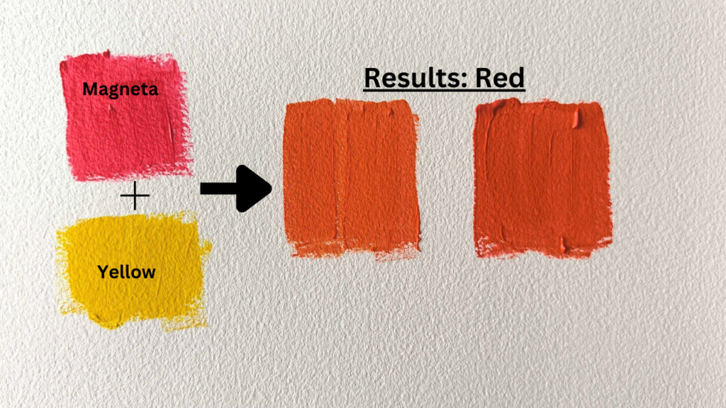
For any brand that produces physical assets—packaging, business cards, billboards, or merchandise—the CMYK (Cyan, Magenta, Yellow, and Key/Black) model is the standard. In this subtractive model, red is actually a secondary color. To achieve a vibrant, true red on a white substrate, a designer must mix Magenta and Yellow.
The precise ratio of these two components determines the “temperature” and “mood” of the red. A mix of 100% Magenta and 100% Yellow produces a standard, bright red. However, brand strategists often tweak these percentages to create a unique identity. Adding a small percentage of Black (Key) can deepen the red into a sophisticated burgundy, signaling luxury and heritage. Conversely, reducing the Magenta slightly can lean the color toward an energetic orange-red, often used by tech startups to signal innovation and warmth.
The Psychology of Red in Marketing
Why do brands go to such lengths to perfect their red? Because the psychological impact is profound. Red is statistically proven to provoke the strongest emotional response of any color in the spectrum. In brand strategy, it is used to:
- Create Urgency: Retailers use red for “Sale” signs because it triggers a sense of immediate action.
- Stimulate Appetite: The food and beverage industry (McDonald’s, KFC, Wendy’s) relies on red to induce hunger.
- Project Power: Financial and automotive brands use deeper reds to project stability, power, and high performance.
Navigating the CMYK and Pantone Landscape
When a brand scales, the challenge shifts from “how do we mix red” to “how do we keep our red consistent everywhere.” This is where the distinction between process colors (CMYK) and spot colors (Pantone) becomes vital for corporate identity.
The Role of Spot Colors in Corporate Identity
While mixing Magenta and Yellow works for general printing, it can lead to slight variations depending on the printer, the paper stock, and the ink quality. For a global brand, these variations are unacceptable. This is why the Pantone Matching System (PMS) is the gold standard in brand strategy.
A “Pantone Red” is not mixed on the press by combining four inks. Instead, it is a pre-mixed, standardized ink. When a brand like Target specifies “Pantone 186 C,” they are ensuring that their signature red looks identical whether it is printed on a plastic shopping bag in Ohio or a cardboard display in Tokyo. This level of precision is what transforms a simple color into a brand asset.
The Impact of Substrate on Color Perception
The “mix” of red also changes based on the material it is applied to. A red that looks vibrant on coated, glossy paper may look dull and “muddy” on uncoated stationery or corrugated cardboard. Professional brand guidelines often include different color formulas for different materials. This might involve increasing the Yellow percentage in the CMYK mix for porous surfaces to counteract the blueish tint of the paper fibers, ensuring the visual output remains strategically aligned with the brand’s core identity.
Digital vs. Physical: Maintaining Red Across Different Mediums
In the modern era, a brand lives more on screens than it does on paper. This introduces a second color model: RGB (Red, Green, Blue). In the digital space, red is once again a primary color. However, the challenge for brand managers is “transliterating” the physical mix of red into the digital world.
RGB for Screens: The Additive Model
Digital screens create color by emitting light. To “make” red on a screen, the device simply turns on its red sub-pixels at maximum intensity while keeping green and blue at zero. This results in the “Hex Code” #FF0000.
The strategic difficulty arises because the “Red” produced by a monitor (RGB) is fundamentally more vibrant and saturated than the “Red” produced by ink on paper (CMYK). A brand strategist must choose a “Web-Safe” or “Digital-First” red that bridges this gap. If the digital red is too neon, it will look disconnected from the physical packaging. If the print red is too muted, it will lose its competitive edge on a smartphone screen.
The Challenge of Cross-Platform Branding
Brand consistency is a hallmark of professional excellence. When a consumer moves from a brand’s Instagram profile to its physical storefront, the transition should be seamless. Achieving this requires a rigorous approach to “Color Mapping.” This involves testing how the Magenta-Yellow mix of a printed logo compares to the Hex code on a high-definition OLED screen. Insightful branding agencies provide “Color Palettes” that specify the exact CMYK, RGB, Hex, and Pantone values to ensure the brand’s “Red” remains its most recognizable signature across all touchpoints.
Case Studies: Brands That Own the Color Red
To understand the strategic importance of the “perfect mix,” we can look at global leaders who have successfully weaponized the color red to dominate their respective markets.
Coca-Cola: The Power of a Proprietary Formula
The “Coca-Cola Red” is one of the most recognizable brand assets in history. It is not a standard CMYK mix. In fact, the specific ink formula is so central to their corporate identity that it is not officially part of the Pantone Matching System; it is a custom, proprietary blend. By controlling the mix so tightly, Coca-Cola has ensured that their red signifies “refreshment” and “happiness” in every corner of the globe.
Netflix and the High-Contrast Digital Red
Netflix utilizes a very specific shade of red (#E50914) that is optimized for digital displays. This red is designed to pop against a black background—mimicking the aesthetic of a dark movie theater. The strategy here wasn’t just to “make red,” but to create a high-contrast visual environment that emphasizes premium cinematic content. The mix is slightly deeper than a pure primary red, giving it a weight and “premium” feel that aligns with their subscription-based business model.
Strategic Implementation: Choosing the Right Red for Your Brand
For entrepreneurs and brand managers, choosing how to “mix” your red is a foundational business decision. It requires an analysis of the competitive landscape and the desired market perception.
Avoiding Visual Fatigue and Competitor Clashes
Before settling on a red formula, a brand must conduct a visual audit of its competitors. If the industry leader uses a bright, yellowish-red, a new challenger might strategically opt for a cooler, magenta-heavy red to differentiate itself. This prevents “brand bleed,” where consumers confuse one company for another due to similar color palettes.
Cultural Nuances and Global Market Entry
The “mix” of red also carries different meanings in different cultures. In Western markets, red often signifies passion or danger. In many Eastern cultures, particularly in China, red is associated with luck, prosperity, and joy. A brand strategy that uses a vibrant, “lucky” red may find immediate cultural resonance in Asian markets but might need to be tempered with darker tones to project “luxury” or “exclusivity” in European markets.
The Technical Execution of the Brand Vision
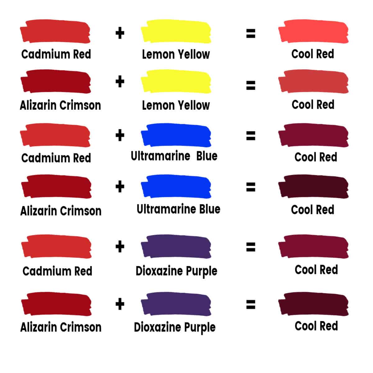
Ultimately, the question of what colors mix to make red leads back to the technical execution of a brand vision. Whether you are mixing 100% Magenta and 100% Yellow for a print run, or fine-tuning Hex codes for a mobile app, the goal is the same: clarity. A brand’s red should never be an accident of the printer or the screen. It should be a deliberate, calculated choice that reinforces the brand’s promise at every interaction.
By mastering the science of color mixing and the strategy of visual identity, a brand can ensure that its use of red is not just a coat of paint, but a powerful engine for recognition, trust, and long-term equity. In the competitive marketplace, the right mix of red can be the difference between blending in and standing out.
aViewFromTheCave is a participant in the Amazon Services LLC Associates Program, an affiliate advertising program designed to provide a means for sites to earn advertising fees by advertising and linking to Amazon.com. Amazon, the Amazon logo, AmazonSupply, and the AmazonSupply logo are trademarks of Amazon.com, Inc. or its affiliates. As an Amazon Associate we earn affiliate commissions from qualifying purchases.