
In the competitive landscape of the $70 billion global baby product industry, the most successful brands understand that their primary user—the infant—and their primary purchaser—the parent—experience the world through vastly different visual lenses. For designers, marketers, and brand strategists, the question of “what colors do babies see first” is not merely a biological curiosity; it is a fundamental pillar of product development and brand positioning.
Understanding the chronological unfolding of a newborn’s vision allows brands to create products that are not only aesthetically pleasing to the adult eye but are biologically optimized for the developing infant brain. This neuro-branding approach ensures that a toy, a book, or a piece of nursery decor serves its functional purpose of engagement, thereby fostering brand trust and long-term loyalty with the parents.
The Power of High Contrast: Why Black and White Dominate Early Branding
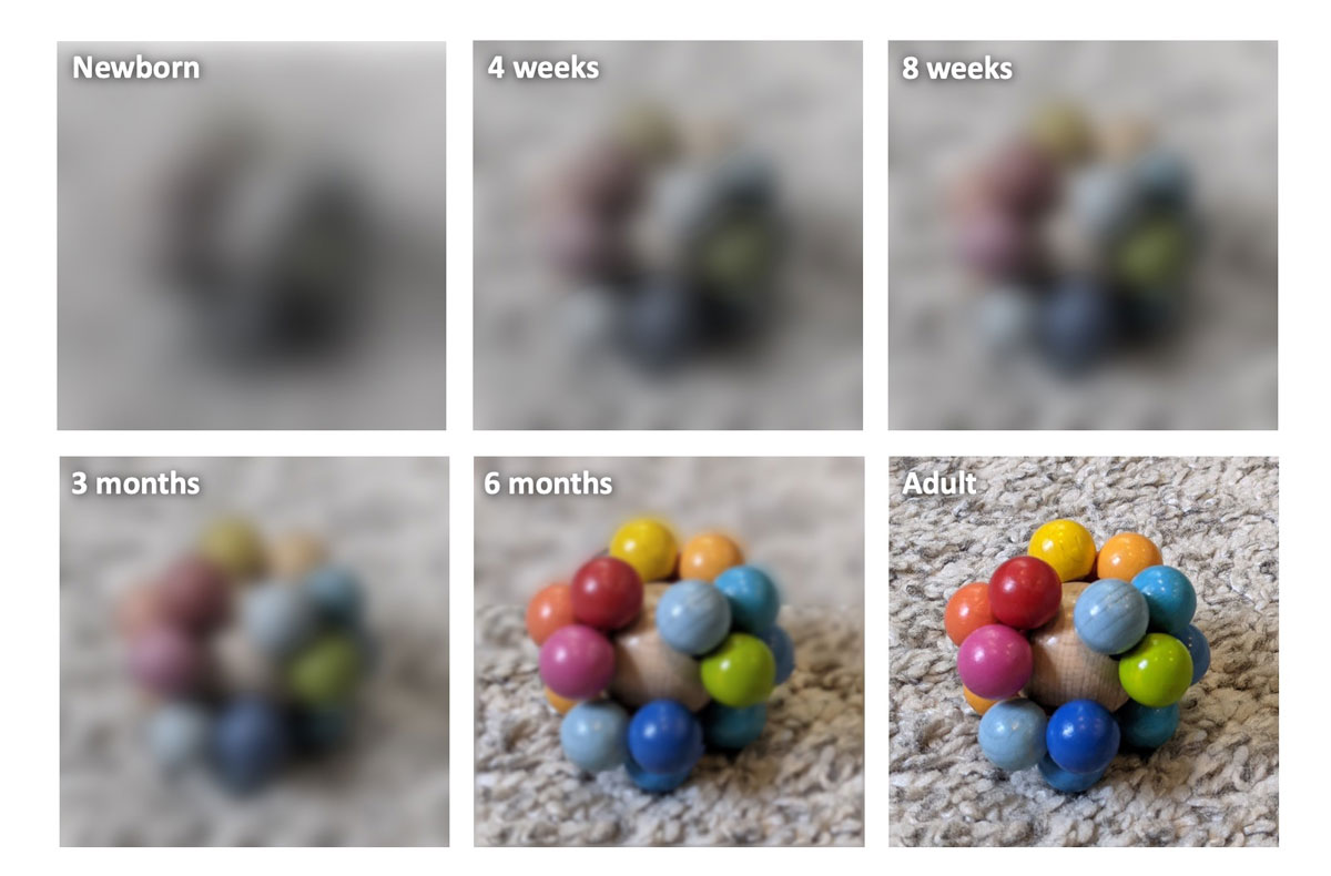
At birth, an infant’s visual system is the least developed of all their senses. The retina is not yet fully formed, and the brain’s visual cortex is still learning to interpret the signals it receives. Consequently, newborns see the world in shades of gray, with a limited focal range of about eight to twelve inches—roughly the distance from a baby’s face to their mother’s face during feeding.
The Biological Imperative of Contrast
For the first few weeks of life, a baby’s eyes are most sensitive to high-contrast patterns. While many modern “minimalist” brands lean into soft, muted beiges and “sad beige” aesthetics to appeal to the parent’s desire for home decor harmony, these palettes are virtually invisible to a newborn. From a brand strategy perspective, the use of high-contrast black and white is a functional necessity.
Research indicates that high-contrast visual stimulation triggers the secretion of neurotransmitters that aid in the development of the optic nerve. Brands like Lovevery and Manhattan Toy Company have built entire identities around this science. By utilizing stark, black-and-white geometric patterns, these brands communicate to the parent that their product is “brain-boosting.” The visual identity of the brand becomes synonymous with developmental progress.
Brand Recognition in the Crib
When a brand utilizes high-contrast patterns, it creates an immediate feedback loop between the infant and the product. Because the baby can actually see the pattern, they will stare at it longer, remain engaged, and show signs of “visual preference.” To a parent watching their child interact with a toy, this engagement is the ultimate social proof. The parent perceives the brand as effective, leading to positive word-of-mouth and repeat purchases. In this niche, the brand’s “design language” is dictated by the baby’s retinal capabilities.
The Introduction of Red: The First Color Milestone in Brand Strategy
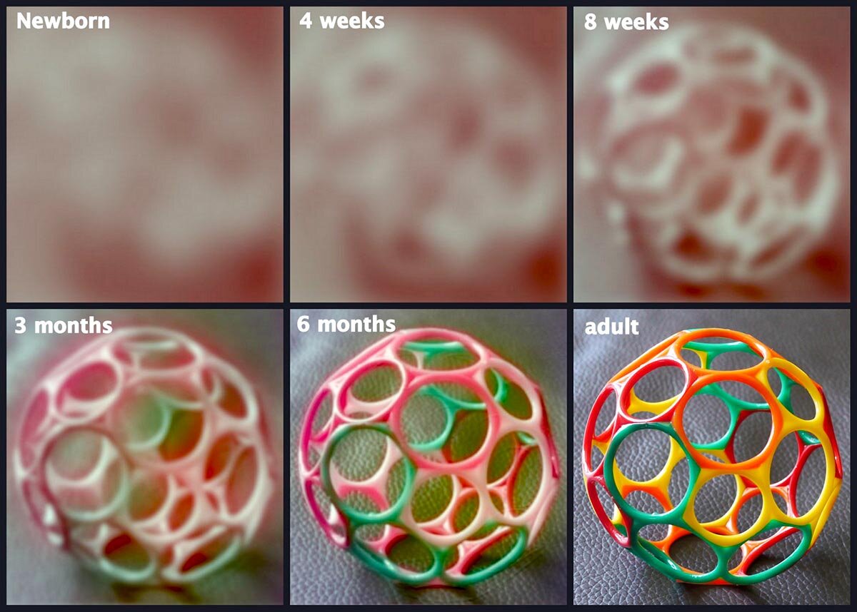
Between the ages of two and four months, a significant shift occurs in the infant’s visual perception. As the cones in the retina develop, the baby begins to see their first chromatic color. While there is some debate among researchers, the consensus is that red is the first color babies can distinguish, followed closely by green.
Red as a Signal and Stimulant
From a marketing and design standpoint, the introduction of red is a powerful tool. Red has the longest wavelength of all visible colors, making it the easiest for the developing eye to process. In the world of brand strategy, red is often used to signify urgency, excitement, and passion. In the world of infant branding, it serves as the first “hook” to transition a child from a monochromatic world into a color-filled one.
Strategic brands introduce red as an accent color in “Stage 2” products. If a mobile or a rattle features a high-contrast black-and-white base with a singular, vibrant red element, it provides a focal point that captures the infant’s attention more effectively than a rainbow of colors would. This targeted use of color prevents overstimulation while maximizing visual tracking.
Case Studies in Early Learning Aesthetics
Consider the iconic “Very Hungry Caterpillar” by Eric Carle. The brand identity of this literary giant relies heavily on the vibrant red of the caterpillar’s head set against a white background and green body. This is not accidental. The design mirrors the specific visual milestones of its target audience. By aligning brand assets with these developmental markers, the brand creates a timeless appeal that spans generations because it is rooted in human biology rather than fleeting design trends.
Emotional Resonance and Color Evolution: Moving Beyond Primary Hues
By the age of five to six months, an infant’s color vision is nearly as sophisticated as an adult’s. They can now distinguish between subtle shades of yellow, blue, and orange. This is the period where brand strategy must pivot. The focus shifts from simple “visual capture” to “emotional resonance.”
The Pivot to Pastels and Soothing Palettes
While high-contrast and primary colors are essential for toys and active engagement, the “nursery brand” segment often takes the opposite approach. Brands specializing in sleep aids, swaddles, and nursery furniture utilize soft blues, muted greens, and lavenders.
The strategy here is grounded in color psychology. Blue and green are shorter wavelengths that are perceived as calming. For a parent struggling with a newborn’s sleep schedule, a brand that promises a “calm environment” through its color palette is selling a solution to a pain point. The brand identity moves from being a “stimulator” (like a toy brand) to being a “facilitator” of rest.
Marketing Maturity: Balancing Baby Needs with Parental Preferences
The biggest challenge for brands in the infant space is the “dual-audience” dilemma. The product must appeal to the baby’s developmental needs, but the purchase decision is made by an adult who is likely influenced by contemporary design trends, social media aesthetics, and personal identity.
In recent years, we have seen a rise in “lifestyle” baby brands that move away from traditional “nursery” colors entirely. These brands use sophisticated earth tones—terracotta, sage, and ochre—which align with adult fashion trends. However, the most successful of these brands still incorporate high-contrast elements on the functional parts of the product (the parts the baby sees) while keeping the exterior shell aesthetically pleasing for the parent’s Instagram feed. This is a masterclass in hybrid branding: meeting biological requirements while satisfying cultural desires.
Strategic Application: Leveraging Vision Milestones for Product Longevity
A brand that understands the timeline of infant vision can create a tiered product strategy that grows with the child. This “staged” approach is excellent for customer retention and increasing the lifetime value (LTV) of a customer.
Packaging Design for the Developing Retina
The brand experience begins long before the product is out of the box. Packaging that utilizes the same high-contrast or color-milestone principles can stand out on a crowded retail shelf. If a parent sees a box with a bold, black-and-white sunburst pattern, they subconsciously associate it with early development.
Furthermore, “unboxing” experiences are increasingly important in the digital age. Brands that include high-contrast “flashcards” as part of their packaging are providing immediate value. They are moving from being a product provider to an educational partner. This builds a layer of brand authority that is difficult for competitors to replicate.
Sensory-Led Brand Identity
In the infant niche, the brand is the experience. Sensory branding involves more than just sight; it involves touch and sound. However, sight remains the primary driver of the initial interaction. By designing products that align with the 0-3 month (monochrome), 3-6 month (red/primary), and 6-12 month (full spectrum/depth perception) windows, brands can market themselves as “developmental experts.”
This expertise is a powerful brand asset. When a brand can explain why their toy is a specific color—referencing the development of the macula or the strengthening of the extraocular muscles—they move out of the “commodity” category and into the “trusted advisor” category. Parents are willing to pay a premium for products that they believe will give their child a developmental advantage.
The Future of Infant Branding in a Digital-First World
As we move further into a digital-centric era, the way babies interact with “brands” is changing. Screen time, while controversial, is a reality. Digital apps for infants often utilize the same high-contrast principles to capture attention. However, the future of brand strategy in this space lies in the balance between the digital and the physical.
Brands that can bridge the gap—perhaps through augmented reality (AR) that enhances a physical high-contrast book or toys that react to specific visual stimuli—will lead the next generation of the market. The core principle will remain the same: the brand must respect the biological limitations of its youngest users.

Conclusion: Biology as a Brand Strategy
“What colors do babies see first” is a question that leads to the heart of sensory-based marketing. For a brand to succeed in the infant space, it must discard the notion that design is purely subjective. In this niche, design is a science.
By starting with black and white to build focus, introducing red to spark interest, and eventually expanding into a full palette to evoke emotion, a brand mirrors the very growth of the human mind. This alignment creates a deep, almost subconscious connection with the consumer. It is a reminder that the most powerful brand strategies are those that are built on the foundations of human development. In the end, the brands that “see” what the baby sees are the ones that parents will eventually see as indispensable.
aViewFromTheCave is a participant in the Amazon Services LLC Associates Program, an affiliate advertising program designed to provide a means for sites to earn advertising fees by advertising and linking to Amazon.com. Amazon, the Amazon logo, AmazonSupply, and the AmazonSupply logo are trademarks of Amazon.com, Inc. or its affiliates. As an Amazon Associate we earn affiliate commissions from qualifying purchases.