
The Seasonal Palette: Defining Winter Hues
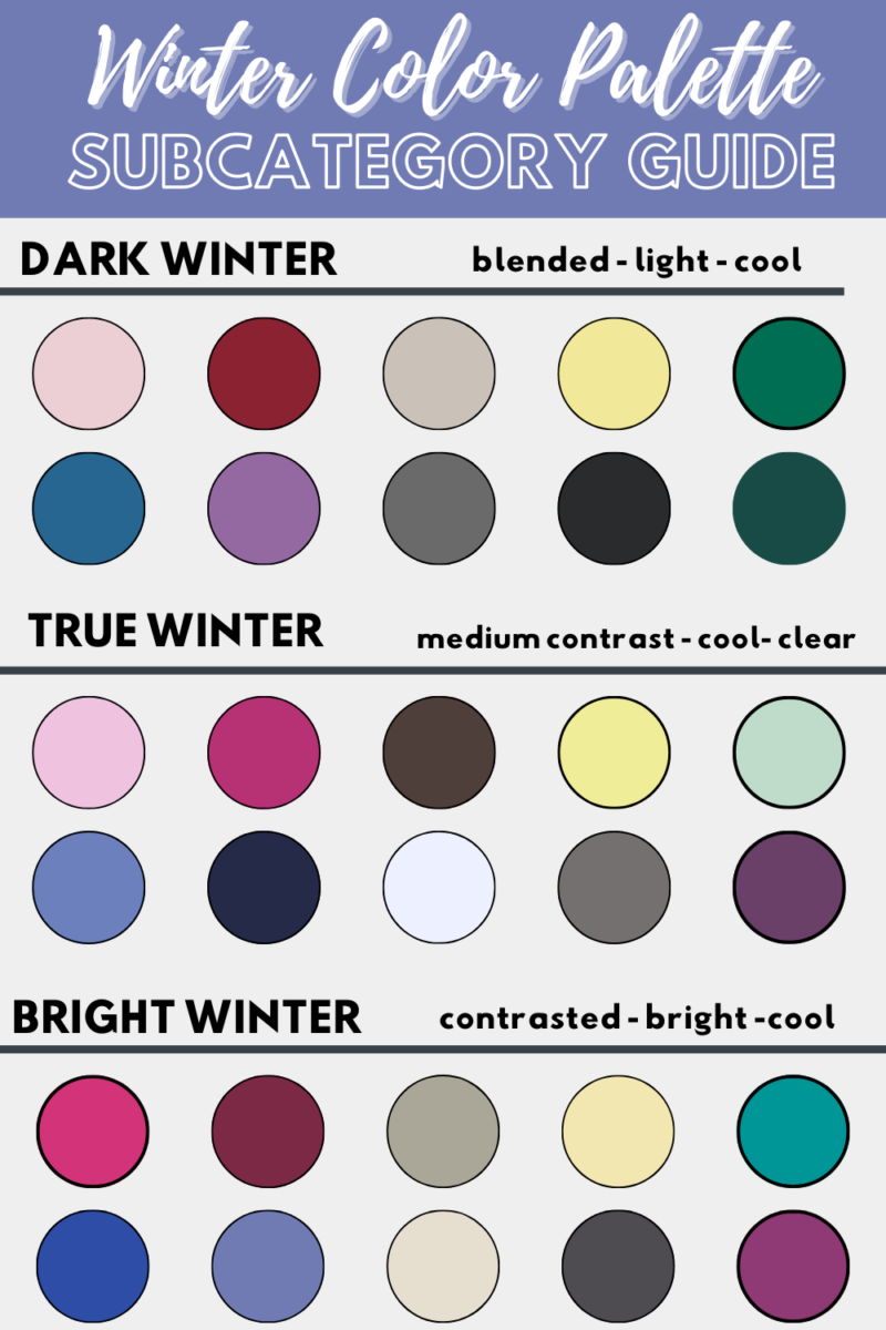
Winter colors are far more than just white and blue; they represent a rich tapestry of tones that evoke the season’s unique atmosphere, from crisp frosty mornings to cozy evenings by the fire. In the realm of branding and design, understanding these colors is crucial for resonating with audiences during a significant portion of the year. Fundamentally, winter palettes are characterized by their coolness, depth, and often, their muted yet sophisticated intensity.
Evoking Emotion and Atmosphere
The perception of winter colors is deeply rooted in human experience and natural phenomena. Think of the stark beauty of a snow-covered landscape: brilliant whites, deep charcoal grays, and icy blues dominate. These natural elements form the core of the winter color spectrum. However, the season also brings forth the warmth of firelight, the richness of evergreen foliage, and the deep reds and burgundies associated with holiday celebrations and cozy interiors.
Psychologically, winter colors often communicate feelings of calm, introspection, elegance, and reliability. They can convey a sense of gravitas and tradition, or conversely, a fresh, minimalist purity. A brand leveraging these hues can aim to instill trust, project an image of luxury, or simply create a comforting and familiar presence during the colder months.

Beyond the Obvious: Shades and Tones
While the stereotypical winter colors like ice blue, snow white, and silver are prevalent, the true depth of a winter palette extends much further.
- Cool Neutrals: Beyond pure white, there are off-whites like ecru, cream, and bone that suggest warmth and softness against the starkness. Grays range from light mist to deep charcoal and slate, offering sophisticated backdrops or primary tones. Blacks, particularly rich, deep matte blacks, convey luxury and authority.
- Deep Blues: From sapphire and navy to indigo and deep teal, these blues reflect the depths of winter skies and frozen waters. They are often associated with professionalism, stability, and calm.
- Jewel Tones: Ruby red, emerald green, amethyst purple, and deep amber provide a luxurious counterpoint to the cooler tones. These colors evoke warmth, celebration, and richness, particularly relevant during the holiday season.
- Earthy Undertones: While winter is cool, it also includes the browns of bare trees, the deep forest greens, and even muted rusts and golds that signify the enduring nature of the season. These add a grounding, organic quality to winter palettes.
The Psychology of Winter Colors in Branding
The strategic selection of winter colors in branding is far from arbitrary; it’s a calculated move to tap into specific consumer emotions and perceptions. Colors have a profound impact on how a brand is perceived, influencing everything from purchase decisions to brand loyalty. For the winter season, this becomes particularly potent.
Trust, Luxury, and Serenity
Winter color palettes naturally lend themselves to conveying qualities such as trust and luxury. The prevalence of deep blues, rich grays, and crisp whites often aligns with industries seeking to project stability, professionalism, and high quality. Financial institutions, high-end fashion brands, and luxury automotive companies frequently gravitate towards these palettes for their inherent sophistication.
The serenity often associated with winter — quiet landscapes, peaceful evenings — can also be communicated through muted blues, soft grays, and warm off-whites. Brands focusing on wellness, home goods, or comfort can effectively use these tones to create an inviting and calming brand presence. This psychological connection helps build an emotional bridge with the consumer, fostering a sense of reliability and comfort during a season that can often feel harsh or demanding.
Driving Consumer Behavior
Beyond simple aesthetic appeal, winter colors can directly influence consumer behavior. The festive reds and greens, when deployed strategically during the holiday shopping season, are powerful motivators, evoking feelings of excitement, generosity, and tradition that drive gift-giving. Similarly, the cool, crisp tones used by technology brands or sportswear during winter launches can signal innovation, performance, and cutting-edge design, appealing to desires for improvement and newness as the year draws to a close or begins anew.
Brands can also use winter palettes to subtly suggest warmth and escape. For travel companies, images of snowy resorts paired with warm, inviting interior shots, utilizing deep reds and golden hues, can stimulate desires for a cozy getaway. For beverage brands, the use of rich browns and creams can evoke the comfort of hot chocolate or seasonal lattes, directly linking the color palette to the product’s sensory experience. The deliberate choice of a winter color story allows brands to guide the emotional landscape of their campaigns and products, fostering specific responses from their target audience.
Strategic Application Across Industries
The versatility of winter colors means they can be adapted and applied across a multitude of industries, each finding unique ways to leverage these seasonal aesthetics for brand enhancement and market penetration.
Fashion and Retail: Seasonal Collections
Perhaps no industry embraces winter colors more overtly than fashion and retail. Seasonal collections are built entirely around the prevailing mood and color trends of winter. Designers utilize deep jewel tones for evening wear, muted earth tones for knitwear, and classic monochromes for outerwear. Retailers translate these palettes into store displays, window dressing, and packaging, creating an immersive shopping experience that aligns with the season.

Beyond clothing, accessories, home decor, and even seasonal food products adopt winter color schemes. A holiday-themed coffee blend might feature packaging with deep reds, greens, and gold, while a winter skincare line could opt for serene blues, whites, and silvers to convey purity and hydration. The key is to create a cohesive visual narrative that reflects the product’s function, target audience, and the seasonal context.
Digital and Content Marketing: Visual Resonance
In the digital realm, winter colors play a crucial role in maintaining brand relevance and engagement. Websites, social media campaigns, email newsletters, and online advertisements all benefit from incorporating seasonal palettes. A brand’s online presence can feel stale if it doesn’t visually adapt to the time of year.
For content marketing, visuals using winter colors can significantly increase engagement. Imagine a blog post about winter wellness tips using soft blues and whites for its header image, or a recipe video for a holiday meal featuring rich reds and greens in its set design. These visual cues immediately resonate with the audience’s current context, making the content feel more timely and relevant. Furthermore, consistent application of a winter palette across digital touchpoints reinforces brand identity and creates a harmonious user experience.
Corporate Identity and Event Branding
While often associated with specific campaigns, winter colors can also inform more permanent aspects of corporate identity, particularly for brands that have a strong seasonal connection or want to convey specific attributes year-round. A ski resort, for example, would naturally incorporate blues, whites, and silvers into its core logo and branding. A luxury brand might lean into deep, sophisticated winter tones as part of its timeless appeal.
For event branding, especially during the colder months, winter palettes are essential. Winter weddings, corporate holiday parties, or New Year’s galas all benefit from carefully curated color schemes. From invitations and décor to lighting and catering presentations, the consistent use of winter colors—be it frosty pastels, opulent jewel tones, or stark monochromes—creates a memorable and cohesive event experience that enhances the overall brand perception of the hosts or organizers.
Crafting a Brand Narrative with Winter Palettes
Integrating winter colors effectively into a brand’s narrative requires more than simply swapping out a summer palette. It demands thoughtful consideration of the brand’s core values, target audience, and overall messaging. The goal is to create a seamless visual story that enhances, rather than distracts from, the brand’s essence.
Consistency and Adaptability
A crucial aspect of using winter colors in branding is maintaining consistency while allowing for seasonal adaptability. A brand shouldn’t undergo a complete identity overhaul every season. Instead, winter palettes should be seen as extensions or variations of the core brand colors. This might involve introducing warmer or cooler shades of existing brand colors, or strategically adding accent colors that resonate with the winter theme.
For example, a brand with a primary blue logo might shift to a deeper navy or an icy sky blue for winter campaigns, perhaps introducing silver or a muted plum as a secondary accent. This approach ensures brand recognition remains strong while demonstrating an understanding of the seasonal context. It communicates to consumers that the brand is thoughtful, dynamic, and connected to their current experiences.
The Power of Contrast and Accent
Winter palettes often benefit immensely from strategic contrast and the intelligent use of accent colors. The inherent depth and coolness of many winter hues can be beautifully offset by a bright, warm accent. A largely monochromatic scheme of grays and whites might be invigorated by a pop of cranberry red or a splash of metallic gold, drawing the eye and adding a touch of festive energy or luxurious appeal.
Conversely, a palette rich in deep jewel tones can be grounded by crisp whites or charcoal grays, preventing it from becoming overwhelming. Understanding how to balance primary winter colors with effective accent hues is key to creating dynamic and engaging brand visuals that capture the spirit of the season without sacrificing clarity or sophistication. This balance helps brands to stand out in a crowded market, especially during peak seasonal shopping periods, by offering visual delight and a clear message.
Future Trends and Timeless Appeal
While certain winter colors possess timeless appeal, trends in design and branding continuously evolve, influencing how these seasonal palettes are interpreted and applied. Brands that stay attuned to these shifts can ensure their winter messaging remains fresh and relevant.
The core elements of winter — coolness, depth, and a touch of warmth — will always define its color story. However, the specific shades and combinations that gain prominence can change. In recent years, there’s been a growing emphasis on muted, sophisticated tones, often drawing inspiration from nature, such as frosted greens, stony grays, and deep, earthy browns. There’s also a rising trend towards sustainability-focused aesthetics, which translates into more organic and less overtly artificial color choices, even within winter palettes.
At the same time, the timeless allure of classic winter combinations — think sophisticated navy and white, luxurious gold and crimson, or elegant silver and charcoal — remains undiminished. These enduring palettes provide a reliable foundation for brands seeking to convey tradition, quality, and a sense of permanence.
Ultimately, for any brand, the most effective use of winter colors will blend an understanding of timeless seasonal associations with an awareness of current design sensibilities. This allows brands to create marketing campaigns and product designs that feel both familiar and fresh, resonating deeply with consumers and reinforcing a strong, adaptable brand identity through every season. By thoughtfully curating their winter color story, brands can ensure their message not only captures the essence of the season but also continues to build equity and connection with their audience long into the future.
aViewFromTheCave is a participant in the Amazon Services LLC Associates Program, an affiliate advertising program designed to provide a means for sites to earn advertising fees by advertising and linking to Amazon.com. Amazon, the Amazon logo, AmazonSupply, and the AmazonSupply logo are trademarks of Amazon.com, Inc. or its affiliates. As an Amazon Associate we earn affiliate commissions from qualifying purchases.