
In the intricate tapestry of personal branding and corporate identity, every detail contributes to the overarching narrative you wish to convey. While a well-tailored suit forms the canvas, the choice of shirt and tie acts as the focal point, a strategic accent that can subtly yet powerfully influence perception. The blue shirt, a ubiquitous staple in professional wardrobes, offers a versatile foundation. However, selecting the right tie color is not merely a matter of aesthetic preference; it is a deliberate act of visual communication, an extension of your personal brand strategy that can reinforce trust, authority, creativity, or approachability.

This isn’t about fleeting fashion trends but about understanding the timeless psychology of color and its application in professional settings. Your tie choice, when paired with a blue shirt, directly impacts how your competence, reliability, and leadership qualities are perceived by clients, colleagues, and stakeholders, making it a critical component of your professional image and, by extension, your organization’s brand representation.
The Psychology of Color in Professional Attire
Colors speak a language that transcends words. In the realm of personal branding, understanding this non-verbal communication is paramount. Each hue carries inherent psychological associations, and when strategically employed, these can significantly amplify or detract from your intended message. With a blue shirt, you’re starting from a position of strength, but the tie selection dictates the specific nuance of your brand statement.
Blue’s Foundational Message
A blue shirt, particularly in shades of light blue or navy, is a cornerstone of professional attire for good reason. Blue inherently signifies trust, stability, reliability, and competence. It’s calming, authoritative without being aggressive, and universally perceived as professional. This makes it an excellent base for building a strong personal brand, as it immediately establishes a foundation of credibility.
Color Perception and Its Impact
When you introduce a tie, you’re layering another set of psychological cues. The contrast and harmony between the blue shirt and the tie color will dictate the dynamic of your presentation. Are you aiming for an impression of vibrant leadership, understated sophistication, or innovative thought? Each color combination offers a unique opportunity to fine-tune your brand’s visual identity. Misaligning these colors can lead to conflicting messages, undermining the clarity and impact of your personal brand. For instance, a tie that clashes or appears overly casual might inadvertently communicate a lack of attention to detail or seriousness, directly impacting perceptions of professionalism and competence.
Classic Combinations for Timeless Branding
Certain tie colors, when paired with a blue shirt, have stood the test of time not just for their aesthetic appeal but for their consistent ability to communicate powerful and positive professional brand attributes. Mastering these combinations provides a strong foundation for any personal branding strategy.
Red Ties: Power, Confidence, and Authority
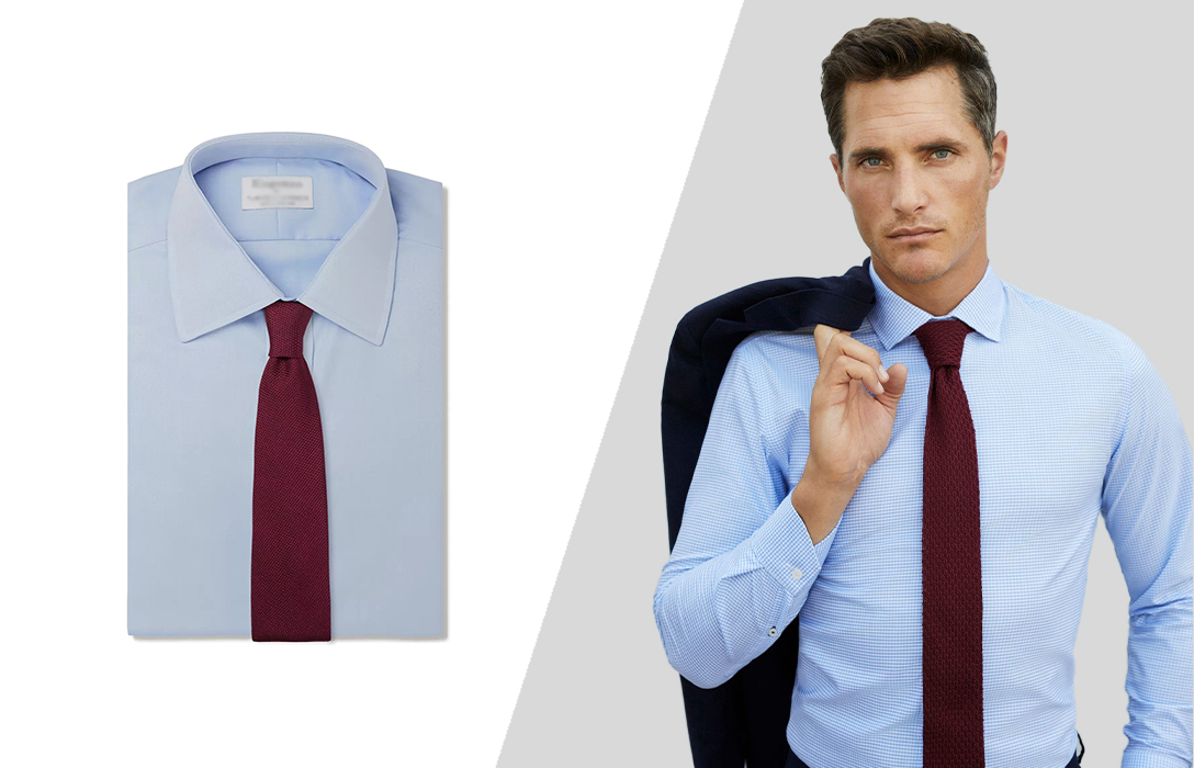
A red tie, especially in shades of crimson, burgundy, or a deep claret, with a blue shirt is a perennial favorite for those seeking to project leadership and strong resolve. Red is a high-impact color, symbolizing passion, energy, and determination. When paired with the trustworthy nature of blue, it creates a balanced yet commanding presence.
- Brand Message: This combination is ideal for situations where you need to assert authority, demonstrate confidence, and convey a sense of decisive leadership. Think high-stakes negotiations, public speaking engagements, or leading critical meetings. It subtly tells observers that you are in control and capable of making impactful decisions. For a personal brand seeking to embody dynamic leadership, a red tie is an indispensable tool.
- Corporate Alignment: Organizations that value strong leadership, results-driven initiatives, and a forward-thinking approach will find their brand values echoed in an individual who confidently wears this pairing.
Navy and Deeper Blues: Trust, Stability, and Sophistication
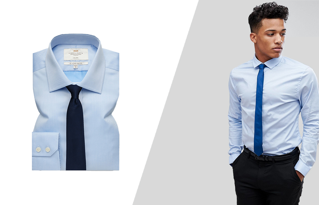
Choosing a tie in a darker shade of blue, such as navy, royal blue, or even patterns incorporating these hues, with a lighter blue shirt creates a monochromatic, sophisticated, and incredibly trustworthy look. This combination reinforces the inherent qualities of blue while adding depth and seriousness.
- Brand Message: This pairing speaks volumes about reliability, strategic thinking, and a calm, collected demeanor. It’s less about overt power and more about consistent competence and deep understanding. It projects an image of someone grounded, dependable, and profoundly professional. This is excellent for building long-term client relationships or showcasing a steady hand in complex situations.
- Corporate Alignment: Companies whose brand pillars are built on integrity, tradition, and enduring quality will find this choice perfectly aligns with their ethos, promoting an image of steadfast professionalism.
Grey and Silver Tones: Professionalism and Modernity
Grey and silver ties, ranging from charcoal to light silver, offer a sleek, modern, and highly professional complement to a blue shirt. These colors are neutral but impactful, conveying sophistication without overt declaration.
- Brand Message: A grey or silver tie communicates a keen eye for detail, a refined sense of style, and an analytical mind. It projects an image of competence, balance, and contemporary professionalism. This is an excellent choice for roles requiring precision, strategic foresight, or a more understated yet impactful presence. It suggests a brand that is thoughtful, precise, and forward-looking.
- Corporate Alignment: Tech companies, financial institutions, or any brand emphasizing innovation, efficiency, and cutting-edge professionalism will find this combination perfectly aligns with their brand values, presenting individuals who embody these traits.
Strategic Color Choices for Specific Brand Messages
Beyond the classics, certain tie colors can be strategically deployed to infuse your personal brand with more specific attributes, catering to particular contexts or desired perceptions. These choices require a deeper understanding of color psychology and a confident hand in execution.
Green Ties: Growth, Harmony, and Innovation
Green ties, in shades from deep forest to vibrant emerald, can add a unique dimension to a blue shirt, especially if chosen carefully. Green is strongly associated with growth, renewal, balance, and often, wealth.
- Brand Message: Wearing a green tie can subtly communicate an affinity for growth, sustainability, or an innovative, harmonious approach. It suggests a personal brand that is fresh, forward-thinking, and perhaps environmentally conscious or focused on development. It’s a less conventional choice than red or navy, thus signaling a degree of individuality and creative confidence.
- Corporate Alignment: Ideal for individuals in sectors like sustainable technology, venture capital, or roles focused on organizational development and human resources, where fostering growth and balance is key.
Purple Ties: Creativity, Luxury, and Ambition
Purple, a color historically associated with royalty and luxury, offers a sophisticated and artistic contrast to a blue shirt. From deep plum to vibrant lavender, purple communicates creativity, ambition, and a touch of refined flair.
- Brand Message: A purple tie with a blue shirt signifies a personal brand that values innovation, creative problem-solving, and a degree of refined individuality. It suggests ambition tempered with thoughtfulness, and a willingness to think outside the box. This is an excellent choice for creative professionals, leaders in innovation, or those looking to convey a sense of unique vision and sophisticated taste.
- Corporate Alignment: Suited for roles in creative industries, design, high-end consulting, or leadership positions where a unique vision and a sophisticated approach are highly valued.
Patterned Ties: Adding Personality and Nuance
While solid ties make direct statements, patterned ties offer an opportunity to infuse more personality and nuance into your brand message without sacrificing professionalism. Stripes, subtle paisleys, geometric patterns, or foulards can break up the monotony and add visual interest.
- Brand Message: The choice of pattern can fine-tune your brand message. A subtle stripe might reinforce dynamism and forward momentum, while a sophisticated paisley could suggest an appreciation for tradition and refined complexity. Geometric patterns can convey a modern, analytical approach. The key is to ensure the pattern and its colors harmonize with the blue shirt and your overall brand objective, avoiding anything too busy or distracting. The scale of the pattern should also be considered – smaller, more intricate patterns often read as more sophisticated and professional.
- Corporate Alignment: Patterned ties allow for greater alignment with a diverse range of corporate cultures, from traditional to more creative environments, provided the patterns chosen reflect the appropriate level of formality and brand personality.
Beyond Color: Texture, Fabric, and Fit in Brand Reinforcement
While color is a primary driver of perception, the efficacy of your personal branding through attire extends to the tactile and structural elements of your tie. Neglecting texture, fabric quality, and proper fit can inadvertently undermine the powerful message your chosen tie color aims to convey, diminishing the overall polish and credibility of your professional image.
The Subtlety of Texture
Texture adds another layer of sophistication and depth to your tie choice. A smooth silk tie projects sleek professionalism and formality, ideal for high-stakes corporate environments. A grenadine or knit tie, with its subtle weave, can convey a more approachable yet still refined demeanor, suitable for creative industries or less formal business settings where smart casual is acceptable.
- Brand Message: A tie’s texture communicates your attention to detail and understanding of appropriate context. A rich texture can suggest a discerning taste and an appreciation for quality, subtly reinforcing a brand message of excellence and meticulousness. Conversely, a cheap or flimsy texture can detract from even the most powerful color choice, hinting at a lack of care or investment in one’s presentation.
Fabric’s Role in Perceived Quality
The fabric of your tie is intrinsically linked to its perceived quality and, by extension, to your personal brand’s perceived value. High-quality silk, wool, or linen ties drape better, hold their shape, and possess a luster that synthetic alternatives often lack.
- Brand Message: Investing in quality fabrics for your ties signals a brand that values excellence and durability. It subtly communicates that you pay attention to the finer details and possess a discerning eye, qualities often associated with reliability and high performance in professional roles. This reinforces a brand narrative of professionalism and a commitment to quality in all aspects.
The Imperative of Fit
Even the most thoughtfully chosen tie color and fabric can be undone by improper fit. A tie that is too long or too short, or a knot that is disproportionate to your collar, can create an unpolished and unprofessional appearance. The tip of your tie should ideally rest at your belt buckle.
- Brand Message: Proper fit in all aspects of your attire, including your tie, demonstrates attention to detail, self-awareness, and respect for professional standards. It conveys a personal brand that is put-together, organized, and meticulous. An ill-fitting tie, regardless of its color or fabric, can inadvertently signal a lack of attention to detail or a casual approach, which can be detrimental to a professional image.
Ultimately, the choice of what color tie to wear with a blue shirt is a strategic decision in personal branding. It’s an opportunity to leverage color psychology, texture, fabric, and fit to construct a powerful visual narrative that supports your professional goals, reinforces your core competencies, and aligns with the corporate identity you represent. By making deliberate choices, you ensure your attire is not just clothing, but a potent instrument in shaping perception and elevating your brand.
aViewFromTheCave is a participant in the Amazon Services LLC Associates Program, an affiliate advertising program designed to provide a means for sites to earn advertising fees by advertising and linking to Amazon.com. Amazon, the Amazon logo, AmazonSupply, and the AmazonSupply logo are trademarks of Amazon.com, Inc. or its affiliates. As an Amazon Associate we earn affiliate commissions from qualifying purchases.