
The Psychological Impact of Color in Brand Identity
Color is far more than just an aesthetic choice; it’s a powerful, subconscious communicator that profoundly influences perception, emotion, and decision-making. In the competitive landscape of branding and marketing, understanding the psychological impact of color is paramount. It forms a crucial cornerstone of corporate identity, shaping how consumers feel about a brand, the values they associate with it, and ultimately, their willingness to engage. The selection of color is not arbitrary; it’s a strategic decision designed to evoke specific responses and foster a desired brand image. When a brand aims to convey strength, resilience, power, and reliability, the strategic application of certain colors becomes an indispensable tool. This article delves into the colors that most effectively symbolize strength within the realm of branding and marketing, exploring their psychological underpinnings and their successful implementation in creating impactful brand identities.

Understanding the Spectrum of Strength: Beyond the Obvious
While certain colors are universally recognized for their association with strength, it’s crucial to recognize that the perception of strength can be nuanced. It’s not solely about brute force or unyielding power; it can also encompass stability, endurance, wisdom, and even controlled passion. Therefore, the colors that symbolize strength often carry these multifaceted meanings.
The Dominance of Red: Passion, Power, and Urgency
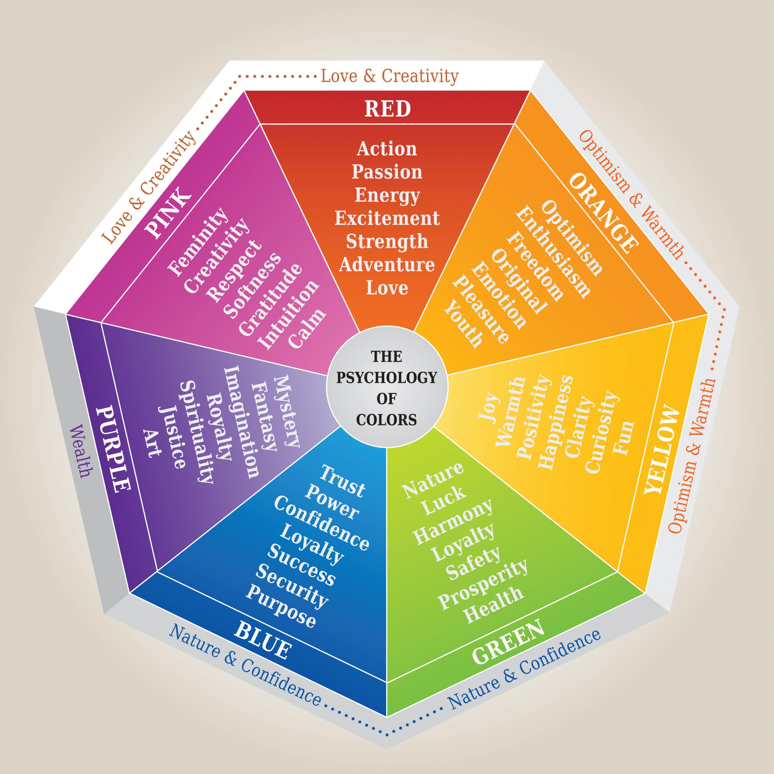
Red is arguably the most potent and universally recognized color for symbolizing strength, power, and passion. Its vibrancy commands attention and triggers a primal physiological response, increasing heart rate and energy levels. In branding, red is often employed by companies aiming to project dynamism, courage, and leadership. It’s a color of action, and by extension, of decisive strength.
Red in Action: Brands That Command Attention
Think of iconic brands that utilize red prominently in their logos and marketing. Red Bull, for instance, uses red to evoke energy, excitement, and a sense of pushing boundaries – the very essence of its product. Coca-Cola, a titan of the beverage industry, uses red to convey warmth, excitement, and a long-standing tradition of robust performance. Ferrari, the epitome of automotive power and speed, famously employs its signature red, a color that instantly communicates performance, passion, and an unshakeable sense of dominance on the road and track. These brands leverage red not just for its visual appeal but for its inherent ability to stir emotions and create a lasting impression of power and vitality.
The Steadfastness of Blue: Trust, Stability, and Authority
While red often signifies outward, dynamic strength, blue represents a more enduring, stable, and authoritative form of power. It is a color deeply associated with trust, reliability, and intelligence. This makes it a popular choice for industries where security, professionalism, and dependability are paramount, such as finance, technology, and law. Blue can convey a sense of calm control, unwavering commitment, and profound competence – all indicators of a strong and stable entity.
Blueprints of Trust: Corporations Built on Blue
Many of the world’s largest and most respected corporations have built their brand identity around shades of blue. IBM, with its iconic blue “Big Blue” moniker, projects an image of unwavering reliability and technological prowess. Ford, a company with a legacy of manufacturing strength and enduring presence, uses blue to signify its trustworthiness and commitment to quality. Even social media giants like Facebook and Twitter (now X) utilize blue, leveraging its association with communication, community, and a stable platform. This consistent use of blue underscores its power in establishing credibility and a sense of dependable strength in the minds of consumers.
The Grounded Power of Black: Sophistication, Formality, and Enduring Presence
Black, often perceived as the absence of light, carries a powerful symbolism of authority, sophistication, elegance, and enduring strength. It is a color that conveys a sense of seriousness, formality, and unshakeable presence. In branding, black can communicate a brand’s established position, its premium quality, and its timeless appeal. It suggests a brand that is confident, self-assured, and has the underlying substance to withstand trends and time.
Mastering the Dark: Luxury and Authority in Black
Luxury brands frequently employ black to convey exclusivity, sophistication, and a refined sense of power. Chanel, with its iconic black packaging and little black dress, epitomizes timeless elegance and an indomitable brand spirit. Apple, while often associated with silver and white, has frequently used black in its product design and marketing, particularly for its high-end devices, to signify sleekness, power, and premium quality. The automotive industry also relies on black for its association with power, luxury, and commanding presence, with many high-performance vehicles opting for a black finish to amplify their inherent strength.
The Nuances of Strength: Secondary Colors and Their Impact
While red, blue, and black are often the primary contenders for symbolizing strength, other colors, when used strategically or in combination, can contribute to this perception. Understanding these nuances allows for more sophisticated and targeted branding efforts.
The Resilient Gold: Prestige, Victory, and Enduring Value
Gold, representing wealth, prestige, and victory, can also symbolize a unique form of strength – the strength of achievement and enduring value. It speaks to a brand that has earned its position, that possesses intrinsic worth, and that has a proven track record of success. Gold evokes a sense of triumph and a lasting legacy.
The Gleam of Success: Brands Adorned in Gold
Brands that aim to project an image of ultimate quality, exclusive achievement, or long-standing excellence might incorporate gold into their branding. Think of awards ceremonies, where gold medals signify peak performance, or high-end watch manufacturers that use gold to denote craftsmanship and a legacy of horological strength. While not as common as red or blue for general strength, gold’s association with victory and enduring value makes it a potent symbol of a brand that has achieved a high echelon of strength and recognition.
The Boldness of Orange: Energy, Enthusiasm, and Determined Resilience
Orange, a vibrant and energetic color, can represent a more dynamic and enthusiastic form of strength. It combines the passion of red with the cheerfulness of yellow, creating a sense of determined optimism and can-do attitude. Orange can symbolize a brand’s boldness, its willingness to take risks, and its ability to overcome challenges with spirited resilience.
The Spark of Determination: Brands Fueled by Orange
Companies that want to project innovation, youthful energy, and an unyielding spirit might leverage orange. Nickelodeon, with its bright orange logo, embodies fun, creativity, and a playful yet persistent energy. Harley-Davidson, while often associated with black and chrome, has used orange in some of its branding and apparel, symbolizing the bold, adventurous, and enduring spirit of its riders and their machines. Orange signifies a strength that is not just about power but about an energetic and optimistic drive to succeed.
Strategic Application: Color Palettes and Brand Consistency
The effectiveness of color in symbolizing strength is not solely about the individual color itself, but also about how it is integrated into a comprehensive brand identity. This involves careful consideration of color palettes, brand guidelines, and consistent application across all touchpoints.
Crafting the Perfect Palette: Harmony and Impact
A brand’s color palette is a deliberate selection of hues that work together to create a cohesive and impactful message. When aiming to convey strength, the primary color chosen for its symbolic meaning (e.g., red for power) might be paired with secondary colors that reinforce or complement this message. For instance, a strong blue might be softened with a touch of white for clarity and professionalism, or a bold red might be grounded with a darker, more sophisticated shade. The interplay of colors within a palette is crucial for creating a balanced yet powerful brand presence.
Consistency is Key: Reinforcing Strength Across All Platforms
The message of strength, once established through color, must be consistently reinforced across all brand touchpoints. This includes logos, websites, social media profiles, packaging, marketing collateral, and even the physical environments associated with the brand. Inconsistency in color usage can dilute the intended message, leading to confusion and a weakened brand perception. A strong brand ensures that every visual interaction with its audience aligns with its core message, solidifying its image as a powerful and reliable entity. This unwavering consistency is a testament to the brand’s own internal strength and its commitment to delivering a unified experience.

Conclusion: The Enduring Power of Color in Brand Messaging
In the complex tapestry of branding and marketing, color stands as one of the most potent and subtle tools for communicating a brand’s essence. When the aspiration is to symbolize strength, a deliberate and informed approach to color selection is not just beneficial; it is indispensable. From the commanding presence of red to the steadfast reliability of blue, the sophisticated authority of black, the prestigious gleam of gold, and the determined energy of orange, each color offers a unique facet of strength. By understanding the psychological nuances of these hues and strategically applying them within well-crafted color palettes and consistent brand guidelines, businesses can forge powerful identities that resonate deeply with their audiences, projecting an image of resilience, confidence, and enduring strength in the marketplace.
aViewFromTheCave is a participant in the Amazon Services LLC Associates Program, an affiliate advertising program designed to provide a means for sites to earn advertising fees by advertising and linking to Amazon.com. Amazon, the Amazon logo, AmazonSupply, and the AmazonSupply logo are trademarks of Amazon.com, Inc. or its affiliates. As an Amazon Associate we earn affiliate commissions from qualifying purchases.