
In the competitive landscape of modern marketing, color is rarely just an aesthetic choice; it is a silent ambassador for a brand’s values, heritage, and positioning. When a designer or brand strategist asks, “What color is pewter?” they are rarely looking for a simple RGB value. Instead, they are exploring a nuanced territory of visual communication that sits comfortably between the industrial strength of charcoal and the luminous sophistication of silver.
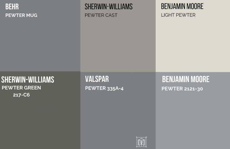
Pewter is a deep, muted gray with slight blue or green undertones, mimicking the appearance of the tin-based alloy from which it takes its name. In the context of brand strategy and corporate identity, pewter represents a “mature neutral.” It is a color that commands respect without demanding attention, making it one of the most versatile tools in a brand designer’s arsenal.

The Anatomy of Pewter: Defining the Brand Palette
To utilize pewter effectively within a brand’s visual identity, one must first understand its technical composition and how it differs from standard grays. Pewter is characterized by its “low-chroma” nature, meaning it lacks intense saturation, which allows it to function as a sophisticated anchor for more vibrant accent colors.
The Digital DNA: Hex Codes and Values
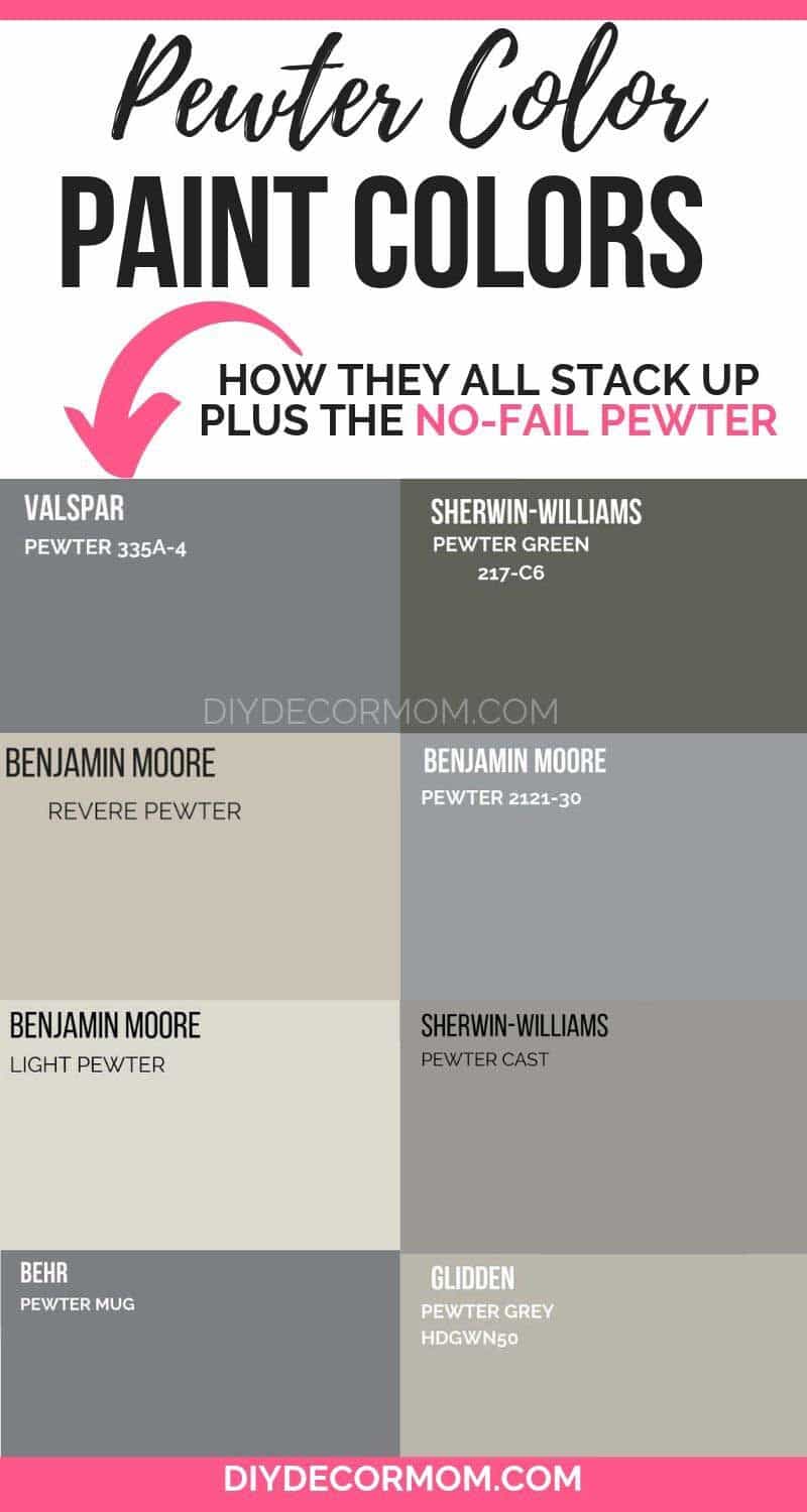
In digital branding, “pewter” isn’t a single fixed point but a spectrum. Typical pewter shades range from Hex #898176 (a warmer, more traditional metallic) to #999DA0 (a cooler, more modern silver-gray). Understanding these variations is crucial for maintaining brand consistency across various platforms, from high-resolution retina displays to physical product packaging.
The Balance of Warmth and Coolness
Unlike “Cool Gray,” which can often feel clinical or sterile, pewter often carries a microscopic hint of warmth. This subtle shift makes it feel more “human” and “established.” For a brand, this distinction is vital. A cool gray might suggest a startup in the biotech space, whereas a pewter-based palette suggests a brand with “gravitas”—something that has been around and intends to stay.
Texture and the Illusion of Metal
In branding, the “color” of pewter is often tied to the “texture” of pewter. Brand strategists often use matte finishes or brushed-metal gradients to evoke the physical properties of the alloy. This tactile association communicates durability and craftsmanship, qualities that are highly prized in luxury and artisanal sectors.
The Psychology of Pewter in Branding
Every color evokes a psychological response. While red triggers urgency and blue fosters trust, pewter occupies a unique space of “Stately Reliability.” It is the color of the middle ground—not as stark as black, nor as clinical as white.
Sophistication and Understated Luxury
In the luxury market, “loud” colors are often eschewed in favor of “quiet luxury.” Pewter is the epitome of this trend. It suggests wealth that doesn’t need to shout. Brands that use pewter in their logos or primary palettes are often signaling a high level of expertise and a focus on quality over flashiness.
Stability and Resilience
Because pewter is historically associated with metalwork and durable household goods, the color carries an evolutionary connotation of strength. In an era of economic volatility, brands in the financial or consulting sectors often lean into pewter tones to subconsciously reassure clients of their stability and long-term resilience.
Timelessness vs. Trendiness
Fads come and go—Neons might be “in” one year and “out” the next. Pewter, however, is a timeless neutral. By centering a brand strategy around pewter, a company protects itself from looking dated. It provides a flexible foundation that can be modernized with trending accent colors (like a vibrant “Digital Lavender” or a “Cyber Lime”) without needing a full rebrand.
Implementing Pewter in Corporate Identity
Integrating pewter into a corporate identity requires a strategic eye for contrast and application. It is rarely used in isolation; rather, it serves as the “hero neutral” that defines the brand’s atmosphere.
Logo Design and Typography
When used in typography, pewter offers a softer alternative to black. Pure black text on a white background can sometimes create “visual vibration,” which is tiring for the eye. Pewter provides high legibility while appearing more integrated and professional. It is particularly effective for serif fonts, where it highlights the elegance of the letterforms without the harshness of high-contrast black.
Digital Presence and UI/UX
In web design and app interfaces, pewter is an excellent choice for backgrounds, sidebars, and “dark mode” iterations. It provides a sense of depth that flat grays cannot match. For tech-forward brands, using pewter-toned shadows and gradients can create a “skeuomorphic” feel that reminds users of high-end hardware, bridging the gap between the digital and physical worlds.
Physical Packaging and Touchpoints
The true power of pewter is often realized in physical brand touchpoints. Embossed pewter foil on a business card, or a matte pewter finish on product packaging, creates a sensory experience. It communicates weight and value. When a consumer holds a pewter-colored box, their brain registers “quality” before they even see the product inside.
Strategy: How to Balance Pewter with Accent Colors
A brand that is 100% pewter can risk looking dull or “muddy.” The secret to a world-class brand strategy lies in the “60-30-10 rule,” where pewter serves as the 30% or 60% foundation, complemented by strategic accents.
The “High-Contrast” Professional Look
Pairing pewter with a crisp white and a deep navy blue creates a classic, “Old Money” professional aesthetic. This is a favorite for law firms, architectural practices, and heritage brands. The pewter acts as the bridge between the starkness of the white and the depth of the navy.
The Modern “Tech-Industrial” Palette
For brands in the engineering or software space, pewter paired with “Electric Blue” or “Signal Orange” creates a high-energy, industrial look. The pewter provides the “machinery” feel, while the bright accent color provides the “energy” or “innovation” signal.
The Naturalistic Organic Strategy
Surprisingly, pewter works exceptionally well with “earth tones” like sage green, terracotta, or muted ochre. In this context, the pewter represents the “stone” or “mineral” element, making it ideal for sustainable brands, high-end organic skincare, or wellness retreats that want to feel grounded and authentic.
Case Studies: The Success of Muted Metallics
To understand “what color pewter” truly represents, we can look at industry leaders who have mastered the art of the sophisticated gray.
The Automotive Sector
High-end automotive brands like Mercedes-Benz and Audi have long used “pewter” and “selenite” finishes in their branding. They don’t just sell cars; they sell precision engineering. By using these metallic neutrals in their showrooms and marketing collateral, they reinforce the “silver arrow” heritage while looking modern and sleek.
The Tech Hardware Influence
Apple’s “Space Gray” and “Titanium” finishes are essentially a masterclass in pewter-based branding. By moving away from bright silver toward a darker, deeper pewter-gray, they transitioned from “fun consumer electronics” to “serious professional tools.” This color shift allowed them to increase price points and reposition their “Pro” line as essential equipment for creators.
Fashion and Minimalism
Brands like Maison Margiela or Celine often use pewter-toned interiors in their flagship stores. The color serves as a neutral backdrop that doesn’t compete with the clothing. It creates an atmosphere of an art gallery, elevating the brand from “retailer” to “curator.”
Conclusion: Why Pewter is the Future of Sophisticated Branding
As we move further into an era dominated by digital noise and visual overstimulation, the “pewter strategy” offers a refreshing alternative. It is a color that represents the “Middle Way”—sophisticated yet humble, modern yet timeless, industrial yet elegant.
Answering the question “what color is pewter” is not about finding a point on a color wheel; it is about identifying a brand’s commitment to quality and nuance. For the brand strategist, pewter is more than a shade of gray. It is a tool for building an identity that feels permanent, professional, and undeniably premium. By embracing this versatile neutral, brands can create a visual language that resonates with an audience looking for stability and understated excellence in an ever-changing market.
aViewFromTheCave is a participant in the Amazon Services LLC Associates Program, an affiliate advertising program designed to provide a means for sites to earn advertising fees by advertising and linking to Amazon.com. Amazon, the Amazon logo, AmazonSupply, and the AmazonSupply logo are trademarks of Amazon.com, Inc. or its affiliates. As an Amazon Associate we earn affiliate commissions from qualifying purchases.