
The question, “What color mixed with blue makes green?” might seem deceptively simple, a query rooted in primary school art lessons. However, for businesses and brands operating in the digital landscape, understanding the fundamental principles of color mixing and, more importantly, their psychological and strategic implications, is far from elementary. In the realm of brand identity, marketing, and visual communication, the subtle interplay of colors can profoundly influence perception, evoke emotions, and ultimately drive consumer engagement. This article delves into the science and art of color mixing, specifically focusing on how blue and its interactions with other hues can contribute to the creation of green, and critically, how this knowledge can be leveraged for powerful brand outcomes. We will explore the foundational principles of color theory, the psychological associations of blue and green, and practical applications for brands seeking to craft compelling visual narratives.

The Science of Color: Understanding Hue, Saturation, and Value
Before we can answer the direct question, it’s crucial to establish a foundational understanding of color itself. Color is not an inherent property of an object, but rather a perception created by the way an object reflects or emits light and how our eyes and brains interpret those wavelengths. In the context of mixing colors for visual mediums like digital design and print, we typically refer to subtractive color mixing (used with pigments) or additive color mixing (used with light). For most branding and design purposes, understanding subtractive color mixing is paramount.
Subtractive Color Mixing: Pigments and Their Interactions
Subtractive color mixing operates on the principle that pigments absorb certain wavelengths of light and reflect others. When we mix pigments, we are essentially combining their absorption properties. The primary colors in subtractive mixing are Cyan, Magenta, and Yellow (CMY). Black (K) is often included to achieve deeper blacks and richer tones.
- Primary Colors: Cyan, Magenta, and Yellow are considered primary because, in theory, they cannot be created by mixing other colors.
- Secondary Colors: These are formed by mixing two primary colors in equal proportions.
- Cyan + Yellow = Green
- Cyan + Magenta = Blue
- Magenta + Yellow = Red
- Tertiary Colors: These are created by mixing a primary color with a neighboring secondary color.
Therefore, to directly answer the initial query through subtractive color mixing, Yellow is the color that, when mixed with Blue, creates Green. However, the shades of green produced will depend on the specific shades of blue and yellow used, as well as their relative proportions. A pure blue mixed with a pure yellow will yield a vibrant green, while a darker blue mixed with a duller yellow might produce a muted or olive-toned green.
Understanding Hue, Saturation, and Value
Beyond the basic mixing of colors, understanding three core components of color is vital for strategic branding:
- Hue: This refers to the pure color itself – for example, the difference between red and blue. It’s the dominant wavelength of light.
- Saturation: This describes the intensity or purity of a color. A highly saturated color is vivid and bright, while a desaturated color appears duller or more muted, leaning towards gray.
- Value (or Brightness/Luminance): This refers to how light or dark a color is. A color with high value is light (closer to white), while a color with low value is dark (closer to black).
For brands, manipulating saturation and value allows for a nuanced palette. A brand might use a highly saturated blue for a call-to-action button but a desaturated, lower-value blue for a background element to create depth and hierarchy without sacrificing brand recognition. The interplay of these elements is as crucial as the hue itself in establishing a brand’s visual language.
The Psychology of Blue and Green: Emotional Resonance and Brand Perception
Color is not merely an aesthetic choice; it’s a powerful psychological tool. The colors we associate with brands can evoke specific emotions, convey values, and influence consumer behavior. Both blue and green, individually and in combination, carry significant psychological weight.
The Serenity and Trust of Blue
Blue is consistently ranked as one of the most popular colors globally. Its association with the sky and the ocean lends it qualities of calm, stability, serenity, and trust.
- Qualities Evoked: Reliability, dependability, professionalism, loyalty, wisdom, peace, and tranquility.
- Industry Associations: Often used by financial institutions, technology companies, healthcare providers, and airlines, all of whom aim to project an image of trustworthiness and competence.
- Potential Pitfalls: Overuse or the wrong shade of blue can sometimes be perceived as cold, distant, or unemotional.
Brands that utilize blue often aim to foster a sense of security and confidence in their audience. Think of the iconic blues of Facebook, Twitter (now X), or IBM. These brands leverage blue to communicate their steadfastness and commitment to their users.
The Growth and Harmony of Green
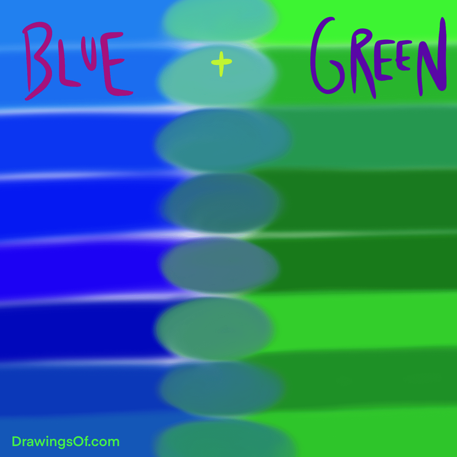
Green, as we’ve established, is a secondary color derived from blue and yellow. It is intrinsically linked to nature, growth, harmony, fertility, and freshness.
- Qualities Evoked: Nature, health, vitality, prosperity, balance, renewal, and environmental consciousness.
- Industry Associations: Commonly adopted by eco-friendly brands, health and wellness companies, food and beverage businesses, and financial services aiming to represent growth.
- Potential Pitfalls: Depending on the shade, green can sometimes be associated with envy or immaturity. A sickly green might evoke feelings of illness.
Brands employing green often seek to connect with themes of sustainability, natural products, or financial growth and stability. Starbucks’ iconic green logo, for instance, evokes freshness, natural origins, and a welcoming, nurturing environment.
The Synergy of Blue and Green: Creating a Unified Brand Message
When blue and green are used together in a brand’s palette, they can create a sophisticated and multifaceted message. The combination often speaks to a balance between stability and growth, or between professionalism and natural vitality.
- Balancing Trust with Vitality: A brand might use blue as a primary color to establish trust and then incorporate shades of green as secondary or accent colors to signify innovation, growth, or a commitment to natural or sustainable practices.
- Evoking Calm and Renewal: The soothing qualities of blue combined with the refreshing nature of green can create a sense of balance and well-being, ideal for wellness or lifestyle brands.
- Communicating Financial Growth and Stability: For financial institutions, blue can represent security and reliability, while green can symbolize wealth, growth, and prosperity.
The specific shades and proportions of blue and green used will significantly alter the perceived message. For example, a bright, energetic green paired with a deep, trustworthy blue might suggest progressive growth within a stable framework. Conversely, a muted, earthy green with a pale, sky-like blue might evoke a sense of calm, natural harmony.
Applying Color Theory to Brand Identity and Visual Design
Understanding how colors mix and their psychological impact is not just academic; it’s a critical component of building a successful brand identity and executing effective visual marketing strategies. The choices made regarding color palettes directly influence how a brand is perceived by its target audience.
Crafting a Cohesive Brand Palette
A brand’s color palette is its visual fingerprint. It extends beyond the logo to encompass all visual touchpoints, from websites and social media graphics to packaging and marketing collateral.
- Defining Core Brand Values: Before selecting colors, brands must clearly define their core values and the message they wish to convey. Are they aiming for authority and trust? Innovation and excitement? Natural purity and sustainability?
- Selecting Primary and Secondary Colors: Based on these values, primary colors are chosen to represent the core essence of the brand. Secondary and accent colors are then selected to complement the primary colors and provide versatility. For instance, a tech company prioritizing innovation might use a bold blue for reliability and a vibrant green for forward-thinking growth.
- Considering Color Harmony: Understanding color relationships (analogous, complementary, triadic) is crucial for creating visually pleasing and harmonious palettes. For example, blue and green are analogous colors, sitting next to each other on the color wheel. This relationship generally creates a sense of unity and calmness.
- Testing and Iteration: It’s essential to test color palettes across various applications and gather feedback to ensure they resonate with the target audience and effectively communicate the desired message. A/B testing different color schemes for website buttons or ad campaigns can provide valuable data on effectiveness.
Color in Digital Marketing and User Experience
In the digital realm, color plays a pivotal role in user interface (UI) design and user experience (UX).
- Call-to-Action (CTA) Buttons: The color of a CTA button is one of the most important design decisions. It needs to stand out from the rest of the page and convey a sense of urgency or invitation. While contrasting colors are often used, a well-chosen shade of green or blue can effectively draw attention and encourage clicks, depending on the surrounding palette.
- Information Hierarchy and Readability: Color can be used to guide the user’s eye through content, highlight important information, and improve readability. For example, using different shades of blue for links versus regular text can enhance navigation.
- Brand Recognition: Consistent use of a brand’s color palette across a website, app, or social media profiles reinforces brand identity and makes it instantly recognizable to users. This familiarity breeds trust and comfort.
- Emotional Engagement: Colors can influence user emotions. A calming blue interface might encourage longer engagement on a mindfulness app, while a vibrant green could energize users on a fitness platform.
The Future of Color in Branding: Adaptability and Personalization
As technology evolves, so too do the possibilities for color in branding.
- Dynamic Color Palettes: With advancements in AI and user profiling, brands may explore dynamic color palettes that adapt based on user preferences, time of day, or even emotional sentiment analysis. This allows for a more personalized and engaging experience.
- Accessibility: Ensuring color palettes are accessible to users with visual impairments is no longer an option but a necessity. Understanding contrast ratios and avoiding problematic color combinations is paramount.
- Global Color Symbolism: While general color psychology is useful, brands operating internationally must be aware that color meanings can vary significantly across cultures. A color that signifies prosperity in one culture might represent mourning in another. Research and adaptation are key.
In conclusion, the seemingly simple question of what color mixes with blue to make green opens a complex and fascinating world of color theory, psychology, and strategic application for brands. By understanding the scientific principles of color mixing, the emotional resonance of hues like blue and green, and the practical implications for design and user experience, businesses can craft powerful visual identities that resonate with their audience, build trust, and drive meaningful engagement in an increasingly competitive marketplace. The mastery of color is not just about aesthetics; it’s about effective communication and building lasting connections.
aViewFromTheCave is a participant in the Amazon Services LLC Associates Program, an affiliate advertising program designed to provide a means for sites to earn advertising fees by advertising and linking to Amazon.com. Amazon, the Amazon logo, AmazonSupply, and the AmazonSupply logo are trademarks of Amazon.com, Inc. or its affiliates. As an Amazon Associate we earn affiliate commissions from qualifying purchases.