
Color is far more than a mere aesthetic choice in branding; it is a potent, non-verbal language capable of evoking deep-seated emotions, influencing perceptions, and forging lasting connections with an audience. When a brand seeks to cultivate “love” – whether that’s passionate loyalty, unwavering trust, or a feeling of deep affection – the strategic deployment of color becomes paramount. Understanding the nuanced psychology of color allows brands to communicate their core values, resonate with their target demographic, and build an identity that transcends mere recognition to inspire genuine emotional attachment. This isn’t just about making things pretty; it’s about crafting an emotional landscape where customers feel understood, valued, and, ultimately, loved by the brand.

The Psychology of Color in Branding
Every hue carries inherent psychological associations, shaped by culture, biology, and personal experience. For brands aiming to communicate “love” in its various forms, selecting the right palette is a foundational step in their corporate identity and marketing strategy. These associations can be harnessed to elicit specific emotional responses, driving consumer behavior and shaping brand perception.
Red: Passion, Energy, and Urgency
Red is perhaps the most visceral color associated with love, symbolizing passion, desire, and intense emotion. It’s a color of high energy, urgency, and boldness. Brands that want to evoke romantic love, excitement, or a powerful connection often lean into red. Think of iconic luxury brands that use red to signify passion and exclusivity, or consumer goods that aim to stimulate appetite or immediate action. However, its intensity means it must be used judiciously; too much red can convey aggression or danger. In a branding context, a judicious splash of red can signal confidence, a pioneering spirit, or an ardent commitment to customer satisfaction, subtly communicating a brand’s “love” for its mission or its audience.
Pink: Romance, Tenderness, and Playfulness
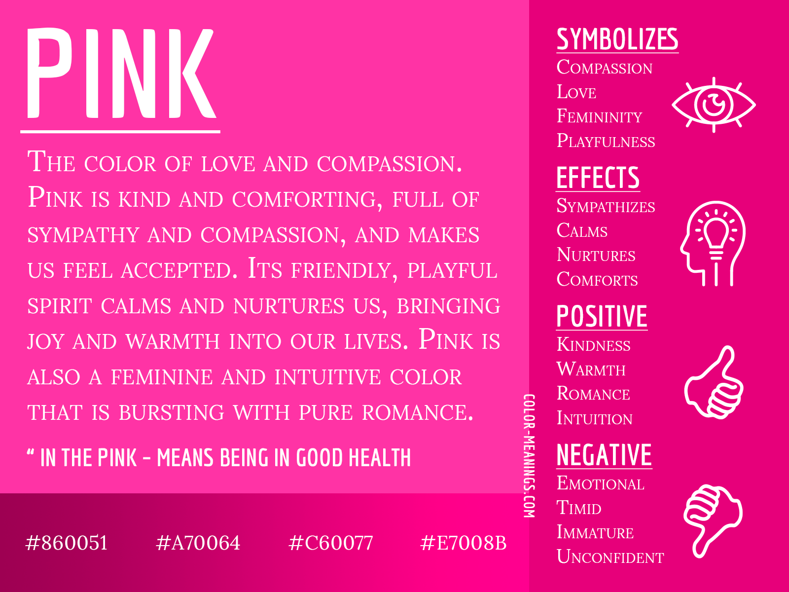
Pink, often considered a softer cousin to red, traditionally embodies romance, tenderness, and nurturing love. It’s frequently associated with femininity, gentleness, and a lighthearted playfulness. Brands targeting a demographic that values compassion, warmth, or youthful innocence often utilize pink. From beauty products and confectionery to charities focusing on gentle care, pink conveys an approachable, affectionate, and sometimes sentimental form of love. It can soften a brand’s image, making it appear more empathetic and caring, fostering a sense of warmth and emotional safety for consumers seeking connection and gentle affirmation.
Orange: Enthusiasm, Warmth, and Optimism
Orange is a vibrant, energetic color that radiates warmth, enthusiasm, and optimism. It often combines the energy of red with the joy of yellow, creating a sense of friendliness and approachability. While not directly linked to romantic love, orange can evoke a communal, friendly form of affection and belonging. Brands that position themselves as innovative, adventurous, or community-oriented often find success with orange. It can make a brand feel inviting, accessible, and full of positive energy, fostering a “love” for shared experiences and a vibrant, optimistic outlook. For brands aiming for a youthful, dynamic, and engaging presence, orange communicates a spirited affection and a desire to connect.
Yellow: Joy, Optimism, and Friendliness
Yellow is universally associated with happiness, sunshine, and optimism. It’s an uplifting color that signifies cheerfulness, friendliness, and creativity. While not “love” in the romantic sense, yellow can cultivate a deep sense of goodwill and positive emotional connection, akin to the love of friendship or the joy derived from shared happiness. Brands aiming to appear approachable, positive, and inspiring often incorporate yellow into their identity. It can communicate a brand’s “love” for bringing joy to its customers, fostering an environment of optimism and bright possibilities. When used effectively, yellow can make a brand feel like a trusted, cheerful companion, building a foundation of positive emotional recall.
Beyond the Primary Palettes: Nuance and Context
While specific colors carry inherent psychological weight, the art of branding lies in understanding that “love” isn’t a monolithic emotion. It manifests in diverse forms: romantic love, familial love, self-love, philanthropic love, or even the passionate love for a hobby or interest. A brand’s ability to express these nuances through color, considering cultural contexts and combinations, is what truly sets it apart.
The Spectrum of Love: From Romantic to Philanthropic
A brand seeking to evoke romantic love (e.g., luxury chocolates, jewelry) will lean into deep reds, rich purples, or soft pinks. A brand fostering familial love (e.g., family-oriented services, comfort food) might use warm yellows, earthy browns, or comforting greens. Self-love and wellness brands often employ serene blues, calming greens, or gentle pastels. Philanthropic organizations frequently utilize blues (trust, calm), greens (growth, healing), or even specific symbolic colors associated with their cause to evoke empathy and a love for humanity. The key is to define the type of “love” the brand embodies and align its color strategy accordingly, ensuring a cohesive and authentic emotional message.
Cultural Sensitivity in Color Choice
The meaning of color is not universal; it is deeply intertwined with cultural context. What signifies love and passion in one culture might represent mourning or aggression in another. For instance, while white symbolizes purity and new beginnings in many Western cultures (e.g., wedding dresses), it’s associated with death and mourning in some Eastern cultures. Red, a symbol of love and good fortune in China, can denote anger in parts of Africa. Brands with international aspirations must conduct thorough cultural research to ensure their chosen color palette resonates positively across all target markets, avoiding unintended miscommunications that could undermine efforts to build emotional connections. A nuanced understanding of semiotics in diverse cultural landscapes is crucial for global brand success.

The Power of Combination and Contrast
Rarely does a brand rely on a single color. The interplay between primary, secondary, and accent colors creates a more complex and sophisticated emotional narrative. A vibrant red paired with a calming blue can suggest passionate reliability. A playful pink with a sophisticated grey can evoke youthful elegance. Contrasting colors can draw attention, create energy, and define distinct brand elements, while analogous colors can convey harmony and serenity. The judicious use of color combinations, along with considerations of saturation, lightness, and texture, allows brands to paint a multi-faceted emotional picture, deepening the “love” customers feel by reflecting the complexity of their own emotions and desires.
Building Brand Loyalty Through Emotional Resonance
True brand “love” isn’t merely about initial attraction; it’s about fostering enduring loyalty and advocacy. Color plays a critical role in sustaining this emotional resonance, ensuring that the brand consistently communicates its values and reinforces the positive feelings customers associate with it.
Consistency is Key
For color to effectively communicate “love” and build recognition, consistency across all touchpoints is non-negotiable. From a brand’s logo and website to its packaging, advertising, and physical spaces, a uniform color palette reinforces brand identity and strengthens emotional associations. Inconsistency can dilute a brand’s message, confuse consumers, and erode the trust and familiarity that underpin loyalty. A consistent use of color builds a mental shortcut; seeing the signature red of a beloved brand immediately triggers associations of passion, quality, and connection, reinforcing the “love” built over time. This unwavering visual identity makes the brand feel reliable, dependable, and deeply committed to its promise.
Storytelling with Color
Colors are powerful storytellers. A brand’s chosen palette can narrate its origin, values, and aspirations. A brand committed to environmental sustainability might use a palette dominated by greens and blues to tell a story of nature, responsibility, and growth. A startup aiming to disrupt a traditional market might employ bold, unexpected color combinations to tell a story of innovation and daring. By consciously weaving color into its brand narrative, a company can create a richer, more engaging experience for its audience, inviting them to be part of an emotional journey that fosters deeper connection and “love” for what the brand stands for.
Measuring Emotional Impact
While subjective, the emotional impact of color in branding can be indirectly measured through various metrics. Brand sentiment analysis, customer feedback on visual assets, A/B testing of color variations in marketing campaigns, and even physiological responses (e.g., eye-tracking) can provide insights into how audiences react to a brand’s color choices. Monitoring these indicators allows brands to refine their visual identity, ensuring their colors consistently evoke the desired emotional response and strengthen the bonds of “love” with their consumer base. The goal is to move beyond mere aesthetics to quantifiable emotional engagement.
Case Studies: Brands That Mastered “Love” Through Color
Examining successful brands reveals how they strategically use color to cultivate deep emotional connections, effectively translating into customer “love.”
Hallmark and the Emotion of Connection
Hallmark, a brand synonymous with greetings and heartfelt messages, predominantly uses a calming, trustworthy blue often paired with warm, inviting golds or soft reds. This palette perfectly encapsulates their brand promise: fostering genuine human connection, empathy, and the enduring “love” between people. The blue signifies reliability and sincerity, while the accompanying warm tones add a touch of personal affection and care. Their consistent use of these colors across cards, stores, and advertising reinforces the emotional weight of their products, making customers instinctively associate Hallmark with warmth, sentiment, and the love they share with others.
Victoria’s Secret and Allure
Victoria’s Secret has masterfully used black and pink to define its brand of alluring, romantic love. The deep black communicates sophistication, mystery, and luxury, while the vibrant, often neon pink injects a sense of playful femininity, desire, and modern romance. This powerful contrast creates an identity that is both aspirational and intimate, effectively selling a vision of self-love and romantic appeal. The brand’s color strategy has been instrumental in creating a distinct emotional landscape that resonates with its target audience’s desires for confidence, allure, and a touch of fantasy.
Charities and Empathy
Many charitable organizations effectively use color to evoke philanthropic love and empathy. The American Heart Association, for example, prominently features red to symbolize the heart, life, and the urgent need for action, directly tapping into a powerful sense of care and love for human well-being. Organizations focused on environmental causes often use greens and blues, evoking a love for nature and a desire to protect the planet. These strategic color choices are not accidental; they are carefully selected to trigger emotional responses that motivate donations, volunteering, and a collective love for humanity and the world around us.
In the intricate tapestry of branding, color is not just a visual identifier; it is a profound emotional communicator. By understanding its psychology, cultural nuances, and strategic deployment, brands can consciously craft an identity that doesn’t just attract attention, but cultivates a genuine, lasting “love” from their audience, transforming consumers into loyal advocates.
aViewFromTheCave is a participant in the Amazon Services LLC Associates Program, an affiliate advertising program designed to provide a means for sites to earn advertising fees by advertising and linking to Amazon.com. Amazon, the Amazon logo, AmazonSupply, and the AmazonSupply logo are trademarks of Amazon.com, Inc. or its affiliates. As an Amazon Associate we earn affiliate commissions from qualifying purchases.