
In the competitive landscape of visual communication, a brand’s color palette is its most immediate and visceral form of storytelling. Among the thousands of pigments available to designers and brand strategists, vermillion stands as one of the most historically significant and psychologically potent choices. Often mistaken for a generic “bright red,” vermillion is a specific, high-intensity hue that sits at the intersection of red and orange. It is a color that demands attention, communicates authority, and bridges the gap between ancient tradition and modern luxury.
For brand owners and marketing professionals, understanding what vermillion is—and how it functions within a corporate identity—is essential for crafting a brand that resonates on a deeper, almost instinctual level. It is not merely a color; it is a strategic tool for differentiation and emotional engagement.

Defining Vermillion: The Intersection of Heritage and Modern Identity
To understand vermillion as a branding element, one must first understand its physical and historical composition. Historically derived from the mineral cinnabar (mercury sulfide), vermillion was for centuries the most expensive and sought-after pigment in the world. From the murals of Pompeii to the lacquerware of the Chinese dynasties, it was the color of the elite.
The Chemical and Visual Profile
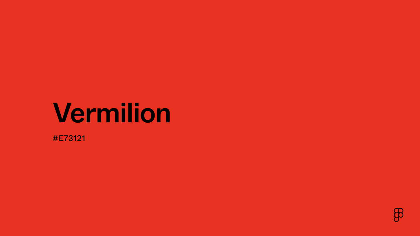
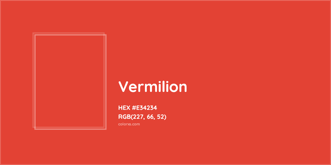
Visually, vermillion is characterized by its warmth. While a “true red” (like carmine) leans toward the blue or cool end of the spectrum, vermillion leans toward yellow. This slight orange undertone gives it a vibrating quality, making it appear more luminous under natural light than flatter reds. In the digital realm, vermillion is often categorized by specific HEX codes, most commonly #E34234 or #FF4D00, depending on the desired intensity.
In a brand style guide, defining vermillion requires precision. Because it sits on the edge of the red-orange border, it is susceptible to “shifting” across different mediums. A vermillion logo that looks vibrant on a backlit OLED smartphone screen may appear muddy when printed on uncoated matte paper unless specific Pantone (PMS) matches are established. For a brand, this technical consistency is the difference between looking premium and looking amateur.
The Evolution from Pigment to Brand Asset
The transition of vermillion from a rare mineral to a synthetic industrial pigment allowed it to become a staple of 20th-century branding. As manufacturing processes stabilized the color, it became synonymous with high-visibility safety and prestige. Today, when a brand selects vermillion, they are tapping into a lineage of power. It is a color that suggests the brand has a history, even if it is a modern tech startup. It provides an instant “heritage” feel because of our collective cultural memory of the color in fine art and royal iconography.
The Psychology of Vermillion in Brand Strategy
Color psychology is the backbone of brand strategy. Every hue triggers a specific physiological and emotional response. Vermillion, due to its unique position between red and orange, captures the benefits of both colors while mitigating their potential negatives.
Urgency, Action, and Appetite
Red is the color of the “lizard brain.” It increases the heart rate, creates a sense of urgency, and stimulates appetite. This is why it is the dominant color in the fast-food and clearance-sale industries. However, pure red can sometimes feel aggressive or “angry.”
Vermillion, by incorporating the warmth of orange, softens this aggression. It replaces “danger” with “vitality.” In a brand context, vermillion says “Act Now” with a smile rather than a shout. It is highly effective for Call-to-Action (CTA) buttons, hero sections of websites, and packaging that needs to “pop” off a crowded retail shelf. It creates a sense of excitement and movement, making it ideal for brands in the fitness, automotive, and fast-moving consumer goods (FMCG) sectors.
Authority and Traditional Prestige
Unlike bright neon oranges, which can sometimes feel “cheap” or overly “discount-oriented,” vermillion maintains a level of sophisticated gravitas. In many Eastern cultures, particularly in China and Japan, vermillion represents luck, protection, and the sacred.
When Western brands use vermillion, they often do so to signal a “premium” status. It is the color of the “Red Carpet” (which historically leaned toward vermillion) and the “Red Seal” of authenticity. A brand using this hue is positioning itself as an authority. It is not just a participant in the market; it is a leader. This is particularly useful for consulting firms, luxury goods, and heritage brands looking to modernize their look without losing their soul.
Case Studies: Iconic Brands Mastering the Vermillion Spectrum
Looking at successful brands that have claimed a stake in the vermillion territory provides a roadmap for how the color can be used to build immense brand equity.
The Velocity of Ferrari’s Rosso Corsa
While “Ferrari Red” has evolved over the decades, its most iconic iterations, such as Rosso Corsa (Racing Red), lean heavily into the vermillion spectrum. The choice was originally dictated by national racing colors (Italy was assigned red), but Ferrari turned it into a global symbol of speed and wealth. The slight orange shift in the red ensures that the cars look vibrant even under the harsh, direct sunlight of a racetrack. For Ferrari, vermillion isn’t just a color; it is a visual shorthand for adrenaline and engineering excellence.
The Levi’s Batwing and the “Red Tab”
Levi Strauss & Co. uses a specific shade of vermillion-adjacent red for its iconic “Batwing” logo and the small tab on the back pocket of its jeans. In the world of apparel, where blue denim is the standard, the vermillion tab provides the necessary contrast to make the brand instantly recognizable from a distance. It serves as a “seal of quality.” The color choice here is strategic: it stands out against the cool tones of indigo, ensuring the brand name is the first thing the eye sees.
Adobe and the Creative Standard
In the tech and software space, Adobe has long utilized a vibrant, warm red that sits firmly in the vermillion family. For a company that provides tools for “creatives,” the color choice is perfect. It represents the “spark” of an idea and the energy of the creative process. By maintaining this color across its Creative Cloud suite, Adobe has created a “monopoly on the color” within the software industry. When a designer sees that specific shade of vermillion, they immediately associate it with professional-grade creative tools.
Implementation: How to Incorporate Vermillion into Your Brand Palette
Choosing vermillion is only the first step; the second is determining how it interacts with the rest of your brand’s visual identity. Because vermillion is such a “loud” color, it requires a thoughtful supporting cast of neutrals and secondary tones.
Color Pairing and Contrast
To maintain the prestige of vermillion, it is often best paired with sophisticated neutrals.
- Vermillion and Charcoal/Navy: This is a classic “power” pairing. The dark neutral grounds the energy of the vermillion, making it suitable for corporate identities and financial tech (FinTech) brands that want to appear both energetic and stable.
- Vermillion and Cream/Off-White: This pairing leans into the heritage aspect of the color. It feels organic, high-end, and artisanal. This is a common palette for boutique hotels, high-end skincare, and luxury stationery.
- The “Complementary” Trap: Designers should be cautious when pairing vermillion with its direct complement, cyan or bright teal. While high in contrast, this can often feel “vibrating” and exhausting for the eyes. A more sophisticated approach is to use “split-complementary” tones like deep forest green or muted slate blue.
Cross-Platform Consistency
In a digital-first world, your brand lives on screens before it lives on paper. Vermillion can be a difficult color to render accurately across all devices. When building a brand identity, it is crucial to provide a “Digital Style Guide” that accounts for:
- RGB/HEX for Web: Ensuring the color doesn’t “clip” or become neon on high-saturation screens.
- CMYK for Print: Vermillion often loses its “glow” when converted to standard four-color printing. Strategists should recommend a “Spot Color” (such as a specific Pantone) for high-stakes print materials like business cards or premium packaging to ensure the color remains true.
- Accessibility (WCAG): Vermillion is a bright color, but when used as text on a white background, it may not always meet the contrast ratios required for accessibility. Brand designers must test their vermillion shades to ensure they are legible for all users, potentially using a slightly darker version for typography.
The Future of High-Impact Colors in Digital-First Branding
As we move further into an era dominated by high-resolution screens and augmented reality, “high-impact” colors like vermillion are becoming even more valuable. In an infinite scroll of content, a brand has less than a second to capture a user’s attention. Vermillion is a “thumb-stopping” color.
Furthermore, the rise of “Minimalist-Plus” branding—where clean, whitespace-heavy designs are punctuated by a single, aggressive pop of color—has made vermillion a favorite for startups looking to disrupt established markets. It allows a brand to look modern and clean while still possessing a “heartbeat” of energy.
In conclusion, vermillion is far more than a mere aesthetic choice. It is a strategic asset that carries the weight of history and the pulse of modern psychology. For a brand, adopting vermillion is a statement of intent: it signifies a refusal to be ignored and a commitment to a legacy of excellence. Whether it is used in the sleek curve of a supercar, the tab on a pair of jeans, or the icon of a creative software, vermillion remains the ultimate color for brands that aim to be both timeless and intensely present.
aViewFromTheCave is a participant in the Amazon Services LLC Associates Program, an affiliate advertising program designed to provide a means for sites to earn advertising fees by advertising and linking to Amazon.com. Amazon, the Amazon logo, AmazonSupply, and the AmazonSupply logo are trademarks of Amazon.com, Inc. or its affiliates. As an Amazon Associate we earn affiliate commissions from qualifying purchases.