
In the world of professional sports, few assets are as visually iconic as the tennis ball. While most spectators view it as a mere tool of the game, for brand strategists and corporate identity experts, the tennis ball represents one of the most successful examples of visual standardization in marketing history. The question of “what color is a tennis ball”—a debate that has periodically set social media ablaze—is not just a matter of subjective perception or color theory; it is a fascinating case study in brand evolution, psychological marketing, and the intersection of technology and product design.

The official color, designated as “Optic Yellow” by the International Tennis Federation (ITF), sits at a unique intersection of green and yellow on the visible light spectrum. For brands like Wilson, Penn, and Dunlop, this specific hue is more than a requirement; it is a signature of quality and a pillar of their market identity. Understanding why this color exists and how it influences the branding of the sport provides profound insights into how visual identity can define an entire industry.
The Birth of a Visual Trademark: Why Color Matters in Branding
Before the early 1970s, the tennis world looked significantly different. For nearly a century, the standard tennis ball was white. This was a direct extension of the sport’s “country club” branding—clean, traditional, and elite. However, as the 1960s ushered in the era of color television, the white ball presented a significant branding problem for the sport. It frequently disappeared against white clothing or the pale backgrounds of stadium seating, making it difficult for viewers at home to follow the action.
From White to Fluorescent: A Strategic Shift
In 1972, the ITF introduced the fluorescent yellow ball, specifically designed for higher visibility on color TV screens. This move was a masterclass in strategic pivot. By changing the product’s core visual attribute, the sport’s governing bodies were able to enhance the “product experience” for the remote consumer. It was a branding decision driven by media necessity.
Interestingly, Wimbledon, the bastion of tennis tradition, resisted this change for over a decade, maintaining the white ball until 1986. This resistance highlights a classic branding tension: the desire to maintain heritage versus the need for modern functionalism. Ultimately, the global standardization of Optic Yellow won because it provided a cohesive visual identity that was instantly recognizable across any broadcast medium.
The Psychology of Visibility
From a brand strategy perspective, the choice of Optic Yellow was not arbitrary. Human vision is most sensitive to light at a wavelength of approximately 555 nanometers—the exact territory occupied by the tennis ball. By adopting this color, the sport effectively “branded” the most visible point on the color spectrum. When a consumer sees that specific neon glow, even outside the context of a court, the brand association with “Tennis” is immediate. This is the pinnacle of brand salience—when a color alone can trigger a complex set of industry-specific associations.
Consistency as a Corporate Identity: Standardizing “Tennis Yellow”
In the corporate world, brand consistency is the bedrock of trust. For tennis ball manufacturers, the “Optic Yellow” specification is a rigorous technical standard that must be met to maintain their licensing and market position. If a brand like Penn produced a ball that leaned too heavily toward lime green, it would not only violate ITF regulations but also dilute the consumer’s expectation of what a premium tennis ball should be.
The ITF and the Rules of the Game
The ITF acts as the ultimate brand manager for the sport. Their specifications for weight, bounce, and color ensure that the “product” remains consistent regardless of whether it is manufactured in Thailand or the United States. This level of standardization is comparable to how a global franchise like McDonald’s ensures its logo’s “Golden Arches” are the exact same shade of yellow worldwide.
For a manufacturer, adhering to these standards is a form of brand validation. The “ITF Approved” stamp is a B2B and B2C seal of quality that allows a company to compete in the high-performance segment of the market. Without this color consistency, the brand loses its professional credibility.
Defining “Optic Yellow” in the Manufacturing Process
The production of the optic yellow felt involves a complex dyeing process that utilizes fluorescent pigments. These pigments are designed to absorb ultraviolet light and re-emit it as visible light, making the ball appear “brighter” than its surroundings. From a marketing standpoint, this “glow” serves as a metaphor for the high energy and precision of the sport. Brands invest millions in R&D to ensure that their specific felt (a mix of wool and nylon) holds this color under intense stadium lighting and various weather conditions, ensuring that the brand’s visual output remains pristine until the final set.
The Marketing Narrative: How Brands Own the Debate

In 2018, the “what color is a tennis ball” debate reached a fever pitch when a viral video asked Roger Federer for his opinion. His simple answer—”It’s yellow”—carried the weight of a legendary brand ambassador. This moment illustrated how personal branding and corporate strategy intersect to resolve consumer confusion.
Roger Federer and the Power of Personal Branding
Federer, a man who has built a multi-billion dollar brand around elegance and precision, provided the “official” verdict for many fans. When an elite brand ambassador weighs in on a product characteristic, it reinforces the brand’s narrative. For Nike and Uniqlo, the brands that have clothed Federer, the color of the ball is a key consideration in their seasonal palettes. They design apparel that either complements or contrasts with the Optic Yellow to ensure the athlete remains the focal point of the visual frame.
Capitalizing on Viral Controversy
The debate itself (Yellow vs. Green) is a goldmine for brand engagement. Smart marketing teams at Wilson and Penn use these moments to engage with their audience. By leaning into the controversy, these brands can drive social media impressions and reinforce their position as the authorities on the sport. The debate doesn’t hurt the brand; it deepens the consumer’s emotional and cognitive investment in the product. It turns a functional object into a conversation piece.
Color and Brand Equity: The Penn vs. Wilson Rivalry
In the competitive landscape of sports equipment, Wilson and Penn (owned by Head) are the dominant players. Because the product itself is highly standardized, these companies must rely on brand equity and minor visual cues to differentiate themselves. The color of the ball serves as a canvas for their logos, which are the primary tools for brand recognition during play.
Product Differentiation in a Homogenous Market
When the color is fixed by law, how does a brand stand out? They do so through packaging and the “prestige” of their associations. Wilson, as the official ball of the US Open and Roland Garros, leverages those partnerships to claim the “premium” space in the consumer’s mind. Penn, on the other hand, often positions itself as the “America’s #1 Selling Ball,” focusing on reliability and market ubiquity.
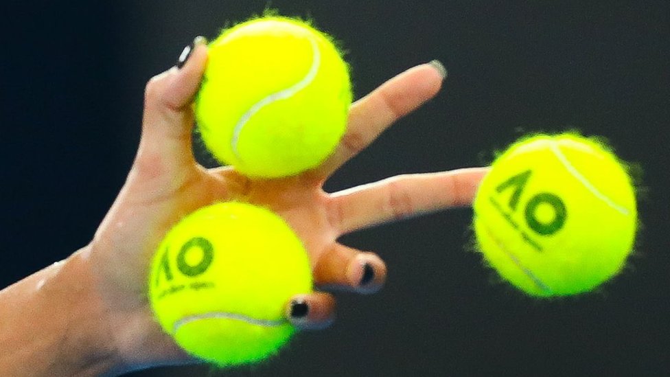
Both brands use the Optic Yellow as a background for their high-contrast black or red logos. This creates a “moving billboard” effect. Every time a pro player serves, the brand’s logo is broadcast to millions. The color of the ball is the essential medium that makes this mobile advertising possible.
Sponsorships and Visual Monopoly
The strategic acquisition of tournament sponsorships is essentially a quest for a visual monopoly. When Wilson signs a deal with a Grand Slam, they are not just selling balls; they are buying the exclusive right to have their brand associated with that specific shade of Optic Yellow in that environment. For the duration of the tournament, the “Brand Identity” of the event and the “Brand Identity” of the manufacturer become inextricably linked through the shared visual of the ball.
Future-Proofing the Sport: Technology and the Evolving Visual Brand
As we move further into the digital age, the branding of the tennis ball continues to evolve alongside technology. High-definition broadcasting, 4K resolution, and augmented reality (AR) are changing how we perceive color.
High-Definition Broadcasting and Color Saturation
Modern broadcasts often use “color grading” to make the court look more vibrant. This can sometimes shift the perceived color of the ball, making it look more green or more yellow depending on the network’s settings. Brand managers must now work with broadcasters to ensure that the “product” looks correct on screen. This is a new frontier in brand management: ensuring visual integrity across diverse digital displays.
The Tennis Ball as a Digital Asset
With the rise of data tracking technology like Hawk-Eye, the tennis ball has become a digital data point. The Optic Yellow color is crucial for the high-speed cameras to track the ball’s trajectory with millimeter precision. From a branding perspective, this elevates the ball from a simple piece of equipment to a high-tech component of the “Smart Sport” ecosystem. The color is no longer just for the human eye; it is for the machine eye, ensuring that the brand of the sport remains synonymous with accuracy and technological advancement.
In conclusion, the tennis ball’s color is a deliberate, strategic asset that has been optimized over decades to serve the needs of fans, broadcasters, and manufacturers. Whether you perceive it as yellow or green, the reality is that its specific hue is a masterpiece of brand engineering. It is a color that was born in a laboratory, popularized by television, and cemented in the public consciousness by the world’s greatest athletes. In the high-stakes game of global branding, Optic Yellow is more than just a color—it is the ultimate winning shot.
aViewFromTheCave is a participant in the Amazon Services LLC Associates Program, an affiliate advertising program designed to provide a means for sites to earn advertising fees by advertising and linking to Amazon.com. Amazon, the Amazon logo, AmazonSupply, and the AmazonSupply logo are trademarks of Amazon.com, Inc. or its affiliates. As an Amazon Associate we earn affiliate commissions from qualifying purchases.