
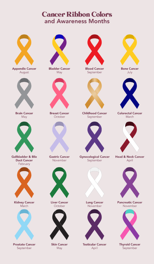
In the landscape of modern communication, visual symbols often speak louder than words. When asking “what color is the prostate cancer ribbon,” the answer is a specific, calming shade of light blue. However, from a brand strategy and corporate identity perspective, this ribbon is far more than just a piece of colored fabric. It is a powerful brand asset, a psychological anchor, and a centerpiece of a global awareness movement.
The light blue ribbon serves as the primary visual identifier for prostate cancer awareness, functioning much like a corporate logo. In the same way that a “swoosh” represents athletic performance or an “apple” denotes innovation, the light blue ribbon represents a commitment to men’s health, early detection, and research funding. Understanding the strategic nuances of this color choice and its application in marketing provides a masterclass in how non-profits and healthcare brands build equity and influence.
The Power of Symbolism: Defining the Visual Identity of Prostate Cancer
Brand strategy relies heavily on the ability to evoke an immediate emotional response through visual cues. The light blue ribbon was not chosen at random; its adoption was a calculated move to differentiate the cause within a crowded “awareness market” while tapping into deep-seated psychological associations.
Why Light Blue? The Psychology of Color Selection
In color psychology, blue is universally associated with stability, trust, and serenity. Specifically, the “light” or “sky” blue variant used for prostate cancer carries a different semiotic weight than the navy blue often used in finance or the royal blue used in tech. Light blue suggests a sense of openness and tranquility, which is critical in a healthcare context where the subject matter—cancer—can be inherently frightening.
From a branding perspective, light blue is also traditionally associated with masculinity in Western cultures. By utilizing this hue, brand strategists created a direct visual link to the demographic most affected by the disease. It allows the brand to feel accessible and “safe” for men who might otherwise be hesitant to engage with medical discourse.
Historical Evolution of Awareness Ribbons as Branding Tools
The use of ribbons as a branding mechanism gained mainstream momentum in the 1990s, pioneered largely by the pink ribbon for breast cancer. The prostate cancer movement learned from this “gold standard” of non-profit branding. To build a successful identity, the movement needed a symbol that was easy to replicate, universally recognizable, and distinct from its predecessors.
The light blue ribbon emerged as the visual solution. It successfully carved out a niche in the “ribbon economy,” ensuring that when a consumer sees that specific shade, they do not confuse it with the red of HIV/AIDS awareness or the purple of Alzheimer’s. This distinction is the cornerstone of brand positioning.
Strategic Brand Implementation: How Organizations Leverage the Ribbon
A visual identity is only effective if it is implemented consistently across all touchpoints. For organizations like the Prostate Cancer Foundation (PCF) or ZERO – The End of Prostate Cancer, the light blue ribbon is the “North Star” of their marketing collateral.
Establishing Trust through Consistency
In the world of corporate identity, consistency equals credibility. When a non-profit uses the light blue ribbon consistently across its website, social media, and physical brochures, it builds brand recognition. This recognition is vital for fundraising. Donors are more likely to contribute to an organization that possesses a professional, cohesive visual identity because it signals stability and organizational health.
The strategic use of the light blue ribbon also helps in “category ownership.” By saturating the market with this specific color during awareness months (such as September), organizations ensure that they own the mental real estate associated with men’s health.
Co-branding and Corporate Partnerships
One of the most significant aspects of the light blue ribbon’s brand strategy is its versatility in corporate social responsibility (CSR) partnerships. Major corporations often seek to align their brands with health causes to improve their public image.
The light blue ribbon provides a turnkey branding solution for these partners. A watch manufacturer might release a “light blue” edition of a timepiece, or a sports league might incorporate light blue accents into their uniforms. These co-branding efforts expand the reach of the awareness movement while providing the corporate partner with the “halo effect” of being associated with a noble cause. The ribbon acts as the bridge between the corporate entity and the social mission.

Design Principles for Health Awareness Campaigns
The effectiveness of the light blue ribbon is not just in its color, but in how it is integrated into modern design frameworks. As we move further into a digital-first world, the ribbon must be optimized for various platforms and user experiences.
Digital Accessibility and the Blue Palette
In digital design, the specific HEX code for the prostate cancer ribbon (often around #ADD8E6 or similar variations) must be handled with care regarding accessibility. Brand designers must ensure that the light blue maintains a high enough contrast ratio against background colors to be legible for users with visual impairments.
Furthermore, the “light blue brand” is often extended into a full UI/UX color palette. Designers might use darker shades of blue for “Call to Action” (CTA) buttons to signify urgency and importance, while using the signature light blue for headers and iconography to maintain brand continuity. This hierarchical use of color is a classic digital branding technique used to guide user behavior.
Minimalism vs. Information Density in Design
Contemporary brand design favors minimalism. The light blue ribbon is an inherently minimalist icon. It conveys a complex message through a simple loop. In marketing materials, this allows for “white space,” which prevents the audience from feeling overwhelmed by medical data.
Strategic designers use the ribbon as a focal point, surrounding it with clear, concise copy. This “less is more” approach is essential in an era of information overload. The ribbon serves as a visual shorthand, allowing the brand to communicate its essence in the split second it takes for a user to scroll past an ad or a social media post.
Marketing the Movement: From Visual Recognition to Impact
The ultimate goal of any brand strategy is to drive action. For the light blue ribbon, that action includes scheduling screenings, donating funds, or participating in advocacy.
Measuring Brand Equity in the Non-Profit Sector
Brand equity is typically measured by how much a brand name is worth. In the context of the light blue ribbon, equity is measured by “awareness levels.” Marketing teams conduct surveys to determine how many people can correctly identify the cause associated with the light blue ribbon.
High brand equity in this sector leads to lower “customer acquisition costs” for donors. If the public already recognizes and trusts the light blue ribbon, the organization spends less energy explaining who they are and more energy explaining why they need support. This efficiency is a direct result of a disciplined visual identity strategy.
Social Media Strategy and Viral Visuals
In the age of Instagram and TikTok, the light blue ribbon has had to adapt to “visual storytelling.” Awareness campaigns now leverage the color through filters, hashtags, and “blue-out” days where supporters post blue squares or wear blue clothing.
This is a form of “user-generated branding.” By giving the audience a simple color and a symbol, the brand empowers its community to become advocates. When thousands of individuals adopt the light blue color scheme on their profiles, it creates a “social proof” effect. It signals that this is a mainstream, supported movement, which in turn attracts more attention from influencers and media outlets. This organic growth is the pinnacle of successful brand marketing.

Conclusion: The Enduring Legacy of a Single Color
The question “what color is the prostate cancer ribbon” may have a simple answer, but the strategy behind it is deeply complex. The light blue ribbon is a masterclass in brand identity, demonstrating how color, psychology, and design can unite to tackle one of the world’s most significant health challenges.
Through strategic implementation, consistent design, and savvy marketing partnerships, the light blue ribbon has moved beyond a mere symbol to become a global brand. It stands as a testament to the power of visual communication in the non-profit sector. For brand strategists and marketers, it serves as a reminder that a well-defined identity—built on trust, clarity, and emotional resonance—is the most powerful tool for driving change and building a lasting legacy. As the movement continues to evolve, the light blue ribbon will remain the steady, recognizable face of a cause that touches millions, proving that in the world of branding, the right color can indeed change the world.
aViewFromTheCave is a participant in the Amazon Services LLC Associates Program, an affiliate advertising program designed to provide a means for sites to earn advertising fees by advertising and linking to Amazon.com. Amazon, the Amazon logo, AmazonSupply, and the AmazonSupply logo are trademarks of Amazon.com, Inc. or its affiliates. As an Amazon Associate we earn affiliate commissions from qualifying purchases.