
In the intricate world of branding and design, understanding the fundamental principles of color theory isn’t merely an academic exercise; it’s a strategic imperative. The question “what color is opposite green on the color wheel?” might seem rudimentary, yet its answer holds profound implications for brand identity, marketing effectiveness, and consumer perception. This concept, known as complementary colors, is a cornerstone for creating visual impact, fostering emotional connections, and establishing a distinct corporate identity.
The Science of Color: Understanding the Color Wheel’s Strategic Value
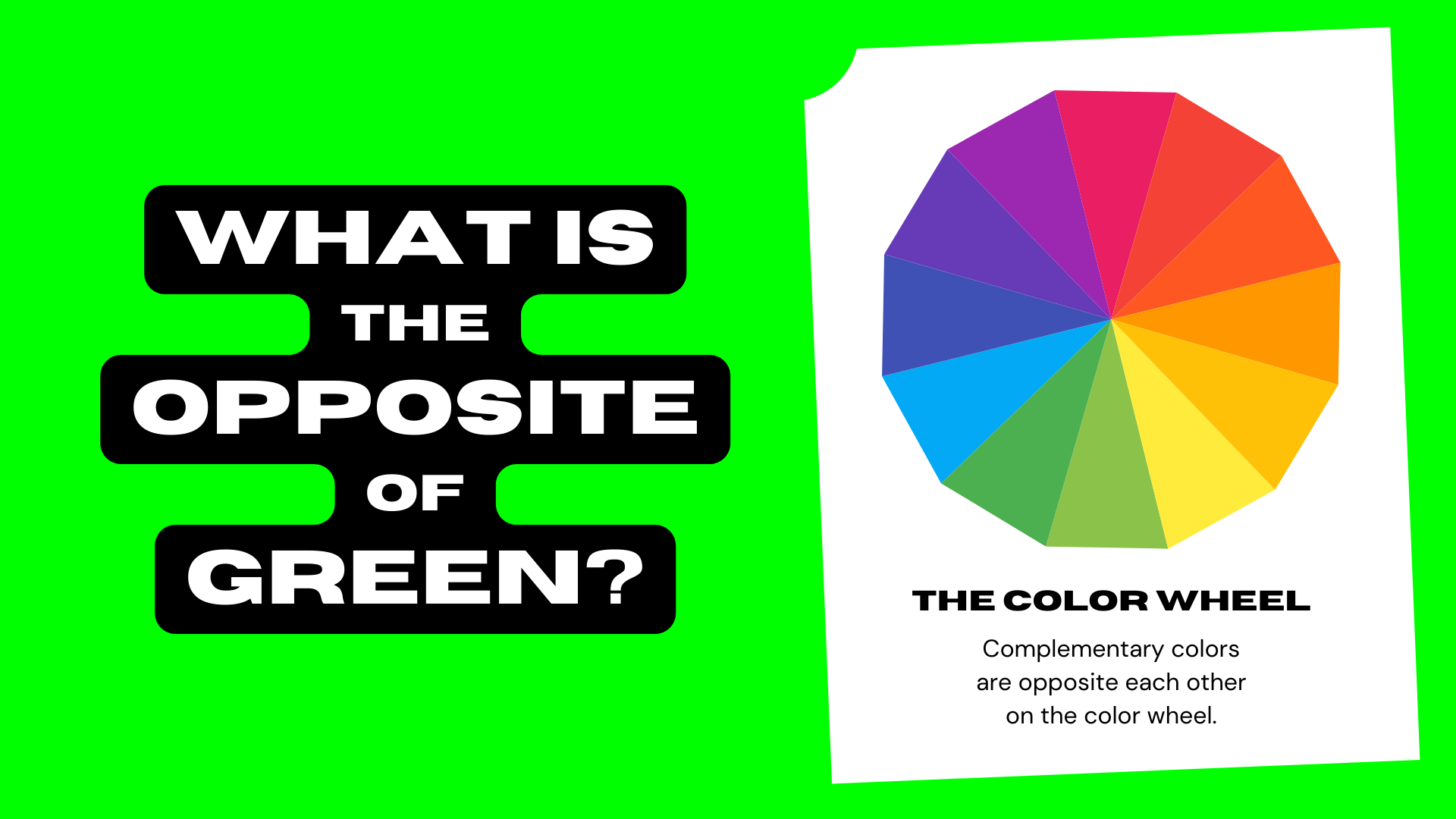
At the heart of visual design lies the color wheel, a diagrammatic representation of colors arranged by their chromatic relationship. For centuries, artists, designers, and marketers have leveraged this tool to create harmony, contrast, and visual interest. It serves as the compass guiding choices that ultimately define a brand’s aesthetic and emotional resonance.

The Foundation of Visual Harmony: A Designer’s Core Tool
While modern digital design often operates within RGB (Red, Green, Blue) for screens or CMYK (Cyan, Magenta, Yellow, Key/Black) for print, the traditional artist’s color wheel, based on RYB (Red, Yellow, Blue) primary colors, remains the conceptual bedrock for understanding color relationships. This model visually illustrates how colors are derived and how they interact. Primary colors mix to form secondary colors (e.g., yellow + blue = green), and secondary colors mix with primaries to create tertiary colors.
The true power of the color wheel for branding, however, lies in its ability to quickly identify color schemes that evoke specific feelings or achieve particular visual effects. Among these schemes, complementary colors stand out for their inherent dynamism and ability to create maximum visual contrast.
Unveiling Green’s Complement: The Power of Red
Directly opposite green on the traditional color wheel sits red. This pairing signifies a complementary relationship, meaning that when these two colors are placed next to each other, they appear more vibrant and intense than they would in isolation. The reason for this lies in how our eyes perceive light and color; complementary colors provide the greatest possible contrast, stimulating different photoreceptors in the eye simultaneously, resulting in a visually arresting effect.
For brand strategists, recognizing red as green’s complement is more than a simple fact; it’s an opportunity. It signals a built-in mechanism for creating visual pop, drawing attention, and leveraging the psychological associations of two powerful, yet contrasting, hues. This inherent tension and balance between red and green can be harnessed to communicate complex brand messages and differentiate a company in a crowded marketplace.
Red and Green: A Branding Power Couple Beyond the Holidays
While often associated with festive occasions, the strategic pairing of red and green extends far beyond seasonal decorations. In branding, these two colors can form a remarkably effective duo, capable of evoking a broad spectrum of emotions and driving specific consumer behaviors.
Evoking Emotion: The Psychological Impact of Complementary Colors
Every color carries a psychological weight, influencing mood, perception, and even purchasing decisions. Understanding these associations is crucial for crafting a brand identity that resonates with its target audience.
-
Green’s Associations: Green is inherently linked to nature, growth, freshness, and environmental consciousness. It often conveys feelings of tranquility, health, and vitality. Brands leveraging green typically aim to project an image of sustainability, organic purity, or financial growth. Think of the verdant logo of Whole Foods Market, the early branding of Starbucks (evoking coffee beans and growth), or the fresh feeling of Android’s robot. Its calming properties can also signify reliability and balance.
-
Red’s Associations: In stark contrast, red is a color of intense emotion and energy. It symbolizes passion, urgency, love, excitement, and power. It can also denote danger or a call to action. Brands that dominate with red often seek to capture attention, stimulate desire, and convey boldness or speed. Iconic examples include Coca-Cola’s vibrant red, Netflix’s compelling logo, Target’s bulls-eye, or CNN’s impactful news branding. Red demands attention and can evoke a sense of immediacy and dynamism.
When combined strategically, the interplay between red and green allows brands to tap into a rich tapestry of human emotion. A brand selling organic energy drinks, for instance, could use green for its natural credibility and a vibrant red accent to signify the invigorating kick of the product.
Strategic Applications in Brand Identity and Marketing
The power of complementary colors, specifically red and green, lies in their ability to create visual tension and clarity, which are invaluable assets in branding and marketing.
- Contrast and Visibility: Using red and green together maximizes readability and draws the eye. Imagine a green background with a critical red call-to-action button; the button will inherently stand out. This contrast is highly effective for highlighting key information, warnings, or promotional offers in marketing materials, advertisements, and digital interfaces. It ensures that crucial elements are not overlooked, guiding the user’s attention precisely where the brand intends.

-
Balance and Harmony: While “contrast” is the immediate takeaway, the intelligent use of red and green can also achieve a sophisticated balance. When one color dominates and the other acts as an accent, the result is not a clash, but a visually engaging composition. For instance, a brand with a primary green palette signifying nature might use subtle red elements to denote passion, innovation, or a powerful outcome, thus enriching the overall narrative without overwhelming it. This careful calibration ensures the brand feels dynamic yet cohesive.
-
Targeting and Messaging: The choice of which color dominates (red or green) can significantly influence a brand’s core message and its appeal to specific demographics. A brand targeting environmentally conscious consumers will likely lean heavily on green, using red sparingly for specific alerts or promotional highlights. Conversely, a brand focused on high-energy performance might use red as its primary color, with green accents to suggest balance or organic origins, if applicable. These deliberate choices shape the brand’s voice and its connection with its desired audience.
Mastering Complementary Contrasts in Corporate Identity
Applying the principle of complementary colors, particularly red and green, extends across every visual touchpoint of a brand, from its foundational logo to its digital presence and product packaging. This consistent application builds a recognizable and memorable corporate identity.
Logo Design and Visual Systems
A logo is the cornerstone of a brand’s visual identity, and the thoughtful use of complementary colors can make it iconic. While few brands feature a 50/50 split of red and green due to the strong Christmas association, savvy designers use these hues or their close variants to create distinct elements within a logo. For example, a stylized green leaf might feature a tiny red berry, or a primarily green brand might use a reddish-orange hue as a dynamic highlight or a crucial differentiating mark. The challenge lies in creating synergy without evoking unintended associations. The key is balance and intent. A robust visual system then dictates how these colors are applied consistently across all media, ensuring every interaction reinforces the brand’s intended message and aesthetic.
Website and User Interface Design
In the digital realm, complementary colors play a vital role in guiding user experience and communicating status. Think about the pervasive use of red for error messages, warnings, or “delete” buttons, signaling urgency or caution. Conversely, green is widely used for success messages, “submit” buttons, or positive indicators. This intuitive understanding of red for stop/caution and green for go/success is deeply ingrained and essential for effective UI design. Beyond functional cues, complementary pairs can also define visual hierarchy, differentiate interactive elements, and create engaging backdrops that make content pop without causing eye strain, provided sufficient contrast ratios are met for accessibility.
Packaging and Product Design
On the retail shelf, a product has mere seconds to capture a consumer’s attention. Complementary colors offer a potent tool for achieving immediate shelf appeal and communicating product attributes. A brand selling a natural, organic product might utilize a predominantly green package, with subtle red typography or a small graphic element to highlight a key ingredient, a “new and improved” label, or a powerful flavor profile. This creates an exciting visual tension that draws the eye and suggests both freshness (green) and impact (red). The strategic use of red and green can make a product stand out amidst competitors, conveying both its core identity and its unique selling propositions through visual language.
Beyond Red and Green: A Holistic Approach to Brand Color Palettes
While the red and green complementary pair offers potent design possibilities, a comprehensive brand color strategy rarely stops there. A truly effective palette incorporates a broader range of hues to create versatility, depth, and nuanced messaging.
Expanding the Palette: Triadic, Analogous, and Monochromatic Schemes
Designers frequently employ other color schemes to build a full brand identity.
- Triadic schemes use three colors evenly spaced on the color wheel (e.g., red, yellow, blue), offering vibrancy and dynamic contrast.
- Analogous schemes use colors next to each other on the color wheel (e.g., various shades of green, blue-green, and blue), creating harmony and a sense of calm.
- Monochromatic schemes use different shades, tints, and tones of a single color, providing elegance and sophistication.
Understanding how red and green fit into these broader schemes—perhaps as a dominant analogous green palette with a striking red accent—allows brands to maintain their core identity while expanding their visual vocabulary for different applications and moods.
The Role of Neutrals and Accent Colors
Even the most dynamic complementary schemes benefit immensely from the grounding presence of neutral colors. Grays, whites, blacks, and browns provide visual breathing room, allowing the vibrant red and green to truly pop without overwhelming the viewer. These neutrals can serve as backgrounds, text colors, or secondary elements that support the primary brand colors. Furthermore, introducing tertiary accent colors (e.g., a rich teal or a burnt orange) can add depth, complexity, and a unique personality to a brand’s visual language, enabling it to express a wider range of emotions and concepts while still leveraging the fundamental contrast of its complementary core.
Cultural Nuances and Evolving Trends
It is crucial for global brands to acknowledge that color meanings are not universal. While red and green might carry specific connotations in Western cultures, their interpretations can vary significantly across different regions. For example, red can symbolize good fortune in some Asian cultures, while green might be associated with Islam in others. A robust brand strategy considers these cultural nuances to avoid misinterpretation or unintended offense. Furthermore, brand palettes must also be adaptable to evolving design trends. While core brand colors should remain consistent, the way they are applied, the specific shades chosen, and their interaction with other elements can be subtly adjusted over time to keep a brand feeling contemporary and relevant without losing its foundational identity.
In conclusion, the simple question of “what color is opposite green on the color wheel?” unlocks a sophisticated understanding of how red and green, as complementary colors, serve as potent tools in the branding arsenal. From psychological impact and strategic marketing applications to the meticulous details of logo design and user interfaces, mastering this fundamental color relationship empowers brands to craft compelling narratives, forge strong emotional connections, and build enduring corporate identities that resonate deeply with their audiences.
aViewFromTheCave is a participant in the Amazon Services LLC Associates Program, an affiliate advertising program designed to provide a means for sites to earn advertising fees by advertising and linking to Amazon.com. Amazon, the Amazon logo, AmazonSupply, and the AmazonSupply logo are trademarks of Amazon.com, Inc. or its affiliates. As an Amazon Associate we earn affiliate commissions from qualifying purchases.