
The question of “what color is most popular” might seem deceptively simple, yet in the realm of branding, it’s a question with profound implications. Color is not merely an aesthetic choice; it’s a powerful, non-verbal communicator that shapes perception, evokes emotions, and ultimately influences consumer behavior. For brands, understanding color popularity is less about chasing fleeting trends and more about strategically aligning with established psychological associations and market preferences to build a resonant and recognizable identity. This article delves into the data-driven world of color in branding, exploring which hues tend to resonate most with consumers and why, and how brands can leverage this knowledge to their strategic advantage.
The Psychology of Color in Branding: Beyond Simple Preference
Color psychology is the bedrock upon which effective brand color strategies are built. While individual preferences can vary, research has identified a consistent tapestry of emotional and psychological responses that different colors tend to elicit across diverse populations. This understanding is crucial for brands, as it allows them to intentionally craft an emotional narrative that aligns with their core values and desired brand perception. It’s not about asking individuals what color they like most, but rather what color communicates the intended message most effectively.
Universal Color Associations and Their Brand Implications
Certain colors have developed almost universal associations due to their presence in nature, cultural symbolism, and historical context.
Blue: Trust, Stability, and Professionalism
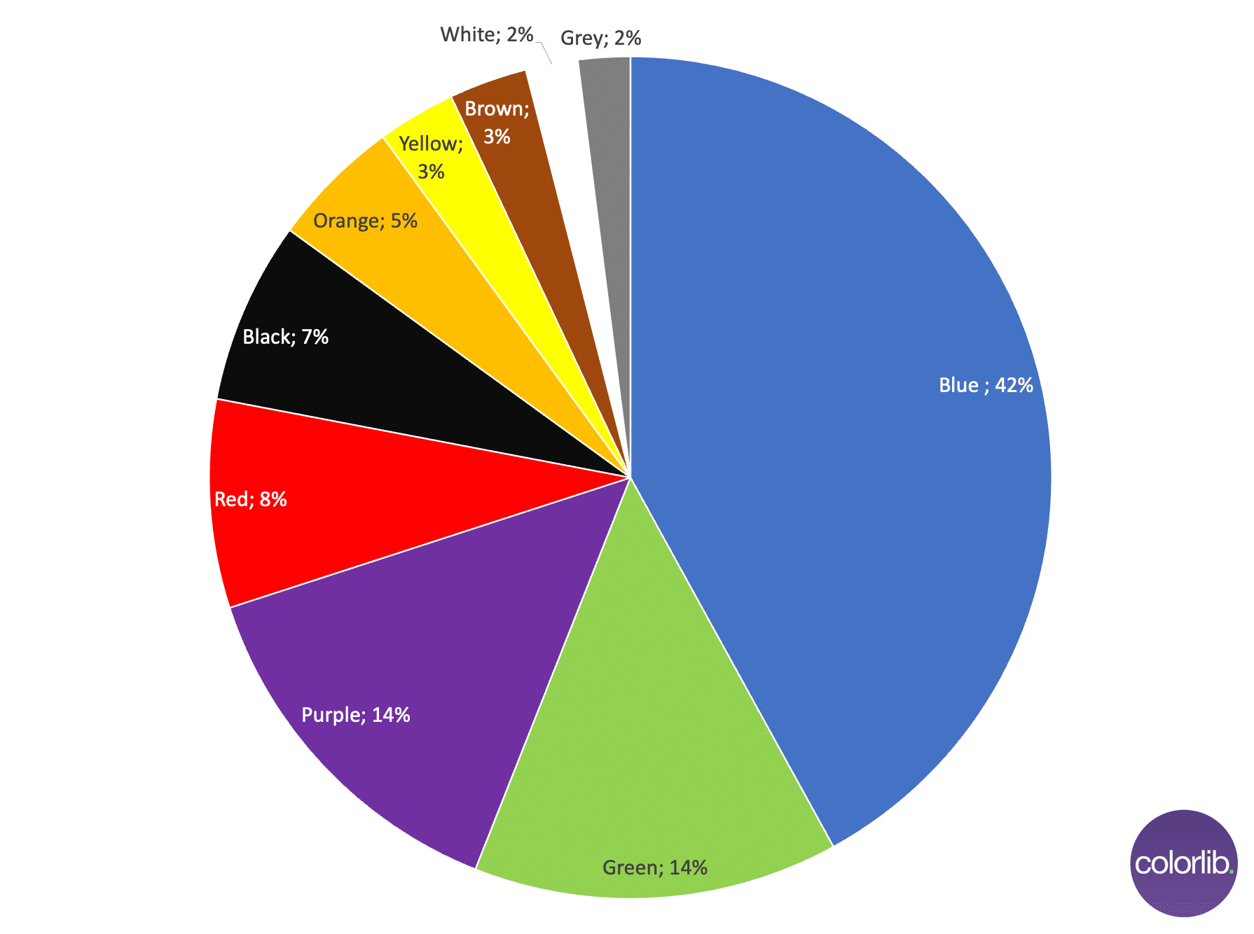
Blue is consistently cited as one of the most popular and frequently used colors in branding, particularly in industries that prioritize trust and reliability, such as finance, technology, and healthcare. Its association with the sky and the ocean evokes feelings of calm, serenity, and stability. In a business context, blue signals competence, dependability, and authority. This makes it an ideal choice for companies aiming to convey a sense of security and professionalism. Think of the ubiquitous blue in corporate logos from IBM to Facebook (now Meta) to PayPal. These brands leverage blue’s inherent trustworthiness to build consumer confidence and a sense of steadfastness.
- Brand Applications: Financial institutions, technology firms, healthcare providers, and government organizations often favor blue. Its ubiquity can also present a challenge, requiring brands to differentiate themselves within a crowded space through unique design and application of the color.
Red: Passion, Urgency, and Excitement
Red is a bold and attention-grabbing color that evokes strong emotions. It’s associated with passion, love, energy, and excitement, but also with danger and urgency. This duality makes it a powerful tool for brands looking to create a sense of urgency or convey high energy. Red is frequently used in sales promotions, food and beverage industries (think Coca-Cola or McDonald’s), and entertainment to stimulate appetite, create excitement, and drive immediate action. Its ability to increase heart rate and blood pressure makes it an inherently stimulating hue.
- Brand Applications: Retail, hospitality, automotive, and often brands targeting a younger demographic utilize red. Its power lies in its ability to cut through visual clutter and demand attention, making it effective for Calls to Action (CTAs) and product launches.
Green: Nature, Growth, and Health
Green is intrinsically linked to nature, representing growth, harmony, health, and prosperity. It’s a calming and refreshing color that promotes feelings of balance and well-being. This makes it a natural fit for brands in the environmental, health and wellness, organic food, and financial sectors (where it signifies wealth and growth). The rise of sustainability consciousness has further amplified the appeal of green for eco-conscious brands.
- Brand Applications: Environmental organizations, organic food companies, health and wellness products, and financial services. Its association with money can also make it a strategic choice for wealth management firms.
Yellow: Optimism, Happiness, and Creativity
Yellow is the color of sunshine, symbolizing happiness, optimism, creativity, and warmth. It’s an energizing color that can stimulate mental activity and generate cheerfulness. However, yellow can also be perceived as attention-grabbing to the point of being overwhelming or cheap if not used judiciously. Brands that want to project a friendly, approachable, and energetic image often turn to yellow.
- Brand Applications: Children’s brands, creative industries, food services, and brands aiming for a playful and approachable persona. It’s often used as an accent color to add vibrancy and draw attention.
Orange: Enthusiasm, Friendliness, and Warmth
Orange, a blend of red and yellow, embodies the enthusiasm and friendliness of yellow with the energy of red. It’s a welcoming and vibrant color that suggests creativity, adventure, and affordability. Brands that want to appear dynamic, approachable, and fun often incorporate orange into their identity.
- Brand Applications: Food and beverage, youth-oriented brands, and companies that want to convey a sense of innovation and accessibility. Think of Nickelodeon or Fanta.
Purple: Royalty, Luxury, and Spirituality
Purple has historically been associated with royalty, nobility, and luxury due to the rarity and expense of purple dyes in ancient times. It also evokes spirituality, imagination, and wisdom. Brands seeking to convey a sense of sophistication, exclusivity, and creativity often opt for purple.
- Brand Applications: Luxury goods, beauty products, creative agencies, and brands with a mystical or spiritual element.
Black: Sophistication, Power, and Elegance
Black is a timeless and versatile color that signifies sophistication, power, elegance, and formality. It can also convey mystery and seriousness. In branding, black is often used by luxury brands to create an aura of exclusivity and high value. It can also be used to add a touch of modern minimalism or a bold, striking statement.
- Brand Applications: Luxury fashion, automotive, technology, and high-end services. Its versatility allows it to be paired with almost any other color to create different effects.
White: Purity, Simplicity, and Cleanliness
White represents purity, simplicity, cleanliness, and clarity. It’s a minimalist color that can create a sense of spaciousness and modernity. Brands often use white to convey a feeling of transparency, honesty, and a fresh start. In the digital space, white is essential for readability and creating a clean user interface.
- Brand Applications: Technology (especially Apple), healthcare, minimalist brands, and brands emphasizing hygiene. Its simplicity makes it a powerful backdrop for other brand elements.
Data-Driven Insights: Decoding Popularity in the Market
While the psychological underpinnings of color are crucial, real-world data offers tangible insights into which colors are most prevalent and successful in the marketplace. Analyzing brand portfolios across industries reveals distinct patterns in color usage, often correlating with the aforementioned psychological associations.
Color Dominance in Top-Tier Brands
Studies and analyses of the color palettes of the world’s leading brands consistently show a strong presence of certain colors. Blue, for instance, is overwhelmingly dominant. This is not accidental; it’s a strategic choice reflecting the desire for trust and reliability in a global marketplace. When consumers interact with brands, especially in critical sectors like finance or technology, they are looking for assurance.
-
Blue’s Dominance in Tech and Finance: The tech industry, with its emphasis on innovation and user engagement, and the financial sector, built on trust and security, both heavily lean on blue. Companies like Microsoft, Dell, and numerous banking institutions utilize blue to foster this sense of stability and competence. This widespread adoption has, in turn, reinforced the color’s association with these qualities in consumers’ minds.
-
The Rise of Green for Sustainable Brands: As environmental consciousness grows, green has seen a significant surge in popularity. Brands committed to sustainability, ethical sourcing, or natural products frequently adopt green. This allows them to immediately communicate their values and attract a like-minded consumer base. The visual language of green is instantly recognizable as representing something natural, healthy, or environmentally friendly.
Color Palettes and Brand Recognition
Brand recognition is a cornerstone of successful branding, and color plays a pivotal role in this. A consistent and distinct color palette helps consumers identify a brand quickly and recall it. This is where the “popularity” of a color shifts from being a universal preference to a strategic tool for differentiation and memorability.
-
The Power of Unique Color Combinations: While certain colors might be more popular individually, the truly successful brands often employ unique and memorable color combinations. Think of the distinct red and white of Coca-Cola, the golden arches of McDonald’s, or the vibrant purple and yellow of Amazon. These are not just random color choices; they are meticulously crafted elements of a comprehensive brand identity designed for immediate recognition.
-
The Challenge of Over-Saturation: The very popularity of some colors, like blue, can lead to saturation. If too many brands in a similar space use the same color, it becomes harder for any single brand to stand out. This necessitates a deeper dive into the nuances of color application – shade, tint, saturation, and how it interacts with other visual elements – to achieve a unique brand presence. For example, while blue might be popular, a specific shade of cerulean or a vibrant turquoise can offer a distinct feel compared to a more conventional navy.
Strategic Color Selection: Moving Beyond Popularity
Understanding color popularity is only the first step. Strategic color selection for a brand involves a multifaceted approach that goes beyond simply picking a “popular” hue. It requires a deep understanding of the target audience, the competitive landscape, and the core message the brand aims to convey.
Target Audience and Cultural Nuances
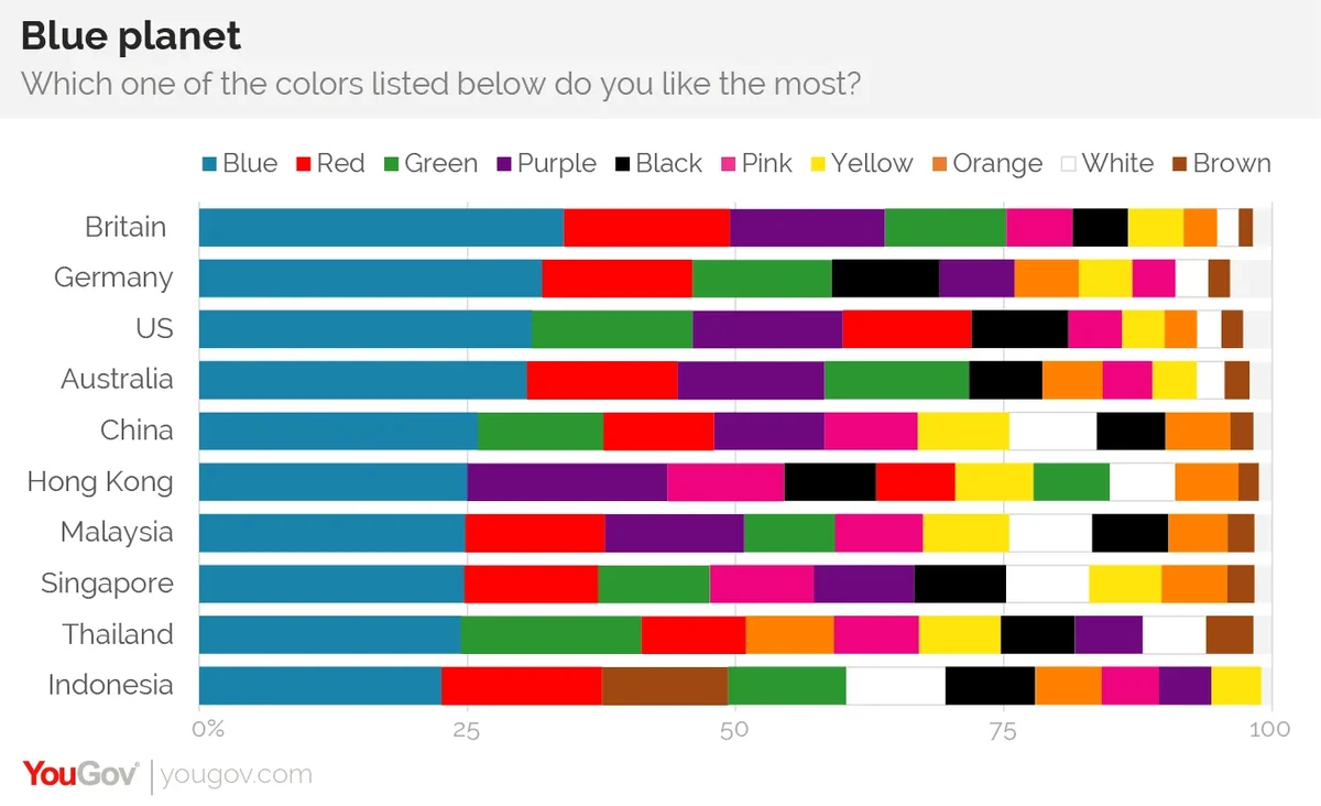
The perception and popularity of colors can vary significantly across different demographics and cultures. What evokes trust and reliability in one culture might be perceived differently in another. Brands operating in a global market must be mindful of these nuances.
-
Cross-Cultural Color Interpretations: For instance, while white signifies purity in Western cultures, it is often associated with mourning and funerals in some East Asian cultures. Similarly, red, a color of luck and celebration in China, can signify danger or warning in other contexts. Brands expanding internationally must conduct thorough research into local color meanings and preferences.
-
Demographic Influences: Younger audiences might be drawn to brighter, more energetic colors, while older demographics might prefer more subdued or classic palettes. Similarly, colors associated with luxury and sophistication might appeal to a different audience than those that communicate fun and affordability.
Competitive Analysis and Differentiation
Before settling on a color palette, a thorough analysis of competitors is essential. Identifying the dominant colors within a brand’s competitive set allows for strategic differentiation.
-
Avoiding the “Sea of Sameness”: If all direct competitors are using blue, adopting blue without a clear differentiator can lead to the brand blending in. In such cases, exploring secondary or accent colors that offer a unique contrast can be more effective. This might involve using a less common but equally impactful color or a distinctive shade of a popular color.
-
Creating a Distinct Visual Signature: The goal is to create a color palette that is not only aesthetically pleasing and psychologically resonant but also unique enough to become a visual signature for the brand, instantly recognizable to consumers.
The Role of Color in Brand Messaging
Ultimately, a brand’s color is a powerful tool for communicating its essence. The chosen colors should be a natural extension of the brand’s mission, values, and personality.
-
Communicating Brand Values: A brand focused on sustainability will naturally gravitate towards greens and earth tones. A luxury brand will likely employ black, gold, or deep jewel tones. A playful children’s brand will use vibrant, cheerful colors. The color choice should feel authentic and reinforce the brand’s narrative.
-
Consistency Across All Touchpoints: Once a color palette is established, consistency is paramount. This means applying the chosen colors uniformly across all brand touchpoints – from the logo and website to packaging, marketing materials, and social media presence. This reinforces brand recognition and builds a strong, cohesive identity in the minds of consumers.
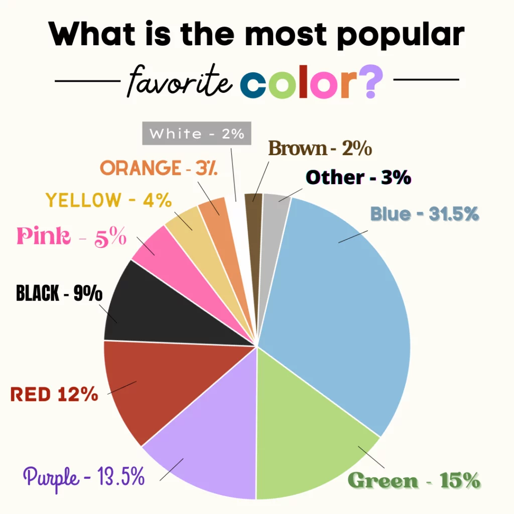
In conclusion, the question of “what color is most popular” in branding is not about identifying a single universally favored hue. Instead, it’s about understanding the psychological impact of colors, analyzing market trends, and strategically employing a chosen palette to build a distinctive and resonant brand identity. While blue might statistically appear most often, the true power lies in how a brand leverages color – in combination, in nuance, and in context – to connect with its audience, communicate its values, and achieve lasting recognition in a visually crowded world. The most popular color is, ultimately, the one that most effectively tells the brand’s story.
aViewFromTheCave is a participant in the Amazon Services LLC Associates Program, an affiliate advertising program designed to provide a means for sites to earn advertising fees by advertising and linking to Amazon.com. Amazon, the Amazon logo, AmazonSupply, and the AmazonSupply logo are trademarks of Amazon.com, Inc. or its affiliates. As an Amazon Associate we earn affiliate commissions from qualifying purchases.