
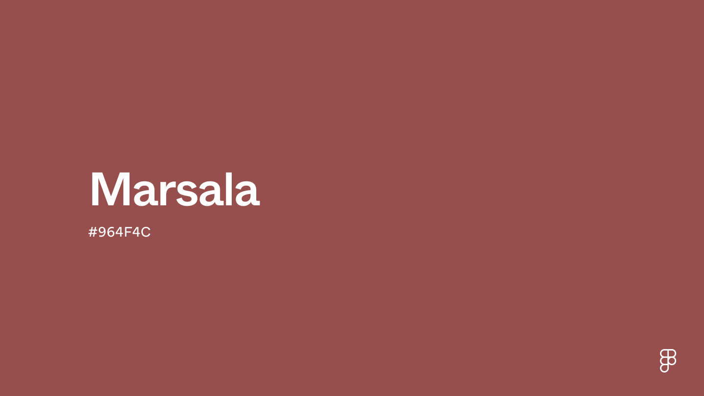
The inquiry into “what color is Marsala” extends far beyond a simple hue identification; it delves into the strategic and psychological dimensions of brand identity and marketing. Marsala is not merely a shade of red; it is a sophisticated, deeply evocative color that has played a significant role in design and branding, particularly since its rise to prominence as a global trend. Described as a naturally robust and earthy wine red, Marsala sits at the intriguing intersection of rich red, warm brown, and subtle plum tones. This complex composition lends it an air of groundedness, warmth, and quiet confidence, making it a compelling choice for brands seeking to convey elegance, authenticity, and a timeless appeal. Understanding the nuances of Marsala, from its psychological impact to its versatile applications, is crucial for businesses aiming to craft a powerful and resonant visual identity.

The Essence of Marsala: A Deep Dive into its Hue
Marsala’s distinctive character stems from its intricate blend of undertones, allowing it to adapt across various aesthetic applications while maintaining its core identity. Its depth prevents it from being overtly aggressive, while its warmth keeps it from feeling stark or cold, striking a harmonious balance.
Unpacking the Color Profile
Marsala’s visual identity is rooted in its natural, organic quality. It isn’t a bright, primary red, nor is it a dull brown. Instead, it’s a sophisticated tertiary color, rich with brown and reddish-brown undertones that evoke the natural earth, fine fortified wines, and the autumnal landscape. This grounding quality imbues Marsala with a sense of stability, maturity, and sincerity. The subtle infusion of red elements provides warmth and a touch of passion, without overpowering its inherent elegance. Its muted saturation ensures that it communicates strength and substance rather than fleeting vibrancy. This unique profile makes Marsala incredibly versatile, capable of appearing both rustic and refined, traditional and contemporary, depending on the colors and textures it is paired with. For brands, this means a color that can convey both heritage and modern sophistication.
The Psychology Behind the Shade
Colors are powerful communicators, and Marsala is particularly adept at eliciting specific emotional and psychological responses. Psychologically, Marsala is often associated with warmth, comfort, and a sense of belonging. Its earthy tones connect it to nature and authenticity, suggesting reliability and trustworthiness. The robust quality of the color can convey confidence, a deep-rooted sense of identity, and a certain gravitas, without being ostentatious. It stimulates an appetite for richness, not just in food and drink, but in experiences and material quality, making it an excellent choice for luxury brands, artisan products, and hospitality. Brands that utilize Marsala can effectively project an image of grounded sophistication, sincerity, and enduring quality, appealing to consumers who value substance, heritage, and genuine connection. It’s a color that invites reflection and suggests a deeper story.
Marsala’s Moment in the Spotlight: Pantone’s Influence
The global recognition of Marsala was largely propelled by its selection as Pantone’s Color of the Year, a designation that profoundly impacts design trends and brand strategies worldwide.
The Significance of Color of the Year
Pantone’s annual Color of the Year announcement is a highly anticipated event in the design world, serving as both a trend forecast and a cultural commentary. It is meticulously chosen through careful consideration of global cultural influences, including fashion, art, entertainment, technology, and socio-economic conditions. The selected color acts as a bellwether, influencing product development, graphic design, interior decoration, and marketing campaigns across various industries. For brands, understanding and strategically responding to the Color of the Year provides an opportunity to demonstrate relevance, innovation, and a pulse on contemporary aesthetics. It offers a common visual vocabulary that can resonate with consumers on a broader scale, creating a sense of being current and forward-thinking.
How Marsala Embodied its Era
As Pantone’s Color of the Year for 2015, Marsala perfectly encapsulated a prevailing societal desire for depth, richness, and grounding in an increasingly digital and fast-paced world. Its organic and earthy qualities spoke to a longing for authenticity, connection to nature, and a return to simpler, more meaningful values. In a landscape often dominated by fleeting digital trends, Marsala offered a robust and substantive antidote, reflecting a collective yearning for handcrafted quality, traditional craftsmanship, and enduring design. Brands that embraced Marsala during this period were able to tap into this cultural zeitgeist, positioning themselves as purveyors of timeless elegance, genuine value, and a sophisticated, yet accessible, luxury. The color provided a visual anchor, suggesting durability and an unpretentious yet refined style.
Strategic Applications: Leveraging Marsala in Branding and Design
Integrating Marsala effectively into a brand’s visual language requires a strategic understanding of its psychological effects and its versatility across different touchpoints. Its depth allows for diverse applications, from foundational color to impactful accent.
Corporate Identity and Logo Design
For corporate identity, Marsala offers a compelling blend of gravitas and approachability. A brand featuring Marsala in its logo or core identity immediately conveys a sense of established credibility, refined taste, and deep-rooted authenticity. Unlike more assertive reds that might suggest urgency or aggression, Marsala communicates passion and energy with a reassuring sense of maturity and stability. It can elevate a brand from being merely functional to being aspirational. This makes it an excellent choice for luxury goods, financial institutions, artisan crafts, or hospitality brands seeking to project trustworthiness, heritage, and a sophisticated yet grounded image. Paired with complementary neutrals such as soft creams, charcoal greys, or even metallic golds, Marsala can create a powerful, memorable, and distinctive visual signature that stands out in a competitive market, signifying quality and enduring value.
Marketing Campaigns and Product Presentation
In marketing campaigns, Marsala excels at creating an inviting and luxurious atmosphere. Its ability to evoke warmth and comfort makes it ideal for lifestyle photography, advertisements for home goods, fashion, or food and beverage industries. When used in product packaging, Marsala subtly suggests premium quality and a rich experience, signaling to consumers that they are investing in something substantial and well-crafted. For digital marketing, the color can serve as an elegant background for compelling typography or as a sophisticated accent to draw the eye to key calls to action, provided it is balanced with lighter tones to ensure readability and user experience. Brands can leverage Marsala to craft narratives emphasizing heritage, authenticity, slow living, and the intentional enjoyment of life, resonating deeply with consumers who prioritize depth and quality over superficiality.
Personal Branding and Lifestyle Aesthetics
Beyond corporate applications, Marsala is a powerful color for personal branding, especially for professionals in creative fields, luxury services, or anyone aiming to project sophistication, discernment, and grounded confidence. A personal brand incorporating Marsala in its website design, professional portfolio, or even curated wardrobe communicates an image of intellectual depth, refined taste, and a distinctive personal style. In lifestyle aesthetics, Marsala contributes to creating environments that feel both elegant and profoundly welcoming. Whether used as an accent wall, a statement piece of furniture, or carefully chosen accessories, the color imparts an air of cultivated taste and inviting warmth. For influencers, designers, or consultants, Marsala can serve as a compelling visual cue that reinforces their unique value proposition and aesthetic sensibilities, making a memorable impression on their audience.
Beyond the Trend: Marsala’s Enduring Appeal
While Marsala enjoyed a significant moment in the spotlight as Color of the Year, its inherent qualities ensure its continued relevance and lasting appeal in branding and design, far transcending any fleeting trend cycle.
Versatility and Timelessness in Design
Marsala’s complex composition is the key to its remarkable versatility. It harmonizes beautifully with an extensive array of other colors, from crisp off-whites and muted greys to deep forest greens, navy blues, and even shimmering golds or coppers. This adaptability makes it a perennially favored choice for designers seeking a color that can transition seamlessly across seasons, styles, and applications without losing its impact or feeling dated. Unlike more vibrant or polarizing trend colors, Marsala possesses an intrinsic timeless quality that allows it to integrate seamlessly into both classic and contemporary design schemes. Its depth and sophistication prevent it from ever feeling obsolete, instead rooting it in a sense of enduring elegance and refined simplicity, making it a reliable yet impactful choice for brands striving for longevity and consistent appeal.
Crafting Brand Narratives with Color
Colors are potent storytellers, and Marsala articulates a narrative of richness, stability, and quiet confidence. Brands can harness this inherent storytelling capability to articulate their core values and connect with their audience on a profound emotional level. A brand that strategically uses Marsala might convey a story of meticulous craftsmanship, a deep respect for tradition, or an unwavering commitment to delivering experiences that are both luxurious and deeply grounded. It suggests a brand that is secure in its identity, unpretentious yet highly refined. This narrative power is particularly valuable in today’s markets, where authenticity, transparency, and a strong sense of purpose are highly valued by discerning consumers. By carefully integrating Marsala, brands can sculpt a visual identity that not only looks appealing but also communicates a compelling, consistent, and memorable message.
Mastering Color Selection for Brand Impact
The choice to integrate Marsala, or any color, into a brand’s identity is never arbitrary; it is a meticulously strategic decision that reflects the brand’s core identity, aspirations, and target audience. Effective color selection is an art informed by market insights and a deep understanding of psychological impact.
The Role of Context and Audience
The ultimate effectiveness of Marsala, like any color, is heavily dependent on the specific context and the intended audience. A luxury fashion brand targeting an older, affluent demographic might successfully use Marsala to convey heritage and exclusivity, whereas a tech startup aimed at a younger, minimalist-focused demographic might find it too traditional or heavy. It is paramount for brands to understand the cultural connotations of a color, its impact within specific industry verticals, and how it truly resonates with the target audience’s values and preferences. Before full integration, brands must conduct thorough research into their market’s aesthetic preferences, analyze competitor color schemes, and clearly define the overall messaging they wish to convey. A color that delivers immense value in one context could be entirely counterproductive in another, underscoring the critical need for strategic foresight and targeted application.
Building a Cohesive Color Palette
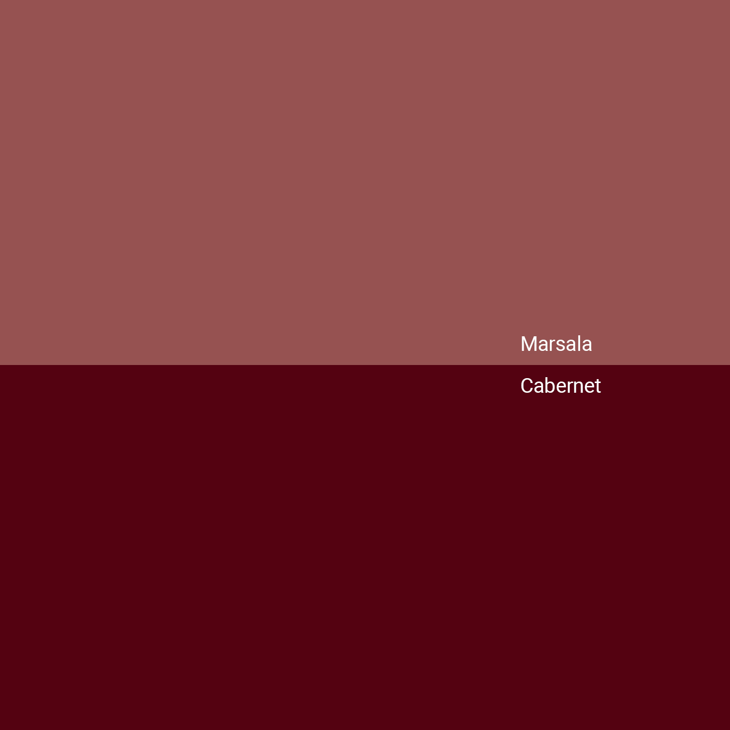
While Marsala possesses significant power as a standalone color, its true impact within branding often emerges when it is intelligently integrated into a thoughtfully constructed color palette. Rarely does a brand rely on a singular color; rather, a cohesive palette establishes visual harmony and allows for versatile application across all brand assets. Marsala can serve as a primary anchor, a sophisticated secondary color, or a rich accent. It pairs exceptionally well with earthy tones such as deep olive green, muted teal, or even sophisticated metallics like gold and copper for a touch of glamour. It can also complement softer pastels for a more delicate and nuanced approach. The key objective is to create a palette where each color supports and enhances the others, ensuring consistency across all brand communications and reinforcing the brand’s unique identity with every visual interaction. This holistic approach to color management is indispensable for forging a memorable and impactful brand presence that stands the test of time.
aViewFromTheCave is a participant in the Amazon Services LLC Associates Program, an affiliate advertising program designed to provide a means for sites to earn advertising fees by advertising and linking to Amazon.com. Amazon, the Amazon logo, AmazonSupply, and the AmazonSupply logo are trademarks of Amazon.com, Inc. or its affiliates. As an Amazon Associate we earn affiliate commissions from qualifying purchases.