
In the world of corporate identity and marketing, color is rarely a matter of mere aesthetics. It is a calculated psychological tool designed to evoke specific emotions, drive consumer behavior, and establish an immediate connection between a product and a lifestyle. When we ask, “What color is Easter?” we are not simply discussing the dyes used on eggs or the shades of spring flowers. From a brand strategy perspective, we are analyzing a seasonal visual language that commands billions of dollars in global retail spending.
For brands, Easter represents the first major psychological shift of the fiscal year. It marks the transition from the stark, utilitarian tones of winter to a palette of rebirth, optimism, and renewal. Understanding how to navigate this spectrum—ranging from traditional pastels to modern high-contrast metallics—is essential for any organization looking to capture seasonal market share while maintaining a cohesive brand identity.
The Psychology of Pastel: Why Easter Colors Define Spring Branding
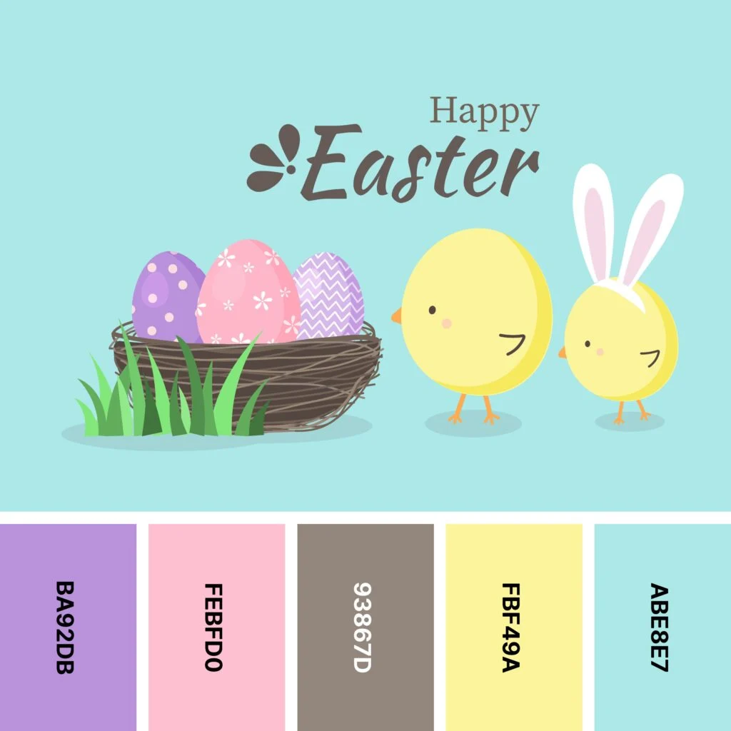
The traditional answer to “What color is Easter?” is almost always a collection of pastels: lavender, mint green, baby blue, and soft primrose yellow. These aren’t chosen by accident. In the realm of brand strategy, these colors serve as a psychological “reset” for the consumer.
The Symbolism of Lavender and Mint
Lavender and mint green are foundational to the Easter aesthetic. Lavender carries historical connotations of luxury and grace, but in its desaturated “Easter” form, it communicates calmness and approachability. For a brand, utilizing lavender in seasonal packaging can soften a corporate image, making it appear more family-oriented and gentle.
Mint green, on the other hand, is the ultimate signifier of “newness.” After the dormant months of winter, consumers are biologically primed to respond to shades of green. In marketing, this translates to freshness—an essential attribute for brands in the food, beverage, and skincare sectors. When a brand pivots to mint during the Easter season, it signals that the product is a part of the “spring cleaning” of the consumer’s life, offering a fresh start.
Soft Yellows and the “Fresh Start” Narrative
Yellow is the most visible color in the spectrum, but during Easter, it is tempered into a soft, creamy hue. This color represents sunlight and optimism. In brand psychology, yellow is used to trigger the release of serotonin, making the consumer feel happy and hopeful. By incorporating these shades into digital assets or retail displays, brands tap into the collective desire for a brighter, warmer season. It is a strategic move that aligns the brand with the positive emotional trajectory of the spring solstice.
Seasonal Color Transitions: Moving from Winter Grays to Easter Vibrance
One of the most significant challenges in brand management is the seasonal transition. A brand must remain recognizable while adapting its visual language to fit the current cultural moment. Transitioning from the high-contrast or muted tones of the winter holidays into the Easter palette requires a delicate balance of brand equity and seasonal relevance.
Managing Brand Consistency Across Campaigns
The goal of seasonal branding is not to replace the core brand identity but to “dress it up” for the occasion. Strategic brands use “anchor colors”—their primary brand colors—and surround them with Easter-specific accents. For example, a tech company with a stark navy-blue logo might not change the logo color, but it will utilize lavender and sky-blue backgrounds in its seasonal advertising to signal a shift in tone.
This consistency ensures that the brand does not lose its authority or recognizability. If a brand pivots too far into the seasonal palette, it risks becoming “white labeled,” looking like a generic holiday product rather than a premium offering. The strategy is to maintain the core structure while adopting the seasonal “mood.”
The Impact of High-Contrast Palettes on Consumer Attention
While pastels are the traditional choice, modern brand strategy often incorporates high-contrast accents to cut through the visual noise. As more brands flood the market with soft pinks and greens, those that introduce a “pop” of high-intensity color—such as a vibrant coral or a deep violet—tend to capture more visual attention in a crowded retail environment.
This is particularly effective in digital marketing. On platforms like Instagram or Pinterest, where the user scrolls rapidly, a soft pastel image might blend into the background. A brand that uses a “neopastel” approach—taking traditional Easter colors and amping up the saturation—can stop the scroll and drive higher engagement rates.
Case Studies: Brands that Master the Easter Visual Identity

Certain brands have been so successful in their Easter color strategy that they have essentially “claimed” specific shades within the seasonal context. These case studies demonstrate how color becomes a brand asset that is as valuable as a trademark.
Cadbury and the Power of Royal Purple
Cadbury is perhaps the most iconic example of Easter branding. While their signature “Cadbury Purple” (Pantone 2685C) is used year-round, it takes on a specific power during the Easter season. Purple is traditionally associated with royalty and penance in the religious context of Easter, but for Cadbury, it represents premium indulgence.
By pairing this deep, regal purple with bright yellow accents and gold foil, Cadbury creates a visual hierarchy. The purple provides the brand’s authority and heritage, while the yellow signals the joy and accessibility of the Easter holiday. This color combination is so deeply embedded in the consumer’s mind that they can identify a Cadbury display from the other side of a supermarket without seeing a single logo.
Lindt and the Gold Standard of Premium Holiday Packaging
Lindt’s “Gold Bunny” is another masterclass in seasonal brand strategy. While most competitors focus on the pastel spectrum, Lindt uses gold as its primary Easter color. Gold is not a traditional Easter color in the “springtime” sense, but it serves a vital strategic purpose: it positions the product as a luxury gift.
The red ribbon around the neck of the Gold Bunny serves as a secondary brand trigger. Red is a color of urgency and passion. When placed against the gold foil, it creates a high-status visual that justifies a premium price point. Lindt proves that “what color is Easter” can be answered with “gold,” provided the brand can back up that claim with a consistent narrative of quality and prestige.
Implementing Easter Aesthetics in Digital and Print Marketing
For small to mid-sized brands, implementing an Easter color strategy requires a multi-channel approach. The visual experience must be seamless across the unboxing experience, the website interface, and social media touchpoints.
Optimizing Social Media Visuals for Spring Trends
In the digital space, the “color of Easter” is often dictated by current design trends. Currently, there is a shift toward “Earth-toned Easter.” This involves moving away from synthetic-looking pastels toward more organic, muted shades like sage, terracotta, and dusty rose.
Brands that cater to a Gen Z or Millennial demographic are finding success by adopting these more “authentic” and “sustainable” tones. This reflects a broader brand strategy move toward environmental consciousness. By using colors that look like they were sourced from natural dyes, brands signal that they are aligned with the values of the modern, eco-conscious consumer.
Packaging Design and the Unboxing Experience
The physical touchpoint—the packaging—is where the Easter color palette must work the hardest. For e-commerce brands, the “unboxing” is the primary moment of brand reinforcement. Using custom tissue paper in seasonal shades or a soft-touch matte finish in a spring hue can elevate the perceived value of the purchase.
Designers often use a “60-30-10” rule for seasonal packaging: 60% of a neutral “anchor” color (like white or craft brown), 30% of the primary Easter shade (like mint), and 10% of a bold accent (like a metallic gold or a bright magenta). This creates a balanced, professional look that feels seasonal without being overwhelming.
The Future of Seasonal Color Forecasting
As we look toward the future of brand strategy, the question of “What color is Easter?” is increasingly being answered by data. AI-driven tools now analyze millions of social media posts to determine which colors are trending in real-time, allowing brands to adjust their digital assets on the fly.
Data-Driven Color Selection for Global Markets
Global brands must also consider that the “color of Easter” varies by geography. In some cultures, bright reds and oranges are more prevalent in spring festivals, while in others, the focus is entirely on white and gold. Predictive analytics allow brands to localize their color palettes, ensuring that a campaign launched in London resonates just as deeply as one launched in Sydney or New York.

Sustainability and the “Green” Easter Movement
Finally, the “color” of Easter is becoming increasingly “green”—not just as a shade, but as a brand philosophy. Brands are moving away from plastic-heavy, vibrantly dyed packaging in favor of biodegradable materials that maintain their natural textures. In this context, the “new Easter palette” is one of raw fibers, soy-based inks, and recycled paper.
This strategic shift proves that color is never static. It is a living component of a brand’s identity, reflecting the changing values of the society it serves. Whether it is the royal purple of a chocolate bar or the organic sage of a sustainable clothing line, the colors of Easter are a powerful medium through which brands tell their story of renewal, joy, and growth.
aViewFromTheCave is a participant in the Amazon Services LLC Associates Program, an affiliate advertising program designed to provide a means for sites to earn advertising fees by advertising and linking to Amazon.com. Amazon, the Amazon logo, AmazonSupply, and the AmazonSupply logo are trademarks of Amazon.com, Inc. or its affiliates. As an Amazon Associate we earn affiliate commissions from qualifying purchases.