
The question “What color is cream?” seems deceptively simple. We might conjure images of dairy products, soft furnishings, or the subtle off-white shade that graces many interiors. However, within the strategic realm of branding, the color cream transcends its literal definition to become a potent symbol, a deliberate choice laden with meaning and capable of eliciting specific emotional responses. This article will explore the multifaceted nature of cream as a brand color, delving into its psychological impact, its historical and cultural associations, its versatile applications, and the strategic considerations that guide its selection and implementation in corporate identity. Far from being just a shade, cream is a sophisticated tool in the brand architect’s arsenal.
The Psychology of Cream: Evoking Warmth, Luxury, and Serenity
The perceived “color” of cream is deeply rooted in human psychology and sensory experience. While technically an off-white, its subtle warmth and softness differentiate it from stark, clinical whites. This nuance is crucial for brands seeking to convey specific emotions and values.
Warmth and Comfort: A Foundation of Trust
Unlike the coolness of pure white, which can sometimes feel sterile or distant, cream exudes an inherent warmth. This warmth translates into feelings of comfort, familiarity, and approachability. Brands that utilize cream in their palettes often aim to build a sense of trust and reassurance with their audience. Think of cozy cafes, premium bedding manufacturers, or artisanal bakeries; cream in these contexts enhances the feeling of a welcoming and nurturing environment. This emotional connection is vital for establishing long-term customer loyalty, as consumers are more likely to engage with brands that make them feel at ease. The subtle yellowness or beige undertones present in most cream shades contribute to this perception, tapping into primal associations with sunlight, natural materials, and gentle hues.
Sophistication and Luxury: The Understated Elegance
While bold colors often grab immediate attention, cream offers a more refined and understated form of sophistication. It speaks of quiet confidence and discerning taste rather than ostentatious display. This makes it an ideal choice for luxury brands, high-end fashion houses, and premium service providers. Cream evokes a sense of timeless elegance and quality, suggesting that the product or service is of superior craftsmanship and refined appeal. It allows for other elements of the brand to shine, acting as a sophisticated backdrop that elevates rather than competes. The historical association of cream with ivory, parchment, and natural silks further reinforces its connection to luxury and heritage. This nuanced perception allows brands to position themselves as exclusive and aspirational without alienating a broader audience through aggressive or overwhelming visual cues.
Serenity and Purity: A Calm and Clean Aesthetic
Cream also possesses a calming and purifying quality. It’s less demanding than bright white, offering a gentler visual experience that can reduce stress and promote a sense of tranquility. This makes it a popular choice for brands in the wellness, spa, and healthcare industries. The subtle tint of cream can make designs feel more organic and less clinical, fostering an environment of peace and healing. This aesthetic choice can be particularly effective in counteracting the anxieties often associated with certain services or products, creating a sanctuary-like brand experience. The association with natural, unsullied elements further enhances this perception of purity and well-being.
The Cultural and Historical Resonance of Cream: A Palette of Meaning
The meaning and perception of colors are not universal; they are shaped by culture, history, and societal trends. Cream, with its ties to natural elements and historical artistic movements, carries a rich tapestry of associations that brands can leverage.
Natural Origins: Earth, Sky, and Dairy
Cream’s most direct association is with its namesake: the rich, fatty layer of milk. This evokes a sense of nourishment, purity, and natural goodness. Beyond dairy, cream shades are abundant in nature. They are found in the sands of pristine beaches, the soft hues of natural linen and cotton, the delicate petals of certain flowers, and the muted tones of weathered wood. These natural connections imbue cream with a feeling of authenticity and groundedness, making it a favored choice for brands emphasizing sustainability, organic ingredients, or a connection to the natural world. This organic feel resonates with a growing consumer desire for transparency and genuine products.
Historical and Artistic Allusions: From Classics to Modernism
Historically, cream and similar off-white tones have been prominent in art and design. Think of the warm, aged canvases of Old Masters, the elegant simplicity of Art Nouveau interiors, or the minimalist aesthetics that gained traction in mid-20th century design. These historical touchpoints lend cream a sense of timelessness and cultural gravitas. In the digital age, cream can be used to evoke a sense of vintage charm or artisanal craftsmanship, contrasting with the often stark and saturated palettes of modern technology. This ability to bridge historical elegance with contemporary relevance makes cream a versatile and enduring choice. It can signal heritage and tradition while remaining relevant and appealing to modern sensibilities.
Global Interpretations: Nuances in Perception
While generally perceived positively, the exact connotations of cream can vary slightly across cultures. In some Western contexts, it might be associated with weddings and celebration, symbolizing purity and new beginnings. In other cultures, muted tones might be more prevalent in traditional attire, suggesting modesty and humility. Brands operating on a global scale must be mindful of these nuances. However, the fundamental attributes of warmth, gentleness, and understated elegance tend to be widely appreciated, making cream a relatively safe and universally appealing choice when approached with cultural sensitivity. Understanding these subtle differences allows for more targeted and impactful brand messaging.

Strategic Application of Cream in Brand Identity: Beyond the Logo
The color cream is rarely used in isolation. Its true power lies in its strategic integration across various touchpoints of a brand’s identity, from the visual elements of its logo and website to the tactile experience of its packaging and marketing collateral.
The Logo and Visual Identity: A Subtle yet Significant Statement
Incorporating cream into a logo can immediately set a tone of sophistication and trustworthiness. It can be used as a primary brand color, a secondary accent, or as a background element. A cream logo against a darker background, for instance, can create a striking yet elegant contrast. Conversely, a cream logo on a white or light background can convey a sense of subtlety and understated luxury. The font choice and surrounding graphic elements will further define the brand’s personality when paired with cream. For example, a delicate script font in cream might evoke a romantic or artisanal brand, while a bold sans-serif font in cream could suggest a modern, minimalist approach. The key is to ensure the cream hue is consistent and aligns with the overall brand message.
Website Design and User Experience: Creating an Inviting Digital Space
On websites and digital platforms, cream serves as an excellent alternative to pure white. It reduces eye strain, making longer reading sessions more comfortable. It provides a warm, inviting backdrop that enhances the perceived quality of content and imagery. By using cream as a primary background color, brands can create a sense of spaciousness and calm, guiding the user’s eye through the content without overwhelming them. Accent colors can be strategically placed against the cream backdrop to highlight calls to action or important information. This thoughtful use of color contributes significantly to the overall user experience, fostering engagement and encouraging exploration of the brand’s offerings.
Packaging and Product Design: A Tactile and Emotional Connection
The tactile experience of packaging plays a crucial role in brand perception. Using cream-colored paper stock, textures, or printing inks can elevate the perceived value of a product. A product housed in a cream-colored box or wrapped in cream tissue paper immediately communicates a sense of premium quality and careful consideration. This is particularly effective for products that aim to convey natural ingredients, artisanal craftsmanship, or a sense of indulgence. The visual appeal of cream packaging can also stand out on crowded shelves, drawing attention through its understated elegance rather than aggressive visual noise. This sensory engagement builds a stronger emotional connection with the consumer.
Marketing Collateral and Brand Messaging: Reinforcing the Narrative
From brochures and business cards to social media graphics and advertising campaigns, cream can be consistently applied to reinforce a brand’s narrative. Using cream in marketing collateral helps maintain a cohesive visual identity across all touchpoints. It can be used to frame testimonials, highlight key product features, or create visually appealing layouts for informational content. When paired with evocative imagery or thoughtful copy, cream can amplify the intended message, whether it’s one of comfort, luxury, or serene professionalism. The consistent application of cream across all brand communications solidifies its identity and strengthens its emotional resonance with the target audience.
Considerations and Challenges: Mastering the Nuances of Cream
While cream offers significant advantages, its effective implementation requires careful consideration and a deep understanding of its subtle variations and potential pitfalls.
The Spectrum of Cream: Finding the Right Shade
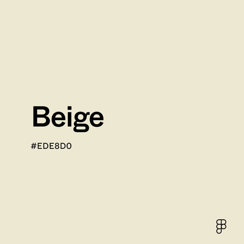
“Cream” is not a single, monolithic color. It exists on a spectrum, ranging from pale, almost white hues with a hint of yellow, to richer, more golden or beige tones. The specific shade chosen can dramatically alter the brand’s perception. A very pale cream might lean towards a crisp, modern feel, while a deeper, warmer cream can evoke a more vintage or opulent aesthetic. Brands must meticulously select the shade of cream that best aligns with their core values and desired brand persona. This often involves extensive testing and mood boarding to ensure the chosen hue accurately represents the brand’s intended message.
Balancing Cream with Other Colors: Harmony and Contrast
Cream is often most effective when used in conjunction with other colors. The choice of complementary or contrasting colors can significantly influence the overall mood and message. Pairing cream with natural earthy tones like browns, greens, or deep blues can enhance its organic and grounded qualities. For a more sophisticated and contemporary feel, cream can be juxtaposed with metallics like gold or rose gold, or with deep, rich jewel tones. Conversely, pairing cream with overly bright or jarring colors can dilute its intended effect and create visual disharmony. The art lies in creating a balanced palette where cream plays its intended role – whether as a subtle foundation or a gentle highlight.

Avoiding Monotony: The Importance of Texture and Contrast
While cream can convey serenity, overreliance on a single shade of cream without variation can lead to a monotonous and unengaging brand experience. To combat this, brands should incorporate variations in texture, tone, and the strategic use of other complementary colors. Different finishes (matte vs. gloss), paper textures, or even subtle patterns within cream elements can add depth and visual interest. Highlighting cream areas with subtle shadows or gradients, or using it as a backdrop for more vibrant content, can also prevent it from becoming visually flat. The goal is to leverage the inherent qualities of cream while ensuring the overall brand presentation remains dynamic and captivating.
In conclusion, the question “What color is cream?” is an invitation to explore the profound impact of color in brand building. It is a shade that whispers rather than shouts, conveying warmth, luxury, and serenity through its subtle nuances. By understanding its psychological resonance, historical context, and strategic applications, brands can harness the power of cream to craft identities that are not only visually appealing but also deeply resonant and enduring. It is a testament to the fact that sometimes, the most powerful messages are conveyed not through bold pronouncements, but through the quiet elegance of a carefully chosen hue.
aViewFromTheCave is a participant in the Amazon Services LLC Associates Program, an affiliate advertising program designed to provide a means for sites to earn advertising fees by advertising and linking to Amazon.com. Amazon, the Amazon logo, AmazonSupply, and the AmazonSupply logo are trademarks of Amazon.com, Inc. or its affiliates. As an Amazon Associate we earn affiliate commissions from qualifying purchases.