
The seemingly simple question, “what color is cherry,” unravels a complex tapestry of sensory perception, psychological association, and strategic brand deployment. Far from being a singular hue, “cherry” represents a spectrum of reds, each imbued with distinct characteristics that brands meticulously leverage to communicate specific messages, evoke particular emotions, and forge indelible connections with their target audiences. In the intricate world of corporate identity and marketing design, understanding the nuances of “cherry” is not merely an aesthetic choice but a potent strategic decision.
The Multifaceted Hue: Defining ‘Cherry’ in Branding
At its core, “cherry” as a color concept extends far beyond the singular shade of a ripe fruit. It encompasses a rich semantic spectrum that brands exploit to their advantage, ranging from vibrant primary reds to deep, sophisticated crimsons, and even the warm, reddish-brown tones associated with cherry wood. This breadth allows for incredible versatility in branding.

Beyond the Fruit: Interpreting ‘Cherry’ as a Color Concept
The initial association with “cherry” is, of course, the fruit itself – a small, round, often shiny red delight. This immediate connection brings forth connotations of freshness, naturalness, sweetness, and vitality. Brands in the food and beverage industry frequently harness this direct association, using vibrant cherry reds to signal natural ingredients, refreshing flavors, or wholesome goodness. Think of cherry-flavored sodas, yogurts, or jams, where the color instantly reinforces the product’s identity and appeal.
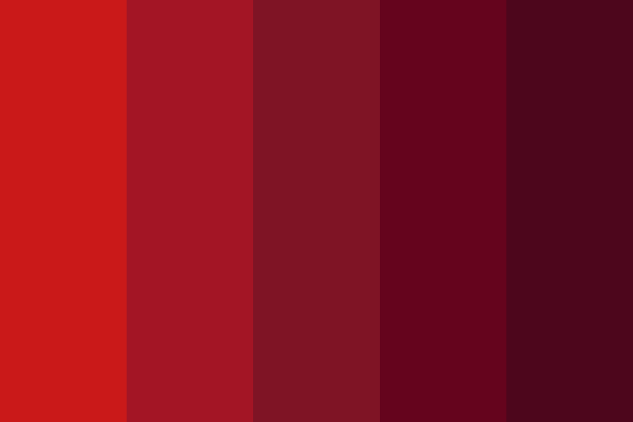
However, “cherry” quickly branches out into a broader color family. “Cherry red” as a descriptive term often refers to a bright, clear, and slightly deep red, vibrant and eye-catching. Then there are the deeper, more muted tones that lean towards burgundy or maroon, which might be described as “dark cherry” or “black cherry,” suggesting richness, luxury, or a more mature sophistication. Furthermore, the reddish-brown hues of polished “cherry wood” evoke warmth, tradition, craftsmanship, and enduring quality, a distinct color identity used predominantly in furniture, flooring, and interior design. The context, therefore, is paramount: a “cherry red” sports car conveys a vastly different message than a “cherry wood” executive desk.
The Semantic Spectrum: What ‘Cherry’ Communicates
Each iteration of “cherry” carries a unique set of communicative properties:
- Vibrant Cherry Reds (e.g., Maraschino Cherry): These intense, bright reds communicate energy, passion, boldness, and excitement. They demand attention and are often used for calls to action, warnings, or products aimed at a youthful, dynamic demographic. They suggest speed, modernism, and high energy.
- Deep Cherry Reds (e.g., Black Cherry, Bing Cherry): Moving into richer, more saturated reds, these tones convey luxury, sophistication, warmth, and indulgence. They suggest a premium quality, often seen in high-end fashion, cosmetics, or gourmet foods. There’s a sense of depth and timeless elegance.
- Cherry Wood Tones: These reddish-brown hues, infused with the warmth of natural wood, speak of tradition, craftsmanship, authenticity, and comfort. They imply durability, reliability, and a classic, enduring appeal, frequently utilized by brands in furniture, automotive interiors, or bespoke product design.
Understanding this semantic spectrum allows brands to precisely tailor their color choices to align with their overarching identity and the specific messages they wish to impart to their consumers.
The Psychology of ‘Cherry’ Tones in Consumer Perception
The impact of color on human psychology is well-documented, and “cherry” tones, as derivatives of red, carry significant emotional weight. Brands harness these psychological triggers to shape consumer perception and drive desired behaviors.
Emotional Triggers and Brand Associations
Red, in general, is a color of strong emotion. It’s associated with passion, love, anger, urgency, and excitement. “Cherry” refines these broad associations, adding specific layers of meaning.
- Indulgence and Desire: The richness of deep cherry reds often triggers feelings of indulgence, luxury, and desirability. Think of a decadent cherry cordial or a glossy cherry-red lipstick – both evoke a sense of treat and allure. This makes it a powerful choice for products positioned as premium or aspirational.
- Health and Vitality: The natural aspect of the cherry fruit links the color to health, freshness, and vitality. Brands in the health food, organic product, or wellness sectors might use lighter, brighter cherry tones to suggest natural goodness and wholesome benefits.
- Warmth and Comfort: Cherry wood tones, with their earthy red-brown character, evoke feelings of warmth, comfort, and security. This is why they are popular in home furnishings and spaces designed to feel inviting and stable.
- Attention and Action: Vibrant cherry reds are inherently attention-grabbing. They can be used effectively for calls to action, sales promotions, or any element that requires immediate notice. The eye is naturally drawn to these energetic hues.
Cultural Nuances and Global Branding
While some emotional responses to color are universal, others are deeply rooted in cultural context. Brands operating globally must be acutely aware of how “cherry” tones might be interpreted in different markets. In many Western cultures, red signifies love, passion, and excitement, but also danger or warning. In some Eastern cultures, red is associated with good luck, prosperity, and celebration.
For example, a brand selling health drinks with a bright cherry label might find strong resonance in markets where red signifies vitality, but could encounter different interpretations elsewhere. The richness of a dark cherry color might suggest wealth and status globally, yet its specific shade might need adjustment to align with local aesthetic preferences or symbolic meanings. Successful global branding requires not just selecting an appealing color, but also ensuring its message is universally understood or appropriately adapted for diverse audiences.
Strategic Application: Leveraging ‘Cherry’ in Brand Design
The strategic deployment of “cherry” tones spans every touchpoint of a brand’s visual identity, from its foundational logo to its extensive digital presence. Each application is carefully considered to reinforce brand values and elicit specific consumer responses.

Logo and Visual Identity
The logo is the cornerstone of a brand’s visual identity, and the choice of color here is critical. “Cherry” can be used as a primary brand color to establish an immediate, memorable impression. Brands seeking to convey passion, energy, or a unique flavor profile often opt for a vibrant cherry red. Think of brands that exude a sense of excitement or bold indulgence – a cherry-red logo immediately communicates this. Conversely, a darker, more sophisticated cherry hue might be chosen by luxury brands or those emphasizing heritage and refinement, offering an understated elegance rather than overt dynamism. Used as an accent color, cherry can add a crucial pop of energy or sophistication to an otherwise neutral palette, drawing the eye to key elements without overwhelming the design.
Packaging Design and Product Appeal
In product packaging, “cherry” tones are powerful tools for communicating taste, quality, and origin. For food and beverage products, a bright cherry red package instantly suggests a cherry flavor, freshness, and natural sweetness, triggering appetite appeal. It helps these products stand out on crowded shelves, capturing consumer attention. In luxury goods, such as cosmetics or fine chocolates, deep cherry red packaging conveys richness, premium quality, and desirability, often hinting at an indulgent experience within. For products utilizing actual cherry wood, the color of the finish itself becomes a brand identifier, signifying craftsmanship, durability, and a classic aesthetic – a powerful silent salesman in furniture or high-end electronics. The visual and tactile experience of the packaging directly influences perceived value and willingness to purchase.
Digital Presence and Marketing Campaigns
In the digital realm, “cherry” maintains its potency. On websites, a strategic use of cherry red for call-to-action buttons (e.g., “Buy Now,” “Sign Up”) can significantly boost conversion rates by leveraging the color’s inherent urgency and attention-grabbing qualities. In social media visuals and advertising campaigns, cherry tones can create striking visuals that cut through digital clutter, conveying energy, excitement, or a sense of celebration. For brands aiming to evoke naturalness or organic origins, warmer, fruit-like cherry hues can be integrated into lifestyle imagery, subtly linking the brand to health and vitality. Maintaining color consistency across all digital and physical touchpoints is vital for a cohesive brand experience, ensuring that the “cherry” a consumer sees online matches what they encounter in person.
Case Studies: Brands That Master ‘Cherry’
Many brands have successfully integrated “cherry” into their identity, demonstrating its versatility and impact across various industries.
Food & Beverage
Cherry Coke stands as an iconic example. Its very name incorporates “cherry,” and the brand’s visual identity heavily relies on a vibrant, almost effervescent cherry red, instantly communicating its unique flavor profile as a playful, exciting twist on a classic. Similarly, premium chocolate brands like Lindt might offer a “Cherry Intense” flavor, using a rich, dark cherry red on their packaging to signify the sophisticated, indulgent experience within, contrasting with the vibrant red of more mainstream fruit flavors. Smaller, artisanal jam or pie companies often use images of ripe cherries and corresponding reds to emphasize their natural ingredients and homemade quality.
Fashion & Beauty
The beauty industry frequently champions “cherry” in its purest, most vibrant form. “Cherry red” is a timeless and bold statement for lipstick shades and nail polishes, conveying confidence, glamour, and classic allure. Brands like NARS or Dior often feature specific “cherry” variations in their seasonal collections, highlighting its enduring popularity and ability to evoke both retro chic and modern sophistication. In fashion, while not always a dominant color, “cherry” can be used for accent pieces, accessories, or linings to add a luxurious pop of color and evoke passion or dynamism in a collection.
Home & Lifestyle
In home furnishings, cherry wood furniture has been a hallmark of classic design for centuries. Brands specializing in high-end furniture often showcase cherry pieces for their rich, warm reddish-brown hue, signifying tradition, durability, and a timeless elegance that appeals to those seeking a sophisticated and lasting aesthetic. In kitchen appliances, brands like KitchenAid offer their iconic stand mixers in a vibrant “Empire Red” that closely mirrors a classic cherry red, transforming a utilitarian object into a stylish statement piece that adds energy and personality to a kitchen.
Future Trends and the Enduring Appeal of ‘Cherry’
As consumer preferences evolve and digital landscapes shift, the strategic use of “cherry” tones continues to adapt, solidifying its place as a timeless and versatile branding element.
Sustainability and Natural Aesthetics
A growing emphasis on sustainability and natural products aligns well with the inherent connection of “cherry” to nature. Brands focused on eco-friendly or organic offerings can leverage softer, more natural cherry hues to reinforce their commitment to health, the environment, and authentic ingredients. The raw, unvarnished look of natural cherry wood, for instance, evokes a sense of artisanal quality and respect for materials, aligning with conscious consumer values.
Digital Evolution and Color Reproduction
The challenge of consistent color reproduction across diverse digital screens and physical products remains a key focus for brands. Ensuring that a “cherry red” appears identical whether on a smartphone, a high-resolution monitor, or in print is crucial for maintaining brand integrity. Advances in color management systems and digital printing technologies are essential for faithfully translating the intended impact of “cherry” across all platforms, safeguarding the brand’s visual promise to the consumer.
The Timeless Allure
Ultimately, the enduring appeal of “cherry” lies in its multifaceted nature and its profound ability to evoke strong emotions and associations. It can signify the fresh and natural, the bold and energetic, or the luxurious and traditional. This adaptability allows “cherry” to transcend fleeting trends, maintaining its relevance across generations and diverse product categories. Whether a brand aims for classic elegance or contemporary vibrancy, the “color of cherry” offers a rich and powerful palette for crafting resonant and memorable identities. Its ability to connect with universal human experiences—taste, passion, warmth, and nature—ensures that “cherry” will remain a vital hue in the strategic arsenal of brand builders for years to come.
aViewFromTheCave is a participant in the Amazon Services LLC Associates Program, an affiliate advertising program designed to provide a means for sites to earn advertising fees by advertising and linking to Amazon.com. Amazon, the Amazon logo, AmazonSupply, and the AmazonSupply logo are trademarks of Amazon.com, Inc. or its affiliates. As an Amazon Associate we earn affiliate commissions from qualifying purchases.