
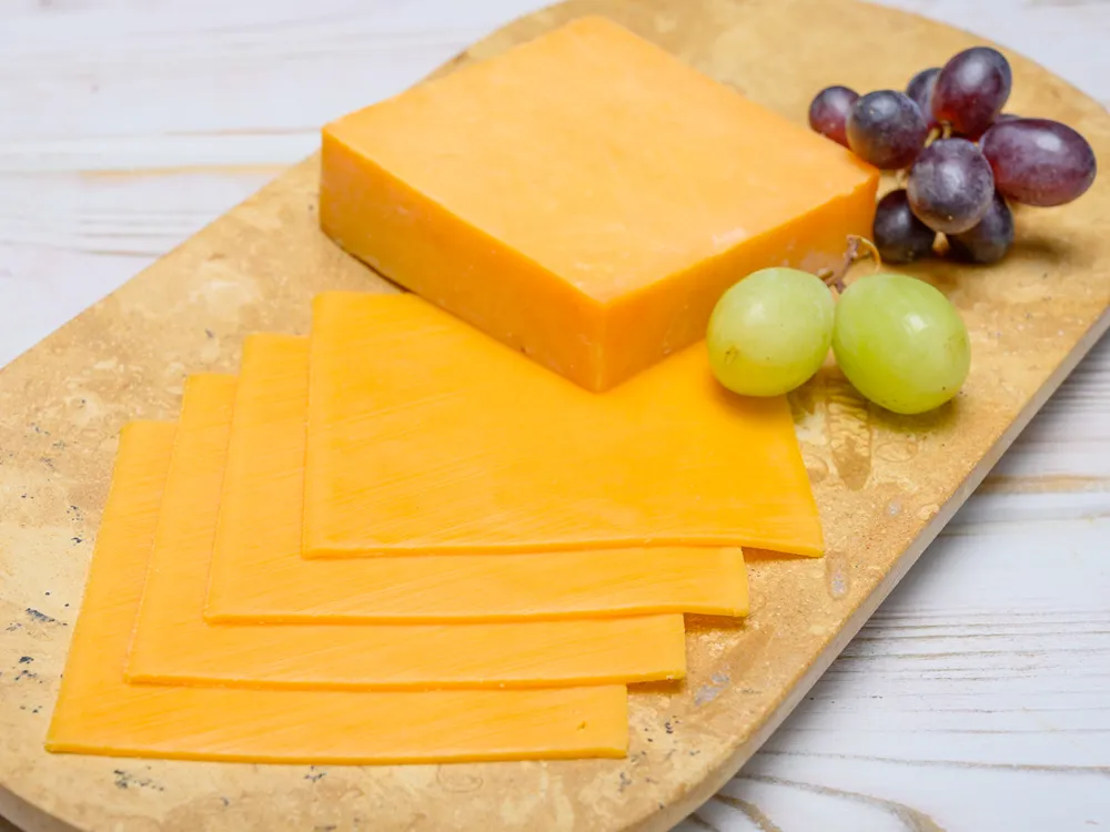
In the hyper-competitive landscape of the consumer packaged goods (CPG) industry, a product’s visual identity often dictates its market success long before a consumer ever tastes it. When we ask the question, “What color is American cheese?” we are not merely discussing a byproduct of dairy science; we are examining one of the most successful examples of visual brand strategy in modern history. Depending on which brand you pull from the refrigerator shelf, American cheese is either a pale, creamy white or a vibrant, saturated orange.
This binary choice is not accidental. It is a calculated branding decision rooted in consumer psychology, regional market preferences, and the relentless pursuit of brand consistency. For marketers and brand strategists, the color of American cheese serves as a masterclass in how a simple visual cue can communicate quality, nostalgia, and brand promise.
The Psychology of the Golden Slice: Why Color Defines Food Branding
Color is the most immediate form of non-verbal communication available to a brand. In the food industry, color functions as a sensory shortcut, telling the brain what to expect in terms of flavor, texture, and nutritional value. The “classic” orange of American cheese is perhaps the most recognizable example of this phenomenon.
The Science of Visual Appetite
From a brand strategy perspective, the specific shade of orange used in processed cheese—often achieved through the use of annatto—is designed to trigger a specific physiological response. Warm colors like yellow and orange are known to stimulate the appetite. In the context of branding, this color suggests richness and heartiness. By standardizing this hue, brands like Kraft and Land O’Lakes have created a visual expectation of “meltability” and “comfort.”
When a consumer sees that specific glowing orange, they aren’t just seeing cheese; they are seeing a brand promise of a consistent, creamy experience. If the color were to deviate by even a few shades, the “Brand Trust” built over decades would begin to erode. This is why corporations invest millions in color-matching technology to ensure that every slice, in every package, in every grocery store across the country, is the exact same Pantone-level shade.
Yellow vs. White: Segmenting the Market
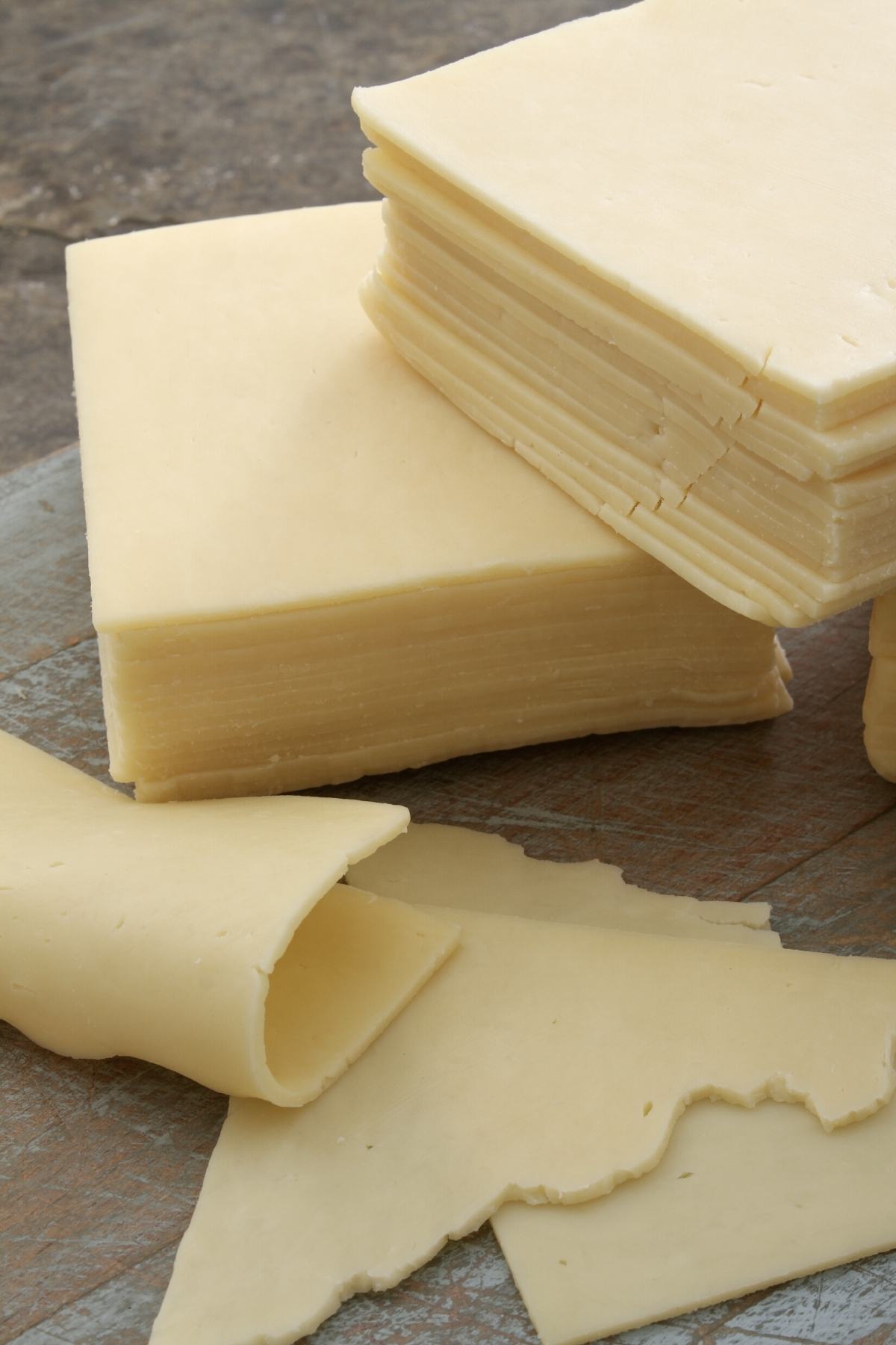
The existence of “White American” cheese is a strategic move in brand positioning. While the orange slice dominates the mass market and the “nostalgia” sector (burgers and grilled cheese), the white variety is often branded to appeal to a different demographic. White cheese is frequently positioned as a “cleaner,” “more natural,” or “premium” alternative, even if the base ingredients are nearly identical to its orange counterpart.
This segmentation allows brands to capture two different psychological profiles. The orange slice targets the “Mainstream/Nostalgic” consumer, while the white slice targets the “Deli/Authentic” consumer. By offering both, a brand ensures it occupies the maximum amount of “mental real estate” in the dairy aisle.
Consistency is Currency: The Manufacturing of a Brand Standard
In global brand management, consistency is the bedrock of loyalty. If a consumer buys a product and it looks different than it did the previous week, the perceived quality of the brand drops. This is especially true for a product as homogenized as American cheese.
Maintaining the Pantone of Processed Cheese
For a brand manager, the color of American cheese is a technical specification that must be defended. Large-scale food producers use spectrophotometers to measure the light reflected off their cheese slices. This data ensures that the product falls within a very narrow “color corridor.”
This level of rigor is identical to how a luxury fashion house ensures its signature leather is dyed to the exact specification or how a tech company ensures its logo appears correctly on every screen. In the world of CPG, the product is the brand. If the color drifts, the brand identity drifts. A “faded” orange slice might suggest the product is old or low-quality, even if it is perfectly safe to eat. Therefore, color is a proxy for freshness and corporate competence.
Trust Through Uniformity
Why does uniformity matter so much? Because uniformity breeds trust. In an unpredictable world, consumers gravitate toward brands that provide a predictable experience. The vibrant, unchanging color of American cheese acts as a visual seal of approval. It tells the customer, “This is the same product you loved ten years ago, and it will be the same ten years from now.” This “Visual Brand Language” (VBL) is what separates a market leader from a generic store-brand competitor. While the store brand might vary in shade based on the supplier, the premium brand remains immutable.
From Annatto to Global Identity: The Evolution of the American Cheese Palette
The history of why American cheese is orange is a fascinating look at how historical “branding” techniques evolved into modern corporate identity. Originally, high-quality cheeses made from the milk of cows grazing on beta-carotene-rich grass had a natural golden tint. Lower-quality cheesemakers began adding colorants like annatto to mimic this “premium” look.
Historical Roots of the Orange Hue
What began as a way to “fake” quality eventually became its own category of quality. By the mid-20th century, the orange color no longer represented “high-fat grass-fed milk”; it represented “American Cheese” as a distinct brand category. This is a classic example of “rebranding through association.” The color was divorced from its original source and married to a new identity: modern, industrial, and American.
Brand strategists call this “owning a color.” Just as UPS owns “Pullman Brown” or Tiffany & Co. owns “Tiffany Blue,” the processed cheese industry effectively owns that specific high-saturation yellow-orange. It is a visual asset that is fiercely protected through marketing and packaging design.
Cultural Perception and Brand Loyalty
The color also varies by geography, which is a key consideration in international brand strategy. In certain regions of the United States, such as the Northeast, white American cheese is the dominant preference in delis. In the Midwest and South, the orange variety is king.
A sophisticated brand strategy accounts for these regional identities. A brand like Boar’s Head, for example, maintains its prestige by offering both, but often highlights the “White” variety in its premium deli branding to distance itself from the “processed” connotations of the bright orange squares. This is an exercise in “Brand Architecture”—using different visual cues to appeal to different sub-cultures while maintaining a single corporate identity.
Case Study: Kraft and the Power of Iconic Design
One cannot discuss the color of American cheese without discussing Kraft. The Kraft Singles brand is perhaps the most significant example of how a product’s color and its packaging can become inseparable in the mind of the consumer.
The Blue Box and the Yellow Slice
The visual contrast between the royal blue of the Kraft logo/packaging and the bright yellow-orange of the cheese is a deliberate use of complementary colors. In design theory, blue and yellow/orange are opposite each other on the color wheel, creating the highest possible level of visual “pop.” This makes the product stand out on a crowded supermarket shelf.
Kraft doesn’t just sell cheese; they sell the “Yellow Square.” The shape and the color are the brand’s primary visual equity. When Kraft changed its recipe to remove artificial preservatives, they were incredibly careful to ensure that the color did not change. They understood that while consumers wanted “cleaner” labels, they would not tolerate a change in “Visual Identity.” The color was the non-negotiable anchor of the brand.
Protecting the Visual Asset
Kraft’s branding strategy involves reinforcing the “ideal” version of their product in every advertisement. In commercials, the cheese is always shown at the perfect stage of a melt, where the color becomes even more vibrant and glossy. This “heightened reality” becomes the benchmark for the consumer. By controlling the visual narrative of what American cheese should look like, Kraft sets the industry standard that all other brands are forced to follow.
The Future of Food Aesthetics in a Digital-First World
As we move into an era dominated by social media and “food photography,” the color of American cheese is taking on a new role. Brands are now designing their products to be “camera-ready.”
Branding Beyond the Supermarket Shelf
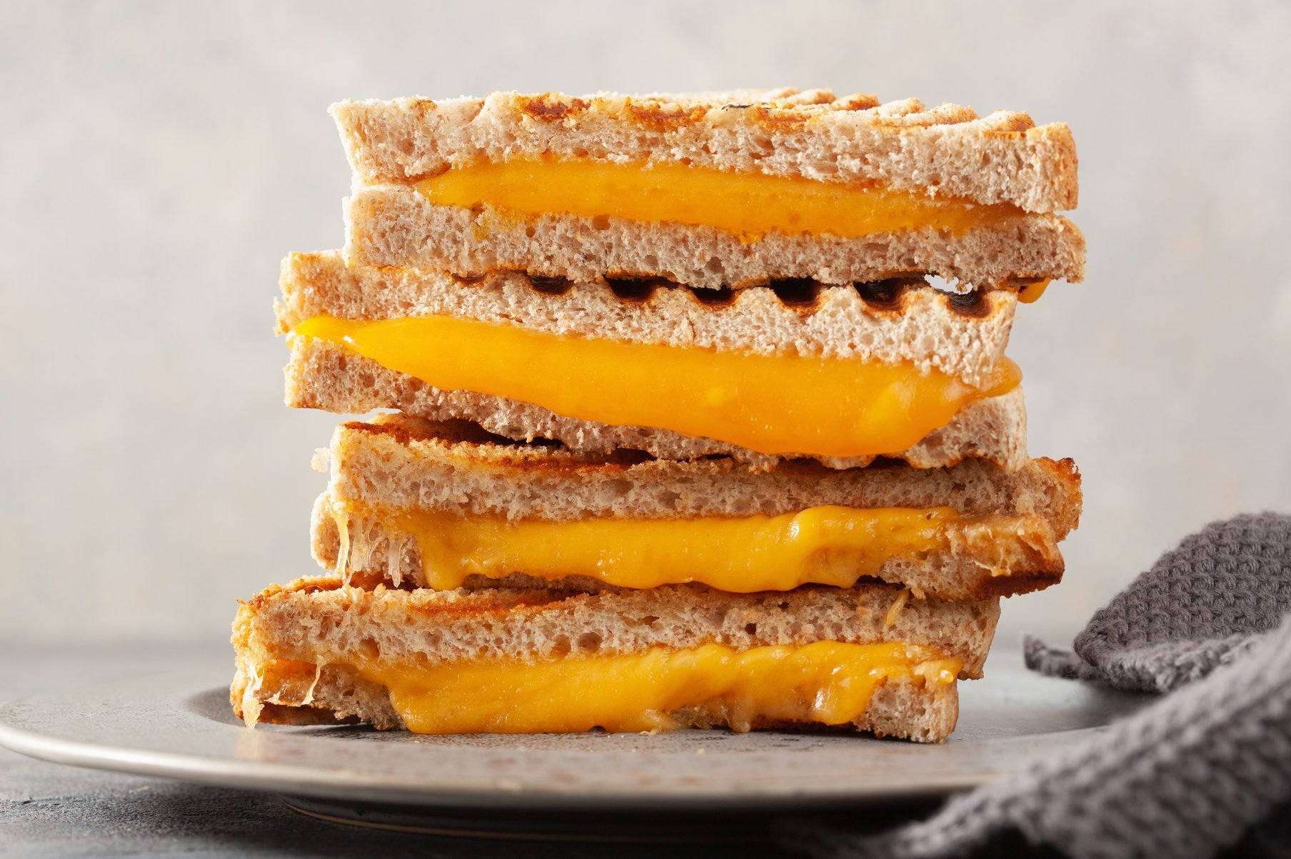
On platforms like Instagram and TikTok, the “cheese pull” has become a viral phenomenon. The specific color of American cheese—its high-contrast orange—photographs better than almost any other cheese. It looks “better” on a digital screen, which has led to a resurgence in the color’s popularity among “foodie” brands and high-end burger joints.
Modern “cult” brands like Shake Shack or various “smash burger” startups specifically choose the most vibrant orange American cheese because it aligns with their “highly-visual” brand strategy. The color provides an instant “pop” against a brown patty and a green leaf of lettuce, making the product instantly recognizable in a tiny social media thumbnail.
Conclusion: The Strategic Palette
So, what color is American cheese? It is the color of a deliberate, multi-generational marketing strategy. It is a color chosen to trigger hunger, to ensure consistency, and to build a “Visual Brand Language” that transcends language barriers.
Whether it is the “premium” white of a high-end deli counter or the “nostalgic” orange of a backyard barbecue, the color of American cheese is one of the most powerful tools in the brand manager’s kit. It is a reminder that in the world of branding, what we see is often more important than what we taste. By mastering the art of the “Golden Slice,” brands have created a visual icon that is as much a part of the American identity as the products themselves. Color, in this case, isn’t just an aesthetic choice—it is a billion-dollar business strategy.
aViewFromTheCave is a participant in the Amazon Services LLC Associates Program, an affiliate advertising program designed to provide a means for sites to earn advertising fees by advertising and linking to Amazon.com. Amazon, the Amazon logo, AmazonSupply, and the AmazonSupply logo are trademarks of Amazon.com, Inc. or its affiliates. As an Amazon Associate we earn affiliate commissions from qualifying purchases.