
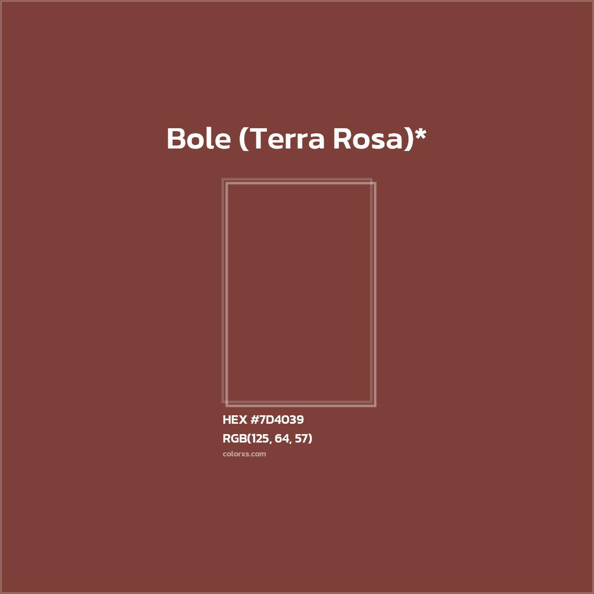
The digital identifier #7d4039 represents a specific point in the vast spectrum of visible light, translating a complex combination of red, green, and blue into a single, hexadecimal code. At its core, #7d4039 is a deep, muted reddish-brown, a hue that evokes a sense of earthiness, warmth, and grounded sophistication. While seemingly just a technical specification, for branding professionals and designers, understanding a color like #7d4039 goes far beyond its numeric value. It delves into the realm of psychology, cultural association, and strategic application in crafting a compelling brand identity.
Decoding the Hue: Understanding #7d4039
Every digital color is defined by its Red, Green, and Blue (RGB) components, with values ranging from 0 to 255. The hexadecimal code #7d4039 is a shorthand for these values. Breaking it down reveals:
- Red (R): 125
- Green (G): 64
- Blue (B): 57

With a significantly higher red component and relatively low green and blue values, the color leans strongly into the red spectrum, but with enough green and blue to pull it towards brown rather than a vibrant red. The muted nature suggests a desaturated quality, moving it away from bright, primary colors into a more natural, understated palette.
The perceived color is often described as a burnt sienna, a rich terracotta, or a deep chestnut. It’s a color that feels organic and established, rather than artificial or fleeting. In the language of color psychology, such reddish-browns are often associated with comfort, stability, authenticity, and heritage. They communicate a sense of reliability and a connection to the natural world. Brands that seek to convey durability, craftsmanship, tradition, or environmental consciousness often gravitate towards similar palettes.
This particular shade carries an inherent seriousness and depth, suggesting quality and a refined taste. It’s not a color that screams for attention but rather commands respect through its understated presence. Understanding these intrinsic qualities is the first step in strategically deploying #7d4039 within a brand’s visual identity.
The Strategic Application of Earth Tones in Branding
The choice of #7d4039, or any color within the earthy, reddish-brown spectrum, is rarely arbitrary for a brand. These colors are selected to build a specific narrative and evoke particular emotions in the target audience. Brands often opt for these hues to establish a connection with nature, sustainability, and authentic, natural processes. Consider artisan food brands, organic product lines, or companies specializing in natural materials like wood or leather; a color like #7d4039 becomes a visual shorthand for their core values.
In a marketplace often saturated with vibrant, hyper-modern palettes, an earth tone like #7d4039 stands out by offering a sense of grounded tranquility and timelessness. It contrasts sharply with the digital blue or electric greens favored by tech companies, positioning a brand using #7d4039 in a space of quiet confidence and enduring quality. This strategic differentiation can be crucial in attracting an audience that values substance over flash, tradition over trend, and authenticity over superficiality.
Moreover, these tones are excellent at conveying trust and reliability. They suggest a brand that is dependable, well-established, and has a strong foundation. This makes them particularly effective for heritage brands, luxury goods that emphasize craftsmanship, and even financial institutions seeking to project stability and security. The warmth inherent in #7d4039 also contributes to a feeling of approachability and comfort, making a brand feel inviting and familiar.
Brand Identity and Visual Consistency
A single color, when integrated into a comprehensive brand identity, becomes a powerful tool for visual consistency. #7d4039, whether used as a primary brand color, an accent, or a background texture, contributes to the overall visual language that defines a brand. Its deployment across all touchpoints – from logos and websites to packaging and marketing collateral – ensures a cohesive and memorable brand experience.
Consistency is paramount in building brand recognition and recall. When consumers repeatedly encounter the same carefully chosen palette, it strengthens their association with the brand. For a color like #7d4039, this consistency helps embed the qualities of earthiness, warmth, and reliability into the consumer’s perception of the brand. It aids in creating a unique visual signature that differentiates the brand from competitors, particularly in industries where many players might lean on similar aesthetics.
Developing a robust set of brand guidelines that meticulously define how #7d4039 (and its complementary colors) should be used is essential. This includes specifying its application in different media, ensuring color fidelity across print and digital, and dictating its role in the overall design system. Such meticulous planning ensures that the brand’s visual message remains unified and powerful, irrespective of where or how consumers interact with it.
Crafting a Narrative: Brands Leveraging #7d4039’s Essence
To truly appreciate the power of #7d4039, one can imagine the types of brands that would choose this specific hue and the narratives they would aim to build. Consider a high-end, artisanal coffee roaster. The deep reddish-brown perfectly mirrors the color of roasted coffee beans, instantly evoking the rich aroma and warmth of a freshly brewed cup. It speaks to the craft, the natural origins of the product, and the comforting ritual of coffee consumption.
Similarly, a bespoke leather goods manufacturer could adopt #7d4039 as a cornerstone of their brand. The color aligns with the natural texture and enduring quality of fine leather, conveying heritage, durability, and luxury that improves with age. It suggests a product made with care, tradition, and an appreciation for natural materials. Another example might be an organic food retailer or a winery specializing in aged vintages, where the color speaks to the natural processes, richness, and depth of their offerings.
In these hypothetical scenarios, #7d4039 isn’t just a color; it’s a narrative element. It might be used as the dominant color in a logo, providing a sturdy anchor. It could serve as a background for packaging, creating a tactile, sophisticated feel, or as an accent color on a website to highlight calls to action or key information. When paired with complementary colors like soft creams, deep forest greens, or muted golds, its richness is further enhanced, allowing for a versatile yet cohesive visual system. The choice of #7d4039 becomes a statement about the brand’s identity, its values, and its promise to the consumer.
The Psychology of Warm Reddish-Browns in Marketing
The decision to incorporate a color like #7d4039 into a marketing strategy is rooted in a deep understanding of human psychology. Warm reddish-browns are inherently comforting. They remind us of the earth, wood, and natural environments, fostering a sense of grounding and security. In a fast-paced, often overwhelming world, brands that can tap into these primal feelings offer a sense of refuge and familiarity.
From a marketing perspective, this translates into building trust and loyalty. Consumers are more likely to engage with and remain loyal to brands that make them feel safe, authentic, and understood. #7d4039 subtly communicates these attributes, helping to build a relationship based on reliability and genuine connection. It can communicate luxury without being ostentatious or exclusive, appealing to a segment of the market that values understated elegance and genuine quality over flashy displays. This nuanced appeal can significantly influence purchase decisions, as consumers often make choices not just based on product features, but on the emotional resonance they feel with a brand.

Integrating #7d4039 into Digital and Physical Design
Effective brand integration of #7d4039 requires careful consideration across both digital and physical design applications. In the digital realm, such as website design or app interfaces, it’s crucial to ensure usability and accessibility. While #7d4039 is a rich color, its relatively dark value means that text placed directly on it might require lighter shades for sufficient contrast, adhering to WCAG (Web Content Accessibility Guidelines) standards. It works exceptionally well as a background color that grounds a page, or as a color for headers, footers, or accent elements, adding sophistication without overwhelming the user.
For print materials – brochures, business cards, packaging, or signage – maintaining color fidelity is paramount. A hex code like #7d4039 is an RGB value, designed for screens. When transitioning to print, it needs to be accurately translated into CMYK (Cyan, Magenta, Yellow, Key/Black) or matched to a Pantone equivalent to ensure consistent output. Discrepancies between digital and print colors can dilute brand consistency and professionalism.
Beyond flat surfaces, #7d4039 can be translated into physical spaces and product design. Imagine a retail environment where the brand’s identity is echoed in furniture, wall colors, or decorative elements, using this deep reddish-brown to create a warm, inviting, and sophisticated atmosphere. For product design, elements incorporating this color could evoke a sense of natural materials or artisanal craftsmanship, subtly enhancing the product’s perceived value and authenticity.
Ultimately, the choice and application of a color like #7d4039 are deeply strategic decisions in brand building. It’s about leveraging the emotional and psychological power of a hue to communicate core values, build trust, differentiate in the market, and create a lasting, meaningful connection with the target audience across every brand touchpoint.
aViewFromTheCave is a participant in the Amazon Services LLC Associates Program, an affiliate advertising program designed to provide a means for sites to earn advertising fees by advertising and linking to Amazon.com. Amazon, the Amazon logo, AmazonSupply, and the AmazonSupply logo are trademarks of Amazon.com, Inc. or its affiliates. As an Amazon Associate we earn affiliate commissions from qualifying purchases.