
In the intricate world of brand identity and marketing, color choice is far from arbitrary; it’s a strategic decision that shapes perception, communicates values, and evokes emotional responses. Periwinkle, a delicate blend of blue and violet, stands out as a color of subtle sophistication and captivating versatility. For brands considering integrating periwinkle into their visual lexicon, understanding its inherent qualities and optimal pairings is paramount to crafting a cohesive and impactful presence. This exploration delves into the strategic implications of periwinkle, guiding brands on how to leverage its unique appeal through thoughtful color combinations.
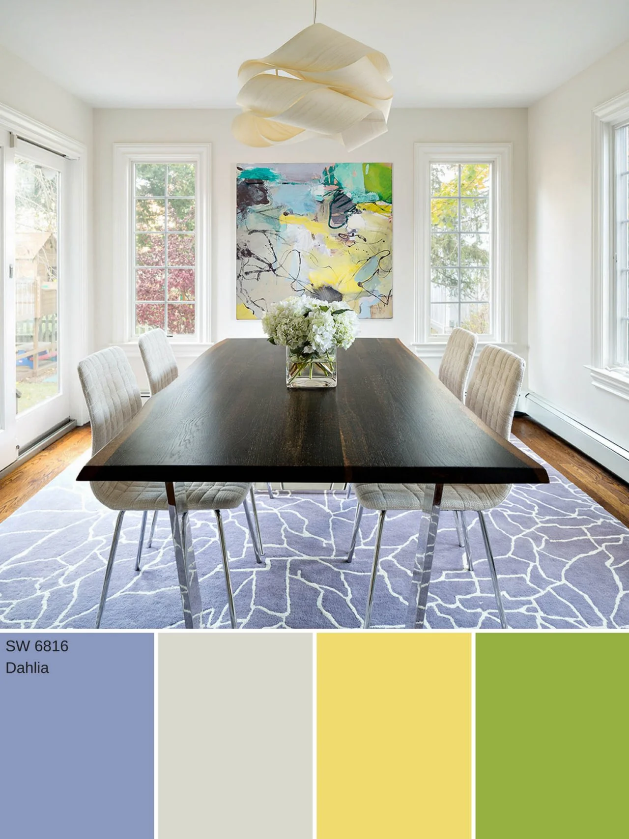
Understanding Periwinkle: A Brand’s Perspective
Periwinkle exists in the intriguing space between blue’s calming stability and violet’s creative mystique. Its pastel yet vibrant nature offers a unique canvas for branding, allowing for both understated elegance and distinct character. For design professionals, this color represents an opportunity to differentiate a brand from the often saturated primary and secondary palettes.
The Psychology of Periwinkle
Psychologically, periwinkle is often associated with tranquility, freshness, and inspiration. The blue undertones lend it a sense of calm and reliability, qualities highly sought after in industries like wellness, finance, or tech where trust is crucial. Simultaneously, the violet notes introduce an element of creativity, imagination, and even luxury. This dual nature allows periwinkle to convey a sophisticated balance, suggesting innovation grounded in serenity. Brands aiming to project a forward-thinking yet approachable image can find a powerful ally in this hue. It evokes feelings of peace without being dull, and creativity without being overwhelming, making it ideal for brands targeting audiences appreciative of subtlety and depth.
Periwinkle’s Versatility in Branding
One of periwinkle’s greatest strengths lies in its adaptability. It can function as a primary brand color, a complementary accent, or a strategic highlight in a broader palette. Its mid-tone quality ensures it doesn’t overpower other colors, yet it possesses enough character to hold its own. This makes it suitable for a wide array of industries, from fashion and beauty to technology and home decor. For a luxury brand, periwinkle can convey exclusivity and refinement. For a wellness brand, it can symbolize calm and natural purity. In tech, it can represent innovation and user-friendliness. Its ability to transcend typical color associations provides designers with significant creative freedom to tailor its message to specific brand narratives and target demographics.
Strategic Color Pairings for Periwinkle
The art of pairing periwinkle effectively lies in understanding color theory and applying it to brand objectives. The right combinations can elevate a brand’s visual appeal, ensuring messages are not only seen but also felt and remembered.
Complementary Colors: Dynamics and Contrast
On the color wheel, the direct complement to blue-violet (periwinkle’s core) is yellow-orange. However, a strict complementary pairing can sometimes be too jarring for the subtle nature of periwinkle. Instead, considering shades of soft gold, warm amber, or muted coral can create a vibrant yet harmonious contrast. These warm tones can inject energy and optimism into a periwinkle-dominated palette, making it suitable for brands that want to communicate both calmness and dynamism. For instance, a periwinkle logo accented with a touch of soft gold can instantly convey a sense of premium quality and approachable warmth. This dynamic interplay can capture attention without sacrificing elegance, ideal for marketing campaigns or product highlights.
Analogous Colors: Harmony and Nuance
Analogous color schemes involve colors adjacent to periwinkle on the color wheel, such as various shades of blue and purple. This approach creates a harmonious, soothing, and sophisticated palette. By pairing periwinkle with deeper indigos, gentle lavenders, or soft sky blues, brands can establish a sense of fluidity and depth. This combination is particularly effective for brands in the beauty, spa, or wellness sectors, where tranquility and natural flow are key messages. An analogous palette maintains a cohesive visual identity, projecting calm professionalism and refined taste. It’s excellent for creating gradients in digital interfaces or for backgrounds in print materials where a subtle, elegant backdrop is desired.
Triadic & Tetradic Schemes: Bold Statements
For brands seeking a more vibrant and memorable identity, triadic or tetradic schemes can be explored. A triadic scheme involving periwinkle would typically include a warm yellow and a muted red or peach. This creates a balanced yet impactful visual. For example, a periwinkle base paired with soft mustard and a dusty rose can create a contemporary, artistic, and unique brand presence. Tetradic schemes, while more complex, offer the widest range of contrast and visual interest. These sophisticated palettes are suitable for brands that want to stand out boldly, making a strong statement in creative industries, fashion, or lifestyle. The key here is careful saturation and balance to ensure the palette remains cohesive and doesn’t overwhelm the viewer.

Neutral Pairings: Elegance and Balance
Neutral colors—grays, beiges, creams, and whites—are periwinkle’s steadfast companions, offering balance and allowing periwinkle to truly shine. A classic pairing with crisp white or off-white evokes purity, simplicity, and modernity, making it perfect for tech brands, minimalist aesthetics, or high-end fashion. Pairing periwinkle with various shades of gray, from light silver to charcoal, creates a sophisticated and corporate feel, ideal for professional services or luxury goods. Beige and cream tones, on the other hand, lend a softer, more organic, and inviting warmth to periwinkle, suitable for home decor, natural products, or artisanal brands. These neutral combinations ensure that periwinkle remains the focal point while benefiting from a backdrop that enhances its inherent elegance and versatility.
Applying Periwinkle in Brand Identity and Marketing
The theoretical understanding of periwinkle and its pairings translates into tangible brand assets and strategic marketing efforts. The consistency of color application across all touchpoints is crucial for building strong brand recognition.
Logo and Visual Identity
When incorporating periwinkle into a brand’s logo, it often works best as the primary identifier or a significant accent. For instance, a technology startup might use periwinkle for its main icon, paired with a sophisticated gray font. A beauty brand could feature periwinkle in a delicate emblem, conveying luxury and freshness. The emotional associations of periwinkle—trust, creativity, serenity—can be powerfully embedded within the core visual identity, influencing initial perceptions and fostering immediate connection with the target audience. The choice of accompanying fonts and graphic elements should also align with the periwinkle’s character, either reinforcing its softness or adding a contrasting edge.
Website and Digital Presence
In digital design, periwinkle can create a welcoming and visually appealing user experience. As a background color, especially a lighter shade, it provides a clean, calming backdrop that allows content to stand out. It can be used for calls to action (CTAs), navigation elements, or interactive components to draw attention without being aggressive. For SaaS platforms or lifestyle blogs, a periwinkle-themed UI can communicate user-friendliness and innovation. When designing a website, ensure sufficient contrast for readability, particularly for text, adhering to accessibility guidelines. Periwinkle used in conjunction with blues and greens can create a harmonious, nature-inspired feel, while paired with clean whites and grays, it signals modern sophistication.
Packaging and Product Design
For physical products, periwinkle packaging can convey a sense of quality, care, and distinctiveness. In the cosmetics industry, a periwinkle tube or box suggests premium ingredients and gentle formulations. For children’s products, it can evoke innocence and wonder. In home goods, periwinkle can signify tranquility and aesthetic appeal. The tactile experience of unwrapping a periwinkle-packaged item adds to the brand’s perceived value. Consider the material and finish; a matte periwinkle can feel luxurious and understated, while a glossy finish might suggest playfulness or modernity. Strategic use of accent colors on packaging, such as a metallic foil or a contrasting ribbon, can further enhance the overall brand experience.
Marketing Campaigns and Collateral
In marketing campaigns, periwinkle can be a powerful tool for differentiation. Its gentle yet distinctive nature can help advertisements stand out in a cluttered media landscape. For seasonal campaigns, periwinkle can evoke spring freshness or winter tranquility, depending on its pairings. In brochures, flyers, or social media graphics, periwinkle can establish a consistent visual theme. Using it for key headlines or graphic elements can create visual hierarchy and draw the reader’s eye. A well-executed periwinkle-centric campaign can imbue brand communications with a memorable elegance, enhancing recall and reinforcing the brand’s unique positioning in the market. Its calming influence can also make marketing messages feel less intrusive and more inviting.
Leveraging Periwinkle’s Emotional Impact
Beyond aesthetics, the strategic application of periwinkle leverages its inherent emotional resonance to connect with audiences on a deeper level, aligning brand messaging with psychological impact.
Evoking Trust and Serenity
The blue component of periwinkle inherently links it to feelings of trust, stability, and calm. Brands in service industries—healthcare, finance, or consulting—can utilize periwinkle to project an image of reliability and professional serenity. A periwinkle lobby or waiting area can instantly put clients at ease, while periwinkle in corporate branding materials reinforces a commitment to clear-headed decision-making and ethical practices. This connection to serenity can also be powerful for brands promoting relaxation, mindfulness, or stress reduction, offering a visual cue that aligns perfectly with their core promise.
Signifying Creativity and Innovation
The violet undertones in periwinkle are associated with imagination, creativity, and unique thinking. This makes periwinkle an excellent choice for brands in creative sectors, tech startups, or educational institutions that wish to signify innovation and forward-thinking approaches. A periwinkle-themed design agency or a software company using periwinkle in its UI suggests a blend of artistic vision and functional design. It communicates that the brand is not just competent but also imaginative, offering novel solutions and fresh perspectives. This subtle hint of creativity can differentiate a brand in competitive markets, appealing to consumers who value originality and ingenuity.

Targeting Specific Demographics
Periwinkle’s appeal can also be strategically used to target specific demographics. Its softness and sophistication often resonate with audiences seeking premium, refined, or thoughtful products and services. It tends to appeal to those with an appreciation for aesthetics and a desire for products that offer a sense of calm and well-being. Furthermore, its unique position between traditional blue and purple allows it to transcend gendered color associations, appealing to a broader, more inclusive audience. By understanding the demographic segments that naturally gravitate towards periwinkle’s psychological associations, brands can fine-tune their messaging and visual strategies for maximum impact and resonance.
aViewFromTheCave is a participant in the Amazon Services LLC Associates Program, an affiliate advertising program designed to provide a means for sites to earn advertising fees by advertising and linking to Amazon.com. Amazon, the Amazon logo, AmazonSupply, and the AmazonSupply logo are trademarks of Amazon.com, Inc. or its affiliates. As an Amazon Associate we earn affiliate commissions from qualifying purchases.