
In the intricate tapestry of personal branding, every sartorial choice serves as a deliberate stroke, painting a picture of who you are, what you represent, and the values you embody. Burgundy pants, with their rich, sophisticated hue, offer a unique opportunity to articulate a distinct brand message. Far from being a mere fashion decision, selecting complementary colors for burgundy is an exercise in strategic design, influencing perception, establishing authority, and communicating personality. Understanding the interplay of colors with this deep red shade is crucial for anyone looking to refine their visual identity and strengthen their personal brand presence.

The Psychology of Burgundy in Personal Branding
Burgundy, a color often associated with sophistication, ambition, and a certain degree of gravitas, carries significant psychological weight. It blends the energy and passion of red with the grounded stability of brown, creating a hue that is both dynamic and refined. For personal branding, burgundy can project an image of thoughtful confidence and understated power.
Power, Sophistication, and Approachability
Choosing burgundy signals a departure from conventional corporate neutrals, suggesting a personality that appreciates nuance and possesses a keen sense of style. It implies ambition without aggression, sophistication without aloofness, and an intellectual depth that can be highly advantageous in professional settings. This color choice can make an individual seem approachable yet authoritative, a compelling combination for leaders, consultants, and creative professionals alike. It subtly communicates an individual who pays attention to detail and invests in their presentation, which are both highly valued traits in any professional brand.
The Contextual Impact
The perceived meaning of burgundy can shift dramatically based on the colors it’s paired with. A pairing with crisp white might convey cleanliness and precision, while a combination with charcoal grey could speak to serious intent and traditional values. Understanding these contextual nuances allows for precise control over the brand narrative you wish to communicate. The goal is to select colors that amplify burgundy’s inherent strengths while aligning with your specific brand objectives, whether it’s establishing creative flair, corporate gravitas, or approachable elegance.
Foundation Colors: Building a Versatile Wardrobe
When building a cohesive personal brand around burgundy pants, establishing a foundation of versatile, complementary colors is essential. These are the workhorse shades that provide balance, allowing the burgundy to shine while ensuring your overall look remains polished and professional.
Classic Neutrals: White, Cream, Black, Grey
Neutrals are the backbone of any sophisticated wardrobe and are indispensable when pairing with burgundy.
- White and Cream: These hues offer a crisp, clean contrast that highlights burgundy’s richness. A white shirt or blouse creates an immediate impression of professionalism and clarity, ideal for formal business settings or presentations where a sharp, decisive brand image is paramount. Cream softens the contrast, lending a touch of warmth and approachability, perfect for networking events or creative industry engagements.
- Black: Pairing burgundy with black exudes an air of undeniable power and modern sophistication. This combination is impactful, serious, and chic, making it suitable for high-stakes meetings, evening events, or any situation where a strong, authoritative personal brand is desired. However, care must be taken to avoid an overly dark or heavy aesthetic, especially in warmer climates or less formal contexts.
- Grey (Charcoal, Mid-Grey, Light Grey): Grey offers a refined, understated elegance that perfectly complements burgundy. Charcoal grey provides a strong, corporate feel, while mid and light greys offer a softer, more approachable contrast. This pairing is excellent for projecting a thoughtful, intelligent, and composed brand image, particularly in academic, consulting, or design fields where subtlety and intellect are valued.
Earth Tones: Beige, Camel, Olive Green
Earth tones provide an organic, sophisticated backdrop for burgundy, suggesting a natural elegance and grounded sensibility.
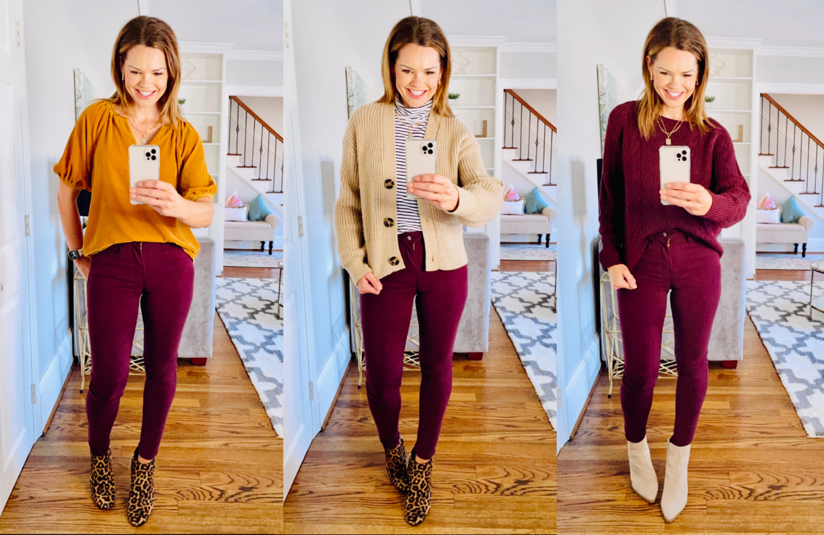
- Beige and Camel: These warm neutrals create a softer, more harmonious palette with burgundy. A camel blazer or a beige knit top can lend an air of approachable luxury and relaxed confidence, ideal for informal client meetings, mentorship sessions, or brand-building events that require a less rigid aesthetic. This pairing speaks to a brand that values comfort, quality, and understated style.
- Olive Green: Though less common, olive green offers a surprisingly elegant and distinctive pairing with burgundy. This combination hints at a sophisticated understanding of color theory and a willingness to embrace unique style. It projects an image of creativity, discernment, and a connection to nature or authenticity, making it suitable for brands in sustainable industries, outdoor lifestyle, or artistic fields.
Complementary & Contrasting Hues for Impact
Beyond the foundational neutrals, strategic use of complementary and contrasting colors can amplify specific aspects of your personal brand, injecting personality and memorable flair.
Subtle Elegance: Navy and Dark Green
For a sophisticated yet less conventional approach, navy and dark green are exceptional choices.
- Navy: A classic pairing, navy offers a deep, authoritative contrast without the starkness of black. The combination of burgundy and navy is inherently professional, conveying trust, stability, and intelligence. It’s an excellent alternative to grey for corporate environments, providing a sense of gravitas and polish that reinforces a reliable and credible personal brand.
- Dark Green (Forest, Emerald): Similar to olive, but with more depth, dark green creates a rich, opulent palette with burgundy. This pairing signifies an appreciation for luxury, tradition, and intellectual depth. It’s a powerful combination for branding in fields such as heritage brands, exclusive consulting, or high-end design, suggesting a brand that values enduring quality and timeless appeal.
Bold Statements: Mustard Yellow and Teal
For those whose personal brand embraces creativity, innovation, or a more assertive presence, bold complementary colors can create striking visual narratives.
- Mustard Yellow: This warm, earthy yellow provides a vibrant, yet sophisticated contrast to burgundy. It suggests optimism, creativity, and a willingness to stand out without being ostentatious. This pairing is ideal for individuals in creative industries, startups, or those aiming to project a brand image that is both energetic and thoughtful.
- Teal: Teal, a blend of blue and green, offers a cool, jewel-toned contrast to burgundy’s warmth. This combination is modern, artistic, and captivating, projecting a brand that is forward-thinking, insightful, and unique. It’s particularly effective for those in technology, design, or any field where innovation and a fresh perspective are key brand attributes.
Monochromatic Mastery: Deep Reds and Maroons
A monochromatic approach, using varying shades of red and maroon, can create a powerful, unified, and highly sophisticated brand statement. Pairing burgundy pants with a deep red blouse or a maroon jacket creates depth and an intentional, high-fashion aesthetic. This strategy demonstrates confidence, an artistic eye, and a strong sense of self, reinforcing a brand that is coherent, refined, and distinctly memorable.
Occasion and Objective: Tailoring Your Brand Message
The most effective personal branding adapts to the context. The “right” color pairing for burgundy pants depends significantly on the occasion and the specific brand message you intend to convey.
Professional Authority: The Boardroom & Beyond
For environments demanding gravitas and authority, stick to classic pairings. Charcoal grey, navy, or black tops with burgundy pants signal seriousness and competence. A crisp white shirt under a navy blazer with burgundy trousers creates an image of meticulous professionalism and leadership. The goal here is to project reliability, expertise, and a commanding presence without appearing overly rigid.
Creative Expression: Networking & Social Engagements
When the goal is to showcase creativity, approachability, and personal flair, explore richer or more unexpected combinations. A mustard yellow knit, a teal silk blouse, or even a subtly patterned top with burgundy pants can communicate individuality and an engaging personality. These choices are excellent for networking events, creative industry gatherings, or speaking engagements where your brand needs to resonate with innovation and authentic self-expression.
Casual Chic: Weekend Branding
Even off-duty, your personal brand is in play. For sophisticated casual wear, pair burgundy pants with softer neutrals like cream, beige, or even a light grey marl tee. An olive green utility jacket or a camel sweater can also create a relaxed yet polished look that maintains brand consistency. This demonstrates that your brand is effortlessly stylish and authentic across all contexts, reinforcing a cohesive identity.
Accessories and Texture: Amplifying Your Brand’s Narrative
The power of personal branding extends beyond primary color choices. Accessories and the texture of your garments play a pivotal role in refining your message and adding layers of sophistication.
Strategic Pop of Color
Accessories offer an opportunity to introduce accent colors that complement or contrast with your burgundy pants. A pocket square in a subtly patterned teal, a tie with a hint of mustard yellow, or a watch strap in a sophisticated dark green can provide a refined pop of color, demonstrating attention to detail and a keen aesthetic sense. These small touches contribute significantly to a nuanced and memorable personal brand.

Material Matters
The fabric and texture of your clothing also contribute to your brand’s narrative. Pairing smooth, tailored wool burgundy pants with a crisp cotton shirt evokes a different brand message than pairing velvet burgundy pants with a chunky knit sweater. Silks, leathers, tweeds, and knits each add a distinct layer of sophistication, warmth, or edge. Thoughtfully combining textures can elevate your overall look, communicating a brand that understands quality, craftsmanship, and stylistic depth.
Ultimately, choosing what color goes with burgundy pants is about making intentional decisions that reinforce your desired personal brand. It’s about leveraging the psychology of color, understanding foundational aesthetics, and strategically deploying complementary hues to create a visual identity that is both authentic and impactful. By mastering these principles, you transform mere clothing into a powerful tool for communication and brand building.
aViewFromTheCave is a participant in the Amazon Services LLC Associates Program, an affiliate advertising program designed to provide a means for sites to earn advertising fees by advertising and linking to Amazon.com. Amazon, the Amazon logo, AmazonSupply, and the AmazonSupply logo are trademarks of Amazon.com, Inc. or its affiliates. As an Amazon Associate we earn affiliate commissions from qualifying purchases.