
The question “what color goes with bronze?” transcends mere aesthetic preference; it delves into the strategic realm of brand identity, perception, and market positioning. For brand strategists, designers, and business owners, selecting a complementary color palette for a primary hue like bronze is a critical decision that profoundly impacts how a brand is perceived, its emotional resonance, and its ability to communicate core values. Bronze, with its rich history, inherent warmth, and metallic sheen, offers a robust foundation for a brand’s visual language, but its true power is unleashed when paired thoughtfully with colors that amplify its strengths and align with the brand’s overarching narrative.
The Strategic Role of Color in Brand Identity
Color is arguably the most immediate and potent visual cue in a brand’s arsenal. Long before a customer reads a slogan or understands a product’s features, they react to its colors. This initial impression shapes subconscious associations and contributes significantly to brand recognition and recall.
Beyond Aesthetics: Psychological Impact of Color
Every color carries a psychological weight, evoking specific emotions and associations. Red might signal urgency or passion, blue trust or professionalism, and green nature or growth. When crafting a brand identity, understanding these universal psychological impacts is paramount. The goal isn’t just to make something look “nice” but to strategically deploy color to elicit desired feelings and communicate specific brand attributes.
Bronze as a Foundation: Its Intrinsic Meanings
Bronze itself is a color steeped in meaning. Historically, it signifies durability, strength, and longevity, often associated with awards, statues, and ancient artifacts, lending it an air of prestige and heritage. Its metallic nature suggests quality, value, and a certain grounded sophistication. The warmth of bronze can evoke feelings of comfort, stability, and even luxury, depending on its specific shade and finish. For brands aiming to project a sense of enduring quality, tradition, or understated elegance, bronze serves as an excellent foundational color. Its versatility allows it to be perceived as industrial and robust or refined and opulent.
Harmonizing with Bronze: Complementary Color Palettes for Brands
The art of pairing colors with bronze lies in creating palettes that are not only visually appealing but also strategically aligned with the brand’s message. Different complementary colors can pull bronze in various directions, from earthy and organic to sleek and modern.
Earth Tones for Organic Luxury
For brands seeking to evoke natural beauty, sustainability, or artisanal craftsmanship, earth tones offer a seamless integration with bronze.
- Sage Green: A muted green brings a sense of tranquility, growth, and connection to nature. Paired with bronze, it suggests organic luxury and timeless elegance, ideal for wellness brands, sustainable fashion, or artisanal home goods.
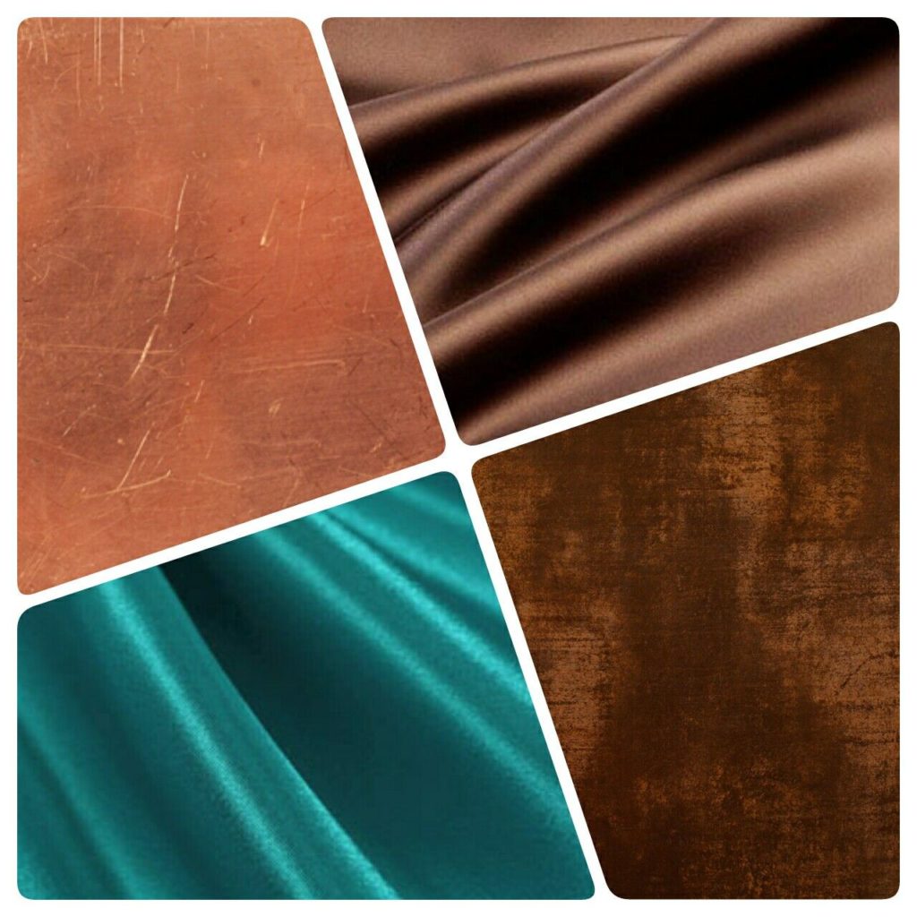
- Terracotta/Rust: These warm, earthy reds and oranges resonate with bronze’s inherent warmth, creating a palette that feels grounded, authentic, and inviting. It’s excellent for brands focused on handcrafted items, ceramics, or travel experiences.
- Cream/Ivory: Soft, neutral creams provide a sophisticated backdrop, allowing bronze to truly shine as an accent. This pairing speaks to minimalist luxury, high-end hospitality, or classic fashion brands, conveying purity and refined taste.
- Deep Tan/Camel: These richer browns enhance bronze’s warmth, creating a sophisticated, robust feel. Think leather goods, premium coffee brands, or bespoke tailoring, where tradition and quality are paramount.
Cool Contrasts for Modern Elegance
To imbue bronze with a contemporary edge or to temper its warmth, cool colors provide an effective contrast, lending an air of modernity and professionalism.
- Navy Blue: A timeless and authoritative color, navy blue paired with bronze evokes trust, stability, and corporate elegance. This combination is particularly effective for financial institutions, professional services, or high-end technology brands seeking to balance innovation with reliability.
- Charcoal Gray/Slate: These deep grays offer a sophisticated, neutral counterpoint that allows bronze to act as a point of interest or a symbol of refined detail. It creates a sleek, industrial-chic aesthetic suitable for architectural firms, luxury automotive brands, or modern design studios.
- Teal/Deep Turquoise: These vibrant, jewel-toned blues and greens introduce a touch of creativity and exoticism. When combined with bronze, they can suggest luxury with a unique flair, ideal for interior design, boutique hotels, or innovative lifestyle brands.
- Crisp White: As a primary neutral, white provides clarity and spaciousness. Bronze accents against a white background communicate clean design, purity, and modern simplicity, often seen in high-end retail, contemporary art spaces, or minimalist personal branding.
Vibrant Accents for Dynamic Storytelling
While bronze often implies tradition, it can be invigorated with carefully chosen vibrant accents to tell a more dynamic story, particularly for brands that wish to project creativity, energy, or a unique personality.
- Deep Plum/Amethyst: These rich purples add a touch of mystery, luxury, and artistic flair. Paired with bronze, they can create a regal and opulent feel, suitable for luxury cosmetics, high-end jewelry, or theatrical brands.
- Emerald Green: A color of wealth and vitality, emerald green makes a striking statement with bronze, suggesting growth, ambition, and refined taste. This combination works well for upscale event planning, premium beverage brands, or brands with an ecological luxury focus.
- Burnt Orange/Saffron: These deeper, more sophisticated oranges can enhance bronze’s warmth while injecting a dose of energy and creativity. Ideal for brands in the culinary arts, cultural institutions, or products aiming for a sophisticated, vibrant appeal.
- Marigold/Mustard Yellow: Used sparingly, these vibrant yellows can add a playful yet refined pop against bronze, signifying optimism, creativity, and uniqueness. Brands in creative industries, fashion accessories, or artisanal food could leverage this pairing.
Monochromatic & Analogous Schemes for Understated Sophistication
Sometimes, the best complements are those closest to the primary color. Shades of brown, gold, and copper can be used alongside bronze to create a rich, cohesive, and incredibly sophisticated palette without stark contrasts. This approach emphasizes texture and subtle variations, perfect for brands that value heritage, timelessness, and understated luxury. Think of a brand that wants to evoke the warmth of a vintage library or a high-end whiskey distillery.
Case Studies and Application: Deploying Bronze Effectively
Observing how successful brands integrate bronze and its complementary colors reveals its versatility and impact.

Luxury and Heritage Brands: Evoking Timelessness
Many high-end watchmakers, bespoke tailoring services, or luxury spirits brands subtly incorporate bronze or bronze-like tones with deep navies, forest greens, or rich creams. This combination immediately communicates a legacy of craftsmanship, durability, and a commitment to enduring quality. The bronze element often appears in physical product details, logo accents, or premium packaging, reinforcing a sense of exclusivity and timeless value.
Modern Industrial and Architectural Brands: Bridging Past and Future
Architectural firms or brands producing high-quality industrial design elements often pair bronze with charcoal grays, raw concrete textures, and stark whites. This creates a compelling dialogue between the raw, honest material of bronze and the sleek, modern aesthetic of contemporary design. It speaks to strength, innovation rooted in tradition, and a sophisticated understanding of materials.
Personal Branding: Projecting Authority and Warmth
For individuals in consulting, executive leadership, or high-end creative fields, a personal brand palette featuring bronze can project a unique blend of authority, approachability, and seasoned wisdom. Paired with a deep teal or a warm cream, bronze suggests a professional who is both grounded and insightful, commanding respect without being overtly aggressive.
Practical Considerations for Brand Implementation
Selecting colors is just the beginning. Effective brand execution requires attention to how these colors translate across various mediums.
Digital vs. Print: Ensuring Color Consistency
Bronze, being a metallic color, poses unique challenges for reproduction. What appears as a shimmering metallic on a screen might look flat in print if not handled correctly. Utilizing spot colors (like metallic inks for print) or understanding how to simulate metallic effects in digital design (through gradients and highlights) is crucial. Consistency in CMYK, RGB, and Hex codes for chosen complementary colors across all brand touchpoints is non-negotiable to maintain a unified brand identity.
Accessibility and Inclusivity in Color Choices
Beyond aesthetics, brand colors must also meet accessibility standards. Ensuring sufficient contrast between text and background colors, especially when using bronze, is vital for readability and inclusivity. This applies to website design, marketing materials, and any visual communication.
The Role of Materials and Textures
Bronze itself often implies a specific texture – solid, metallic, slightly aged or highly polished. When choosing complementary colors, consider how they will manifest on different materials. A rich navy might appear luxurious on a velvet surface, while crisp white can enhance the clean lines of a ceramic. The interplay of color with material texture significantly enhances the sensory experience of a brand, particularly for physical products or retail environments.
Future-Proofing Your Bronze-Based Brand Palette
A brand’s visual identity should be designed for longevity, yet remain adaptable.
Evolution vs. Revolution: When to Tweak Your Colors
While core brand colors like bronze should remain consistent, secondary palettes can evolve subtly over time. As market trends shift or a brand expands its offerings, minor adjustments to complementary hues can keep the brand feeling fresh and relevant without sacrificing its established recognition. This is an evolution, not a revolution, ensuring the brand’s essence remains intact.

Market Trends vs. Brand Essence: Staying Relevant
While it’s important to be aware of broader design and color trends, a brand’s color palette, particularly one built around a strong hue like bronze, should primarily reflect its core essence and target audience. Chasing fleeting trends can dilute brand identity. Instead, focus on how your bronze-based palette can consistently communicate your unique value proposition, allowing for strategic updates that enhance, rather than overshadow, your brand’s foundational appeal.
Ultimately, choosing what color goes with bronze is an exercise in strategic design. It’s about leveraging the inherent qualities of bronze and pairing it with colors that tell a compelling, consistent, and memorable brand story across every touchpoint.
aViewFromTheCave is a participant in the Amazon Services LLC Associates Program, an affiliate advertising program designed to provide a means for sites to earn advertising fees by advertising and linking to Amazon.com. Amazon, the Amazon logo, AmazonSupply, and the AmazonSupply logo are trademarks of Amazon.com, Inc. or its affiliates. As an Amazon Associate we earn affiliate commissions from qualifying purchases.