
Aqua, a captivating hue nestled between blue and green, evokes a unique blend of tranquility, freshness, and sophistication. For brands, selecting aqua as a primary or accent color is a deliberate strategic choice, imbuing the corporate identity with specific psychological associations. However, the true power of aqua in branding is unlocked not in isolation, but through its harmonious and strategic pairings. Understanding what colors go with aqua is fundamental to developing a cohesive, impactful, and memorable brand palette that resonates with your target audience and reinforces your brand’s core values.
The Strategic Role of Aqua in Brand Identity
Aqua’s inherent versatility makes it a compelling candidate for diverse brand identities. Its presence can suggest innovation, health, environmental consciousness, luxury, or even technological prowess. The strategic decision to incorporate aqua must be rooted in a deep understanding of its psychological impact and how it aligns with your brand’s overarching narrative.

Aqua’s Psychological Associations
Aqua draws upon the calming properties of blue and the invigorating qualities of green. Psychologically, it is often associated with:
- Serenity and Calm: Like clear waters or a tranquil sky, aqua can convey peace, relaxation, and a sense of escape, making it ideal for wellness, spa, and hospitality brands.
- Freshness and Purity: Its clean, crisp nature aligns well with brands focused on health, hygiene, organic products, or fresh produce.
- Innovation and Modernity: Lighter, brighter aquas can feel futuristic and cutting-edge, appealing to tech startups or forward-thinking service providers.
- Trust and Reliability: Leaning into its blue undertones, aqua can foster a sense of dependability and professionalism, crucial for financial institutions or B2B services.
- Nature and Environment: Its connection to water and natural landscapes makes it a strong choice for eco-friendly brands, outdoor recreation, or marine-focused businesses.
When a brand chooses aqua, it’s not just picking a pretty color; it’s adopting a set of inherent meanings that will shape consumer perception. The colors paired with aqua then act as modifiers, enhancing or complementing these core messages.
Target Audience and Brand Persona Alignment
The optimal color pairings for aqua depend heavily on your target audience’s demographics, psychographics, and the specific persona your brand aims to project.
- Youthful and Energetic: Brighter, bolder complements might be chosen.
- Luxury and Sophistication: Muted, rich tones, or metallic accents could be preferred.
- Trustworthy and Professional: Classic neutrals and subtle accents would reinforce this.
A brand aiming for a vibrant, youthful aesthetic will pair aqua differently than one targeting a discerning, affluent demographic seeking understated elegance. The pairings must consistently reflect the desired brand persona and communicate effectively to the intended audience.
Classic Pairings: Building Brand Harmony with Aqua
Certain color combinations with aqua have stood the test of time, proving effective across various branding contexts. These pairings establish fundamental harmonies, offering reliable foundations for a brand’s visual identity.
Neutral Foundations: White, Grey, and Beige
Neutrals are the workhorses of any brand palette, providing balance and allowing more vibrant hues to shine.
- White: Pairing aqua with white creates an incredibly clean, fresh, and modern aesthetic. This combination screams purity, clarity, and spaciousness. It’s perfect for brands in health, wellness, minimalist design, or any sector wishing to convey transparency and simplicity. Think of a health tech brand logo or a serene spa’s website.
- Grey: From light silver to deep charcoal, grey offers sophistication and professionalism. Aqua with lighter greys maintains a modern, crisp feel, while darker greys introduce a sense of gravitas and stability. This pairing is excellent for corporate brands, luxury services, or technology companies that want to blend approachability with expertise. It speaks to innovation grounded in reliability.
- Beige/Cream: These warm neutrals introduce an organic, approachable softness to aqua. This combination is less stark than white or grey pairings, creating a more natural, comforting, and sometimes vintage or earthy feel. It’s often chosen by brands in organic food, sustainable fashion, or natural beauty products, conveying a gentle, wholesome, and genuine identity.
Earthy Tones: Organic Growth and Trust
Drawing inspiration from nature, earthy tones ground aqua and reinforce its connection to the environment and authenticity.
- Browns (Light to Dark): Brown, particularly natural wood tones or rich chocolate, adds a sense of stability, heritage, and warmth when paired with aqua. This combination is excellent for brands emphasizing natural ingredients, sustainability, craftsmanship, or outdoor adventure. It creates a robust, reliable, and down-to-earth persona. Imagine an eco-friendly coffee brand or an outdoor gear company.
- Olive Green/Forest Green: While aqua itself contains green, pairing it with deeper, more muted greens creates a rich, natural, and harmonious palette. This evokes lush landscapes, emphasizing growth, renewal, and environmental stewardship. Brands focused on conservation, gardening, or natural remedies often leverage this sophisticated pairing.
Vibrant Complements: Energy and Distinction
For brands that seek to stand out, create excitement, or convey a youthful energy, strategic vibrant complements are key.
- Coral/Peach: A warm, inviting, and often playful contrast to aqua, coral or peach injects energy and friendliness. This pairing feels optimistic and modern, suitable for lifestyle brands, travel agencies, or youth-oriented products that want to convey warmth and enthusiasm.
- Yellow/Gold: Yellow brings optimism and brightness, while gold adds a touch of luxury and prestige. A bright, cheerful yellow with aqua can signal creativity and playfulness, whereas a muted gold offers an elegant contrast, often seen in high-end hospitality or sophisticated beauty brands. This combination makes a brand feel approachable yet distinguished.
- Navy Blue: A darker, richer blue provides a sophisticated and authoritative complement to aqua. This pairing feels classic, trustworthy, and maritime-inspired. It’s often used by brands that want to convey a strong sense of tradition, expertise, or corporate reliability, such as financial services or nautical-themed luxury goods.
Dynamic Duos and Trios: Advanced Brand Palettes with Aqua
Moving beyond simple two-color pairings, strategic brand palettes often employ more complex schemes to achieve specific effects and deeper messaging.

Analogous Schemes: Serene and Cohesive
An analogous color scheme uses colors that are next to each other on the color wheel. For aqua, this would involve integrating various shades of blue and green.
- Aqua, Teal, and Navy: This creates a deep, ocean-inspired palette that is inherently calming and professional. It’s excellent for brands focused on water, wellness, or technology, offering a cohesive and sophisticated look without harsh contrasts. It exudes reliability and depth.
- Aqua, Mint, and Lime Green: This combination leans into the lighter, fresher side, creating a vibrant, energetic, and natural feel. Ideal for health drinks, organic products, or youthful lifestyle brands, it communicates vitality and freshness.
Complementary Contrasts: Bold and Memorable
A complementary scheme uses colors directly opposite each other on the color wheel, creating high contrast and visual impact.
- Aqua and Orange/Coral: As mentioned, this is a powerful, energetic pairing. Orange, being aqua’s direct complement (or near-complement), creates a dynamic tension that grabs attention. This combination is bold and memorable, perfect for brands that want to convey excitement, innovation, or a playful yet strong identity. It’s often seen in sports branding, tech, or energetic consumer goods.
- Aqua and Russet/Terracotta: A more muted take on the complementary scheme, using earthy oranges or reds. This pairing offers a sophisticated contrast, blending the freshness of aqua with the grounded warmth of terracotta, ideal for artisan brands, sustainable fashion, or home decor.
Triadic Harmony: Balanced and Diverse
A triadic scheme uses three colors equally spaced on the color wheel, offering a vibrant and balanced palette.
- Aqua, Coral, and Golden Yellow: This triadic combination is lively, optimistic, and inviting. It offers a playful yet balanced aesthetic, excellent for brands in tourism, children’s products, or creative services that wish to convey joy, adventure, and warmth. The aqua provides calm, coral adds energy, and yellow brings cheer.
- Aqua, Lavender, and Peach: This softer triadic scheme creates a dreamy, whimsical, and elegant feel. It’s popular for beauty brands, wedding planners, or boutique services that aim for a sophisticated, feminine, and gentle aesthetic.
Practical Application: Designing with Aqua for Brand Impact
Translating color theory into practical brand design requires careful consideration of application, context, and accessibility.
Dominance and Accentuation
When designing with an aqua palette, decide which colors will be dominant, secondary, and accent colors.
- Dominant Aqua: If aqua is your brand’s primary color, other hues will serve to highlight, complement, or provide contrast. Neutrals often form the bedrock, while specific complementary colors are used sparingly for calls to action or key messaging elements.
- Aqua as an Accent: If aqua is used as an accent, ensure it stands out effectively against your primary brand colors. An aqua accent can add a pop of freshness to an otherwise neutral or earth-toned palette, drawing attention to important details or graphics.
Contextual Considerations: Digital vs. Print
Colors render differently across various mediums.
- Digital (RGB): Aqua tends to look more vibrant on screens due to the RGB color model. Ensure your chosen aqua and its pairings maintain consistency across web, social media, and app interfaces.
- Print (CMYK/Pantone): CMYK printing can sometimes mute or shift colors. Using Pantone spot colors for key brand elements can help ensure color accuracy for printed materials, ensuring your aqua consistently reflects your brand’s intended identity on business cards, brochures, and packaging.
Ensuring Accessibility and Readability
A crucial aspect of responsible brand design is ensuring your color choices provide sufficient contrast for readability, especially for text.
- Contrast Ratios: Use online tools to check contrast ratios between text and background colors within your aqua palette to meet WCAG (Web Content Accessibility Guidelines) standards.
- Color Blindness: Consider how your chosen aqua and its pairings appear to individuals with various forms of color blindness. Avoid relying solely on color to convey important information.
Case Studies in Aqua Branding (Conceptual Examples)
To illustrate the strategic power of aqua, let’s consider two hypothetical brands:
Eco-conscious Tech Startup: “Veridian Solutions”
- Brand Goal: To position itself as innovative, trustworthy, and environmentally responsible.
- Aqua Application: A vibrant, clear aqua is chosen as the primary brand color, signifying freshness, forward-thinking technology, and a connection to sustainable practices.
- Pairings:
- Dark Charcoal Grey: For professionalism, stability, and to ground the aqua, used for main text and structural elements.
- Lime Green (Accent): A small pop for calls to action or highlighting eco-friendly features, emphasizing growth and environmental alignment.
- Clean White: For abundant negative space, communicating clarity and modern minimalism.
- Overall Effect: A modern, approachable, and responsible tech brand that feels both cutting-edge and committed to sustainability.
Luxury Spa & Wellness Brand: “Aura Haven”
- Brand Goal: To evoke serenity, luxury, and holistic well-being.
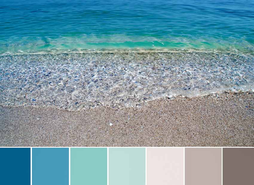
- Aqua Application: A muted, sophisticated aqua (closer to a soft teal or seafoam) is used as a foundational color, conveying tranquility and premium quality.
- Pairings:
- Warm Cream/Beige: As a primary neutral, offering warmth, comfort, and an organic, natural feel.
- Brushed Gold/Copper (Accent): Used sparingly for logos, metallic accents in packaging, or delicate website elements, signifying luxury, indulgence, and warmth.
- Soft Lavender (Secondary Accent): To add a touch of relaxation, mysticism, and therapeutic quality, often for sub-headings or subtle design elements.
- Overall Effect: An elegant, calming, and upscale brand that promises relaxation, rejuvenation, and an elevated experience.
Choosing the right colors to go with aqua is not merely an aesthetic exercise; it is a critical branding decision that profoundly influences how your brand is perceived, its emotional connection with consumers, and its distinct position in the market. By strategically pairing aqua with complementary, analogous, or contrasting hues, brands can unlock its full potential to create a memorable, effective, and cohesive visual identity.
aViewFromTheCave is a participant in the Amazon Services LLC Associates Program, an affiliate advertising program designed to provide a means for sites to earn advertising fees by advertising and linking to Amazon.com. Amazon, the Amazon logo, AmazonSupply, and the AmazonSupply logo are trademarks of Amazon.com, Inc. or its affiliates. As an Amazon Associate we earn affiliate commissions from qualifying purchases.