
In the intricate world of branding, color is far more than a mere aesthetic choice; it is a powerful strategic tool that communicates identity, evokes emotion, and shapes perception. Forest green, with its deep, rich saturation, inherently projects qualities such as nature, growth, stability, and sophistication. However, the true strength of this hue in a brand’s visual identity often lies not just in its individual presence, but in the harmony and impact of its complementary colors. Understanding which colors pair effectively with forest green is paramount for any brand aiming to craft a compelling, consistent, and memorable visual language. This deep dive explores the strategic considerations for pairing colors with forest green, ensuring your brand’s palette resonates with its core values and target audience.
The Strategic Psychology of Forest Green in Branding
Forest green is a color deeply rooted in our primal understanding of the natural world. Its psychological impact is significant and can be harnessed to convey specific brand attributes. Before exploring pairings, it’s crucial to understand what forest green intrinsically communicates and how to leverage it.
Nature, Serenity, and Growth
At its core, forest green is synonymous with lush landscapes, ancient trees, and thriving ecosystems. For brands, this translates into associations with sustainability, environmental consciousness, and organic quality. It evokes a sense of calm, balance, and renewal, making it ideal for brands in wellness, eco-friendly products, or services that promise peace of mind. Furthermore, its connection to nature implies growth and vitality, suggesting a brand that is evolving, enduring, and robust.
Target Audience and Brand Values
The decision to feature forest green prominently in a brand’s palette often reflects a deliberate choice to align with specific values. Brands aiming for an image of luxury, heritage, or tradition might choose forest green for its inherent richness and timeless appeal. Those focused on health, well-being, or environmental responsibility find it a natural fit. Understanding your target audience’s emotional responses and cultural associations with green is vital. For instance, a finance brand might use forest green to project stability and prosperity, while a skincare brand might use it to emphasize natural ingredients and purity. The challenge, and the opportunity, lie in choosing companion colors that amplify these desired brand messages without creating dissonance.
The Challenge of Pairing
Forest green is potent; it commands attention and brings its own distinct personality. Pairing it incorrectly can dilute its impact, create visual clutter, or send mixed signals about the brand. The right companion colors, however, can enhance its richness, provide necessary contrast, introduce dynamic energy, or ground the overall aesthetic. The goal is always to create a balanced, intentional palette that reinforces the brand’s identity and effectively communicates its message.
Classic Companions: Timeless Pairings for Forest Green
For brands seeking enduring elegance, sophistication, and a sense of grounded reliability, certain color pairings with forest green have stood the test of time. These palettes are often chosen for their ability to convey professionalism, luxury, and approachability.
Earthen Neutrals: Beige, Cream, and Tan
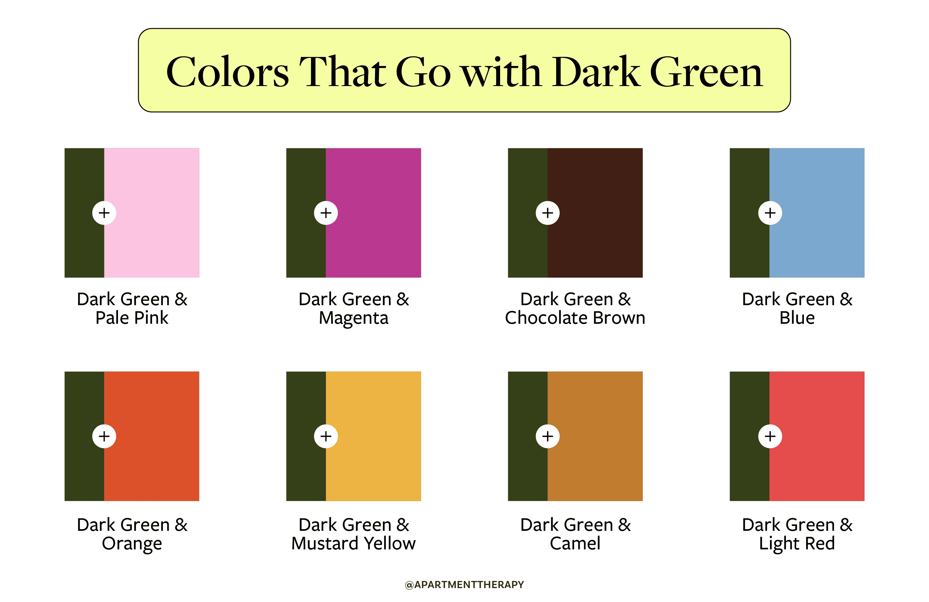
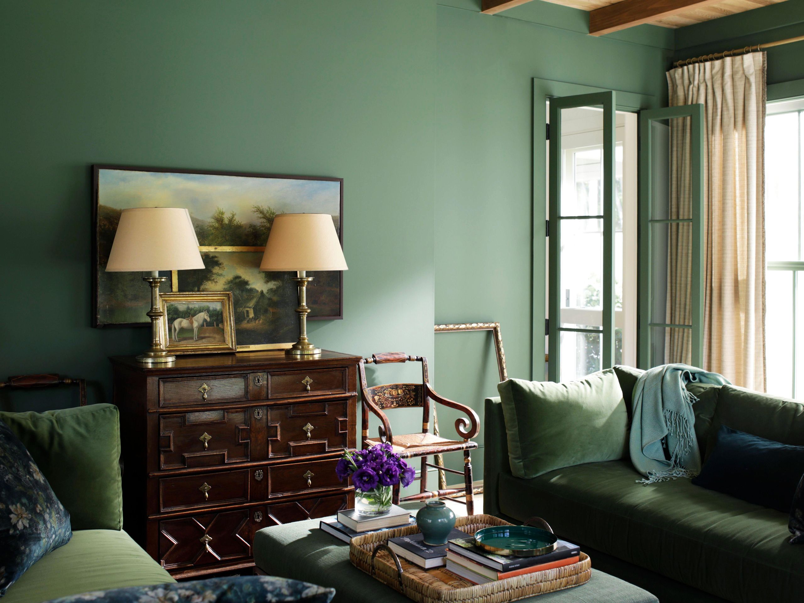
Perhaps the most intuitive and sophisticated pairings for forest green come from the family of earthen neutrals. Colors like beige, cream, sand, and taupe provide a soft, organic contrast that beautifully complements the natural undertones of forest green. This combination evokes a sense of grounded elegance, tranquility, and authenticity.
- Impact on Brand: Brands utilizing this palette often project an image of understated luxury, natural quality, and timeless appeal. It’s excellent for eco-conscious brands, high-end lifestyle products, or services that emphasize comfort and well-being.
- Application: Ideal for website backgrounds, product packaging that suggests natural ingredients, premium marketing collateral, and interior design for retail spaces seeking a calming yet upscale ambiance. The neutrals allow forest green to shine as the primary identifier, while providing a clean, breathable backdrop.
Metallics: Gold, Copper, and Silver
To infuse a brand with a touch of opulence, modernity, or classic grandeur, metallics are unparalleled. Gold, copper, and even certain shades of silver create a stunning juxtaposition against the depth of forest green.
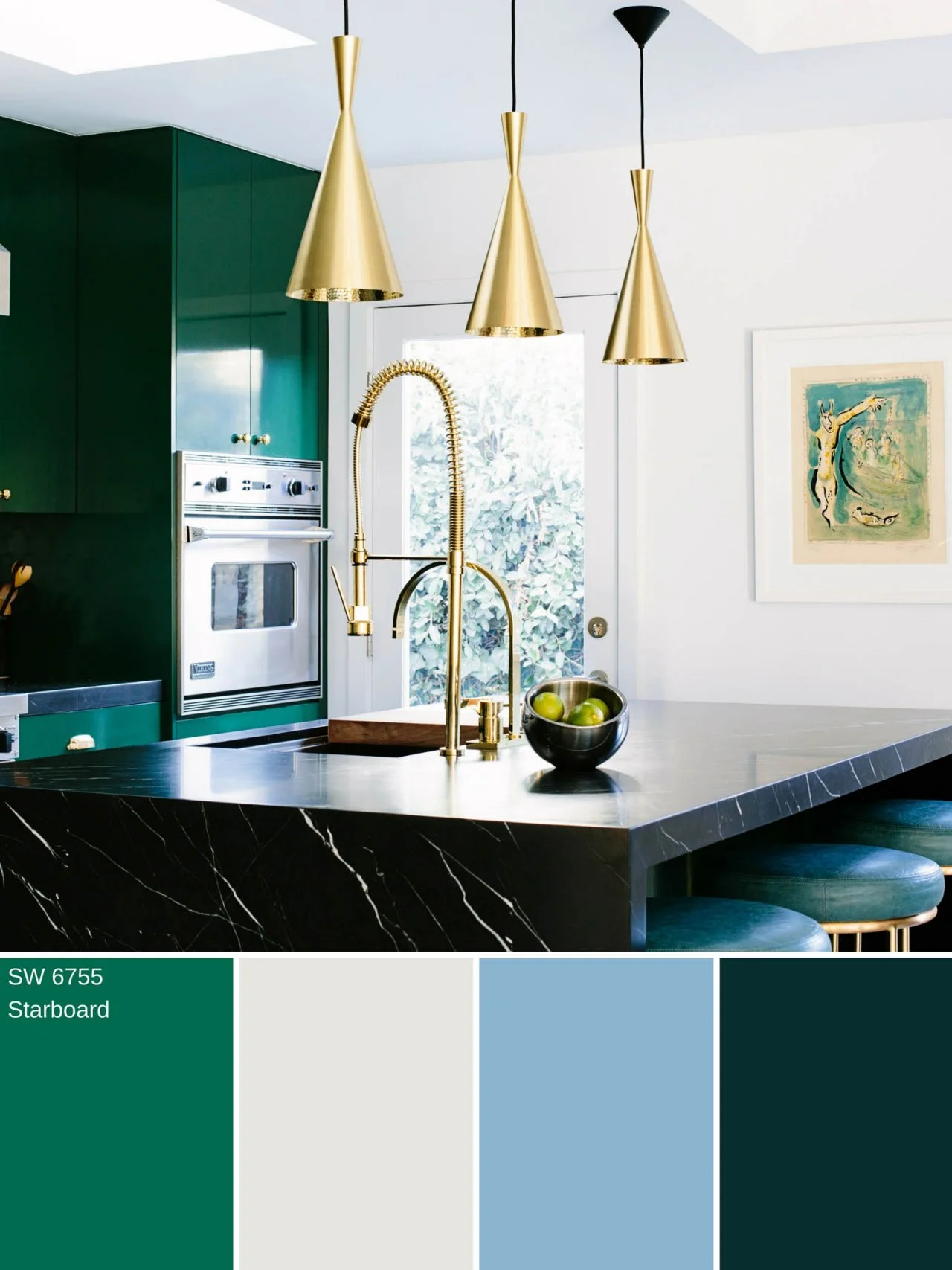
- Gold: Pairing forest green with gold immediately elevates the brand to a realm of luxury, heritage, and premium quality. It suggests richness, success, and established value. This combination is particularly effective for high-end fashion, jewelry, gourmet food brands, or companies with a long-standing history.
- Copper: Copper offers a warmer, more rustic yet still sophisticated metallic sheen. It hints at craftsmanship, warmth, and an artisanal quality, making it suitable for bespoke products, specialty coffee brands, or businesses that value handcrafted excellence.
- Silver: While less common than gold or copper, a sleek, polished silver can give forest green a more contemporary, high-tech, or even minimalist luxury feel. It works well for modern design firms or luxury brands aiming for a sleek, innovative edge.
- Application: Metallics are often best used as accent colors—in logos, foiled packaging details, premium print finishes, or subtle UI elements on a website. Their judicious use ensures they enhance, rather than overwhelm, the forest green.
Muted Blues and Greys
For a palette that exudes trust, stability, and quiet sophistication, pairing forest green with muted blues or subtle greys is an excellent strategy.
- Muted Blues (e.g., dusty blue, slate blue): These create a serene, harmonious, and professional aesthetic. The combination can evoke sky, water, and earth, suggesting reliability and peace. This pairing is excellent for corporate branding, financial services, or healthcare industries where trust and calm are paramount.
- Greys (e.g., charcoal, dove grey): Greys provide a strong, neutral foundation that allows forest green to stand out with clarity. This creates a refined, modern, and serious tone. It’s often used by professional services, technology firms (to soften a stark tech aesthetic), or architectural practices.
- Application: These pairings work beautifully in corporate branding guides, office interiors, and digital interfaces where readability and a sense of professional calm are critical.
Bold Statements: Dynamic and Contrasting Pairings
While classic pairings offer timeless elegance, some brands require a more dynamic, energetic, or unconventional palette. Strategic use of contrasting colors can make forest green pop and infuse the brand with distinct personality.
Warm Accents: Deep Orange, Mustard Yellow, and Rust
To inject vibrancy, creativity, and a touch of warmth, consider pairing forest green with carefully selected warm accents.
- Deep Orange/Burnt Orange: This combination is reminiscent of autumn landscapes and offers a lively, energetic contrast. It can signify creativity, passion, and a forward-thinking approach. Brands in adventure, outdoors, or creative industries might find this pairing highly effective.
- Mustard Yellow: Mustard yellow provides a vintage, earthy warmth that is both sophisticated and inviting. It adds a touch of intellectualism and unique character, suitable for artisanal brands, independent businesses, or those with a retro sensibility.
- Rust: Rust, a muted, reddish-brown orange, offers an industrial yet organic feel. It works well for brands that blend natural elements with a rugged, durable, or handcrafted aesthetic.
- Application: These warm tones are best used as impactful accent colors—for calls to action, highlighted sections in marketing materials, or smaller elements in a logo that need to draw attention. Their intensity requires thoughtful application to maintain balance.
Jewel Tones: Ruby Red, Sapphire Blue, and Amethyst Purple (sparingly)
For brands that want to convey unparalleled luxury, drama, and a regal presence, jewel tones can create a striking and opulent effect when paired with forest green.
- Ruby Red/Deep Crimson: This pairing is bold and dramatic, suggesting passion, power, and prestige. It demands careful balance, often with red used as a very specific accent to forest green’s primary role.
- Sapphire Blue/Deep Teal: While forest green leans earthy, a rich sapphire blue introduces depth and sophistication, reminiscent of precious gems. This can create a refined, trustworthy, and luxurious feel, often used in high-end corporate identity or exclusive product lines.
- Amethyst Purple: A deep, rich purple can evoke mystery, creativity, and luxury. Used sparingly, it can add an unexpected and intriguing layer of sophistication to a forest green palette.
- Application: Jewel tones should be used with immense discretion, often as subtle highlights in a logo, packaging, or premium brand touchpoints. They are powerful and can easily overwhelm if overused.
Complementary Hues: Deep Plum or Maroon
Venturing into more nuanced complementary hues, deep plum or maroon can offer a sophisticated and slightly unconventional contrast to forest green. These colors share a similar richness and depth, creating a harmonious yet distinct separation.
- Impact on Brand: This pairing can communicate a sense of maturity, artistic flair, and refined taste. It avoids the obvious contrasts but offers a compelling, intellectual harmony that can set a brand apart. Ideal for cultural institutions, high-end boutiques, or brands seeking a distinguished, cultivated image.
- Application: This combination works well in editorial design, sophisticated packaging, or interior spaces where a mood of contemplative luxury is desired.
Implementing Your Forest Green Palette: Brand Applications
Once a harmonious palette centered around forest green is established, its consistent application across all brand touchpoints is critical for building a strong, cohesive identity.
Logo and Visual Identity
The brand logo is often the first and most lasting impression. The chosen color pairs should work seamlessly within the logo design, whether as primary colors or subtle accents. Consider how the colors interact in different formats—digital, print, monochrome—and ensure they maintain readability and impact. The chosen palette should reflect the brand’s core messaging instantly.
Website and Digital Presence
For websites, apps, and social media, color choices impact user experience significantly. Forest green might be used for primary branding elements, while companion colors can define calls to action, interactive elements, or backgrounds. Prioritize accessibility and readability, ensuring sufficient contrast between text and background colors. A well-designed digital palette reinforces brand trust and professionalism.
Packaging and Product Design
Physical products and their packaging offer a tactile experience of the brand’s colors. A forest green product might be encased in packaging that incorporates earthy neutrals for an organic feel, or metallics for a luxurious touch. The colors here not only reflect brand values but also influence consumer perception of quality and desirability.
Marketing Materials and Advertising
Consistency across brochures, advertisements, and campaign imagery is non-negotiable. The chosen forest green palette should be meticulously applied, ensuring that every piece of communication reinforces the brand’s visual identity. This consistency builds recognition and strengthens brand recall over time.
Interior Design (Retail/Office Spaces)
Extending the brand palette into physical environments creates an immersive brand experience. A forest green paired with muted blues or creams can create a calming and professional office space, while forest green with warm accents might enliven a retail store. The environment should align with the brand’s personality and values, making visitors feel a consistent connection.
Ultimately, the most effective color combination for forest green is one that is strategically chosen to align with the brand’s unique identity, resonate with its target audience, and consistently deliver its core message across all touchpoints. By thoughtfully selecting companions that either complement or contrast with its inherent strength, brands can elevate forest green from a simple color to a powerful cornerstone of their visual harmony.
aViewFromTheCave is a participant in the Amazon Services LLC Associates Program, an affiliate advertising program designed to provide a means for sites to earn advertising fees by advertising and linking to Amazon.com. Amazon, the Amazon logo, AmazonSupply, and the AmazonSupply logo are trademarks of Amazon.com, Inc. or its affiliates. As an Amazon Associate we earn affiliate commissions from qualifying purchases.