
Dark purple, a hue steeped in history and symbolism, holds a unique and powerful position in brand identity. Traditionally associated with royalty, luxury, wisdom, and mystery, its rich depth offers immense potential for brands aiming to convey sophistication, creativity, or even a touch of mystique. However, the effectiveness of dark purple as a primary or accent color hinges significantly on its complementary pairings. Understanding which colors harmonize or contrast effectively with dark purple is not merely an aesthetic choice; it is a strategic decision that shapes brand perception, influences emotional response, and dictates visual communication across all touchpoints.

The Psychology and Impact of Dark Purple in Branding
Before delving into specific pairings, it’s crucial to grasp the inherent psychological impact of dark purple. Its deep saturation and often cool undertones evoke a sense of richness and gravitas. For luxury brands, dark purple instantly communicates exclusivity and premium quality, aligning with high-end fashion, exquisite spirits, or bespoke services. In the creative industries, it symbolizes imagination, innovation, and artistic flair, making it a compelling choice for design agencies, art studios, or technology companies pushing boundaries. Spiritual and wellness brands often leverage dark purple to convey tranquility, introspection, and depth of knowledge.
However, the powerful nature of dark purple also means it requires careful consideration. Used incorrectly or in isolation, it can sometimes feel heavy, melancholic, or even overwhelming. The choice of accompanying colors becomes paramount in balancing these inherent qualities, allowing brands to sculpt their desired narrative and emotional connection with their audience. A successful dark purple palette can evoke ambition, luxury, and visionary thinking, while a misstep can inadvertently lead to perceptions of austerity or outdatedness.
Strategic Color Pairings for Dark Purple
The art of pairing dark purple lies in understanding color theory principles and aligning them with specific brand objectives. Whether seeking elegant subtlety, vibrant contrast, or harmonious balance, each pairing tells a different story.
Classic and Sophisticated Combinations
For brands aiming for timeless elegance and high perceived value, certain pairings with dark purple consistently deliver.
- Gold and Dark Purple: This is perhaps the most iconic luxury pairing. Gold, with its inherent association with wealth, prestige, and success, beautifully illuminates the deep richness of dark purple. Think of regal crests, high-end jewelry branding, or sophisticated event invitations. The warmth and metallic sheen of gold prevent dark purple from feeling too somber, adding a touch of opulent sparkle. This combination is ideal for brands in the luxury goods, finance, exclusive hospitality, or high-fashion sectors.
- Silver/Platinum and Dark Purple: While gold offers warmth, silver and platinum bring a cooler, more modern sophistication. This pairing suggests cutting-edge luxury, technology, and refined elegance without the overt flashiness of gold. It’s often seen in high-tech product branding, contemporary art galleries, or upscale professional services looking to convey innovation and sleek design. The cool metallic gleam provides a crisp contrast that highlights dark purple’s depth.
- Cream, Beige, and Warm Neutrals with Dark Purple: To soften dark purple’s intensity and add an inviting warmth, pairing it with creamy whites, soft beiges, or gentle tans is highly effective. This creates a refined, understated luxury that feels approachable yet distinguished. Brands focusing on natural beauty, holistic wellness, artisanal crafts, or sophisticated home decor can leverage this palette to evoke comfort, authenticity, and quiet elegance. The neutral backdrop allows dark purple to be the focal point without overwhelming the senses.
- Deep Gray/Charcoal and Dark Purple: For a modern, corporate, yet undeniably sophisticated look, deep grays or charcoal tones offer a strong, professional pairing. This combination projects authority, stability, and intelligence. It’s excellent for consulting firms, upscale professional services, architectural companies, or tech brands that want to appear serious and innovative without being overly flashy. The subtle interplay between the cool undertones of both colors creates a harmonious, polished aesthetic.
Bold and Modern Contrasts
For brands seeking to make a statement, inject energy, or convey a contemporary edge, bolder contrasting colors can elevate dark purple beyond traditional luxury.
- Teal/Emerald Green and Dark Purple: This analogous-complementary pairing offers a stunning and vibrant contrast. Teal and emerald green bring an element of nature, growth, and often a technological or futuristic feel. When combined with dark purple, it creates a rich, jewel-toned palette that is both luxurious and dynamic. This is particularly effective for eco-luxury brands, innovative tech companies, high-end spas, or creative agencies wanting to signify forward-thinking and unique elegance. The unexpected harmony creates visual intrigue.
- Blush Pink/Soft Peach and Dark Purple: A more contemporary and often feminine approach, pairing dark purple with delicate blush pinks or soft peaches creates a sophisticated yet approachable contrast. This palette balances the depth of purple with the lightness and warmth of the pinks, suggesting modern femininity, artistic sensibility, and gentle luxury. It’s highly suitable for beauty brands, contemporary fashion, lifestyle blogs, or creative businesses targeting a younger, design-conscious audience.
- Burnt Orange/Mustard Yellow and Dark Purple (as accents): While these can be tricky, used sparingly as vibrant accents, burnt orange or mustard yellow can inject an unexpected burst of energy and creativity into a dark purple scheme. This creates a high-contrast, artistic, and somewhat bohemian vibe. It’s a bold choice for brands in niche art markets, unique fashion lines, or creative services that thrive on unconventional aesthetics. The key is moderation to avoid overwhelming the elegant base.
Harmonious and Subtle Palettes
Sometimes, the goal is not stark contrast but a nuanced harmony, where colors subtly enhance dark purple’s inherent qualities.
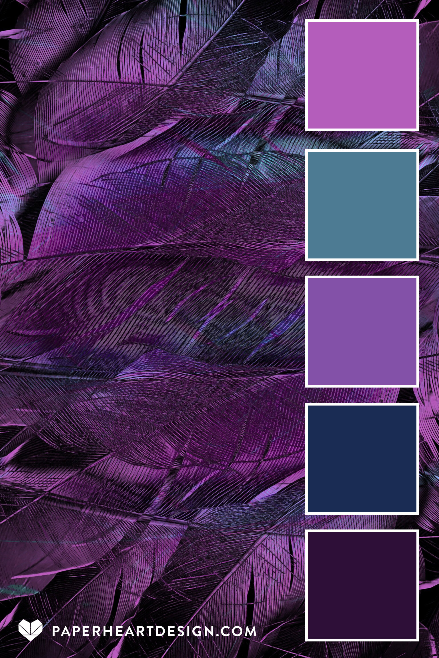
- Monochromatic Deep Purple Shades: Utilizing various shades and tints of purple, from the darkest plum to a soft lavender, creates an incredibly cohesive and sophisticated look. This strategy deepens the sense of luxury and mystery, emphasizing the richness of the base color without distraction. It’s effective for brands that want a strong, singular identity, allowing the variations in tone to create visual interest.
- Navy Blue and Dark Purple: These two deep, cool colors share a similar intensity but possess distinct emotional resonance. Navy brings a sense of trust, professionalism, and stability, complementing dark purple’s luxury and creativity. This pairing is ideal for professional services, established tech companies, or educational institutions aiming for a serious yet forward-thinking image. The close harmony ensures a sophisticated, integrated feel.
Applying Dark Purple Palettes Across Brand Touchpoints
Once a complementary color palette is chosen, consistent application across all brand touchpoints is critical for reinforcing brand identity and maximizing impact.
Digital Presence: Websites and Social Media
On digital platforms, color choices directly affect user experience and message delivery. Dark purple as a primary brand color can establish a luxurious or creative mood on a website. Its chosen companions then dictate the energy and readability. Light neutrals (like cream or soft gray) are essential for background colors to ensure legibility of text. Accent colors (gold, teal, blush pink) can highlight call-to-action buttons, key headlines, or interactive elements, guiding the user’s eye and creating visual hierarchy. On social media, consistent use of the dark purple palette in graphics, filters, and templates ensures instant brand recognition and maintains a professional aesthetic. High contrast pairings can be used for impactful quotes or announcements, while softer combinations suit behind-the-scenes content.
Print Materials and Packaging
The tactile nature of print allows for a different appreciation of color. Dark purple on premium paper stocks, perhaps with metallic foil accents, instantly conveys luxury in business cards, brochures, or product packaging. The chosen complementary colors should enhance the product’s perceived value and align with the brand’s positioning. For instance, a dark purple cosmetic box with gold embossing screams high-end, while one with matte cream accents might suggest organic or artisan quality. The consistency of color across packaging, labels, and promotional materials is crucial for a unified brand experience.
Brand Storytelling and Messaging
Colors are powerful storytellers. A brand utilizing dark purple and gold might narrate a story of heritage, aspiration, and unparalleled quality. A palette incorporating dark purple with teal and silver could speak to innovation, sustainability, and modern luxury. The visual language created by the color palette should always support and amplify the brand’s verbal messaging and overall narrative. This holistic approach ensures that every visual cue reinforces the brand’s core values and unique proposition to its audience.

Avoiding Common Pitfalls and Ensuring Brand Cohesion
While the potential of dark purple is vast, certain pitfalls should be avoided to maintain brand integrity and effectiveness. Overuse of dark purple without sufficient contrasting or balancing colors can make a brand feel heavy, unapproachable, or even dated. Insufficient contrast between text and background, especially on digital platforms, can lead to poor readability and accessibility issues.
Furthermore, inconsistency in color application across different platforms or campaigns dilutes brand recognition. A comprehensive brand style guide, meticulously outlining primary, secondary, and accent colors, along with usage guidelines for different applications, is indispensable. This ensures that whether a customer encounters the brand online, in print, or through a physical product, the visual experience is cohesive, professional, and unmistakably aligned with the brand’s identity and values. The strategic selection and masterful application of colors that “go good with dark purple” are not just design details; they are fundamental pillars of a compelling and enduring brand presence.
aViewFromTheCave is a participant in the Amazon Services LLC Associates Program, an affiliate advertising program designed to provide a means for sites to earn advertising fees by advertising and linking to Amazon.com. Amazon, the Amazon logo, AmazonSupply, and the AmazonSupply logo are trademarks of Amazon.com, Inc. or its affiliates. As an Amazon Associate we earn affiliate commissions from qualifying purchases.