Understanding Copper’s Brand Persona
Copper, as both a material and a color, possesses a distinct brand persona that significantly influences its interaction with other hues in a visual identity. Its inherent characteristics—warmth, metallic luster, and a rich history—position it uniquely in the world of design and marketing. Copper is frequently associated with craftsmanship, durability, authenticity, and value, often bridging the gap between historical elegance and contemporary appeal.
The metallic quality of copper allows it to reflect light, creating depth and dynamic visual interest that flat colors cannot replicate. This luminescence means its perceived shade can subtly shift under varying light conditions, adding to its sophisticated charm. When integrated into a brand’s visual language, copper communicates gravitas and permanence. It speaks to brands that uphold heritage, artisanal quality, resilience, and a sophisticated aesthetic. For businesses aiming to convey reliability, a grounded approach, or a touch of classic elegance infused with modern sensibilities, copper serves as a powerful and engaging anchor. Its intrinsic warmth can foster a sense of approachability, while its metallic sheen maintains a professional and luxurious edge. A deep understanding of these inherent qualities is the foundational step in selecting complementary colors that will amplify copper’s potent brand message rather than dilute it.
Strategic Color Pairings for Brand Impact
The deliberate selection of colors to complement copper is a strategic branding decision that can profoundly affect a brand’s visual identity and its communicated message. The objective is to forge a cohesive palette that enhances copper’s unique attributes while aligning seamlessly with the brand’s overarching identity and its target demographic.
Earthy Tones: Natural Harmony and Authenticity
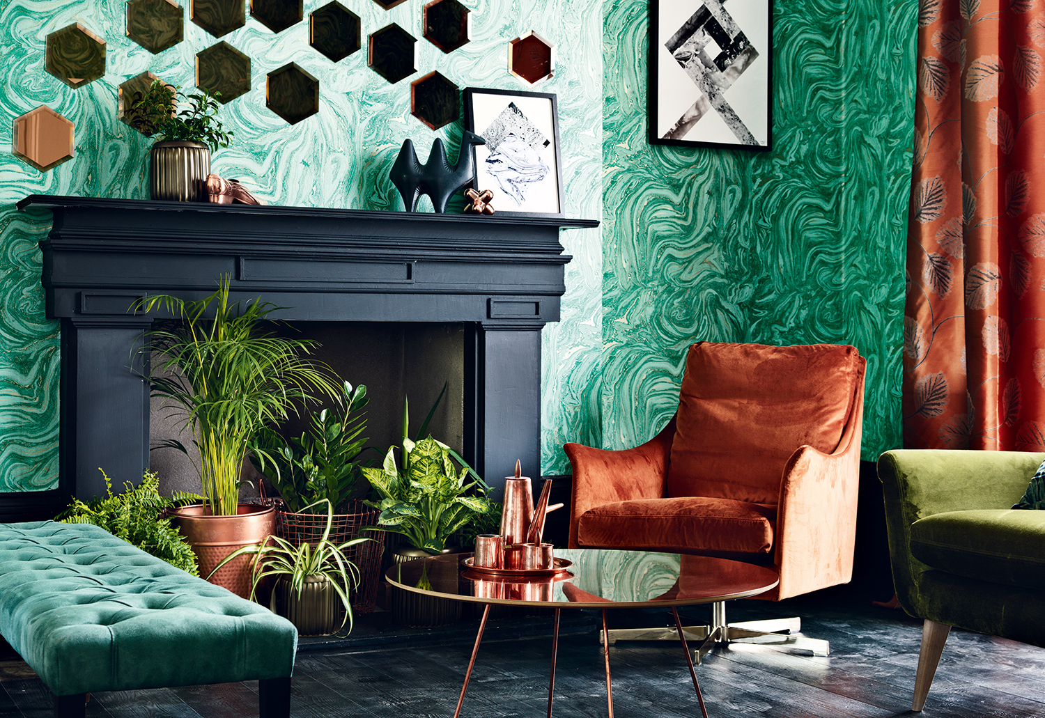
Pairing copper with earthy tones cultivates a sophisticated, grounded, and often organic aesthetic. This combination resonates with themes of authenticity, natural beauty, and timeless appeal, making it an excellent choice for brands emphasizing sustainability, artisanal craftsmanship, hospitality, or premium natural products.
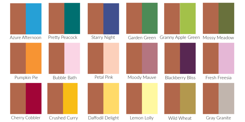
- Deep Greens (Forest, Emerald, Sage): These hues evoke nature, growth, and tranquility. A deep forest green provides a luxurious, rich backdrop for copper, accentuating its warmth and establishing a sense of enduring elegance. Sage green offers a softer, more subdued harmony, ideal for brands focused on wellness, organic goods, or understated sophistication.
- Rich Browns (Chocolate, Taupe, Cognac): Browns enhance copper’s inherent warmth and reinforce feelings of stability, comfort, and heritage. A dark chocolate brown can create a luxurious, robust feel, while a lighter taupe or cognac offers a softer, more inviting atmosphere. This pairing is exceptionally effective for brands specializing in craftsmanship, leather goods, or rustic luxury.
- Muted Oranges & Terracottas: These analogous colors, closely related to copper on the color wheel, create a warm, inviting, and harmonious scheme. Terracotta, in particular, highlights copper’s natural origins and can evoke a sense of global appeal, handmade quality, or desert-inspired aesthetics, often employed by brands in home decor, ceramics, or travel.
Cool Hues: Modernity and Sophistication
Introducing cool colors alongside copper can generate striking contrasts that project modernity, sophistication, and a forward-thinking attitude. This approach is highly effective for brands seeking a contemporary edge, technological innovation, or minimalist luxury.
- Navy Blue: A timeless and powerful combination, navy blue offers a deep, stable counterpoint to copper’s warmth. This pairing exudes confidence, professionalism, and a classic elegance, frequently utilized in corporate branding, luxury goods, and maritime-inspired designs to communicate trust and refined sophistication.
- Teal & Turquoise: These vibrant blues and greens offer a beautiful contrast that accentuates copper’s metallic luster. Teal can create an exotic, luxurious feel, while turquoise imparts a fresh, invigorating, and sometimes whimsical touch. This pairing is excellent for brands in lifestyle, fashion, or those aiming to convey creativity and distinction.
- Charcoal Grey & Black: For unparalleled sophistication and industrial chic, charcoal grey and black provide a powerful, neutral foundation that allows copper to truly stand out. These combinations are modern, sleek, and often associated with high-tech industries, architectural design, or minimalist luxury brands. Black, especially, amplifies copper’s brilliance, creating a dramatic and opulent effect.
- Crisp White & Off-White: White offers a clean, minimalist backdrop that ensures copper remains the undisputed focal point. This pairing evokes purity, simplicity, and modern elegance. It is highly effective for luxury retail, art galleries, or brands that prioritize clean lines and sophisticated simplicity, making products featuring copper appear prominently and refined.
Contrasting Brights: Energy and Distinction
While less commonly used for primary brand identities, the strategic application of contrasting brights can inject energy, playfulness, and memorable distinctiveness into a brand’s visual narrative, particularly for specific campaigns or product lines.
- Vibrant Yellows: A splash of mustard or a more muted gold-yellow can amplify copper’s warmth and metallic quality, adding a lively and optimistic touch. This can be effective for brands aiming for an energetic, creative, or sun-drenched aesthetic.
- Deep Plum or Burgundy: These rich, jewel-toned purples and reds can create a luxurious, dramatic, and somewhat opulent contrast with copper. This pairing suggests depth, sophistication, and a sense of indulgence, fitting for high-end fashion, interior design, or premium experiential brands.

Monochromatic & Analogous: Elegance and Cohesion
Exploring variations within copper’s own color family or its immediate neighbors on the color wheel can yield incredibly elegant and cohesive brand palettes that speak to refined taste and continuity.
- Monochromatic (Various Metallics): Combining copper with other warm metallics like brushed gold, rose gold, or even subtle bronze creates a rich, layered effect without introducing harsh contrasts. This approach emphasizes luxury, refinement, and a sophisticated material palette, frequently observed in jewelry, high-end accessories, or interior design that prioritizes a harmonious metallic scheme.
- Analogous (Warm Reds and Oranges): By pairing copper with deep rust reds, burnt oranges, or muted peach tones, a harmonious and inviting palette emerges. This evokes warmth, comfort, and a subtle energy, making it perfect for brands wanting to convey a welcoming, authentic, or earthy persona without being overly bold or contrasting.
Application in Brand Identity and Marketing
The carefully selected color combinations for copper extend beyond abstract theory into tangible applications across various brand touchpoints. Consistent and strategic deployment ensures a unified, impactful, and memorable brand presence.
Digital Presence and Web Design
In the digital realm, copper can be effectively utilized as an accent color for calls to action, headings, icons, or subtle background textures. When designing a website, the chosen complementary colors must ensure optimal readability and maintain unwavering brand consistency. For instance, a minimalist layout featuring crisp white or charcoal grey backgrounds allows copper elements (such as logo details or navigation accents) to stand out prominently without overwhelming the user experience. Teal or navy blue text combined with copper buttons can create an accessible yet sophisticated user interface. It is crucial to consider how copper appears across diverse screens and devices, ensuring its metallic quality translates effectively without appearing flat or dull. High-resolution images of copper textures or products are indispensable for conveying its inherent richness and luster.
Product Design and Packaging
For physical products and their accompanying packaging, the interplay of copper with selected colors is paramount. A product crafted from copper will naturally serve as the focal point, and its packaging should strategically provide either a luxurious backdrop (e.g., matte black or deep navy for high-end items) or a fresh contrast (e.g., sage green or crisp white for eco-friendly or minimalist designs). The tactile experience of the packaging, combined with the visual palette, powerfully reinforces the brand’s promise and perceived value. For example, a copper kettle presented in a box featuring muted terracotta and cream tones would evoke warmth and homely comfort, whereas a sleek, minimalist grey box would highlight its modern, streamlined design. The choice of packaging material (e.g., recycled paper, soft-touch finishes) should also align meticulously with the selected color narrative to enhance brand cohesion.
Retail and Workspace Aesthetics
The physical environment of a brand’s retail space or corporate office is a powerful, immersive extension of its identity. Copper elements, such as lighting fixtures, signage, furniture accents, or decorative pieces, can dramatically influence the overall ambiance and user experience. Paired with deep greens and natural wood, copper creates a sophisticated, biophilic environment often observed in high-end boutiques or wellness centers. Against a backdrop of concrete grey and exposed brick, it leans into an industrial-chic aesthetic, suitable for modern startups or design-focused retailers. The chosen wall colors, upholstery, and accessory hues must work in seamless concert with copper features to create a cohesive and immersive brand experience. For instance, a hospitality brand utilizing copper bar tops would significantly benefit from rich navy seating and subdued lighting to enhance a feeling of exclusive luxury and intimacy.
The Psychology of Copper and Its Color Combinations
Understanding the profound psychological impact of copper and its accompanying colors is a critical component for strategic branding and effective communication. Copper itself inherently communicates warmth, permanence, and a deep connection to history, craftsmanship, and often, prosperity due to its historical value as a precious metal.
When strategically paired with specific colors, these psychological associations are either amplified or subtly nuanced:
- Copper + Earth Tones: This combination profoundly reinforces feelings of groundedness, reliability, and organic authenticity. It speaks powerfully to consumers who prioritize natural products, sustainability, and enduring quality, fostering a sense of warmth, security, and trust in a brand’s core values.
- Copper + Cool Hues (Blues/Greens): The contrast created by these pairings can stimulate distinct psychological responses. Blues often convey trust, stability, and intelligence. When juxtaposed with copper, it establishes a compelling balance between warmth and cool professionalism, suggesting innovation that is deeply rooted in tradition and reliability. Greens evoke nature, health, and renewal; with copper, this can communicate a sophisticated approach to well-being, eco-consciousness, or luxurious natural products.
- Copper + Neutrals (Black/White/Grey): This sophisticated palette projects clarity, modern minimalism, and refined elegance. Black adds an unmistakable sense of luxury and drama, making copper appear more precious, exclusive, and high-end. White imparts purity and simplicity, allowing copper to stand out as a pivotal focal point of refined elegance and clarity. Greys offer an industrial chic aesthetic, conveying understated modernity and sophisticated functionality.
- Copper + Jewel Tones (Plum/Emerald): These rich, deeply saturated colors, when paired with copper, create an opulent, indulgent, and often dramatic feeling. They strongly appeal to brands targeting luxury markets, suggesting exclusivity, decadence, and a highly sophisticated aesthetic taste that values richness and depth.
Ultimately, the choice of colors to complement copper is far more than a mere aesthetic decision; it is a deliberate and powerful brand statement. Each thoughtfully chosen combination narrates a specific story, evokes a desired emotion, and strategically positions the brand within a competitive landscape. This makes careful color selection a critical and indispensable component of a comprehensive and impactful brand strategy. By leveraging these profound insights, businesses can meticulously craft visual identities that resonate deeply with their target audience and effectively communicate their unique value proposition with enduring sophistication.
aViewFromTheCave is a participant in the Amazon Services LLC Associates Program, an affiliate advertising program designed to provide a means for sites to earn advertising fees by advertising and linking to Amazon.com. Amazon, the Amazon logo, AmazonSupply, and the AmazonSupply logo are trademarks of Amazon.com, Inc. or its affiliates. As an Amazon Associate we earn affiliate commissions from qualifying purchases.