Grey walls offer a sophisticated, neutral canvas, providing an unparalleled foundation for crafting a distinctive spatial identity. In the realm of design, much like a brand leverages a core visual identity to communicate its values and purpose, a thoughtfully curated interior space employs color and form to project its unique persona. The selection of furniture colors against a grey backdrop is not merely an aesthetic choice; it is a strategic decision that dictates the emotional resonance, functional perception, and overall brand narrative of an environment.
The Strategic Canvas of Grey: Building a Spatial Identity
Grey, in its myriad shades, functions as the ultimate neutral, possessing neither the warmth of brown nor the coolness of stark white. This inherent neutrality is its greatest asset in strategic interior design. It acts as a blank slate, absorbing and reflecting the characteristics of the colors it accompanies, thus allowing the furniture to become the dominant voice in the room’s visual storytelling. For a designer aiming to articulate a specific brand persona for a space—whether it’s a tranquil corporate lounge, a vibrant creative studio, or a serene residential haven—grey walls provide the stability and versatility necessary to prevent visual clutter and maintain focus on the curated elements.
The strategic use of grey permits a dynamic interplay of light and shadow, influencing mood and perception. Lighter greys can expand a space, imparting an airy, open brand identity, while darker charcoals lend an intimate, sophisticated gravitas, suitable for a more exclusive or introspective spatial brand. Understanding the undertones of the grey—be it blue, green, or even a subtle beige—is crucial, as these nuances will influence how companion furniture colors are perceived and how harmoniously they contribute to the overarching design message.
Crafting Identity: Cool vs. Warm Palettes for Furniture
The fundamental decision when pairing furniture with grey walls revolves around the desired temperature of the room’s brand identity: cool, calm, and collected, or warm, inviting, and energetic. Each choice sends a distinct message about the space’s purpose and the experience it aims to provide.
Cool Palettes: Projecting Serenity and Sophistication
Furniture in cool tones, when set against grey walls, inherently projects an identity of tranquility, professionalism, and understated elegance. This approach is ideal for spaces that aim to evoke clarity, focus, or a sense of refined calm—think executive offices, contemporary living areas, or minimalist reception lobbies.
- Blues: Deep navy, sapphire, or slate blue furniture pieces introduce depth and a sense of stability. These colors convey trust and reliability, making them excellent choices for spaces where a strong, credible brand identity is paramount. Lighter blues, like sky or powder blue, offer a more ethereal, calming presence, fostering an atmosphere conducive to relaxation and thoughtful contemplation.
- Greens: Emerald, forest, or sage green furniture imbues a space with a sense of growth, balance, and connection to nature. This choice can soften the industrial edge of some greys, creating an inviting yet sophisticated environment. Greens are particularly effective in spaces that aim to promote well-being and organic brand values.
- White and Off-White: Crisp white or creamy off-white furniture stands in stark, elegant contrast to grey walls, enhancing luminosity and creating a clean, modern aesthetic. This pairing suggests minimalism, precision, and an unblemished brand image. It’s a timeless combination that speaks to clarity and forward-thinking design.
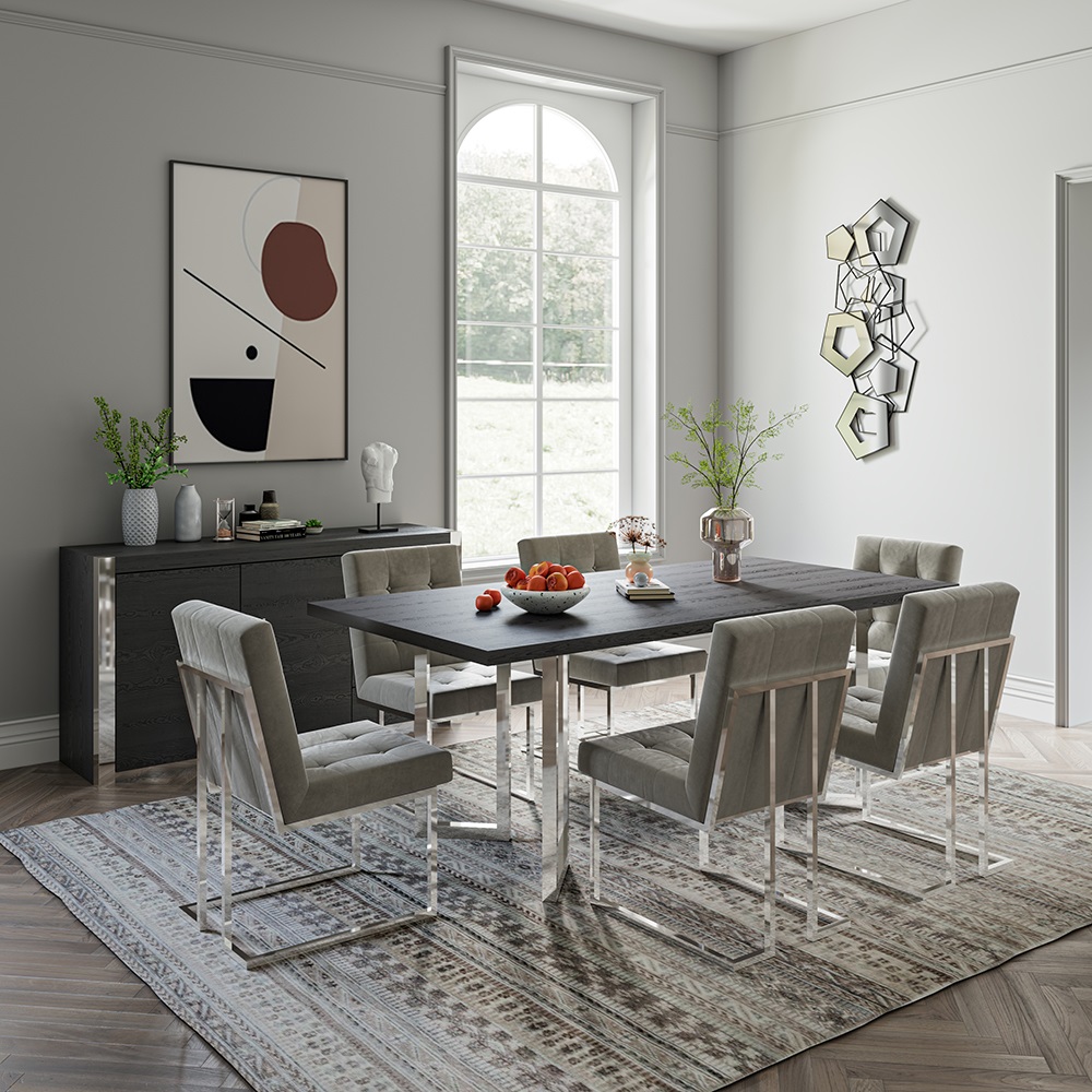
- Metallics: Silver, chrome, and polished steel furniture or accents amplify the cool aesthetic, adding a futuristic or industrial chic dimension. These metallic elements contribute to a sleek, high-tech brand identity, emphasizing innovation and cutting-edge design.
Warm Palettes: Evoking Comfort and Engagement
Conversely, incorporating warm-toned furniture against grey walls creates an inviting, dynamic, and often more personal spatial brand. This strategy is excellent for communal areas, creative hubs, or residential settings where comfort, sociability, and vibrant energy are desired outcomes.
- Earth Tones (Browns, Tans, Beiges): Furniture in shades of chocolate brown, caramel, or sandy beige introduces immediate warmth and organic texture. This pairing roots the space in natural elegance, projecting an identity of grounded comfort, authenticity, and timeless appeal. It’s a reliable choice for spaces seeking to feel approachable and enduring.
- Yellows and Oranges: Bold mustard yellows, vibrant ochres, or rich terracotta oranges infuse a space with energy, optimism, and creativity. These colors act as powerful focal points, communicating a playful, innovative, or energetic brand persona. They are particularly effective in spaces designed to stimulate interaction and ideation.
- Reds and Burgundies: Deep crimson, ruby red, or sophisticated burgundy furniture injects passion, drama, and luxury. This pairing makes a strong statement, suitable for spaces that aim to convey confidence, power, or a highly curated, premium brand identity. Reds can be used sparingly for impactful accents or broadly for an enveloping sense of grandeur.
- Wood Tones: Natural wood furniture, from light maple to dark walnut, inherently brings warmth and texture. The grain of the wood adds an organic dimension, softening the formality of grey and lending an identity of craftsmanship, heritage, and genuine warmth. Different wood finishes can lean more contemporary or traditional, allowing for nuanced brand expression.
Impactful Accents: Design for Distinction
Beyond primary furniture pieces, the strategic deployment of accent colors is crucial for refining the spatial brand. These smaller, deliberate injections of color can punctuate the narrative, draw attention to key features, and prevent the overall scheme from feeling monolithic.
- High-Contrast Pop: A single, vibrant accent color—a bright coral cushion, a lime green throw, or a fuchsia lamp—can introduce an element of surprise and modernity. This is a design technique akin to a brand using a signature color to highlight a unique selling proposition, drawing the eye and making a memorable statement. It signals confidence and a forward-thinking aesthetic.
- Layered Neutrals: For a more understated yet rich brand identity, layering various shades of grey, cream, and beige in textiles (rugs, curtains, cushions) adds depth without introducing new colors. This sophisticated approach communicates subtlety, texture, and refined taste.
- Monochromatic Sophistication: Utilizing different shades of grey for furniture and accents within a grey-walled room can create an incredibly chic and minimalist brand aesthetic. This strategy focuses on texture and form rather than color, speaking to precision, control, and a high degree of design intentionality.

Materiality and Texture: Beyond Color in Brand Expression
While color is paramount, the material and texture of furniture contribute significantly to the overall brand identity of a space. These tactile elements provide depth, warmth, and a sensory experience that color alone cannot achieve.
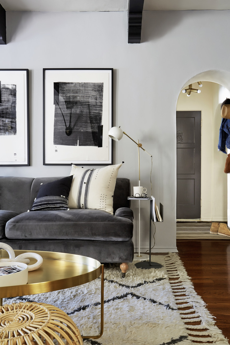
- Soft Textures: Plush velvet, bouclé, or wool upholstery against grey walls projects an identity of comfort, luxury, and approachability. These materials invite interaction and create a sense of softness and warmth, ideal for residential or hospitality brands.
- Smooth and Polished Surfaces: Leather, glass, and polished metal furniture pieces convey a sleek, contemporary, and often professional brand persona. They speak to precision, durability, and a clean, unfussy aesthetic, making them suitable for modern corporate or urban residential environments.
- Natural Elements: Rattan, linen, unpolished wood, or stone accents introduce an organic, earthy brand identity. These materials connect the space to nature, promoting a sense of calm, authenticity, and sustainable values. They are excellent for creating a relaxed, bohemian, or eco-conscious spatial brand.
In conclusion, pairing furniture with grey walls is an exercise in strategic design, mirroring the meticulous process of brand building. By thoughtfully selecting cool or warm palettes, employing impactful accents, and considering the tactile language of materials, designers can consciously shape the perception and emotional impact of any space. The objective is to move beyond mere decoration, to engineer an environment that clearly communicates its purpose, values, and desired experience—effectively establishing a strong, cohesive spatial identity.
aViewFromTheCave is a participant in the Amazon Services LLC Associates Program, an affiliate advertising program designed to provide a means for sites to earn advertising fees by advertising and linking to Amazon.com. Amazon, the Amazon logo, AmazonSupply, and the AmazonSupply logo are trademarks of Amazon.com, Inc. or its affiliates. As an Amazon Associate we earn affiliate commissions from qualifying purchases.