
Grey, often dismissed as merely a neutral, is in fact one of the most sophisticated and versatile colors in a brand’s palette. Far from being dull, grey’s understated elegance provides an exceptional foundation, allowing other colors to truly shine while lending an air of professionalism, stability, and quiet confidence to any corporate identity. For brands aiming to convey trust, modernity, or even a touch of luxury, understanding how to strategically pair grey can unlock immense design potential.
The Strategic Versatility of Grey in Branding
In the realm of brand strategy and corporate identity, color choices are never arbitrary. Each hue carries psychological weight and influences perception. Grey, in its myriad shades, offers a unique blend of neutrality and character, making it a powerful tool for designers and marketers.

Understanding Grey’s Brand Psychology
Psychologically, grey is associated with balance, neutrality, and sophistication. It evokes feelings of reliability, maturity, and practicality. Brands that utilize grey often aim to project an image of authority, timelessness, and technological prowess. It’s the color of concrete, steel, and intellect, suggesting substance and resilience. However, without careful pairing, an overreliance on grey can sometimes lead to perceptions of conservatism or lack of emotion. This is precisely why its pairings are so critical; grey serves as an anchor, grounding more vibrant or expressive colors and providing a canvas against which they can articulate specific brand values. For a tech company, a minimalist grey background might underscore innovation and sleek design. For a luxury brand, a darker charcoal grey can amplify an aura of exclusivity and refinement.
The Spectrum of Grey: From Cool to Warm
It’s crucial to recognize that “grey” is not a singular color but a vast spectrum. The nuances within grey significantly impact its perceived warmth or coolness, and consequently, its optimal pairings.
- Cool Greys: These greys have undertones of blue or green. They tend to feel more modern, industrial, and serene. Brands wanting to convey calmness, precision, or futuristic elements might lean into cool greys. They pair beautifully with cool blues, greens, and even crisp whites, creating a clean, professional aesthetic.
- Warm Greys: Infused with hints of yellow, brown, or red, warm greys are softer, more inviting, and organic. They can make a brand feel more approachable, natural, or heritage-driven. These greys complement earthy tones, warm pastels, and richer jewel tones, fostering a sense of comfort and understated luxury.
- True Greys (Neutral Greys): These greys have no discernible undertones, sitting perfectly balanced between black and white. They are the ultimate chameleon, adaptable to almost any color scheme, providing a true neutral backdrop that allows other colors to take center stage without interference.
Understanding these distinctions is the first step in leveraging grey effectively for corporate identity, ensuring that the chosen shade aligns perfectly with the brand’s desired personality and message.
Classic Combinations: Timeless Appeal for Brands
Certain color combinations featuring grey have stood the test of time, becoming staples in design due to their inherent elegance and broad appeal. These pairings offer a foundation of sophistication and clarity for any brand.
Grey and White: Minimalist Sophistication
The combination of grey and white is the epitome of minimalist design. It speaks volumes through its simplicity, conveying cleanliness, order, and a refined sense of sophistication. This pairing is frequently adopted by high-end fashion brands, architecture firms, and technology companies that prioritize sleek aesthetics and clear communication. A light grey can provide subtle depth against pure white, while a darker charcoal grey paired with white creates stark, dramatic contrast. This palette is inherently modern and timeless, allowing product or service attributes to take precedence without visual clutter.
Grey and Black: Understated Power
When grey is paired with black, the result is an incredibly strong, authoritative, and elegant look. This combination eschews overt flashiness in favor of gravitas and professionalism. It’s a favorite among luxury brands, legal firms, and corporate entities that wish to project an image of unwavering competence and serious intent. The various shades of grey soften the starkness of black, adding dimension and subtlety. A mid-tone grey with black offers a more approachable yet equally powerful aesthetic compared to pure black and white, making it ideal for brands seeking to be seen as both authoritative and approachable.
Grey and Neutrals: Earthy Authenticity
Expanding beyond black and white, grey also harmonizes beautifully with other natural neutrals like beige, taupe, and cream. This creates a warm, inviting, and organic brand identity. This palette is particularly effective for brands in the wellness, home decor, sustainable products, or artisanal food sectors. It evokes a sense of calm, authenticity, and natural elegance. The subtle shifts in tone and texture within this neutral spectrum can create a rich, layered visual experience that feels grounded and genuinely inviting.
Dynamic Duos: Infusing Personality with Grey

While classic pairings provide a strong foundation, grey truly demonstrates its versatility when combined with more vibrant or distinct colors. These dynamic duos allow brands to infuse specific personality traits and emotional cues into their identity, leveraging grey’s stability to amplify the impact of accent colors.
Grey and Blue: Trust, Stability, and Professionalism
Grey paired with blue is a quintessential corporate combination, highly favored in finance, technology, and healthcare sectors. Blue intrinsically signifies trust, reliability, and wisdom, while grey reinforces professionalism and stability. A deep navy blue with a light cool grey creates a serious, credible, and established brand image. Lighter blues with mid-greys can suggest innovation, transparency, and calmness, making them ideal for modern tech startups or wellness brands. This pairing is excellent for brands that want to convey unwavering competence and a sense of security to their audience.
Grey and Green: Nature, Growth, and Sustainability
Combining grey with green evokes a sense of nature, growth, and environmental consciousness. This palette is a natural fit for brands focused on sustainability, organic products, outdoor recreation, or eco-friendly services. The grounding stability of grey allows the freshness and vitality of green to truly pop. A sophisticated dark olive green with a warm grey can convey rugged elegance, while a bright, energetic lime green with a cool light grey speaks to innovation within sustainability. This pairing offers a strong visual message for brands committed to a positive impact.
Grey and Yellow/Orange: Modernity, Optimism, and Energy
For brands looking to inject energy, optimism, and a modern edge, grey paired with yellow or orange is a compelling choice. Yellow brings cheerfulness, innovation, and youthfulness, while orange signifies creativity, enthusiasm, and warmth. When grounded by grey, these vibrant colors achieve a sophisticated balance. A charcoal grey with a vibrant mustard yellow can create a stylish, contemporary feel, appealing to creative agencies or fashion-forward brands. Bright orange accents against a soft grey background can communicate innovation and approachable energy for tech brands or lifestyle services. Grey effectively tames the exuberance of yellow and orange, preventing them from appearing childish and elevating them to a level of strategic vibrancy.
Grey and Purple/Pink: Luxury, Creativity, and Innovation
For brands targeting a sense of luxury, creativity, or even a whimsical touch, grey combined with purple or pink offers distinct possibilities. Purple is historically associated with royalty, luxury, and sophistication, while also representing creativity and spirituality. Pink, in its various shades, can convey playfulness, compassion, or modern chic. A deep plum purple with a cool silver-grey creates an opulent and mysterious aura, suitable for high-end beauty brands or exclusive services. A millennial pink with a light concrete grey offers a fresh, contemporary, and approachable luxury, perfect for lifestyle brands or innovative consumer products. Grey provides the anchor, allowing purple and pink to express their full spectrum of emotive qualities without being overwhelming.
Leveraging Grey for Corporate Identity and Marketing
The strategic integration of grey extends beyond simple aesthetics; it plays a critical role in establishing a cohesive and adaptable corporate identity across all brand touchpoints.
Consistency Across Touchpoints
A well-chosen grey palette provides consistency across various brand assets – from logos and websites to marketing collateral, product packaging, and physical office spaces. By having a clear grey foundation, brands can ensure that all elements align visually, reinforcing brand recognition and professionalism. This consistency builds trust and makes a brand instantly recognizable, regardless of the specific communication channel. It also provides a flexible framework for seasonal campaigns or sub-brand variations, allowing the core identity to remain intact while elements around it shift.
Adaptability for Evolving Brands
One of grey’s greatest strengths is its adaptability. As brands evolve, expand their product lines, or pivot their marketing strategies, a grey-centric palette offers immense flexibility. It can seamlessly integrate new accent colors without disrupting the foundational identity. This resilience makes grey an ideal choice for forward-thinking brands that anticipate growth and change. It allows for fresh infusions of color that can target new demographics or highlight new initiatives, all while maintaining a recognizable and trusted brand image.
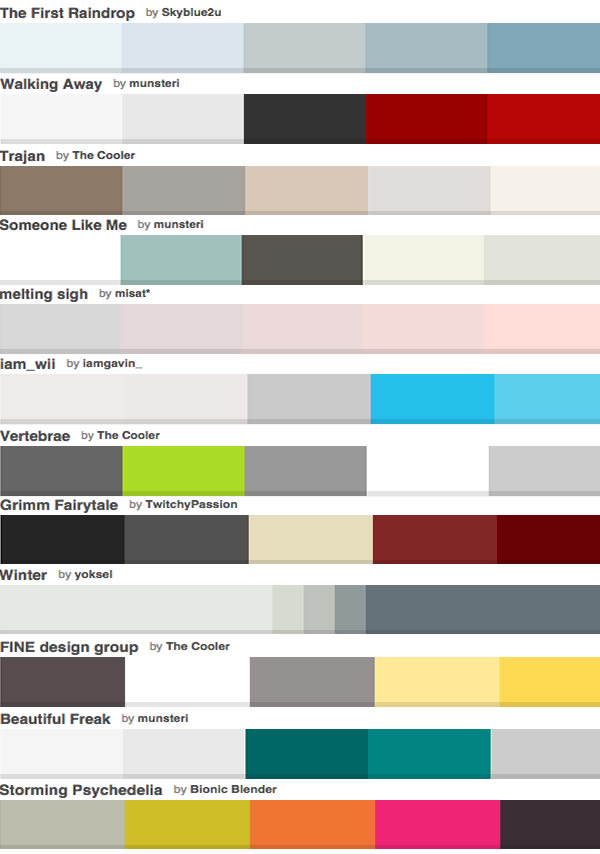
Practical Application: Crafting Your Brand Palette with Grey
When embarking on the creation or refinement of a brand palette involving grey, consider the following practical steps:
- Define Your Brand Personality: What adjectives describe your brand? Reliable, innovative, luxurious, approachable, cutting-edge? These traits will guide your choice of grey’s undertone (cool vs. warm) and its companion colors.
- Research Competitors: Analyze how competitors use color. Identify opportunities to differentiate your brand while understanding industry conventions.
- Experiment with Shades: Don’t settle for the first grey. Explore light greys, dark greys, and mid-tones. Consider how different shades interact with your chosen accent colors.
- Test Across Mediums: Digital screens, print materials, physical products – colors can appear differently. Test your palette across all relevant mediums to ensure consistency and impact.
- Seek Feedback: Gather opinions from your target audience and design professionals. An outside perspective can offer invaluable insights into how your color choices are perceived.
By meticulously considering “what color does grey go with” in the context of your brand’s unique identity and strategic objectives, you can harness this often-underestimated color to create a powerful, sophisticated, and enduring visual presence that resonates deeply with your audience.
aViewFromTheCave is a participant in the Amazon Services LLC Associates Program, an affiliate advertising program designed to provide a means for sites to earn advertising fees by advertising and linking to Amazon.com. Amazon, the Amazon logo, AmazonSupply, and the AmazonSupply logo are trademarks of Amazon.com, Inc. or its affiliates. As an Amazon Associate we earn affiliate commissions from qualifying purchases.