
The inquiry into what specific color results from mixing brown and gray delves into a sophisticated realm often explored by brand strategists and designers. It’s not merely a question of pigment combination but an exploration of the nuanced aesthetic and psychological impact these blended tones can have on a brand’s identity, perception, and market positioning. Far from creating a muddy or indistinct hue, the strategic combination of brown and gray yields a spectrum of rich, complex neutrals that carry profound implications for corporate identity, marketing, and design.
The Nuance of Blended Tones in Brand Identity
Understanding the outcome of mixing brown and gray transcends the basic color wheel. In the context of branding, this combination isn’t about a single, prescriptive color but a family of versatile tones that can evoke a wide array of emotions and messages. Each constituent color brings its own established psychological associations, and their fusion creates something entirely new and often more sophisticated.

Beyond Simple Addition: The Psychology of Color Fusion
Brown, as a primary earth tone, is inherently linked to stability, warmth, authenticity, and natural elements. It conjures images of wood, soil, and resilience, often associated with tradition, comfort, and reliability. Gray, on the other hand, is the quintessential neutral, often signifying balance, sophistication, professionalism, and modernity. It can be perceived as practical, timeless, and technologically advanced, depending on its undertones and accompanying colors.
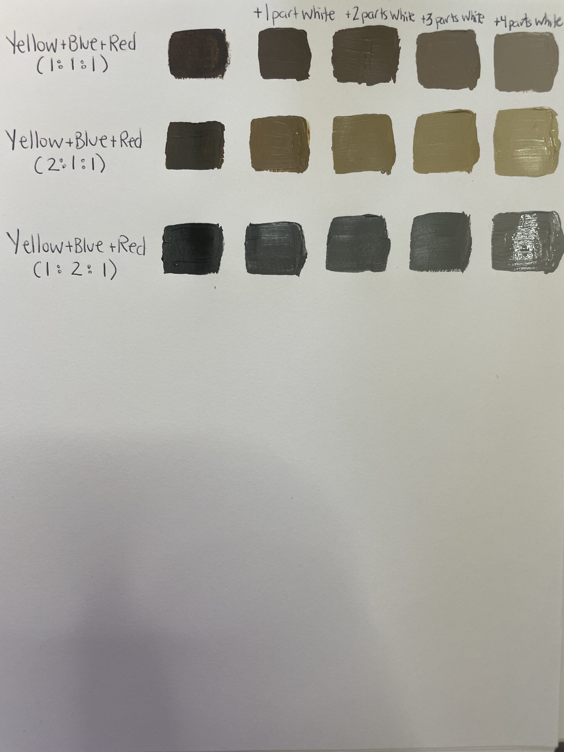
When these two converge, they don’t simply cancel each other out or create a nondescript shade. Instead, they produce a spectrum of colors that inherit traits from both parents. The resulting hues can range from warm, earthy grays to cool, sophisticated browns, often manifesting as complex beige, taupe, or “greige” variations. This fusion imbues the new color with a dual psychology: the grounded authenticity of brown tempered by the refined impartiality of gray, or the modern elegance of gray softened by the organic warmth of brown. This duality makes these blended tones incredibly potent for brand communication, allowing for the articulation of a multifaceted identity.
The Sophistication of “Greige” and “Taupe”: A Designer’s Palette
The terms “greige” and “taupe” are not just interior design buzzwords; they represent a significant segment of the neutral palette for brand designers. “Greige” is often described as a gray with beige undertones, while “taupe” typically leans more towards brown with subtle gray or violet hints. Both exemplify the elegant marriage of brown and gray.
- Greige: This family of colors tends to be cooler and more modern than pure brown, yet warmer and less stark than pure gray. It projects an image of understated luxury, contemporary elegance, and refined simplicity. Brands seeking to convey a sense of modern organicism, sustainable sophistication, or minimalist chic often gravitate towards greige. It suggests a brand that is thoughtful, environmentally conscious, and quietly confident.
- Taupe: With its slightly warmer brown base and gray infusion, taupe often feels more traditional and comforting than greige, but still retains a contemporary edge. It speaks to authenticity, quality craftsmanship, and enduring value. Brands in luxury goods, artisanal products, or those emphasizing heritage and timeless appeal find taupe to be an excellent foundation for their visual identity, signifying reliability and established excellence.
These blended neutrals are highly valued for their versatility. They act as exceptional foundational colors, allowing other accent colors in a brand’s palette to truly shine without overwhelming the overall aesthetic. Their inherent subtlety allows a brand’s message to come through clearly and sophisticatedly, rather than relying on overt, attention-grabbing hues.
Strategic Applications: When Brown Meets Gray in Branding
The deliberate choice to integrate brown-gray blends into a brand’s visual identity is a strategic decision rooted in the desire to communicate specific values, evoke particular emotions, and position the brand effectively within its market. These colors are not chosen for their vividness but for their ability to subtly shape perception and build trust.
Conveying Authenticity and Organic Appeal
For brands focused on natural products, sustainability, artisan craftsmanship, or an earth-friendly ethos, the brown-gray spectrum is a natural fit. A deep taupe or a warm greige can instantly communicate genuine quality, environmental consciousness, and an unpretentious approach. It moves beyond the starkness of pure white or the predictable green, offering a more nuanced and sophisticated representation of “natural.” Brands in organic food, eco-friendly fashion, artisanal furniture, or sustainable tourism can leverage these tones to build an authentic connection with consumers who value integrity and a grounded approach. The muted, natural feel aligns perfectly with a desire for transparency and simplicity.
Modern Minimalism and Understated Luxury
In the realm of modern minimalism, less is often more, and every element chosen must carry significant weight. Brown-gray blends excel here by offering a sophisticated neutrality that supports a clean, uncluttered aesthetic without feeling cold or sterile. A brand employing a crisp greige for its primary background, paired with subtle typography and perhaps a metallic accent, exudes understated luxury. This palette speaks to discerning consumers who appreciate quality over ostentation, and timeless design over fleeting trends. Technology companies, high-end fashion houses, architectural firms, and premium lifestyle brands often adopt these colors to project an image of innovation, efficiency, and refined taste. They suggest a brand that is forward-thinking yet grounded, elegant yet approachable.
Establishing Stability and Trust
The combined psychological attributes of brown (stability, reliability) and gray (professionalism, balance) make their fused tones excellent choices for brands that need to inspire confidence and trust. Financial institutions, professional services firms, healthcare providers, or consultancies often benefit from a palette that includes these grounded neutrals. A rich taupe or a solid greige can serve as a dependable backdrop, reinforcing a brand’s commitment to security, expertise, and long-term relationships. These colors communicate seriousness, integrity, and a steady hand, reassuring clients and stakeholders that the brand is dependable and responsible. They avoid the fleeting nature of trend-driven colors, instead opting for an enduring quality that speaks to permanence.
Crafting a Brand Narrative with Brown and Gray
The successful integration of brown and gray blends into a brand’s identity extends beyond simply selecting a dominant hue. It involves a holistic approach to design, considering how these colors interact with other elements of the brand’s visual language.
Complementary Palettes and Accent Hues
While brown-gray blends can stand alone for their sophisticated neutrality, they truly come alive when paired with carefully selected accent colors. The subtlety of greige or taupe provides a perfect canvas, allowing brighter or deeper accent colors to make a powerful statement without overwhelming the primary aesthetic. For instance, a warm greige background might be enlivened by a rich forest green for an organic, sustainable feel, or a deep navy for a more corporate, trustworthy look. A touch of metallic gold or copper can instantly elevate a taupe-based palette to one of pure luxury. The key is balance: the blended neutral anchors the palette, providing stability, while the accent color injects personality and dynamism. This strategic interplay allows for a versatile brand identity that can adapt across different marketing channels while maintaining core recognition.
The Role of Texture and Finish
The perceived color and emotional impact of brown and gray blends are heavily influenced by the texture and finish of the materials they adorn. A matte greige on a recycled paper stock evokes a different feeling than a glossy taupe on a high-tech device. The tactility of packaging, the sheen of a website button, or the finish of an interior space all contribute to how these nuanced colors are experienced. For instance, a brand focusing on natural skincare might use a soft, slightly textured taupe on its packaging to emphasize natural ingredients and gentle care. A tech startup, conversely, might opt for a smooth, almost metallic greige to convey sleekness and innovation. Designers must consider the entire sensory experience, understanding that the “color” is not just a hue but an embodied quality.
Consistency Across Touchpoints
Maintaining a consistent application of brown-gray blends across all brand touchpoints is paramount for building a strong, recognizable identity. From the corporate logo and website design to marketing collateral, product packaging, physical retail spaces, and social media graphics, the chosen color palette must be applied with precision. Inconsistent use can dilute the brand message and confuse consumers. Establishing clear brand guidelines for color usage, including specific HEX, RGB, CMYK, and Pantone values, ensures that whether a customer encounters the brand online, in print, or in person, the sophisticated message conveyed by its blended neutrals remains cohesive and impactful. This consistency reinforces the brand’s values of stability, authenticity, or modern elegance.
Case Studies and Industry Insights
Many successful brands across various sectors have harnessed the power of brown and gray blends, demonstrating their versatility and effectiveness in communicating distinct brand narratives.
Brands Successfully Leveraging Earthy Neutrals
Consider brands like Everlane, known for its minimalist aesthetic and ethical manufacturing. While their palette extends beyond just brown and gray, these neutrals form a significant backbone of their visual identity, conveying transparency, quality, and timeless design. Similarly, high-end furniture and interior design brands often employ taupe and greige extensively in their showrooms and marketing to project an image of sophisticated comfort, enduring style, and curated luxury. Even tech giants, while often associated with vibrant primary colors, sometimes incorporate these refined neutrals in their premium product lines or corporate communications to signify maturity, exclusivity, and advanced design – think of certain Apple product finishes or premium electronics that eschew overt branding for sleek, muted tones. These examples highlight that brown-gray blends are not merely utilitarian but are powerful tools for establishing a premium and resonant brand presence.

Adapting to Market Trends and Consumer Perception
The appeal of brown and gray blends is not static; it evolves with market trends and consumer perception. In an era of increasing digital noise and visual saturation, the calming and sophisticated nature of these neutrals offers a refreshing counterpoint. Consumers are increasingly drawn to brands that communicate authenticity, sustainability, and understated elegance over flashy, ephemeral trends. This societal shift towards conscious consumption and appreciation for timeless design has further amplified the strategic importance of brown-gray blends. Brands that can subtly communicate these values through their color choices will likely resonate more deeply with contemporary audiences, solidifying their position as trusted and forward-thinking entities. The enduring versatility and inherent sophistication of these blended tones ensure their continued relevance in the ever-evolving landscape of brand strategy and design.
aViewFromTheCave is a participant in the Amazon Services LLC Associates Program, an affiliate advertising program designed to provide a means for sites to earn advertising fees by advertising and linking to Amazon.com. Amazon, the Amazon logo, AmazonSupply, and the AmazonSupply logo are trademarks of Amazon.com, Inc. or its affiliates. As an Amazon Associate we earn affiliate commissions from qualifying purchases.