The seemingly simple question of what color emerges from mixing red and green unveils a fundamental duality in the world of visual communication, a duality that is absolutely critical for successful brand strategy and design. Far from a mere scientific curiosity, understanding the two primary ways colors combine—additive and subtractive—is paramount for any brand aiming for consistent, impactful, and memorable visual identity across diverse platforms. The answer isn’t singular; it depends entirely on how you’re mixing them, dictating everything from a logo’s digital vibrancy to a product’s printed packaging.

The Fundamental Distinction: Additive vs. Subtractive Color
At the heart of color mixing lies the distinction between additive and subtractive color models. Each model governs a different realm of visual experience and, consequently, demands a distinct approach from brand strategists, designers, and marketers seeking to maintain fidelity and impact.
Additive Color (RGB): The Digital Realm
When we speak of colors combining through light, we are entering the realm of additive color. This system is epitomized by the RGB color model, where Red, Green, and Blue are the primary colors of light. In this model, these primary colors are literally added together. The absence of light is black, and when all three primary colors of light are mixed at full intensity, the result is pure white.
Crucially for branding, when red light is combined with green light in the additive model, the resultant color is yellow. This is the phenomenon you witness on your computer screen, smartphone display, television, or any digital interface. Pixels emit these primary lights, and their combinations create the full spectrum of colors we perceive digitally. For brands, this means that their digital assets – websites, social media graphics, app interfaces, digital advertisements, video content – all operate within the RGB space. Ensuring that a brand’s signature red or green (or any other color) maintains its intended vibrancy and saturation in the digital sphere requires careful calibration within this additive framework. Designers must work with RGB values, hex codes, and other digital color specifications to guarantee that a brand’s online presence is visually consistent and impactful, delivering the desired emotional and psychological response to the target audience.
Subtractive Color (CMYK/RYB): The Physical World
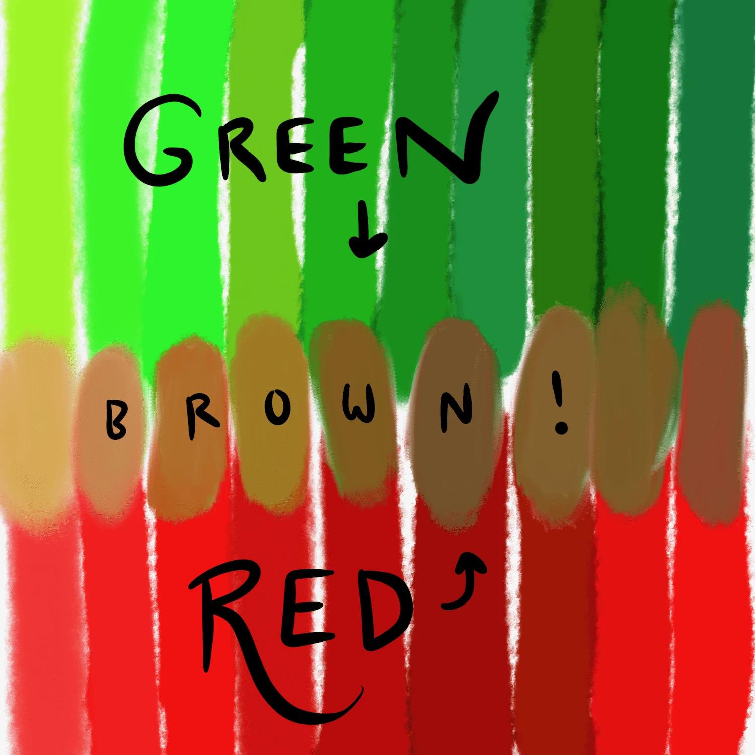
In stark contrast, subtractive color operates on the principle of pigments or dyes absorbing (subtracting) light. This is the model used for physical media such as paints, inks, and filters. Here, the primary colors are traditionally Red, Yellow, and Blue (RYB) for art, or more precisely, Cyan, Magenta, and Yellow (CMY) for commercial printing, often supplemented with Key (black) to form CMYK. In this system, mixing all primary colors ideally results in black (as pigments absorb all light), while the absence of pigment allows white light to reflect (the color of the paper or surface).
When you mix red pigment (paint, ink, dye) with green pigment in the subtractive model, the outcome is typically a shade of brown or a muddy olive green. This happens because the red pigment absorbs certain wavelengths of light, and the green pigment absorbs others. When combined, they absorb an even broader spectrum, leaving only a small amount of light to be reflected, which our eyes perceive as brown or a muted, desaturated green. This principle is vital for any brand engaged in producing physical materials: product packaging, print advertisements, brochures, business cards, merchandise, and even corporate signage. The CMYK model governs how these colors are produced on a press, requiring designers and marketers to specify CMYK values. The challenge often lies in translating vibrant RGB colors from a screen to accurate CMYK print output, as the gamut (range of reproducible colors) for CMYK is generally smaller than RGB. Ignoring this distinction can lead to significant discrepancies between a brand’s digital presence and its physical manifestations, diluting brand consistency and professionalism.
Navigating Color Consistency in Brand Identity
The dichotomy between additive and subtractive color models is not merely an academic point; it’s a practical challenge that lies at the core of effective brand identity management. A robust brand identity demands unwavering color consistency across all touchpoints, digital or physical. A brand’s signature red on its website must evoke the same feeling and recognition as the red on its product packaging or corporate stationery.
This is where comprehensive brand guidelines become indispensable. These guidelines must meticulously define a brand’s primary and secondary color palettes using precise specifications for both RGB (hex codes, RGB values) and CMYK (percentage breakdowns). For ultimate precision, many brands also include Pantone Matching System (PMS) references, a standardized color reproduction system that ensures color fidelity across different manufacturers and printing processes, bridging the gap between digital design and physical production.
Designers and marketers must understand that a direct “what you see is what you get” translation between RGB and CMYK is often elusive. Specialized software and color management tools are essential for converting colors and previewing how they will render in different environments. This proactive approach prevents costly re-prints, delays, and, most importantly, protects the integrity and recognition of the brand’s visual language. In a world saturated with visual stimuli, even subtle variations in a brand’s color can create confusion, erode trust, and diminish the desired emotional connection with consumers.
Beyond the Mix: The Psychology of Red and Green in Branding
While understanding the technical outcome of mixing red and green is crucial, the individual psychological associations of these colors themselves play a profound role in brand strategy, regardless of how they combine. Brands rarely mix their primary identity colors directly; rather, they strategically deploy them individually or in harmonious palettes to evoke specific responses.
Red, a color of high intensity, is universally associated with energy, passion, urgency, excitement, and even danger. In branding, it’s often used by companies wanting to convey power, action, love, or to stimulate appetite (e.g., fast food). It grabs attention and can accelerate decision-making, making it a popular choice for call-to-action buttons or sales promotions.
Green, on the other hand, typically evokes feelings of nature, growth, freshness, health, sustainability, and wealth. Brands in sectors like environmental conservation, finance, wellness, and organic products frequently leverage green to communicate these values. It can create a sense of calm, balance, and reassurance, contrasting sharply with red’s dynamism.
A brand’s strategic choice of these colors, either as dominant hues or as carefully placed accents, deeply influences consumer perception. For instance, a brand that marries a vibrant red with a calming green in its overall branding might aim to convey both exciting innovation and grounded reliability. The key is intentionality: every color choice, and the context of its display (digital or physical), must align with the brand’s core message and desired emotional impact.
Strategic Color Application in Marketing and Design
The insights gleaned from understanding color mixing and psychology directly inform the strategic application of color across all marketing and design touchpoints.
Web & Digital Interfaces
For digital platforms, the RGB model reigns supreme. Brand colors must be optimized for various screen types and lighting conditions. In UX/UI design, a brand’s red might be used for critical alerts or “Buy Now” buttons, leveraging its urgency. Green could signify success messages, confirmations, or eco-friendly options. Digital accessibility is also a key consideration; ensuring sufficient contrast for text and interactive elements in brand colors guarantees inclusivity and a wider audience reach. The consistent application of brand colors across a website, mobile app, and social media profiles reinforces identity and builds a cohesive digital experience that users can recognize instantly.
Print & Packaging Design
The subtractive CMYK model is the workhorse of print and packaging. Here, designers must contend with the nuances of ink opacity, paper stock, and printing processes. A brand’s chosen red might appear slightly different on uncoated paper versus glossy stock, or when printed using spot colors (Pantone) versus process colors (CMYK). The aim is to achieve the closest possible match to the brand’s ideal color, understanding that minor variations are often inherent to the medium. Packaging, in particular, relies heavily on color to attract attention on shelves, communicate product attributes (e.g., a green package for an organic product), and reinforce brand recognition. Precise CMYK specifications are non-negotiable for maintaining brand integrity in this tangible space.

Environmental & Experiential Branding
Beyond screens and paper, brand colors extend into physical environments: retail spaces, event booths, office interiors, and outdoor signage. Here, color accuracy involves considerations for materials like paint, vinyl, fabric, and lighting. A brand’s green logo on a building facade needs to be calibrated against ambient light conditions to ensure it appears as intended to passersby. Experiential branding leverages color to create immersive, branded atmospheres that evoke specific moods and reinforce brand values, transforming passive observation into active engagement.
Ultimately, mastering the question of “what color do you get when mixing red and green” is more than just a scientific inquiry; it’s a foundational pillar of effective brand management. It underpins the strategic decisions that ensure a brand’s visual identity remains coherent, compelling, and consistent, regardless of the medium, fostering strong recognition and a lasting connection with its audience.
aViewFromTheCave is a participant in the Amazon Services LLC Associates Program, an affiliate advertising program designed to provide a means for sites to earn advertising fees by advertising and linking to Amazon.com. Amazon, the Amazon logo, AmazonSupply, and the AmazonSupply logo are trademarks of Amazon.com, Inc. or its affiliates. As an Amazon Associate we earn affiliate commissions from qualifying purchases.