
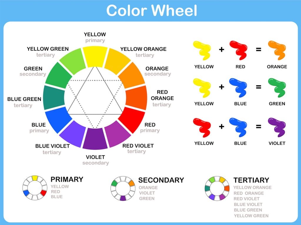
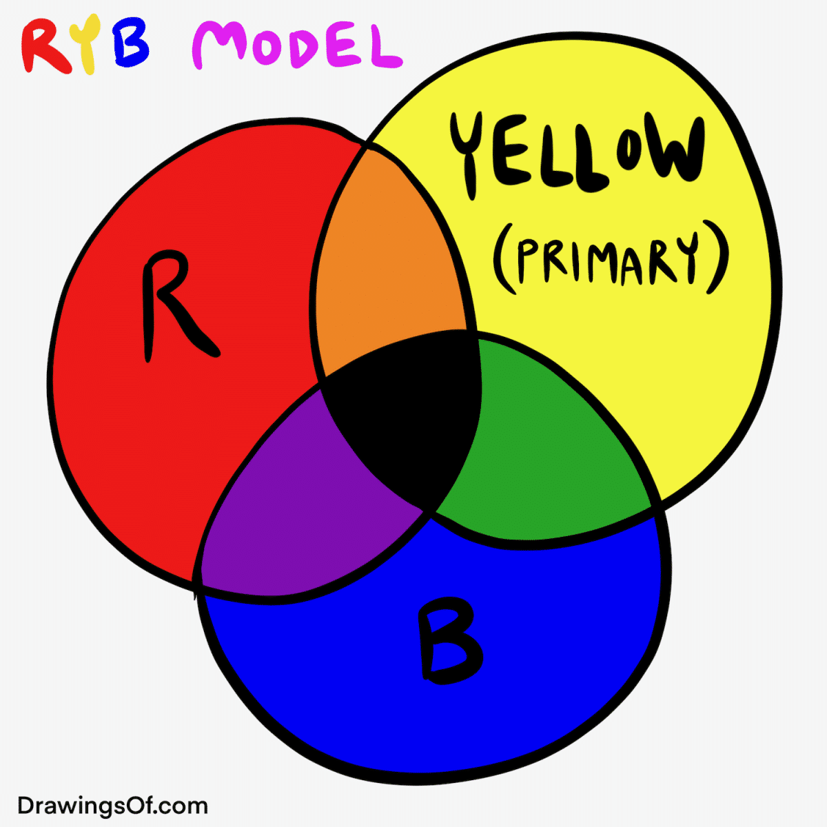
In the fundamental world of art and elementary education, the answer to what happens when you mix yellow and blue is simple: you get green. However, in the sophisticated arena of brand strategy, corporate identity, and consumer psychology, this mixture represents far more than a secondary color on a wheel. It represents the intersection of two powerful psychological drivers—optimism and trust—and the birth of a third, multifaceted identity that symbolizes growth, sustainability, and harmony.
For brand architects and marketing strategists, choosing between yellow, blue, or their resulting green is not a matter of aesthetic preference. It is a calculated decision that influences how a brand is perceived, how much a consumer trusts a product, and ultimately, the brand’s position in a competitive marketplace. To understand the full scope of this color synergy, we must deconstruct the individual components and explore how their fusion creates a narrative of success.
The Psychological Foundations: Deconstructing Yellow and Blue in Branding
Before a strategist can leverage the power of green, they must understand the raw emotional data provided by its parents: yellow and blue. These two colors occupy vastly different spaces in the human psyche, and their combination is an exercise in balancing high-energy stimulation with grounded reliability.
The Power of Blue: The Anchor of Trust and Professionalism
Blue is arguably the most dominant color in corporate branding. From the deep navies of financial institutions like Chase and American Express to the approachable cyans of social media giants like LinkedIn and Meta, blue is the global shorthand for reliability, intelligence, and stability.
Psychologically, blue lowers the heart rate and creates a sense of calm. In a branding context, it signals to the consumer that the company is a safe harbor. It is the color of the sky and the ocean—vast, permanent, and predictable. When a brand utilizes blue, it is making a promise of consistency. This is why it is the preferred choice for sectors where trust is non-negotiable, such as healthcare, technology, and legal services.
The Energy of Yellow: Optimism and Tactical Attention
On the opposite end of the emotional spectrum lies yellow. As the most visible color to the human eye, yellow is the ultimate tool for grabbing attention. Brands like IKEA, McDonald’s, and Nikon use yellow to project an image of friendliness, affordability, and joy.
Yellow is associated with the sun, signifying clarity and warmth. However, in high concentrations, it can also signal caution or urgency (think of traffic signs or legal pads). In branding, yellow is used to stimulate mental activity and encourage communication. It is a youthful, energetic color that demands a response. When a brand leans into yellow, it is positioning itself as an innovator, a disruptor, or a provider of happiness.
The Synthesis of Meaning: Why Green is a Powerhouse for Modern Brands
When a brand moves beyond the primary components and embraces green—the literal mixture of yellow and blue—it captures a unique psychological territory. Green takes the reliability of blue and the optimism of yellow to create a color that symbolizes life, renewal, and equilibrium.
The Subconscious Associations of Green
Green is the color of nature, and as such, it is the most restful color for the human eye. In the current corporate climate, where “Environmental, Social, and Governance” (ESG) criteria are paramount, green has become the primary visual signifier for sustainability and corporate responsibility.
When a brand chooses green, it is tapping into a desire for health and organic growth. This is evident in the branding of Whole Foods or Starbucks, where the color is used to suggest freshness and a connection to the earth. However, green also has a strong association with wealth and finance, particularly in Western markets where it is the color of currency. This dual nature—representing both the natural world and financial prosperity—makes green an incredibly versatile tool for brand strategists.
Balancing Stability with Growth
The strategic advantage of green is its inherent balance. While red can be perceived as aggressive and blue as cold, green sits comfortably in the middle. It suggests that a company is both established (the blue influence) and forward-thinking (the yellow influence).
For a startup, using green can signal that they are a “safe” bet that is also poised for rapid expansion. For a legacy corporation, transitioning toward green accents in their branding can signal a pivot toward “cleaner” tech or more ethical business practices, effectively softening their image without losing their perceived authority.
Strategic Application: How Designers Use the Yellow-Blue Spectrum
In the execution of a brand’s visual identity, the way yellow and blue interact—whether they are kept separate in a logo or blended into a specific shade of green—dictates the brand’s voice.
Additive vs. Subtractive Color in Digital Branding
For modern brands, the “mixing” of color happens across two different mediums: print (CMYK) and digital screens (RGB). When designing for digital security apps or fintech platforms, the “mix” is often conceptual. Designers may use a high-contrast palette of yellow and blue to create a sense of dynamic movement.
The high contrast between a warm yellow and a cool blue creates a visual vibration that draws the eye to calls-to-action (CTAs). For example, a blue website with yellow “Sign Up” buttons is a classic conversion optimization tactic. This utilizes the psychological pull of blue (trust) to make the user feel safe, while the yellow button provides the necessary “spark” to trigger an action.
Creating Visual Hierarchy through Contrast
In professional brand design, the relationship between yellow and blue is often used to establish a hierarchy of information. Because yellow has a higher “luminance” than blue, it naturally pops against a blue background.
Brand strategists use this to guide the consumer’s journey. If the brand’s core message is about “Safety and Savings,” the blue might represent the safety (the background/foundation) while the yellow highlights the savings (the immediate benefit). When these colors are blended into green, the hierarchy becomes more subtle, suggesting a unified experience where the benefits and the foundations are one and the same.
The Market Impact: Why Your Color Choice Dictates Consumer Perception
The decision to use yellow, blue, or green is not made in a vacuum; it is heavily influenced by industry trends and the competitive landscape. A brand’s color choice can help it blend in with industry leaders to gain instant credibility or stand out to signal disruption.
Case Study: The Evolution of Sustainability Branding
Consider the energy sector. Historically, many energy companies used red, white, and blue to signal national pride and industrial strength. As the global conversation shifted toward renewable energy, we saw a massive migration toward the yellow-blue-green spectrum.
BP (British Petroleum) famously redesigned its logo into a “Helios” sunburst of green and yellow. This was a strategic attempt to move the brand’s perception away from “oil” and toward “energy” in a broader, more environmental sense. By mixing the yellow of the sun with the green of growth, they sought to occupy a space of environmental leadership, regardless of their primary product.
Financial and Tech Sector Trends
In the fintech world, we are seeing a departure from the traditional “Stodgy Bank Blue.” Newer players are mixing in vibrant yellows or neon greens to signal that they are different from the traditional institutions. Robinhood, for instance, uses a bold, energetic green. This tells the consumer that the platform is about “money” (the green association) but also about “action” and “growth” (the yellow influence), distinguishing it from the “safe but slow” blue of a traditional savings bank.

Mastering the Palette of Your Brand’s Future
Understanding what color yellow and blue make is the first step in a much larger journey of strategic brand positioning. While the literal answer is green, the strategic answer is a complex blend of trust, energy, and renewal.
When building a corporate identity, one must ask:
- Do we need the stark, high-contrast energy of yellow and blue to drive immediate action?
- Or do we need the harmonious, sustainable, and growth-oriented message of green to build long-term loyalty?
The brands that dominate the market are those that recognize color is a language. Blue speaks of the past and the solid foundation; yellow speaks of the present and the immediate opportunity; and green speaks of the future and the potential for sustainable success. By mastering this palette, a brand can communicate its values to a consumer before a single word of copy is ever read. In the high-stakes world of global branding, the mix of yellow and blue is not just a color—it is a blueprint for how a company intends to grow, compete, and survive in the minds of the public.
aViewFromTheCave is a participant in the Amazon Services LLC Associates Program, an affiliate advertising program designed to provide a means for sites to earn advertising fees by advertising and linking to Amazon.com. Amazon, the Amazon logo, AmazonSupply, and the AmazonSupply logo are trademarks of Amazon.com, Inc. or its affiliates. As an Amazon Associate we earn affiliate commissions from qualifying purchases.