
Taj Mahal quartzite stands as a testament to nature’s artistry, a material that brings unparalleled elegance and durability to any kitchen or bathroom design. Characterized by its warm, creamy white and soft beige base, often interwoven with subtle veining in shades of gold, taupe, and light grey, this natural stone offers a sophisticated foundation for a myriad of design aesthetics. Its inherent warmth and organic movement demand a thoughtful approach to cabinet color selection, one that either harmonizes with its gentle palette or provides a complementary contrast to accentuate its natural beauty. The choice of cabinet color isn’t merely aesthetic; it plays a crucial role in defining the mood, perceived spaciousness, and overall sophistication of a space, fundamentally shaping the “brand” or identity of a home’s interior.

The Allure of Taj Mahal Quartzite: A Foundation for Design
Understanding the intrinsic characteristics of Taj Mahal quartzite is the first step in crafting a cohesive and compelling design narrative. Unlike pure white marbles or uniform granites, Taj Mahal possesses a nuanced depth that makes it uniquely versatile.
Decoding its Hue and Pattern
The beauty of Taj Mahal quartzite lies in its gentle complexity. Its base color typically ranges from an off-white resembling aged parchment to a soft, sandy beige, imbued with an underlying warmth. Veining can vary significantly from slab to slab; some exhibit fine, delicate ribbons of golden-brown or light grey, while others display bolder, more pronounced movements that mimic the flow of water or the layers of ancient rock formations. This natural variation means no two installations are exactly alike, providing an exclusive touch to every project. The stone’s subtle shimmer and slightly translucent quality, particularly when polished, add to its luxurious appeal, reflecting light in a way that brightens the entire room.
The Stone’s Design Versatility
Taj Mahal quartzite’s neutral yet rich character grants it immense design flexibility. It can anchor a traditional, stately kitchen with dark wood cabinetry as effectively as it can grace a minimalist, modern space paired with sleek, light-colored fronts. Its ability to adapt to diverse design languages makes it a preferred choice for homeowners and designers aiming for a high-end finish that withstands fleeting trends. The challenge, and the opportunity, lies in selecting cabinet colors that either amplify its inherent warmth and elegance or provide a calculated counterpoint that enhances its visual impact without overshadowing its natural splendor.
Timeless Pairings: Classic Cabinet Choices for Enduring Sophistication
For those seeking an aesthetic that transcends trends, pairing Taj Mahal quartzite with classic cabinet colors offers a route to enduring sophistication. These choices leverage the stone’s inherent warmth and neutrality to create spaces that feel both luxurious and welcoming.
Crisp Whites and Off-Whites
The quintessential choice for brightness and airiness, white cabinets create a clean, crisp backdrop that allows the Taj Mahal quartzite to shine as the focal point. Pure whites, like a bright Benjamin Moore ‘Chantilly Lace’ or Sherwin-Williams ‘Pure White’, can lend a sharp, contemporary edge, emphasizing the cooler, brighter aspects of the quartzite’s base. However, for a softer, more integrated look, off-whites or creamy whites often prove superior. Shades such as Sherwin-Williams ‘Alabaster’ or Benjamin Moore ‘White Dove’ possess subtle warm undertones that pick up on the creamy hues within Taj Mahal, creating a harmonious and seamless transition from stone to cabinet. This pairing evokes a sense of expansive serenity and timeless grace, making the kitchen feel brighter and larger.
Warm Greiges and Taupes
Bridging the gap between grey and beige, greige and taupe cabinet colors offer a sophisticated neutral alternative. These shades are incredibly versatile, capable of drawing out either the subtle grey or golden undertones present in Taj Mahal, depending on the specific lighting and surrounding decor. A lighter greige can provide a gentle contrast to the quartzite, offering depth without starkness, while a deeper taupe can introduce more gravitas and a cozy ambiance. These colors work exceptionally well in transitional designs, providing a muted backdrop that feels both modern and traditional, and beautifully complementing the organic movement within the stone.
Natural Wood Tones
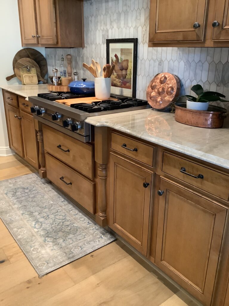
Incorporating natural wood cabinets, particularly in light to medium tones, can infuse a space with organic warmth and textural richness. White oak, maple, or even lighter cherry woods, finished with a clear or natural stain, harmonize beautifully with Taj Mahal quartzite. This pairing is ideal for creating a Scandinavian-inspired, organic modern, or rustic elegant aesthetic. The wood grain adds a layer of visual interest and tactile appeal that complements the stone’s natural patterns, preventing the space from feeling sterile. The warmth of the wood tones echoes the golden and beige veins in the quartzite, creating a rich, cohesive, and inviting environment that feels deeply connected to nature.

Contemporary Statements: Bold Cabinetry to Elevate Your Design
For those inclined to make a distinct design statement, Taj Mahal quartzite can be a surprisingly accommodating partner for bolder cabinet choices. These selections aim to create dynamic contrast or introduce a sophisticated pop of color, defining a unique personality for the space.
Deep Greys and Charcoal
Steering away from the softer neutrals, deep greys and charcoal cabinets offer a striking, modern contrast to Taj Mahal quartzite. These darker shades provide a strong visual anchor, allowing the creamy elegance of the quartzite to truly pop. A rich charcoal, whether matte or with a slight sheen, can create an immediate sense of sophistication and drama, especially when balanced with ample natural light or strategic accent lighting. This pairing is particularly effective in contemporary or industrial-chic designs, where the contrast between light stone and dark cabinetry creates a powerful aesthetic. It can also subtly draw out any cooler grey undertones present in certain slabs of Taj Mahal, lending a more subdued yet equally impactful effect.
Rich Blues and Greens
For a touch of character and luxurious depth, consider cabinets in muted, sophisticated shades of blue or green. Navy blue, a timeless classic, can provide a refined and stately contrast, evoking a sense of calm and classic elegance. Deep forest green or even a softer, earthy sage green can bring an element of nature indoors, creating a serene and grounded atmosphere. These jewel-toned or muted nature-inspired hues work incredibly well with Taj Mahal quartzite because the stone’s neutral base allows the colored cabinets to be a focal point without overwhelming the space. The warmth of the quartzite ensures that even these cooler-toned cabinets feel inviting and integrated, rather than stark. This approach lends itself beautifully to kitchens designed with a bespoke or boutique feel, aligning with a distinctive personal brand.
Black: The Ultimate Contrast
For the most dramatic and cutting-edge aesthetic, black cabinets paired with Taj Mahal quartzite offer an unparalleled visual punch. Whether in a sleek matte finish for a minimalist modern look or a high-gloss lacquer for ultimate luxury, black cabinets create a high-contrast dynamic that is both bold and sophisticated. This pairing emphasizes the creamy, luminous qualities of the Taj Mahal, making it stand out with stunning clarity. To prevent the space from feeling too dark or enclosed, it’s crucial to balance black cabinetry with ample lighting, reflective surfaces, and perhaps a lighter flooring or backsplash. This choice speaks to a design ethos that is confident, impactful, and decidedly contemporary, crafting a space with a strong, memorable identity.
Beyond Color: Holistic Design Considerations
While cabinet color is a pivotal decision, the overall success of pairing with Taj Mahal quartzite depends on a broader consideration of design elements. These details contribute significantly to the perceived quality and harmony of the finished space.
Understanding Undertones in Your Specific Slab
It cannot be stressed enough: every slab of Taj Mahal quartzite is unique. Before finalizing cabinet colors, obtain samples and view them against your chosen slab in various lighting conditions. Pay close attention to the specific undertones present – some slabs lean creamier and more golden, while others may have more pronounced grey or even subtle green undertones. Matching these nuances will ensure a cohesive and natural flow between the countertop and cabinetry. This meticulous attention to detail defines a truly professional and insightful design approach.
The Impact of Lighting
Lighting plays a transformative role in how colors are perceived. Natural light will reveal the true colors of both the quartzite and cabinets, while artificial lighting, especially with different color temperatures (warm vs. cool), can significantly alter their appearance. Warm white LED lights will enhance the golden and creamy tones in Taj Mahal, making the space feel cozier, whereas cooler white lights might bring out more of the grey or neutral aspects. Consider the primary lighting scheme of your space and how it interacts with your chosen palette.
Finishes and Textures
Beyond color, the finish of your cabinets—matte, semi-gloss, or high-gloss—will impact how light reflects and how the color is perceived. Matte finishes absorb light, creating a softer, more contemporary feel, while glossier finishes reflect light, adding vibrancy and making colors appear slightly richer. Similarly, the hardware choice (brass, brushed nickel, matte black) can significantly influence the overall style and pull the look together. A complementary backsplash, whether a subtle subway tile or a dramatic natural stone, also contributes to the layered texture and visual interest, supporting the primary interplay between the quartzite and cabinets. All these elements collectively articulate the distinct brand of the space, whether it aims for classic elegance, modern minimalism, or bold individuality.
aViewFromTheCave is a participant in the Amazon Services LLC Associates Program, an affiliate advertising program designed to provide a means for sites to earn advertising fees by advertising and linking to Amazon.com. Amazon, the Amazon logo, AmazonSupply, and the AmazonSupply logo are trademarks of Amazon.com, Inc. or its affiliates. As an Amazon Associate we earn affiliate commissions from qualifying purchases.