
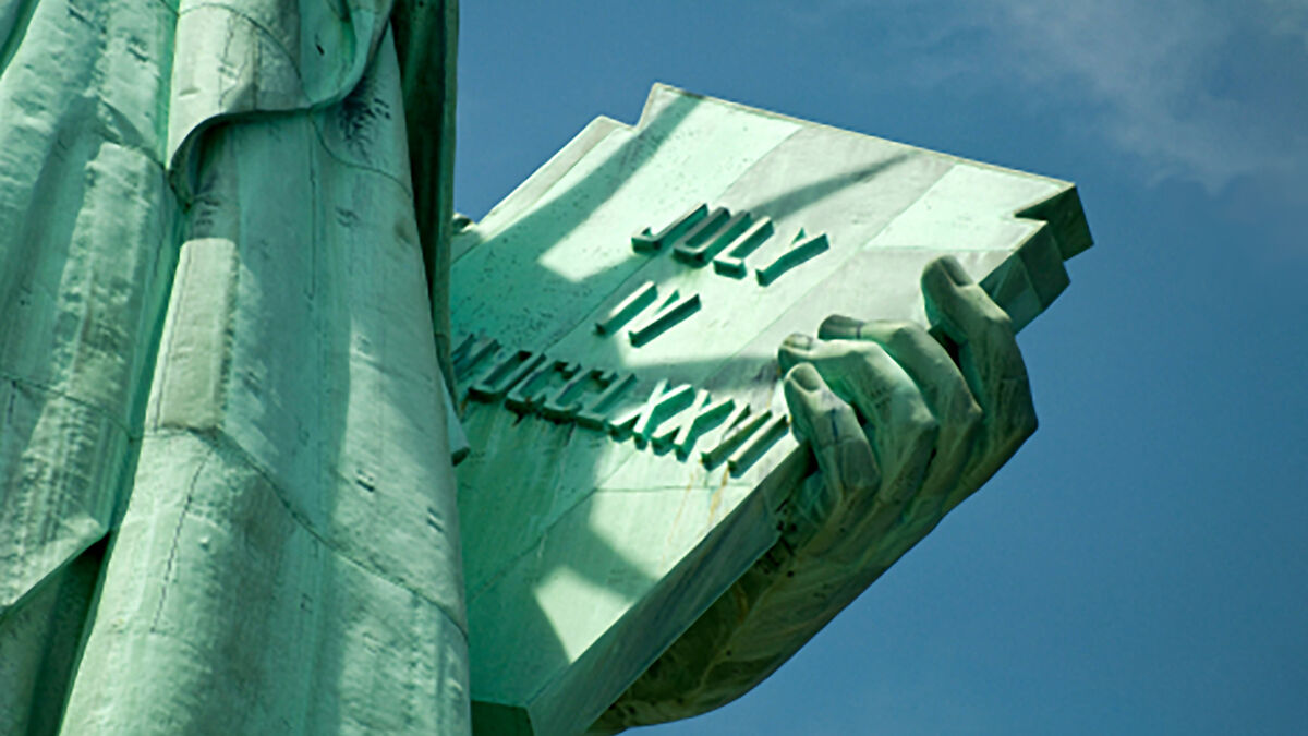
In the realm of global iconography, few symbols command as much instant recognition as the Statue of Liberty. Standing tall in New York Harbor, she is a masterclass in visual storytelling and brand identity. While most observers focus on the radiant crown or the uplifted torch, one of the most critical elements of her “brand kit” is often misidentified as a simple book. In reality, Lady Liberty is holding a tabula ansata, a tablet of law.
For brand strategists and corporate identity designers, the distinction between a “book” and this specific legal tablet is not merely a matter of historical trivia; it is a profound lesson in how physical objects within a brand’s visual language convey deep-seated values and narratives. By examining the tablet—inscribed with the date of American independence—we can extract vital insights into how symbols anchor a brand’s mission and create a timeless connection with its audience.
The Symbolism of the Tabula Ansata: Defining a Core Brand Narrative
Every iconic brand requires a “Founding Document” or a core promise that defines its existence. For the Statue of Liberty, designed by Frédéric Auguste Bartholdi, that promise is the rule of law. The object she holds is not a piece of literature intended for passive consumption, but a legal tablet representing the framework upon which a society is built.
Historical Foundations of the Image
The term tabula ansata translates from Latin to “table with handles.” In antiquity, this form was used to display important votive inscriptions and legal decrees. By choosing this specific shape, the “Statue of Liberty brand” communicates stability, permanence, and authority. In modern brand strategy, this is the equivalent of a “Brand Manifesto.” It tells the world that the entity does not exist in a vacuum; it is governed by a set of principles that are unyielding and public.
When a brand chooses its primary imagery, it must ask: does this symbol represent a fleeting trend or an enduring truth? The choice of a tablet over a book suggests that the “brand” of Liberty is not a story that is being written, but a reality that has been established. This shift from the fluid to the fixed is a powerful psychological tool in establishing brand trust.
The Power of Date-Driven Identity
Inscribed on the tablet is “JULY IV MDCCLXXVI” (July 4, 1776). In the world of corporate identity, a founding date is more than a chronological marker; it is an “Origin Story” condensed into a few characters. By physically clutching the date of her inception, the statue reinforces her “Heritage Brand” status.
Heritage branding is a strategy used by companies like Hermès or Tiffany & Co. to leverage their longevity as a proxy for quality and reliability. For Lady Liberty, the date acts as a stamp of authenticity. It reminds the observer of the specific moment the “product”—in this case, American Democracy—was launched. For modern brands, integrating history into visual assets helps ground the brand in a narrative that transcends current market fluctuations.
Beyond the Object: How Brand Assets Communicate Universal Values
A brand is not just a logo; it is an emotional resonance. The tablet held by Lady Liberty serves as a “Primary Asset” that balances the “Secondary Asset” (the torch). While the torch represents the “Vision” or the “Marketing” of the brand—shining light and attracting attention—the tablet represents the “Product” or the “Operations.”
Liberty as a Global Corporate Identity
If we view the Statue of Liberty as a global brand, we see how it manages to be both specific and universal. The tablet provides the specificity. It anchors the statue in a particular legal tradition. However, because the object is held so prominently, it becomes a universal symbol of “Knowledge through Law.”
This is a critical lesson for personal and corporate branding: your visual identity must have an “Anchor.” Without the tablet, the statue might just be a figure of inspiration. With the tablet, she becomes a figure of governance. This dual-brand architecture—balancing the ethereal (light) with the grounded (the tablet)—is why the image has survived for over a century without needing a significant “rebrand.”
Why Every Brand Needs a “Tablet” of Truth
In an era of digital misinformation and brand skepticism, consumers are looking for “Tablets of Truth.” They want to know what a company stands for in concrete terms. When a brand identifies its “book”—the thing it holds onto most tightly—it clarifies its market position.
Consider a tech brand that prioritizes privacy. Its “tablet” might be its encryption protocol. For a sustainable brand, its “tablet” is its supply chain transparency report. By making these core values a physical part of the brand’s visual presentation, a company moves from “telling” its values to “showing” them. The tablet in Lady Liberty’s hand is not a footnote; it is the headline of her identity.

Consistency and Recognition: The Longevity of the Statue’s Visual Language
One of the hallmarks of a successful brand is its ability to remain recognizable even when its components are abstracted. The silhouette of the Statue of Liberty is so distinct that even a simple outline of the crown and the tablet immediately evokes the entire brand narrative.
Maintaining Visual Integrity Across Centuries
Since her dedication in 1886, the statue’s visual identity has remained remarkably consistent. This is a testament to the “Design System” created by Bartholdi. The proportions of the tablet in relation to the figure are calculated to ensure that even from a distance, the “legal” nature of the object is clear.
In modern branding, consistency is the antidote to invisibility. Brands that constantly change their core symbols risk diluting their “Brand Equity.” The Statue of Liberty has resisted the urge to modernize its accessories, and in doing so, it has gained the ultimate brand accolade: it has become an archetype. When a brand achieves archetypal status, it no longer has to compete for attention; it becomes the standard by which all others are measured.
The Psychological Impact of Tangible Brand Props
Psychologically, the act of “holding” something suggests ownership and responsibility. The fact that the statue holds the tablet close to her body—rather than holding it aloft like the torch—suggests that these laws are something she protects.
From a marketing perspective, “Prop Strategy” is often used in brand photography and video. The objects a brand’s spokesperson or mascot holds can change the entire perception of the brand. A tablet suggests wisdom and law; a sword would suggest defense; a cornucopia would suggest wealth. By identifying the “book” as a tablet of law, the brand of Liberty aligns itself with the “Sage” and “Ruler” archetypes rather than the “Warrior” or “Explorer.”
Modern Applications: What Today’s Brand Strategists Can Learn from Bartholdi
Applying the lessons of the Statue of Liberty to modern brand strategy requires a shift in how we think about visual assets. It’s not about what looks good; it’s about what carries weight.
Minimalism vs. Detail in Iconic Design
The tablet is a simple rectangle. There are no flourishes, no ornate carvings. This minimalism ensures that the focus remains on the message: the date. In an age of cluttered digital design, the “Statue of Liberty approach” to branding suggests that the most powerful messages are often the simplest.
When designing a brand identity, strategists should ask: “What is our July 4th?” What is the single most important piece of information that our audience needs to know? Once that is identified, it should be presented without distraction. The tablet is a frame for the date, much like a well-designed logo is a frame for a brand’s purpose.
Narrative Continuity in Rebranding
While the Statue of Liberty herself hasn’t been rebranded, the way she is used in marketing and media often is. From travel posters to political campaigns, her image is adapted. However, the tablet always remains.
This highlights the concept of “Fixed vs. Fluid” brand elements. A brand should have elements that never change (Fixed) and elements that can adapt to different platforms or cultural moments (Fluid). The tablet is a Fixed element. It provides the narrative continuity that allows the brand to remain relevant across generations. If a brand wants to stay relevant for 150 years, it must identify its “tablet”—the core piece of its identity that is non-negotiable.

Conclusion: The Brand of Liberty and Its Living Document
When we answer the question “What book is Lady Liberty holding?” with “The Tablet of Law,” we uncover the blueprint for one of the most successful brand identities in human history. The tabula ansata is not merely an accessory; it is the physical manifestation of a brand’s promise to its “customers” (citizens and the world).
It represents the marriage of Vision (the torch) and Substance (the tablet). For any modern brand looking to build lasting equity, the lessons are clear:
- Define your core principles in a way that is solid and unmoving.
- Use visual symbols that have historical or psychological weight.
- Maintain consistency to build long-term recognition.
- Balance your brand’s aspirational messaging with its foundational truths.
The Statue of Liberty is more than a monument; she is a case study in how a singular, well-chosen object can define a global identity for centuries. By holding her tablet of law, she ensures that her brand is not just seen, but understood as a pillar of stability in an ever-changing world.
aViewFromTheCave is a participant in the Amazon Services LLC Associates Program, an affiliate advertising program designed to provide a means for sites to earn advertising fees by advertising and linking to Amazon.com. Amazon, the Amazon logo, AmazonSupply, and the AmazonSupply logo are trademarks of Amazon.com, Inc. or its affiliates. As an Amazon Associate we earn affiliate commissions from qualifying purchases.