
In the rapidly evolving landscape of technology, data is the primary currency. Whether you are building a machine learning model, optimizing a software interface, or analyzing server latency, the ability to interpret data accurately is a foundational skill. At the heart of this interpretation lies a fundamental question of coordinate geometry and data science: which axis represents the independent variable?
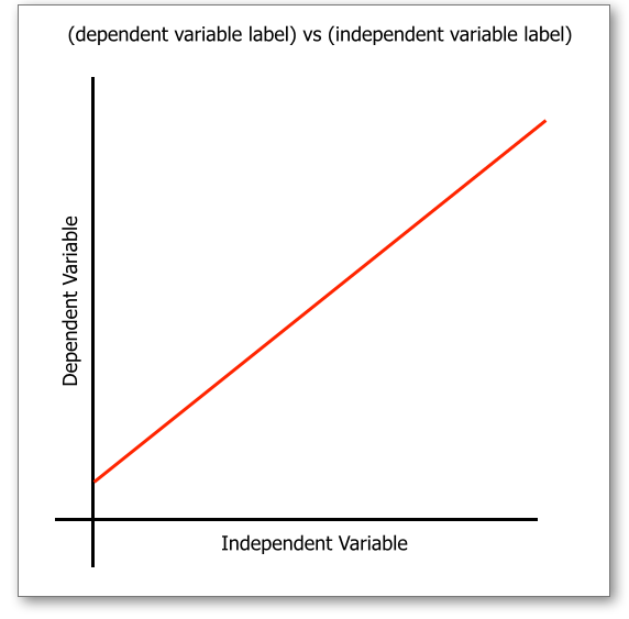
In almost every standardized technical application, the independent variable is plotted on the horizontal axis, also known as the X-axis.
While this may seem like a simple rule from an introductory algebra class, its implications in the tech industry are profound. Proper mapping of variables is the difference between a high-performing neural network and a flawed model, or between a clear user analytics dashboard and one that leads to poor business decisions.

The Fundamentals of Data Mapping in Technology
To understand why we place the independent variable on the X-axis, we must first define what it represents within a technical context. The independent variable is the “input” or the factor that is manipulated or controlled to observe an effect. In a tech environment, this could be the amount of RAM allocated to a process, the number of users hitting a server simultaneously, or the specific timeframe of a software deployment.
Defining the Independent Variable in Software Logic
In software engineering and algorithmic design, the independent variable is often the parameter you pass into a function. It is the “cause” in a cause-and-effect relationship. For instance, if you are testing the scalability of a cloud infrastructure, the “Number of Concurrent Requests” is your independent variable. You control this value to see how the “Response Time” (the dependent variable) reacts.
The Convention of the X-Axis
The X-axis serves as the baseline for our visual logic. In Western cultures, we read from left to right, which aligns with the conceptual flow of time and causality. By placing the independent variable on the X-axis, tech professionals create a narrative flow where the viewer scans the “cause” along the bottom and looks up or down to see the “result” on the Y-axis. This standardization ensures that when a developer shares a performance graph with a stakeholder, there is an immediate, intuitive understanding of the data’s directionality.
Why Standardized Visualization Matters for Tech Teams
Consistency in data mapping is vital for collaboration. In DevOps, for example, site reliability engineers (SREs) use dashboards to monitor system health. If different teams used different axes for their independent variables, the mental overhead required to switch between dashboards would increase the “mean time to resolution” (MTTR) during a system outage. Standardizing the X-axis for independent variables like “Time” or “Payload Size” ensures rapid, error-free communication.
Implementing Variable Logic in AI and Machine Learning
In the realm of Artificial Intelligence (AI) and Machine Learning (ML), the distinction between independent and dependent variables becomes even more critical. Here, independent variables are often referred to as “features,” and the dependent variable is the “target” or “label.”
Feature Engineering and the X-Axis
Feature engineering is the process of selecting and transforming independent variables to improve the performance of a machine learning model. When data scientists visualize these features during the Exploratory Data Analysis (EDA) phase, they plot the feature on the X-axis. This allows them to identify patterns, such as linearity or clusters, relative to the target outcome. Without the correct axis placement, identifying these correlations—such as how “Processor Speed” affects “Power Consumption”—would be significantly more difficult.
Training Models: Inputs vs. Outputs
During the training of a model, the X-axis often represents the input space. If we are visualizing a simple linear regression model, the independent variable (the predictor) sits on the X-axis. As the tech industry moves toward “Explainable AI” (XAI), the clarity of these visualizations is paramount. Users need to see exactly how a change in the input (X) leads to a specific prediction (Y) to trust the algorithm’s decision-making process.
Visualizing Predictive Analytics
In predictive analytics, the goal is to use historical data to forecast future outcomes. Here, the independent variable is almost always time or a specific set of controlled conditions. By plotting these on the X-axis, tech companies can visualize trends and seasonalities. For example, a SaaS company might plot “Subscription Month” on the X-axis to visualize “Churn Rate” on the Y-axis, allowing them to pinpoint exactly when users are most likely to drop off.
Tools and Frameworks for Precision Plotting

Modern tech professionals rarely draw graphs by hand; instead, they rely on a sophisticated stack of software tools and libraries that enforce the X-axis convention for independent variables.
Leveraging Python Libraries (Matplotlib, Seaborn)
Python has become the lingua franca of data science. Libraries like Matplotlib and Seaborn are designed with the “Independent = X-axis” philosophy as a default. When a developer calls plt.plot(x, y), the library assumes the first argument is the independent baseline. Mastering these libraries involves understanding how to manipulate the X-axis to show categorical data, continuous data, or logarithmic scales, all while maintaining the integrity of the independent variable’s position.
Business Intelligence (BI) Tools and Automatic Axis Mapping
Tools like Tableau, Power BI, and Google Looker have revolutionized how tech firms process big data. These platforms often use “smart mapping” to suggest the best axis for your data. When you drag a “Date” or “ID” field into the visualization pane, these tools automatically snap them to the X-axis because they recognize them as independent dimensions. This automation reduces human error and ensures that even non-technical stakeholders are viewing data through a scientifically accurate lens.
Responsive Design in Data Dashboards
In the world of UX/UI design, displaying data on mobile devices presents a unique challenge. However, the rule of the X-axis remains. Responsive charts must scale without flipping the variables. A mobile view of a server’s performance must still keep “Time” on the horizontal axis, even if the horizontal space is limited. Designers often use “scrollable X-axes” to maintain this convention, ensuring that the fundamental relationship between the independent and dependent variables is never compromised for the sake of screen real estate.
Advanced Scenarios: When Traditional Axis Rules Shift
While the X-axis is the standard home for the independent variable, advanced tech applications sometimes require a more nuanced approach to visualization.
Time Series Analysis and the Temporal X-Axis
In almost all time-series analysis, time is the independent variable. However, in high-frequency trading algorithms or real-time network monitoring, “time” can be measured in milliseconds. The challenge here is not just placing time on the X-axis, but managing the density of the data. Tech professionals must use techniques like “downsampling” or “aggregation” to ensure the X-axis remains readable while still accurately representing the independent flow of time.
Categorical Data in UX Research
In User Experience (UX) research, the independent variable might not be a number, but a category—such as “Feature A” vs. “Feature B.” When plotting the results of an A/B test, the X-axis is divided into these discrete categories. Even though the variable is qualitative rather than quantitative, it remains on the horizontal axis. This allows researchers to compare the “Conversion Rate” (Y-axis) across different versions of a software product clearly.
3D Visualization and Multi-Variable Complexity
As we move into 3D data environments—such as Digital Twins or VR data simulations—we introduce a Z-axis. In these scenarios, you may have two independent variables. Conventionally, these are mapped to the X and Y axes (forming the ground plane), while the dependent variable is mapped to the Z-axis (height). This spatial arrangement allows engineers to visualize how two different inputs—such as “Temperature” and “Pressure”—interact to affect a “Material Strength” outcome.
Best Practices for Tech Professionals
To excel in any data-driven tech role, one must go beyond simply knowing which axis is which. You must apply this knowledge to create insights that are both accurate and actionable.
Avoiding Misleading Correlations
One of the biggest risks in data visualization is “spurious correlation.” Just because a variable is on the X-axis doesn’t mean it causes the change in Y. Tech professionals must be rigorous in their analysis, ensuring that the independent variable plotted on the X-axis has a logical, defensible link to the dependent variable. In the world of Big Data, it is easy to find patterns that don’t actually exist.
Accessibility in Data Presentation
In modern software development, accessibility (A11y) is a core requirement. When visualizing the independent variable on the X-axis, consider users with visual impairments. Use high-contrast grid lines, clear axis labels, and even ARIA (Accessible Rich Internet Applications) labels for web-based charts. Ensuring that the X-axis is clearly demarcated helps all users, including those using screen readers, understand the logical flow of your data.
The Future of Dynamic Data Interaction
We are entering an era of “Natural Language Querying,” where developers can ask an AI, “Show me the relationship between server load and error rates.” The AI will generate a graph instantly. Even in this automated future, the underlying code will still place the independent variable (server load) on the X-axis. Understanding this fundamental principle allows tech professionals to audit AI-generated content and ensure that the tools we build continue to adhere to the rigorous standards of scientific communication.
By mastering the placement and manipulation of the independent variable on the X-axis, tech professionals ensure that their insights are grounded in clarity and precision. Whether you are coding the next great app or securing a global network, the X-axis remains your most reliable tool for telling the story of your data.
aViewFromTheCave is a participant in the Amazon Services LLC Associates Program, an affiliate advertising program designed to provide a means for sites to earn advertising fees by advertising and linking to Amazon.com. Amazon, the Amazon logo, AmazonSupply, and the AmazonSupply logo are trademarks of Amazon.com, Inc. or its affiliates. As an Amazon Associate we earn affiliate commissions from qualifying purchases.