
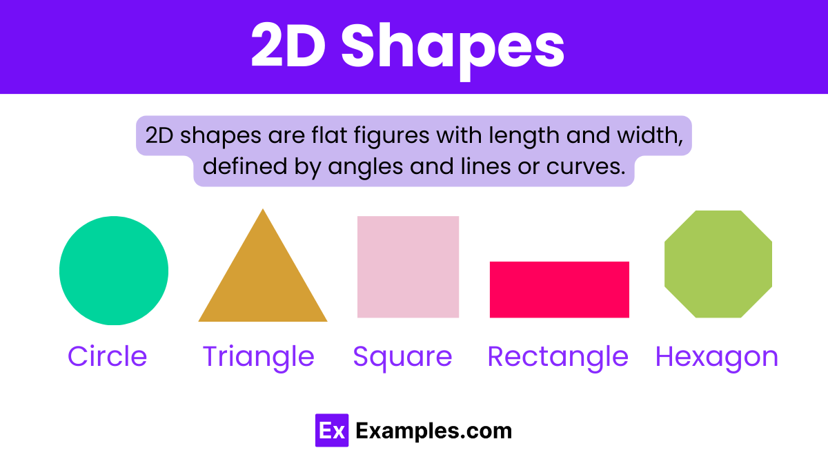
In the world of professional branding and corporate identity, visual communication is often reduced to its most primal elements. Long before a consumer reads a tagline or engages with a product’s features, their subconscious mind processes the fundamental geometry of the brand’s visual assets. When we ask, “What are 2D shapes?” in the context of brand strategy, we are not merely discussing elementary mathematics; we are exploring the foundational building blocks of human perception and market positioning.
A two-dimensional shape—defined by its length and width but lacking depth—serves as the primary vessel for a brand’s personality. From the iconic bitten apple of a tech giant to the interlocking circles of a global payment processor, 2D shapes distill complex corporate values into digestible, memorable icons. This article explores the strategic application of 2D shapes in brand design, the psychology behind geometric choices, and how modern organizations leverage simple silhouettes to build multi-billion dollar identities.
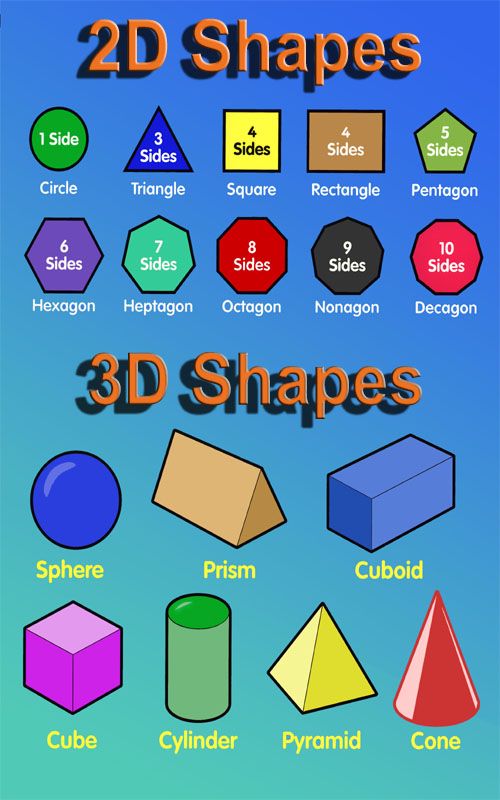
The Fundamental Building Blocks of Visual Communication
At the heart of every successful logo and brand system lies a mastery of basic geometry. 2D shapes are the shorthand of the visual world. In a marketplace saturated with information, brands have only milliseconds to convey their essence. Understanding the nuance of these shapes is the difference between a brand that feels trustworthy and one that feels chaotic.
The Psychology of Geometric Shapes: Circles, Squares, and Triangles
In brand strategy, geometric shapes are never “neutral.” Each category of 2D shape triggers a specific cognitive response based on evolutionary psychology and cultural conditioning.
- Circles and Ovals: These shapes represent unity, wholeness, and community. Because they lack sharp edges, they are perceived as friendly, feminine, and inclusive. Brands like NASA or Mastercard utilize circular motifs to suggest global reach and interconnectedness. In a digital landscape, the circle is often used for profile pictures and call-to-action buttons to foster a sense of welcome.
- Squares and Rectangles: These are the shapes of stability, efficiency, and professionalism. They evoke the imagery of buildings, bricks, and safes. When a brand like LinkedIn or Microsoft utilizes quadrilaterals, they are signaling reliability and organizational structure. The right angle suggests a “no-nonsense” approach that appeals to B2B sectors and financial institutions.
- Triangles: These are dynamic, directional shapes. Depending on their orientation, they can represent tension, action, or growth. An upward-pointing triangle suggests stability and ascension (as seen in the Delta Airlines logo), while a sideways triangle mimics a “play” button, signifying movement and media.
Organic vs. Abstract 2D Forms in Modern Branding
Beyond the rigid world of Euclidean geometry lies the realm of organic and abstract 2D shapes. Organic shapes—those found in nature, such as leaves, clouds, or water droplets—are inherently irregular and fluid.
Modern lifestyle and wellness brands frequently move away from perfect squares and circles in favor of organic blobs or “hand-drawn” silhouettes. This shift is a strategic move to appear more human, sustainable, and approachable. Abstract 2D shapes, on the other hand, are stylized versions of recognizable objects. They provide a unique “ownable” asset for a brand, allowing a company to claim a specific silhouette in the consumer’s mind, much like the Nike Swoosh, which is neither a literal object nor a perfect geometric shape, but an abstract representation of speed and victory.
Strategic Implementation: Translating 2D Shapes into Brand Equity
Identifying a shape is only the beginning. The strategic implementation of these shapes across a brand’s ecosystem determines how effectively that identity translates into market value. A 2D shape becomes a “logo” when it is infused with meaning, but it becomes a “brand” when it is applied consistently across all touchpoints.
Minimalist Design and the Power of Scalability
The current trend in global brand strategy is “de-branding” or simplification. As brands move from physical storefronts to mobile app icons, the complexity of 3D logos (with gradients, shadows, and textures) has given way to flat, 2D design.
A 2D shape is infinitely more scalable than a complex illustration. Whether it is laser-etched onto a tiny microchip or printed on a massive billboard, a well-defined 2D silhouette maintains its integrity. This “reductive” approach forces a brand to find its most potent visual essence. For instance, when Starbucks removed the wordmark from its logo, it relied entirely on the 2D silhouette of the Siren. This level of brand equity is only possible when the 2D shape is distinctive enough to stand alone.
Case Studies: The Success of Geometric Precision
To understand the power of 2D shapes, one must look at the giants of industry who have successfully trademarked geometry.
- Target: The bullseye is a masterpiece of 2D design. It uses concentric circles to create a focal point, symbolizing accuracy and “hitting the mark.” It is a shape that transcends language barriers, making it a perfect global identifier.
- Adidas: The three stripes are a classic example of using rectangles and negative space to create a 2D form that suggests a mountain or a staircase. It conveys the idea of an uphill challenge and the triumph of the athlete, all through three simple parallel shapes.
- Airbnb: Their “Bélo” symbol is an intentional combination of four 2D icons: a head (representing people), a location pin (representing places), a heart (representing love), and the letter ‘A’. By merging these 2D elements into one cohesive shape, they created a symbol for “belonging” that is easily drawn by hand, further enhancing its community-centric brand strategy.
Digital Adaptation: 2D Shapes in UI/UX and Cross-Platform Identity
In the digital age, the definition of “what are 2D shapes” has expanded to include user interface (UI) elements. The way a brand uses shapes in its digital products is just as important as its logo.
Skeuomorphism vs. Flat Design: The Evolution of 2D Icons
In the early days of the smartphone, “skeuomorphism” was the dominant design philosophy—making digital icons look like their real-world 3D counterparts (e.g., a trash can icon that looked like real metal). However, as digital literacy increased, brands shifted toward “Flat Design.”
Flat design relies entirely on 2D shapes. This transition was not just an aesthetic choice; it was a technical one. 2D shapes require less data to render, leading to faster load times on mobile devices. From a branding perspective, flat 2D icons allow for a more cohesive visual language. If a brand uses rounded corners for its buttons (rectangles with a specific border-radius), it communicates a different brand voice than one that uses sharp, 90-degree angles.
Responsive Branding: Maintaining Form Across Screen Sizes
Modern brand strategy requires “responsive logos.” This means a logo must change its level of detail based on the size of the screen. A complex 2D shape might look great on a desktop website but become an unrecognizable smudge on a smartwatch face.
The strategy involves creating a hierarchy of 2D shapes. The “Primary Logo” might include text and a complex symbol, while the “Favicon” or “App Icon” is reduced to the simplest 2D geometric component of that logo. This ensures that the brand’s visual “DNA” is present, regardless of the medium.
Crafting a Cohesive Visual Language: A Practical Framework
For entrepreneurs and brand managers, choosing the right 2D shapes is a high-stakes decision. The visual language established today will dictate the brand’s perception for years to come.
Defining Your Brand’s Primary Geometry
Before opening design software, a brand strategist must define the brand’s core attributes.
- Is the brand disruptive? Use diagonal lines and triangles to suggest breaking the status quo.
- Is the brand a protector? Use squares and heavy borders to suggest a “shield” or safety.
- Is the brand a connector? Use circles and interlocking loops to suggest a network.
By aligning the 2D shape with the brand’s mission statement, the visual identity becomes an extension of the corporate strategy rather than just a decorative element.
Color Theory and Shape Synergy
A 2D shape does not exist in a vacuum; its impact is amplified or mitigated by color. A red square feels aggressive and authoritative, whereas a blue square feels corporate and calm. A yellow circle feels like the sun (optimistic and warm), while a black circle can feel heavy or like a void.
In professional branding, the “Synergy of Form” refers to how the 2D shape, the typography, and the color palette work together to tell a singular story. If the shapes are rounded and soft, but the typography is jagged and aggressive, the brand suffers from “visual cognitive dissonance,” which confuses the consumer and erodes trust.
Conclusion
So, what are 2D shapes in the world of branding? They are the silent ambassadors of a company’s values. They are the tools used to navigate the complexities of human psychology and the technical constraints of the digital world. By mastering the circle, the square, the triangle, and the organic form, brand strategists can create icons that do more than just identify a company—they evoke emotion, build loyalty, and command attention in an overcrowded world. Geometry, it turns out, is the ultimate language of business.
aViewFromTheCave is a participant in the Amazon Services LLC Associates Program, an affiliate advertising program designed to provide a means for sites to earn advertising fees by advertising and linking to Amazon.com. Amazon, the Amazon logo, AmazonSupply, and the AmazonSupply logo are trademarks of Amazon.com, Inc. or its affiliates. As an Amazon Associate we earn affiliate commissions from qualifying purchases.